Stay on Top of the Power BI Data Visualization Curve
Subscribe to our newsletter
Blog
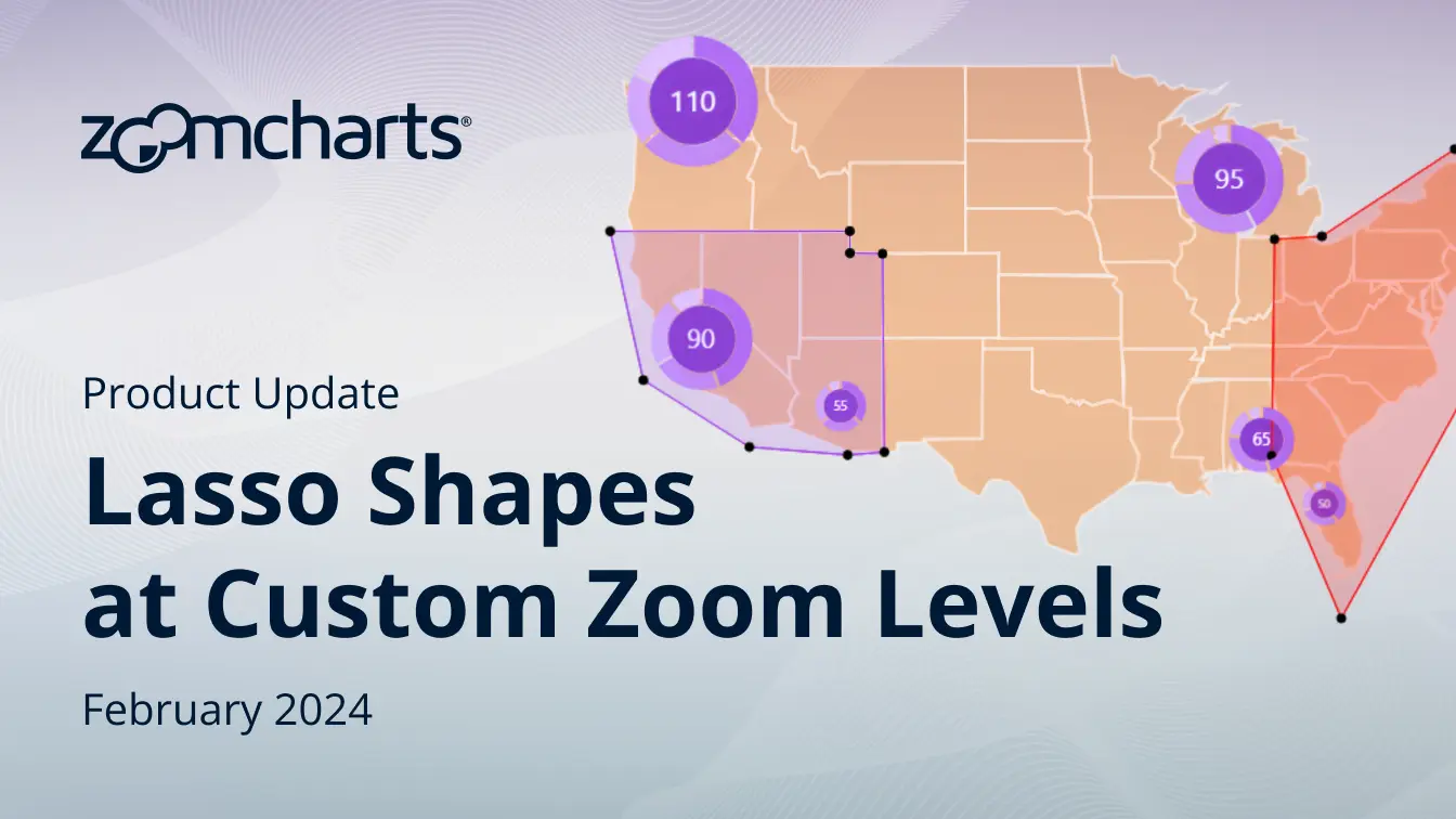
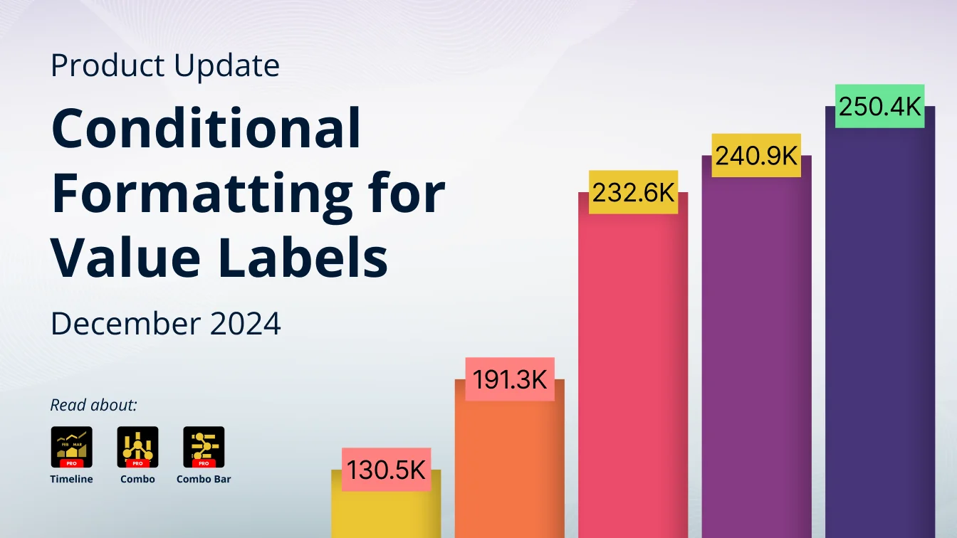
Product updates
ZoomCharts guides
Use cases
Data visualization
Power BI tutorials
Customer stories
Blog
Product updates
ZoomCharts guides
Use cases
Data visualization
Power BI tutorials
Customer stories