
Supply chain and retail data is some of the richest, most decision-critical data any organization produces. It tells you where money is being made, where it is being lost, which products to push, which shipping modes are eroding margin, and which salespeople are driving growth. Yet most supply chain reports get built the same way: a table of orders, a few bar charts, and a handful of slicers. Users open them once, feel overwhelmed, and go back to spreadsheets.
This guide walks through how to apply the 4i design principles in Power BI and build a 4U Supply Chain Report, one that retail managers, operations leads, and the C-suite will actually use to make decisions. The working example is based on a real North America retail and supply chain dataset covering 9,994 orders across 2014 to 2017, the same dataset used in the FP20 Analytics Challenge 10.
4U Reports are BI reports designed around four user-centered stages: Unique, User-friendly, Uncovering, and Understandable. They guide users naturally from first attention through to confident, informed decisions. If you are new to the concept, read the full introduction to 4U Reports here before continuing.
Developers who build through the lens of the 4i chain: Inspiring, Intuitive, Interactive, and Insightful. These are the ones whose reports get opened every Monday morning instead of gathering dust in a shared folder.
What we are working with: the supply chain dataset
The dataset covers 9,994 retail orders across the United States from 2014 to 2017. It is the kind of data a retail director, supply chain manager, or CFO would rely on daily to understand product performance, shipping efficiency, discount impact, and salesperson contribution.
| Dimension | Key fields | Purpose |
|---|---|---|
| Orders | Order ID, Order Date, Ship Date, Ship Mode |
Order and shipping timeline per transaction |
| Customers | Customer ID, Customer Name, Segment |
Consumer, Corporate, or Home Office |
| Geography | Country, City, State, Postal Code, Region |
4 US regions: West, East, Central, South |
| Products | Product ID, Category, Sub-Category, Product Name |
Furniture, Technology, Office Supplies with sub-categories |
| Financials | Sales, Quantity, Discount, Profit |
Revenue, margin, and discount impact per order |
| Operations | Retail Sales People, Returned |
4 salespeople by region, return flag per order |
The dataset already contains a pre-built Calendar Table with Year, Quarter, Month, and Week fields. Use this for all time-based visuals rather than building date hierarchies manually. You can download the dataset from the FP20 Analytics Challenge 10 page.
Before building your report, watch Aivis from ZoomCharts and Federico from FP20 Analytics share their most useful tricks when working with supply chain and retail data. This recording covers the same dataset used throughout this guide, including how to handle date hierarchies, calculate meaningful metrics, and structure the data model for efficient exploration.
The 4i chain: what it means for supply chain developers
The 4i chain is the developer-facing counterpart to the 4U value chain that users experience. Each principle maps directly to a user outcome. For supply chain reports the stakes are high: a retail manager who cannot find the answer they need in under 30 seconds will stop using the report entirely.
Stage 01: Inspiring, a supply chain report that earns attention
Make profit, returns, and shipping visible in 3 seconds
Visual design, layout hierarchy, and KPI prioritization
The summary page must answer one question before the user clicks anything: is the business healthy? For this dataset that means five KPI cards at the top: Total Sales, Total Profit, Profit Margin, Return Rate, and Orders. Everything below those five numbers is context.
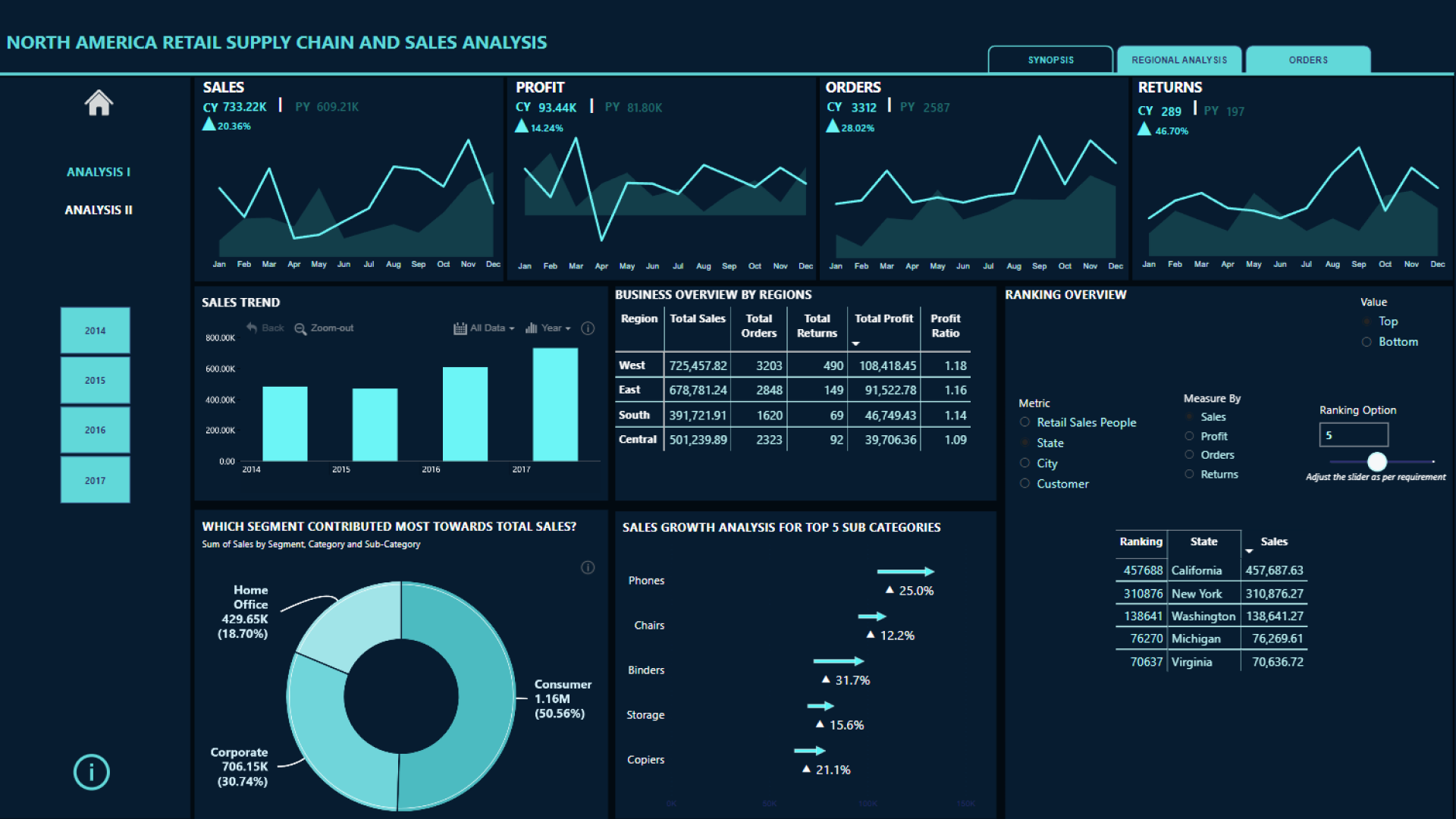
Look at what the winner of this challenge did: the opening view immediately surfaces the most important metrics with clean KPI cards, a consistent color system (green for healthy, red for risk), and a layout that gives each visual breathing room. There is no clutter. The eye lands on the numbers first and the charts second.
Design principles to apply
- Color signals business meaning. Profit above target is green. Returns above threshold are red. Discount rate in the warning zone is amber. Users read this before they read a single number.
- Limit to 6 visuals per page. The summary page needs: KPI cards, sales trend, category breakdown, regional map, top/bottom performers. That is enough. Detail belongs on page two.
- Show the discount story prominently. This dataset's most important hidden insight is that orders with discounts above 30% generate an average profit of negative $107. A single KPI card showing "Avg profit on discounted orders" creates immediate urgency that earns a user's full attention.
Furniture has $742K in sales but only $18K in profit (a 2.5% margin). Technology has $836K in sales and $145K in profit (17.4%). That contrast belongs on the summary page as a side-by-side KPI comparison, not buried in a table on page three. Use the Category and Profit columns with conditional formatting to make this visible immediately.
Stage 02: Intuitive, navigation supply chain users never have to think about
Remove every friction point before the user encounters it
Page structure, labeling, and user controls
A supply chain report typically serves two distinct audiences simultaneously: the C-suite who wants the headline numbers, and operations or retail managers who need to drill into specific products, regions, and salespeople. A two-page structure handles both without asking either to wade through irrelevant content.
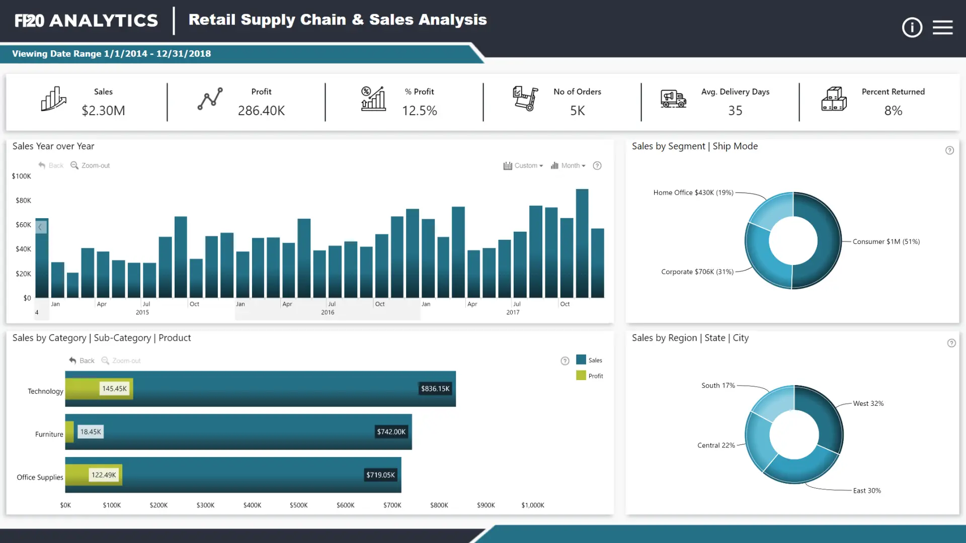
- Page 1: Sales and Performance Overview. KPI cards (Total Sales, Profit, Margin, Return Rate), sales trend over time, category and sub-category breakdown, regional performance map. The C-suite view.
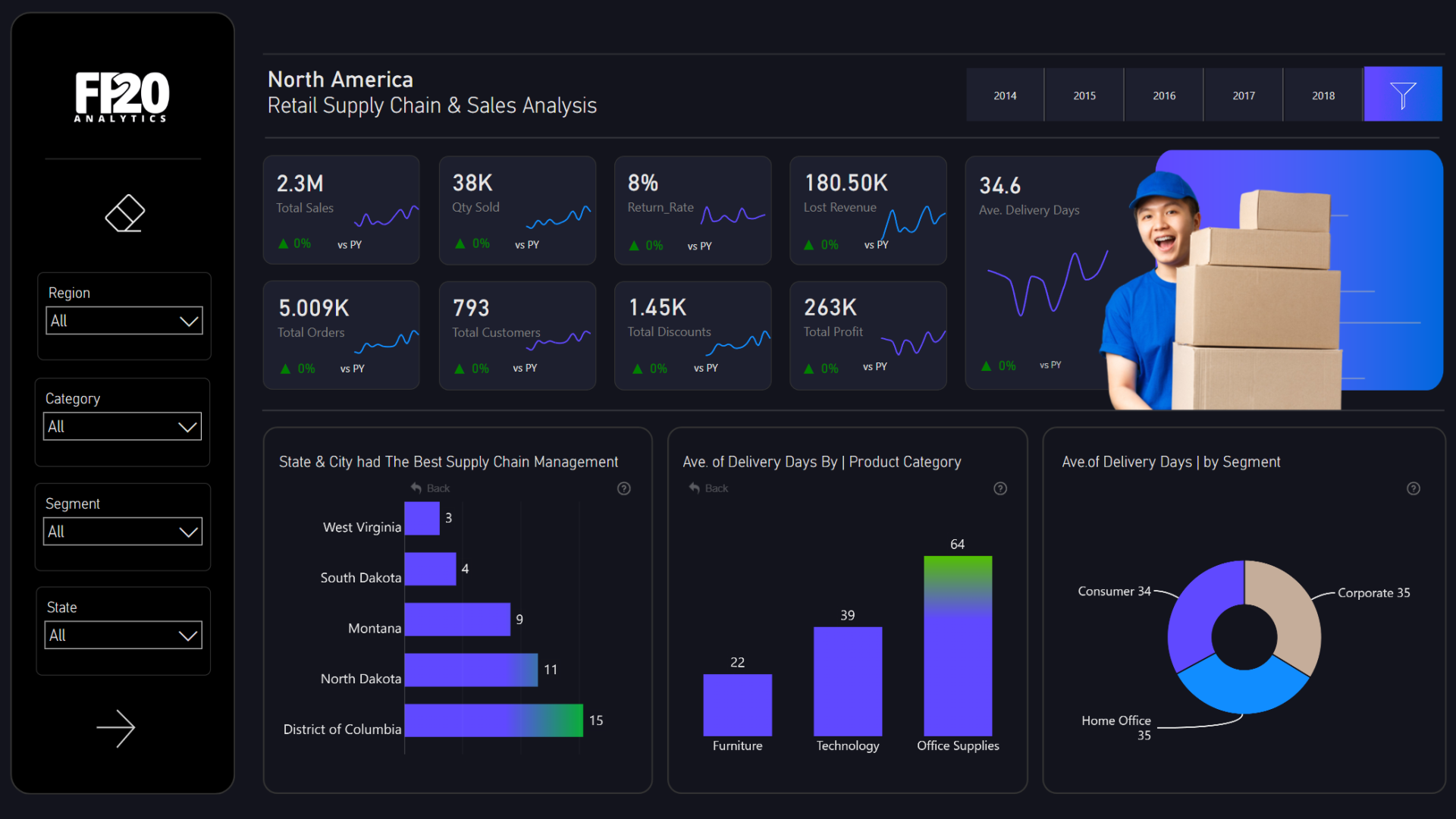
- Page 2: Orders and Salesperson Analysis. Scatter plot of discount vs. profit to expose loss-making discount behavior, salesperson leaderboard, shipping mode performance, return rate by product. The operations view.
Navigation and labeling rules
- Name pages by the question they answer. "How is the business performing?" beats "Overview." "Where are profits being lost?" beats "Analysis."
- Add a reset button to every page. Users who explore by clicking will end up in filtered states they did not intend. A visible reset removes that anxiety.
- Format numbers properly.
2297201is unusable.$2.3Mis immediately readable. Apply currency formatting to all Sales and Profit measures and percentage formatting to Margin and Discount.
The Returned field contains "Yes" and "Not" (not "No"). Build a calculated column to normalize this before displaying it:
Stage 03: Interactive, letting supply chain teams explore by clicking, not configuring
Replace filter panels with direct visual exploration
Cross-chart filtering, drill-down, and direct visual interaction
A retail manager should be able to click on "Furniture" in the category chart and immediately see which sub-categories, regions, salespeople, and shipping modes apply, without touching a single filter panel. This is where ZoomCharts visuals for Power BI become decisive.
Recommended ZoomCharts visuals for this dataset
| Data question | ZoomCharts visual | Interaction |
|---|---|---|
| Sales and profit over time | Drill Down Timeline PRO | Click year to drill to quarter, month, week |
| Sales by category and sub-category | Drill Down Combo Bar PRO | Click category to drill into sub-categories |
| Segment and region split | Drill Down Donut PRO | Click segment to cross-filter all page visuals |
| Geographic sales distribution | Drill Down Map PRO | Click state to filter entire report by geography |
| Discount vs. profit relationship | Drill Down Scatter PRO | Click data point to isolate product or salesperson |
Drill Down Timeline PRO: the sales trend visual
Bind the Calendar Table's Year, Quarter, and Month Name fields as the drill-down hierarchy on the X axis, with Sales and Profit as two series. Users start at the annual view and drill to monthly with a single click, no slicers required. The winner report used this visual as the central piece of its summary page, and it is what allows the user to identify which quarters drove the strongest performance.
Enable Cross-chart filtering so that clicking a year or quarter in the timeline automatically refocuses the category bar chart, the donut, and the map on that time period. This is the core interactive loop of the report.
Drill Down Donut PRO: the segment and region filter
Use two Donut PRO visuals: one for Segment (Consumer 52%, Corporate 30%, Home Office 18%) and one for Ship Mode. Each acts simultaneously as a proportional visualization and a cross-chart filter. Clicking "Consumer" in the segment donut immediately refocuses the entire report on consumer orders. This is the interaction the winning report was recognized for: the donut-as-filter pattern that makes page-level exploration feel effortless.
Drill Down Map PRO: geographic sales exploration
Bind State as the location field and Sales as bubble size. Use conditional formatting to color bubbles by Profit: green for above-average margin, red for below-average. The West region generates $725K in sales but users clicking it immediately see which states within the West drive versus drag that number. Use Region as the first drill-down level and State as the second so users can start regional and zoom to state-level with one click.
All ZoomCharts visuals participate in Power BI's cross-filtering model automatically. In Edit Interactions, set all ZoomCharts visuals to filter (not highlight) all other visuals on the page. Set KPI cards to none. They should display context, not act as filters. Full setup instructions are in the ZoomCharts documentation.
Stage 04: Insightful, surfacing the why behind procurement numbers
Surface the three stories hidden in this dataset
Discount impact, sub-category profitability, and shipping efficiency
Showing that profit margin is 12.5% is useful. Showing that Furniture has a 2.5% margin while Technology has 17.4%, that Tables actively lose money at negative $17.7K, and that every discount above 30% generates an average loss of $107 per order. That is what enables a decision. Stage 04 is where supply chain reports graduate from dashboards to decision tools.
Story 1: The discount trap
This is the most actionable insight in the dataset. Use Drill Down Scatter PRO with Discount on the X axis, Profit on the Y axis, bubble size as Sales, and color by Category. The resulting chart shows a clear negative correlation: as discount increases, profit collapses. Orders with no discount average $66.90 profit. Orders with discount above 30% average negative $107.21. This visual answers the question "are our discounts working?" in under 10 seconds.
Story 2: Sub-category profit divergence
The category-level view hides a critical sub-category story. Use a Drill Down Waterfall PRO chart to show profit contribution by sub-category. Copiers contribute $55.6K in profit. Tables destroy $17.7K. Bookcases lose $3.5K. Presenting this as a waterfall rather than a bar chart makes the cumulative impact of the loss-making sub-categories viscerally clear. Users see exactly how Tables and Bookcases drag the Furniture category's overall margin from where it could be to where it is.
| Sub-category | Category | Profit |
|---|---|---|
| Copiers | Technology | $55,618 |
| Phones | Technology | $44,516 |
| Accessories | Technology | $41,937 |
| Tables | Furniture | -$17,725 |
| Bookcases | Furniture | -$3,473 |
Story 3: Shipping mode efficiency
Standard Class handles 60% of all orders but averages 41.9 days from order to ship. First Class averages 23.5 days. Same Day averages 0.9 days. The question this raises for any retail manager is: are customers choosing Standard Class because it is cheaper, and does that affect return rates or satisfaction? A Drill Down Combo Bar PRO chart with Ship Mode as the category, Sales as the primary bar, and Return Rate as a line series answers this in one visual using Zero-Based Stacking mode.
The dataset has Order Date and Ship Date but no Days to Ship column. Create it with DATEDIFF:
Putting it together: the report structure
A 4U Supply Chain Report on this dataset follows a two-page structure. Each page answers a distinct question and serves a distinct audience.
| Page | Purpose | Key visuals | 4i principle |
|---|---|---|---|
| Sales and Performance | "Is the business healthy and where is profit coming from?" | KPI cards, Timeline PRO, Combo Bar PRO, Donut PRO, Map PRO | Inspiring, Intuitive |
| Orders and Analysis | "Where are we losing money and who is driving it?" | Scatter PRO (discount vs profit), Waterfall PRO (sub-category profit), salesperson leaderboard, shipping mode comparison | Interactive, Insightful |
What the user journey looks like in practice
When all four 4i principles are in place, the supply chain report stops feeling like a tool and starts feeling like a conversation with the data.
-
Stage 01A retail director opens the report and immediately sees that profit margin is 12.5%, that the return rate is 8%, and that Furniture is barely breaking even. That is Inspiring.
-
Stage 02They click "Furniture" in the category chart. The entire report refocuses. They do not look for a slicer. They just click. That is Intuitive.
-
Stage 03They navigate to page two and see the scatter plot. Furniture orders cluster in the high-discount, negative-profit quadrant. They click a data point cluster and the salesperson leaderboard updates. One salesperson is responsible for 40% of the high-discount Furniture orders. That is Interactive.
-
Stage 04The waterfall chart shows Tables at negative $17.7K and Bookcases at negative $3.5K. The insight is immediate: Furniture's margin problem is not a category problem. It is a Tables and Bookcases problem driven by excessive discounting by one salesperson. That is Insightful.
Key DAX measures for this report
These six measures form the analytical foundation of the report. Add them to your model before building any visuals.
See real 4U Supply Chain Reports in action
The best way to understand these principles is to see them applied. These reports were all built on the same dataset used in this guide and submitted to the FP20 Analytics Challenge 10. Each shows a different approach to the same data, and each demonstrates at least one 4U principle done exceptionally well.
Browse all 52 submitted reports on the FP20 Analytics Challenge 10 page or explore more supply chain report examples in the ZoomCharts Report Gallery.
Frequently asked questions
What is a supply chain dashboard in Power BI?
A supply chain dashboard in Power BI is an interactive report that visualizes the key metrics across the entire supply and retail chain, from order placement to delivery, including product performance, shipping efficiency, salesperson contribution, and return rates. A well-designed supply chain dashboard allows users to explore data by clicking visuals rather than configuring filter panels, surfacing answers within seconds.
What data should a Power BI supply chain dashboard include?
At minimum: order and ship dates, product category and sub-category, sales and profit per order, customer segment, geographic location, shipping mode, and a return flag. The most insightful supply chain reports also include discount rates, salesperson attribution, and a calculated shipping days field derived from the gap between order date and ship date.
Which Power BI visuals work best for supply chain analysis?
Drill Down Timeline PRO for sales and profit trends with year-to-month drill-down, Drill Down Combo Bar PRO for category and sub-category breakdowns, Drill Down Donut PRO for segment and shipping mode splits that act as cross-page filters, Drill Down Map PRO for geographic sales exploration, Drill Down Scatter PRO for discount vs. profit correlation analysis, and Drill Down Waterfall PRO for sub-category profit contribution.
How do I build a supply chain and retail report in Power BI?
Start by identifying the two audiences your report will serve: executives who need headline numbers and managers who need operational detail. Build a two-page structure with a summary page for the former and a drill-down analysis page for the latter. Apply the 4i principles: make key metrics visible in 3 seconds (Inspiring), structure navigation so users never need instructions (Intuitive), enable cross-chart filtering so clicking any visual refocuses the page (Interactive), and surface the hidden stories (discount impact, sub-category losses, shipping efficiency) on page two (Insightful).
Where can I download the supply chain dataset used in this guide?
The dataset is available on the FP20 Analytics Challenge 10 page. It includes 9,994 retail orders across the United States from 2014 to 2017, with a pre-built Calendar Table and all the columns described in this guide. All 52 submitted reports using this dataset are also available to browse, download as .pbix files, and interact with as live demos.
Build your 4U Supply Chain Report
Download the FP20 Analytics Challenge 10 dataset, explore the winner report with a live demo, and start building. The ZoomCharts visuals used in this guide are available on Microsoft AppSource.
Get the dataset Read the 4U Reports introduction Explore ZoomCharts visuals


