Feb 14, 2022
Everything You Need To Know About Power BI Bar Charts
Power BI bar charts are a simple and efficient way to show category-based data. Almost everyone has used a bar chart, which is why they've remained incredibly popular through the years. In this article, we will explore the many ways you can make Power BI bar charts even more powerful and use them to the max.
Power BI bar charts are a simple and efficient way to show category-based data. Almost everyone has used a bar chart, which is why they've remained incredibly popular through the years. In this article, we will explore the many ways you can make Power BI bar charts even more powerful and use them to the max.
It is likely that, before hearing about Power BI, almost everyone’s first encounter with a bar chart happened all the way back in pre-school. After all, Power BI bar charts are one of the simplest and universally recognized charts in most industries. But did you know about all the various sub-types you can create using just this one custom visual for Power BI? After reading this article on Combo Bar PRO, you will associate bar charts with a world of endless possibilities. We are going to cover the basics of Power BI bar charts, their uses, their sub-types, and how Combo Bar PRO expands upon our preconceived notions on what you can achieve with a Power BI bar chart.
What is a bar chart?
A bar chart is a type of graph that signifies categorical data using rectangular bars that are proportional to their respective values. While it shares a similarity with the donut or pie charts in the sense that Power BI bar charts display categorical data, it differs in the fact that bar charts focus on individual series or values while donut charts compare proportional data. This makes it easier to compare different values and their changes over time.
Bar charts are very simple and universally understandable. This makes Power BI bar charts one of the most widely used chart types and data visuals within organizations.
Why would you use a bar chart?
There are many uses for Power BI bar charts. Some of their most common ones include:
- Displaying a large number of categories without strict space limitations.
- Comparing results.
- Displaying longer category names because of its horizontal layout.
You’ll find Power BI bar charts being widely used to display data in these industries and areas.
- Evaluating the effectiveness of sales strategies, sales results, and campaign-by-campaign marketing metrics.
- Overseeing matters in human resources such as hiring, sick days, overtime, and efficiency ratios by department or office.
- Comparing financial performance by region, office, or business line.
- Monitoring manufacturing efficiencies and quality metrics by product line.
Pros and cons of using Power BI bar charts
As with every chart, there are certain advantages and disadvantages that come with each visual. This just means that there is a time and place for every type of chart, and it’s important to keep in mind each one’s strengths and weaknesses when creating a report.
Pros:
- Ability to compile large amounts of data into a single chart.
- Easy to oversee and spot trends.
- Simple enough that anyone can interpret a bar chart.
Cons:
- Data storytelling is limited as Power BI bar charts only display results without showing the relationships between different variables.
- Doesn’t always tell the full story by itself – can require additional explanation.
Luckily, Power BI bar charts are also very adaptable and offer a large array of sub-types – line charts, area charts, stacked or clustered bar charts, and more. Let’s take a more in-depth look at these.
Different Power BI bar charts using Combo Bar PRO
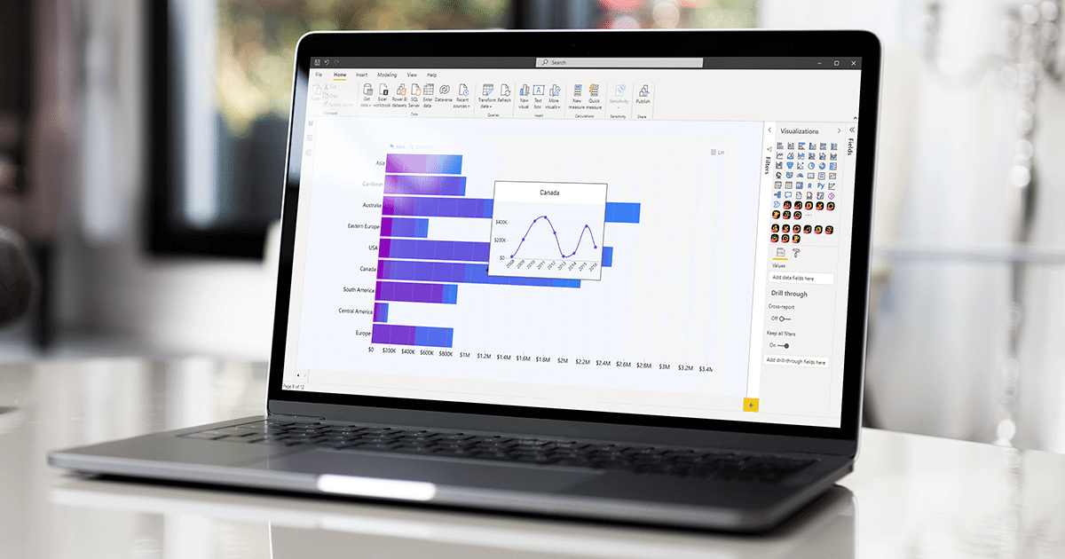
ZoomCharts is a company that specializes in custom visuals for Power BI that expand the visual interaction experience and add additional functionality. One of these visuals is Combo Bar PRO for Power BI which introduces a massive amount of advanced customization options. We’d like to show you the near-full potential of this unique custom visual.
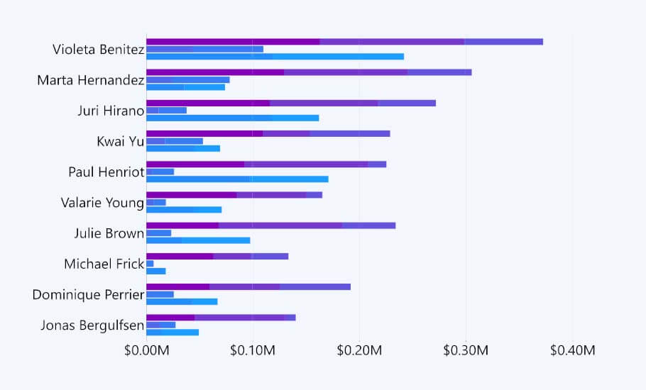
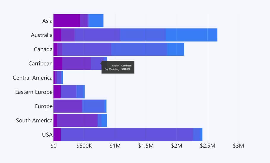
Stacked Bar Chart
In addition to the regular Power BI bar charts, Combo Bar PRO also lets you build stacked bar charts. A stacked bar chart allows us to show additional dimensions using the same measure. If each bar is considered a whole, then a stacked bar chart shows us different categories that make up that whole.
There are different types of stacked bar charts. Combo Bar PRO allows 3 stacking modes - normal, 100% proportional, and zero based.
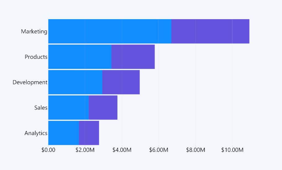
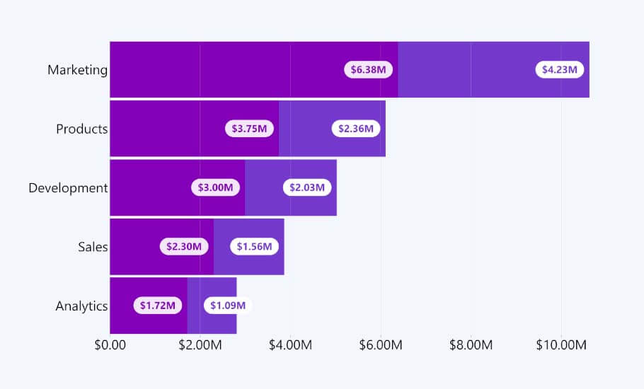
Normal stacking mode
This type of stacked bar chart could be considered the most intuitive of the bunch. When using the Normal stacking mode, each segment of the stacked bar chart adds to the whole bar.

As you can see, this type of stacked Power BI bar chart is a very straightforward way to compare bars and their respective segments. If some segments are close in size, you can always add value labels to make them clearer to the end user.
Additionally, Combo Bar PRO lets you add value labels to each series, as well as format the type of value labels you’d like to display. This is done by adjusting the Total Stack Value under any Series Value Labels. If you would like to show cumulative totals, simply set the Use Total Stack Value mode to Auto.

However, this stacked chart only makes sense if you take note that the value is growing with each series. Returning to the Use Total Stack Value setting, you can change it to False and make each series display its independent value.
100% proportional stacking mode
A sub-type of the stacked bar chart is the 100% proportional stacked bar chart. These Power BI bar charts turn each whole into 100%, and each category represents its proportional part within that 100% whole.
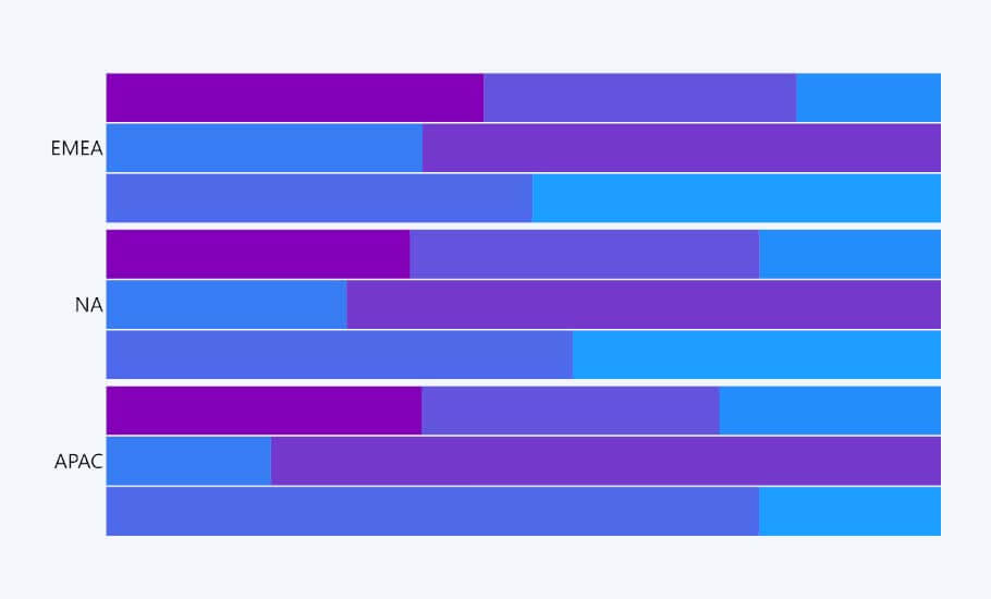
The 100% stacked bar chart can be considered an alternative to the donut and pie charts as it shows proportional differences. However, if the donut chart leaves it up to the end user to differentiate the differences between areas, then the 100% stacked bar chart lets the end user compare length and comes with axis labels that define its measures and dimensions.
For example, a 100% stacked bar chart could easily tell you of which product did you hold the largest market share in each year. Market share is usually measured in percentage and is used to figure out the size of a company in relation to its competitors, so it requires proportional analysis. This is where the 100% stacked bar chart excels.
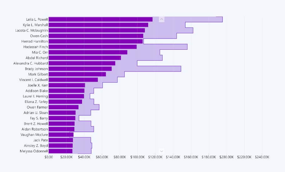
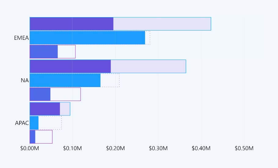
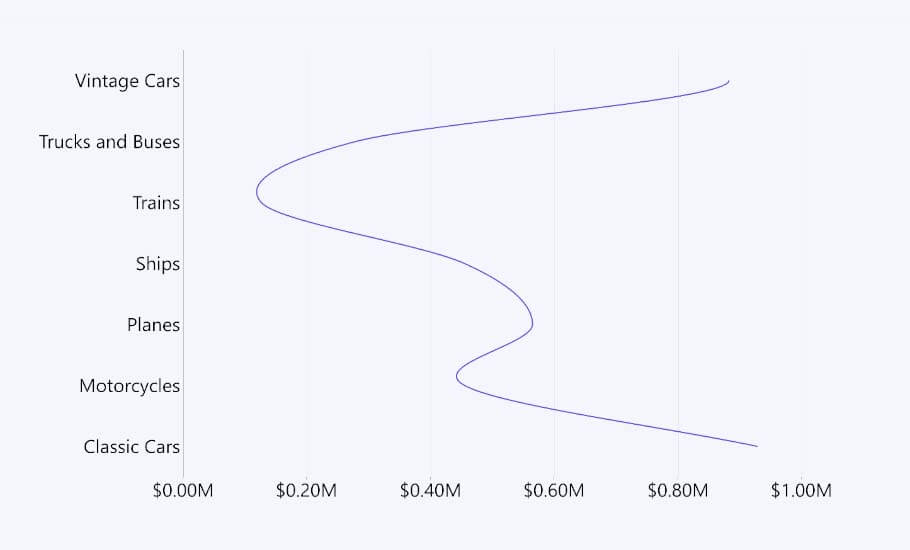
Zero based stacking mode
This is a customization option within Combo Bar PRO. Instead of having each segment stack to make up the whole bar, it can be considered an additional bar that starts at the 0 margin, thus making it appear if it is either on top or behind the existing bar.
If you use the Zero Based option, we recommend adjusting the height percent option. This will remove the illusion of appearing as a normal stacked bar chart, thus not ending up confusing your end users.
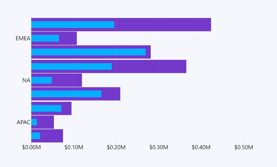
As you can see, this type of stacked bar chart would work great for comparing actuals and their targets. You can also use it to display the completion level of certain processes, as shown below.
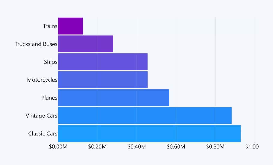
Clustered Bar Chart
Next in line from the stacked bar chart is the clustered bar chart. This chart differs from the stacked Power BI bar charts in the sense that it displays extra dimensions next to the first ones instead of stacking on top.

This is less likely to confuse the end user in deciphering whether the sub-categories stack together, as it makes each sub-category stand alone. However, as the number of series increases, the clustered bar chart starts to become visually complex, so it’s best to limit the number of series you plan to use.
Combo Bar PRO supports default clustering, as well as bar padding from each side of the cluster, meaning you have the power to adjust the space between each cluster from the top and bottom separately.
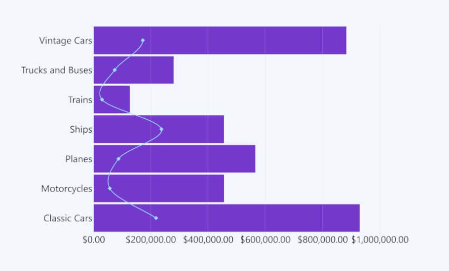
Line Chart
The line chart is another important and frequently used chart type in Power BI. These types of charts are used to visualize a trend over a certain period. A line chart consists of ordered measurement points that are connected by a line.
Combo Bar PRO features two available options for the line chart – normal and stepped.
The stepped line chart, rather than showing overall transition flows, focuses the attention on the leaps in value and irregular changes and trends.

Stepped line charts are useful for displaying inventory levels, price changes, tax rate changes, and other forms of data, whereas a line chart that displays a constant rate of fluctuation would end up telling false data.
A constant line chart also wouldn’t keep in mind the periods when you lack data. In these instances, Combo Bar PRO grants the feature No Data Policy. This feature considers the points for when the value is null. It comes with 3 options – join, skip, and zero.
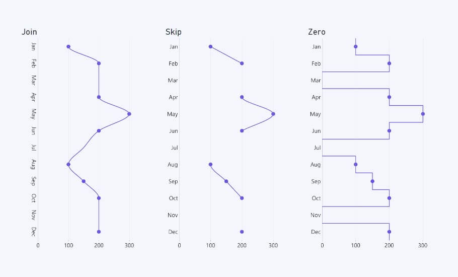
As you can see, the join option finds the next point after the null value and connects to it. The skip option simply stops at the null value and restarts the line at the next point. Finally, the zero option forces the line to drop to zero on the value axis. Each one serves its own purpose depending on what you want to show to your end user.
Combo Chart
A combo chart combines any of the previously mentioned types of Power BI bar charts, the most common one being a simple bar chart with a line chart.
Most default Power BI users tend to synthetically stack charts on top of charts, i.e., create a separate line and bar chart, and then drag the line chart on top of the bar chart. This can impede precision, so Combo Bar PRO was specifically built to allow a large array of combo bar types.
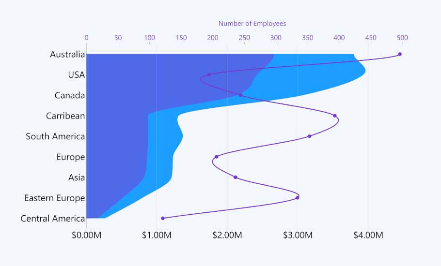
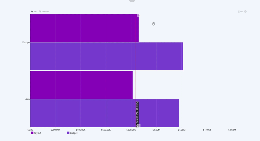
As Combo Bar PRO supports dual value axis, it allows you to create charts that compare one value against another. For example, the above chart compares the number of employees in a country against their average salary. This type of chart would also work to compare total sales and sales volume.
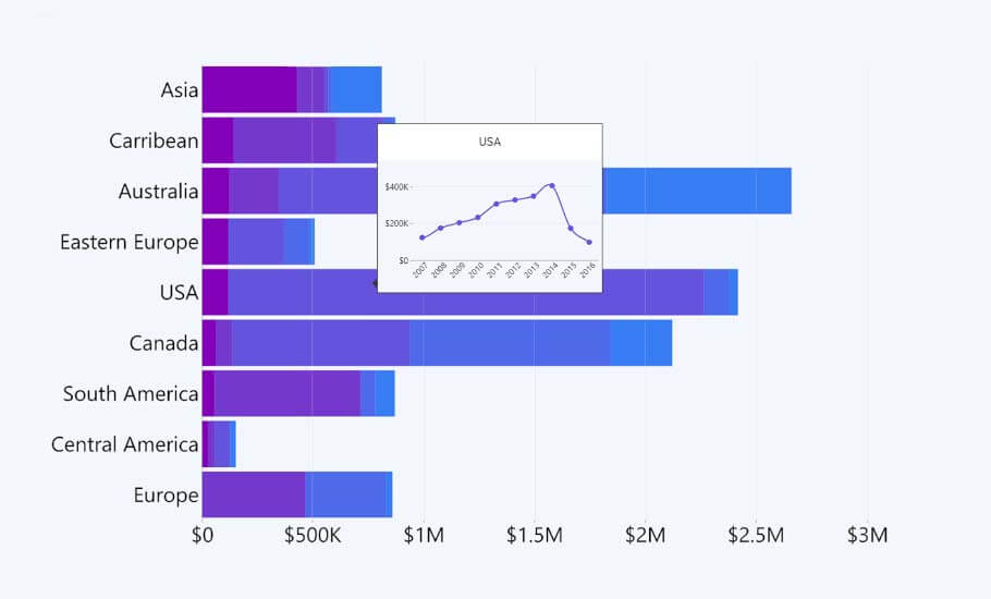
Combo Bar PRO also supports Report Page Tooltips. When you hover above a bar or sub-category, this type of tooltip displays a smaller window of an additional chart type depicting the same data. This is useful if you are lacking space but need to involve another chart. The example below depicts how a tooltip of a line chart appears when hovering over any part of a stacked bar.
If you or your end users prefer the regular Power BI tooltip, then you easily swap to that one. Combo Bar PRO supports the native Power BI tooltip along with its custom ZoomCharts tooltip. You can also adjust the Display Values within the tooltip. This makes it possible for you to customize the values within your tooltip to be more detailed than your value labels.
Other chart variations made possible with Combo PRO
Combo Bar PRO is not the simplest to use or create with, but the most advanced. Without having to search for a separate visual for each Power BI bar chart variation, you can create 100+ chart types using just Combo Bar PRO. It may not be as swift of a process as native Power BI visuals, but with a little bit of patience, report creators can create something really special using Combo Bar PRO. Here are a few examples of other Power BI bar charts.
Funnel chart

Funnel charts get their name from their shape which is similar to a funnel. They are useful for visualizing various stages of a process and comparing the results of each stage. For example, they are great for finding potential problem areas in a sales process.
To easily create a funnel chart using Combo Bar PRO, you would just need to slightly adapt your data. Then, using the Zero Line option, center the zero line in the middle of the chart to create a nice-looking funnel chart.
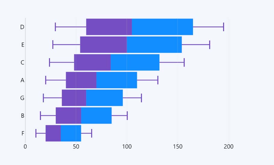
Dumbbell chart
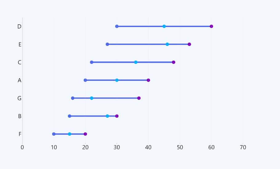
A dumbbell chart works great for illustrating change and comparing the distance between two groups of data points. With two points that measure a minimum and maximum value, the middle point shows us where we are located within that measure.
Box & Whisker Chart
Because Combo Bar PRO focuses on individual series, you can also create a box and whisker chart. This type of chart shows the distribution and variability of your data, as well as the mean and outliers. A box and whisker chart would work great for comparing results from different companies using multiple datasets.
How Combo Bar PRO improves visual interactions
As all Drill Down Visuals by ZoomCharts, Combo Bar PRO for Power BI puts the focus on interactions to guarantee end user friendliness. By ensuring on-chart interactions and removing external items, Combo Bar PRO removes the need for end users to learn hidden controls and cuts down onboarding time to a minimum. For example, the need to hold CTRL is removed in favor of cross-chart filtering, which guarantees a simple yet superior data exploration experience.
If you would like to learn more about how Drill Down Visuals improve user interaction, you can view this recording of one of our past webinars that displays real-time demos and explanations on how to guarantee a great data visualization experience using our custom visuals.
Conclusion
Combo Bar PRO was built with the goal of creating the most advanced combo bar visual that could visualize hundreds of Power BI bar chart combinations. With over 200 customization options, report creators are sure to come up with something unique to show to their end users.

Want more info like this?
Subscribe to our newsletter and be the first to read our latest articles and expert data visualization tips!


