Feb 09, 2023
Power BI Pie Chart: All You Need To Know
Pie charts can be an excellent addition to your report. They will show a quick overview of your data, and act as an eye-catching visual accent. That being said, you need to know when to use them, and how to use them correctly for them to be a valuable part of your visual narrative, not a detriment. We’ll answer these questions and give you a brief Power BI pie chart tutorial in this article.
Pie charts can be an excellent addition to your report. They will show a quick overview of your data, and act as an eye-catching visual accent. That being said, you need to know when to use them, and how to use them correctly for them to be a valuable part of your visual narrative, not a detriment. We’ll answer these questions and give you a brief Power BI pie chart tutorial in this article.
What is a Power BI Pie Chart?
Do you remember your first school research project? You had to find a way to visualize your findings, and pie charts were the obvious go-to chart for all things percentage. It’s one of the default data visualizations in Excel, which, coupled with its simplicity, makes the pie chart one of the most popular ways to show data.
The first known pie chart was made by William Playfair in 1801, and more than two hundred years later, this visualization type is still widely used everywhere, be it research, journalism, marketing or BI. Of course, not all pie charts that you see are used correctly. Pie charts are not always the best choice for data visualization, and you should consider whether they’re suited for the kind of data you want to display.
However, if you’re using percentage-based data and need to show the part-to-whole relationship of each category, pie charts are truly peerless in their simplicity and ease-of-use. It might lack the finer details that other chart types can offer, but it’s excellent for gaining a quick insight at the first glance.
For that reason, pie charts are ubiquitous in the world of business intelligence, as proven by the fact that Drill Down Pie PRO is one of our most downloaded custom visuals for Microsoft Power BI. Their quick readability makes them a great fit for dashboards, but, if you integrate them into interactive reports, they can be an excellent tool for filtering other charts in an intuitive way.
They really are as easy as pie. When you take a slice of a pie, pizza, or any other circular food item, you get an immediate depiction of the remaining amount. Pie charts work in a similar fashion, with ‘slice’ sizes providing a visual representation of the percentage for each category.

Drawbacks of a pie chart
There are many data visualization experts who will say that pies should be used only as a dessert, not a chart. One of the most influential data visualization pioneers, Edward Tufte, famously said that “the only thing worse than a pie chart is several of them”. It’s hard to ignore some of the flaws that pie charts have, and these are some of the most obvious ones that you should consider before you create a pie chart in Power BI.
Too many slices will cause confusion
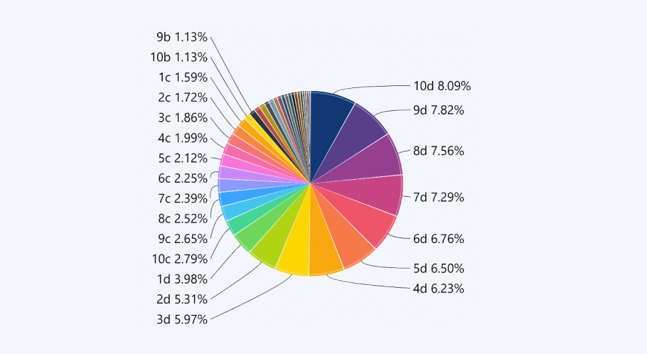
Pie charts work best when there are 2-5 large slices, especially if they are visually distinct in their size. However, when you try to fit too many categories in the same pie chart, it will become too crammed.
Furthermore, if you have multiple similar slices that represent a small fraction of the pie right next to each other, your chart will look more like a barcode than a pie. It’s not just ugly, but also impossible to read. The simple solution would be limiting the amount of slices you have on your chart to five at most.
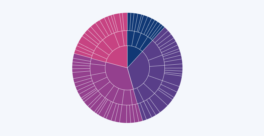
No hierarchy
A regular pie chart cannot show you a hierarchy of categories – it shows all the slices as equals. For example, if you want to display a breakdown of market share per product category, pie chart will do that just fine, but if you want to break down that data into specific brands or model variants, it will prove to be more difficult.
While some creators have tried to adapt pie charts for hierarchical data, we can all agree that there’s nothing more confusing in the world of data visualization than a nested pie chart, commonly called a ‘sunburst’ chart. The name is apt, because it’s an assault to your users’ senses, just like watching the sun with a naked eye.
Nested pie charts were created to display a hierarchy of categories, which is something a pie chart is not designed for. That is, unless it’s designed ground-up to support interactive drill down features.
Hard to tell the real size of a slice
Pie charts are the most effective when the slices have stark differences in their sizes. For example, if you have two slices, one at 80% and the other at 20%, it will be easy to determine which one of them is larger. However, if you have five or more slices, each being similar in size, the minute differences may be harder to spot.

That’s why another staple of pie chart design are labels with percentage. There are various ways to associate each label with the corresponding slice – some creators opt for color coding the labels, while others connect directly to each slice with lines. Some put the percentage directly on each slice. However, creators must be careful not to compromise readability when creating pie charts.
Drill Down Pie PRO features that solve pie chart issues
Here’s the thing about pie charts – they are a victim of their age. A lot of their issues stem from the fact that they are, more often than not, displayed as static visuals in print, web media, keynote slides, or other media.
A Power BI drill down pie chart as a part of a fully interactive report, though? That’s an entirely different story, and with Drill Down Pie PRO custom visual, you can build stunning pie charts that combine ease-of-use with high information density. Here’s a brief rundown of the features that we implemented to eliminate the traditional pitfalls of pie charts.
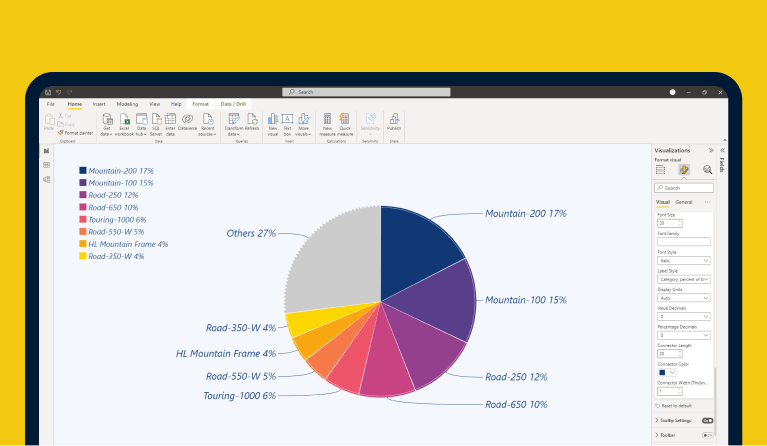
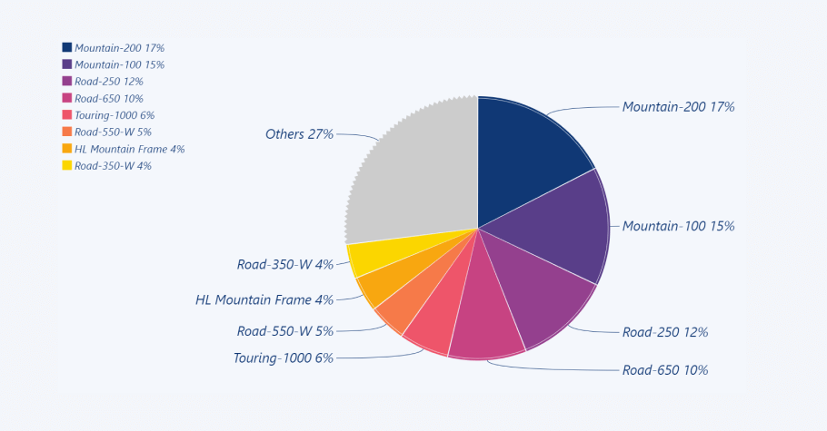
Declutter your data with the Others slice
One of the biggest issues regarding pie charts, indeed, is the mess they create once you have more than a few slices present. However, in many cases you simply must feature all categories for a comprehensive overview of your data.
To avoid your delicious pie turning into a stripy disaster, we’ve implemented an interactive ‘Others’ slice. You can set a certain amount of categories you want displayed as individual slices, and Drill Down Pie PRO will group the rest as a unified Others slice. If you want to explore its contents in closer detail, simply click on.
Drill down to 9 levels of hierarchy
Most attempts to add hierarchy to a static pie chart result in utter chaos – confusing and hard-to-read. That’s why Drill Down Pie PRO shows only the data that’s relevant at the moment. In the default view, you can see a clean and tidy overview of the whole pie chart, business as usual.
However, if you want to drill down to a certain category and explore all the subcategories within, you can do that by clicking on the slice. Up to nine levels deep, in fact.
If you want to go back a level, simply click the button in the middle. The middle section will show an overview of the previous selection, making it easier to navigate the chart and not get lost. Simple and elegant.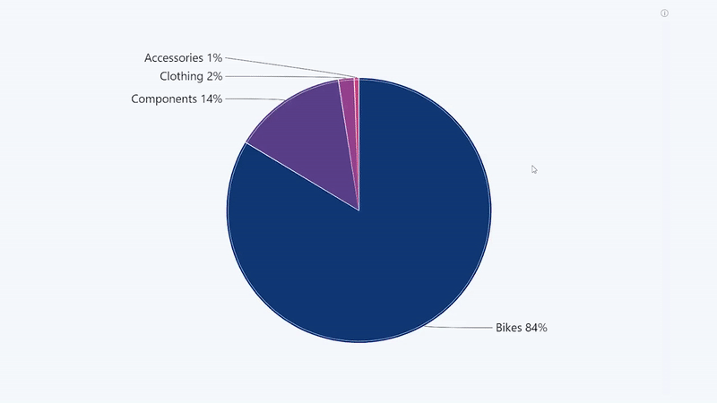
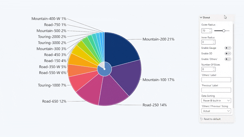
Customize your pie chart with a wide range of options
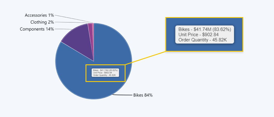
Drill Down Pie PRO includes a wide variety of customization options for slices, legends, and labels, allowing you to choose the best options to display your data. In addition to the customization of the chart itself, detail labels and legend, you can also create rich tooltips.
You can choose between the Power BI tooltip or our custom-made tooltip that can feature additional information. For example, you can show the percentage, decimal value, or additional data fields to put your data in context.
With these tools, you can create a pie chart that not just looks great, but also shows your data in an accurate and easily readable way.
Build fully featured and interactive reports
As a part of a report, the pie chart can also act as an intuitive filter for your data. In addition to the drill down features within the pie itself, allowing you to explore up to nine levels of data, this visual will allow you to filter data on other visuals as well, thanks to cross-chart filtering.
For example, if you filter a particular slice on your pie chart, the other visualizations on your report will show data relevant to the selected category. Conversely, as you drill down on the other charts, the pie will display slices that are relevant to your selection.
When used as a part of an interactive report, a pie chart can be an excellent addition, and you can see the interactivity in action by checking out our Drill Down Reports and trying out some of the examples.
Full touch support
With more and more decision-makers working from home or on the move, it’s important that your reports are usable not just on desktop computers or presentation screens, but also mobile devices. Drill Down Pie PRO, just like other Drill Down Visuals, supports touch gestures. This visual has been designed for intuitive user experience, so you or your users can tap, pinch and pan with ease.

How to create a pie chart in Power BI
If you want to create a pie chart with many features, such as cross-chart filtering, interactive ‘Others’ slice, and extensive customization, we recommend taking a look at Drill Down Pie PRO.
With this custom visual, you can easily create a Power BI pie chart in just a few steps. Here’s a quick step by step guide on how to make a pie chart in Power BI with this custom visual. However, if you want a more detailed guide, you should head to ZoomCharts Academy!
Step 1: Add your data
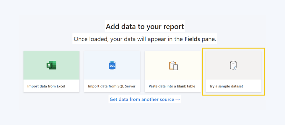
First things first, you’ll need to create or import your data into Power BI. Your data will need to contain just two fields, one of which needs to be a numerical value. If you don’t have a data source of your own and you simply want to practice creating Power BI reports, you can use Power BI sample data.
Step 2: Place the visual on your report
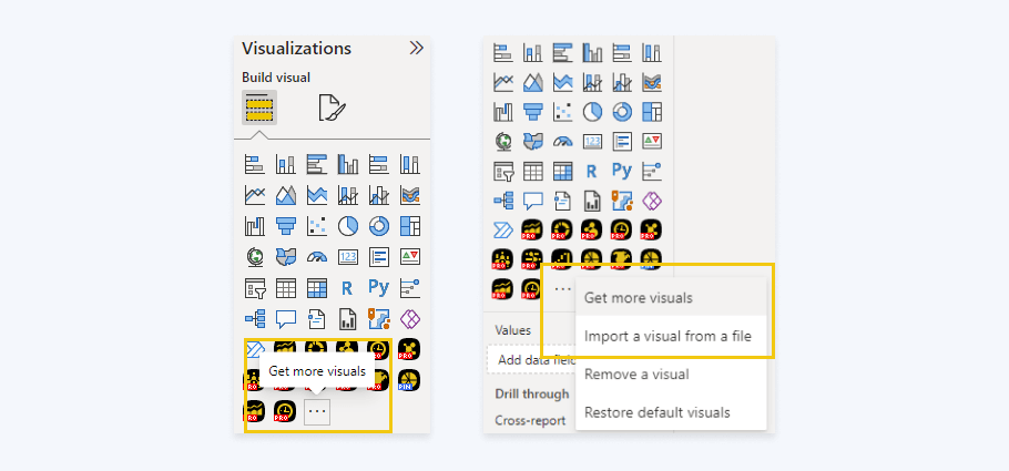
Once you’ve added data, Power BI will reveal a blank workspace. That’s your report, and you can add your Power BI visualizations to it by clicking on their icons in the visualizations panel. If you do not see Drill Down Pie PRO in that list, click on the ellipsis icon and open the Get more visuals menu to download it from AppSource, or Import a visual from a file if you have purchased it from our site.
After clicking the Drill Down Pie PRO icon, you will see a blank visualization on your workspace, and you’ll need to add data to your visual before it can display any slices.
Step 3: Select the data
Select the Drill Down Pie PRO visual by clicking on it, and head to the Visualizations pane. You will see two blank fields – Category and Values. Simply drag the fields that you want to add to your chart into their corresponding boxes, and the visual will create a beautiful pie chart!
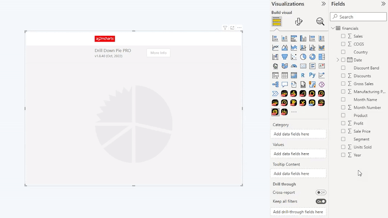
The Tooltip Content field is completely optional, but if you add data there, the tooltip will show additional values corresponding to the category when the user hovers over a slice. It’s a neat way to add additional context to your data while still keeping the pie chart clean.

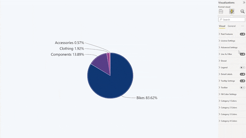
Step 4: Customize your Power BI pie chart
Congratulations! You’ve created your pie chart. Now you can customize it to fit your style and needs, and you can do that by clicking the Format your visual icon on the top of the visualizations panel. You’ll see various submenus for customizing Power BI pie chart colors, shape and size, legends, detail labels, tooltip and many more. Feel free to experiment to create your perfect pie chart visualization!
3 rules for using pie charts correctly
We believe that the pie chart’s bad reputation stems from the misuse of this visualization type. If used correctly, pie charts can be used both as a quick and simple way to show data and as a visually pleasing accent on a report. If used for the wrong kinds of data, or created without following good design principles, it will only serve to confuse the user. Let’s lay down the law on what data is suited for an efficient pie chart visualization.
Rule #1: Use the right tool for the job
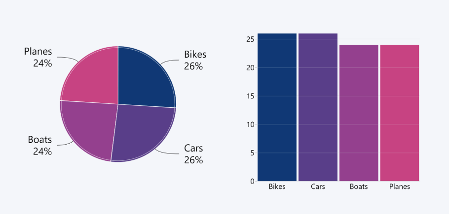
Before you choose the visual that you’ll feature on your report, ask yourself: “What do I want to show with my data?”. Even though column and pie charts can be used for the same kinds of data, each of these visual types will show it from a different perspective, highlighting different things.
Pie charts are unmatched at displaying a parts-to-whole relationship and the proportions of each category compared to the entire sum. However, they are not great for visual comparison between categories, especially if you need to compare them against each other rather than the whole.
If there are multiple similarly sized slices on your pie chart, consider bar or column charts instead, because the visual difference between the categories will be more apparent. With Drill Down Combo PRO, you can create incredible column, line, or area charts featuring up to 25 series. Of course, you’ll enjoy the same rich customization options and drill down features as the previously described Drill Down Pie PRO.
Rule #2: The data should always add up to 100 percent
One of the biggest no-nos in data visualization is creating a pie chart that shows less or more than hundred percent. In some cases, it might be an oversight on the creator’s part. In others, it can be a deliberate attempt to mislead the user – this trick is incredibly popular in opinion poll data to skew the chart in one choice’s favor.
Either way, the pie chart works only if the total adds up to exactly one hundred percent. The entire circle represents 100%, and each slice should be sized according to the category’s share. After all, when you’re baking a real pie, it will still be just one pie, no matter how much filling you stuff in it! The same principle applies to pie charts.
Rule #3: Avoid excess visual effects
The biggest benefit of a pie chart is its simplicity. That all goes away once you apply too many visual effects. You might think they make your chart look cool, but the fact is that some of them may make your data more confusing to read, or, in some cases, even misleading.
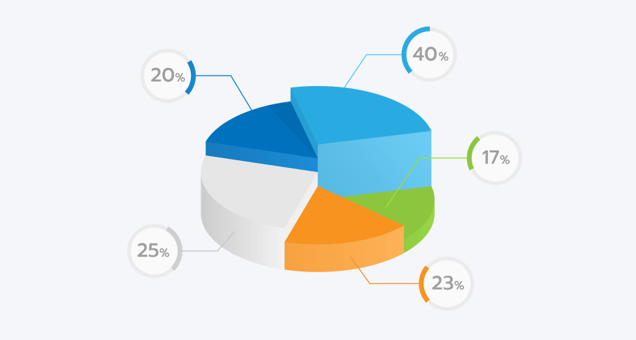
The biggest offender in this regard is the trend of making a 3D pie chart in Power BI without any apparent reason, apart from it looking snazzy. Pie charts accurately display data only if they are a perfect circle, and, if you skew the perspective of your chart, the closest slices will appear larger than they are, and the furthest ones will appear smaller. Whether or not that’s your intention, it’s misrepresentation of data.
Instead, focus on making a simple pie chart that uses colors, gradients, and other customization options to their benefit, not detriment. Choose colors that provide enough contrast so different slices don’t blend together, and use restraint when applying visual effects to create a tasteful and readable pie chart.
Conclusion
With Drill Down Pie PRO, you can create pie charts that are just as delicious as their namesake. You’ll have a wide range of customization options at your disposal, in addition to cross-chart filtering, intuitive drill down interactions, and a dynamic ‘Others’ slice. Get the 30-day free trial and try it out yourself!

Want more info like this?
Subscribe to our newsletter and be the first to read our latest articles and expert data visualization tips!


