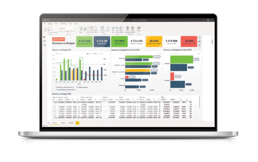
Build immersive and user-friendly reports with the most advanced timeline visual for Power BI. With powerful data aggregation features and intuitive user interactions, Timeline PRO isn’t just a chart - it’s your invitation to explore data.
Get Developer License See it in action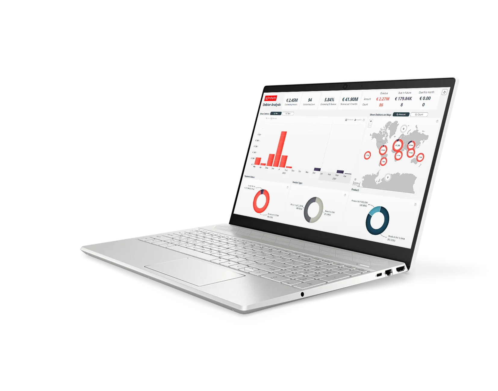
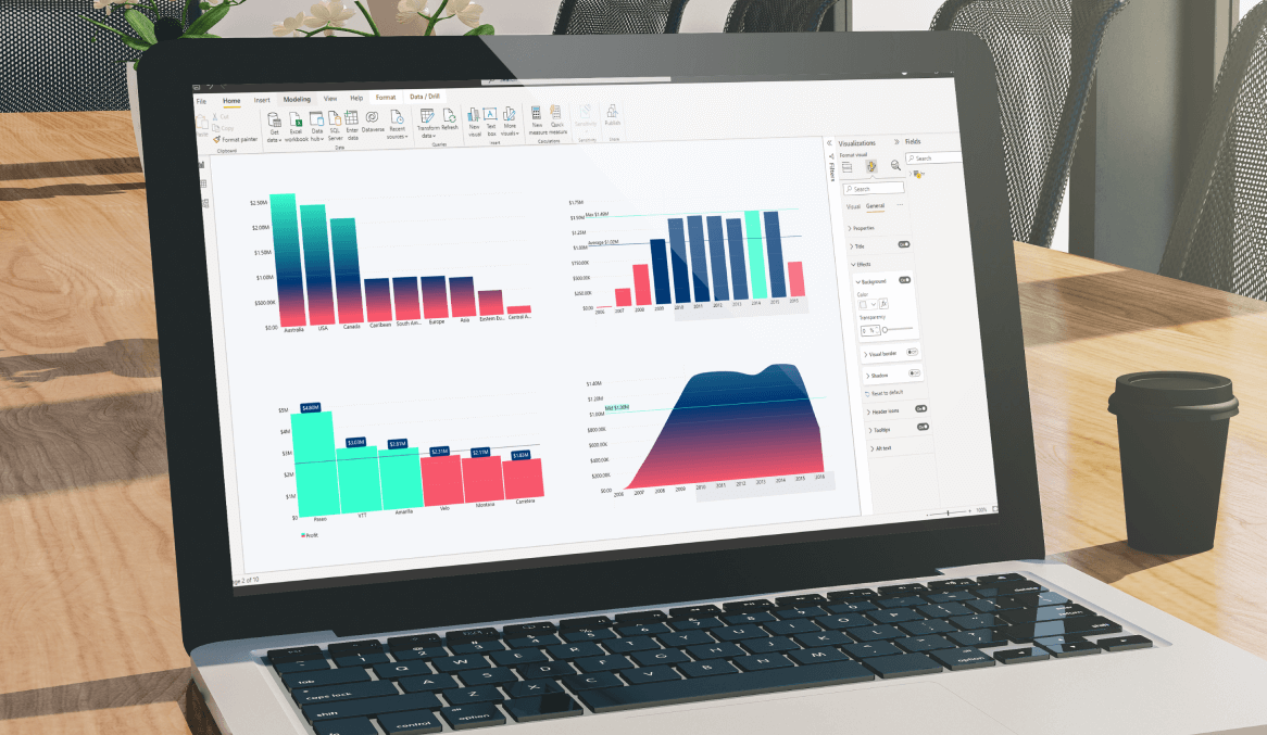
Enhance your data storytelling with visuals that perfectly balance data density with easy readability. Build interactive reports that make data exploration exciting.
ZoomCharts visuals provide intuitive user experience, allowing any user to explore data and quickly gain meaningful insights; even if it’s their first time using Power BI.
With ZoomCharts, data consultants can expand their services, increase customer satisfaction and foster stronger and more involved relationships with their clients.
Maximize the value of your investment in Power BI by increasing the user adoption rate with reports that users love to explore and start using every day.
Create and share reports that produce clear and reliable insights with no room for confusion. Strengthen data literacy and employee trust within your organization.
Enjoy peerless flexibility with more than 200 easy-to-use configuration settings in each visual and full support for touch screen devices and mouse/keyboard.
Our visuals seamlessy work together to create PRO Reports - the most immersive and user-friendly way to explore data.
See the full picture and uncover valuable insights by analyzing data across multiple visuals via cross-chart filtering.
Spend less time searching for answers. With ZoomCharts, the data you’re looking for is fewer clicks away.
See the full picture and uncover valuable insights by analyzing data across multiple visuals via cross-chart filtering.
Spend less time searching for answers. With ZoomCharts, the data you’re looking for is fewer clicks away.
Try live demos of incredible Power BI PRO Report examples created by ZoomCharts team and community members!
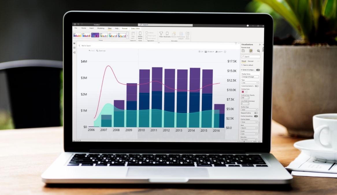
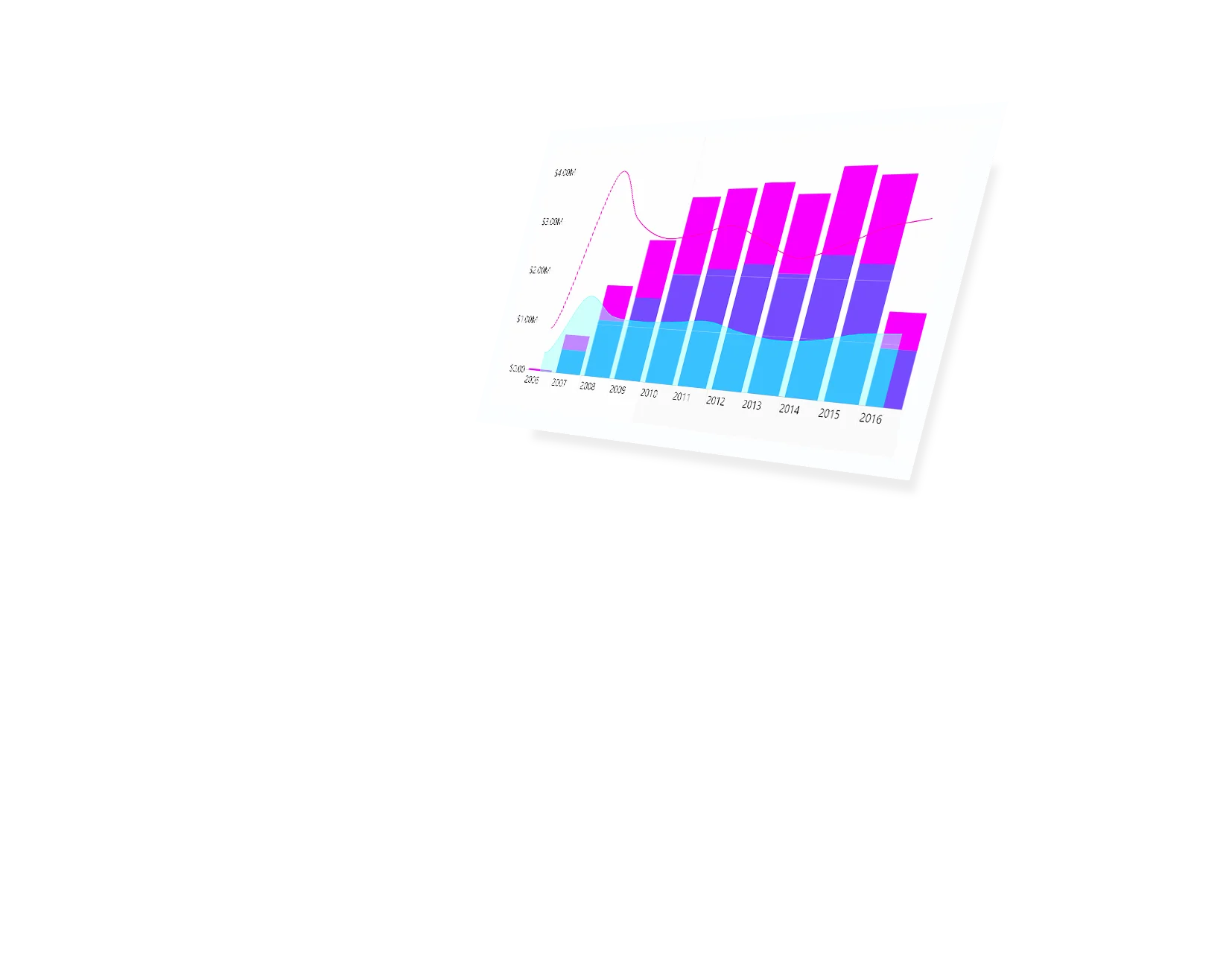
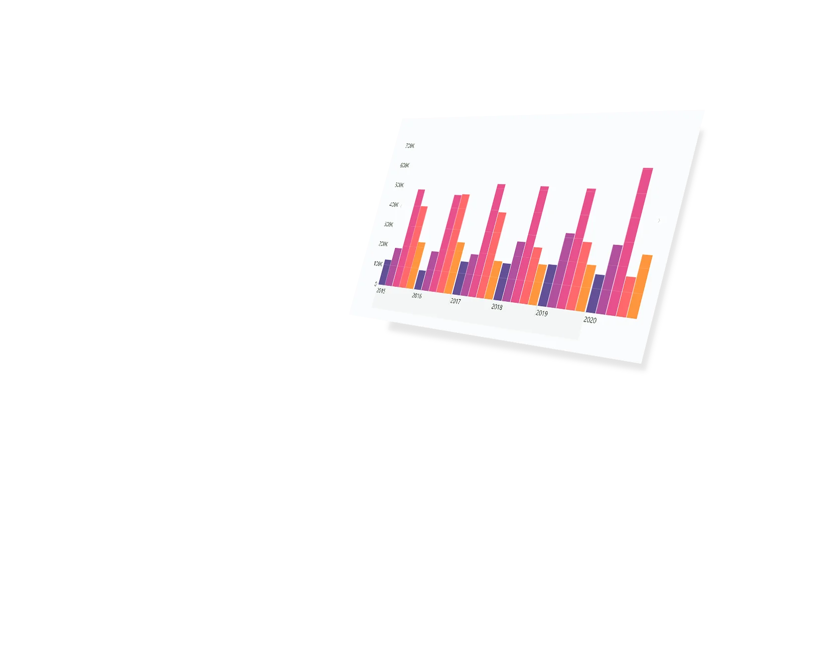
Ensure compelling data storytelling and maximum user friendliness through vast customization options. Add navigation arrows. Use lines, areas and columns for chart series.
Don’t worry about constrictions. Input up to 25 series and explore large amounts of data. Default series configurator lets you efficiently customize all series at once.
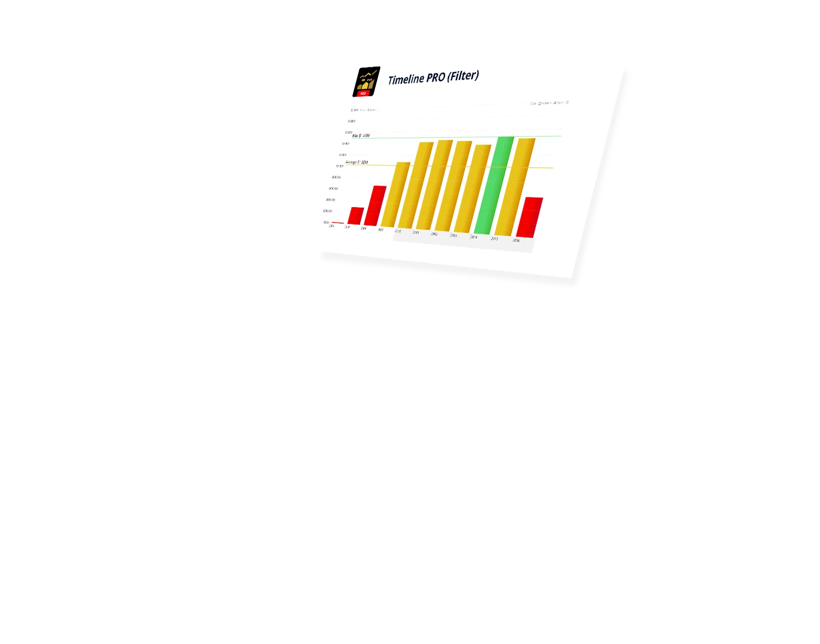
Use color-based formatting to better compare and analyze your data. Make the chart automatically highlight certain values that are out of bounds. Use different formatting modes – gradients, stepped values, and more.
Demonstrate milestones or targets using thresholds. Add line and area thresholds, customize their every aspect.
Add and customize the legend block. Pick different markers, customize the fonts and colors to help your users follow and read your report.
Make your reports more user-friendly than ever before by customizing tooltips. Hide series with no data in the tooltip. Customize displayed text for empty tooltips. Use both native and custom ZoomCharts tooltips.
Upon selecting multiple units for certain series, choose how the visual aggregates the values – sum, average, max, min, first, last, count.
Timeline PRO supports DAX calculated measures. Drill down into multiple levels while the chart calculates and applies your measures automatically. Experience full control over your data.
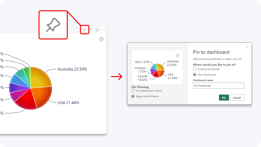
Enhance your dashboard with a stunning visual! Drill Down (Pin) supports the ability to pin the visual as a tile in Power BI dashboards.
Filter and slice reports, or pin to dashboard - whichever you prefer.
Designed for engaging data exploration across multiple visuals.
Best choice for interactive PRO Reports in Power BI.
Uses filtering API to act as a slicer and filter data across multiple ZoomCharts or other visuals on the report.
Full customization and touch support.
Supports Pin to Dashboard for use with Power BI Service dashboards.
Optimized for lightweight datasets and single-visual drill down.
Uses selection API to highlight data in native Power BI visuals.
Full customization and touch support.
Supports Pin to Dashboard for use with Power BI Service dashboards.
Optimized for lightweight datasets and single-visual drill down.
Uses selection API to highlight data in native Power BI visuals.
Full customization and touch support.
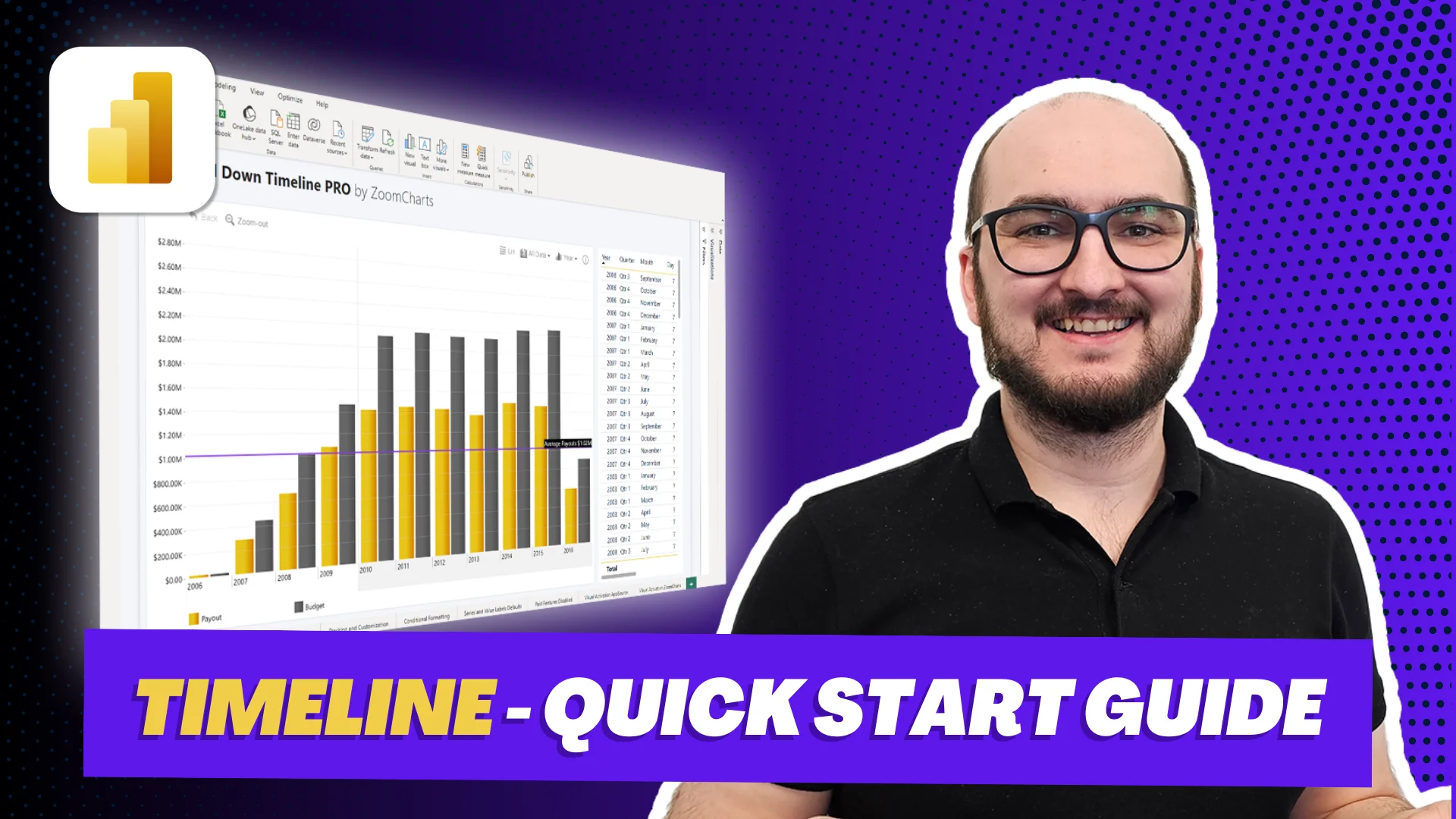
Get the most out of this visual and use its full potential in your reports by watching tutorial videos that provide a deeper look into the setup and data preparation process for Drill Down Timeline PRO
Watch video tutorialsShare a few details in the contact form so we can better help you and your company!
Learn even more about report creation with Drill Down Visuals.
This field allows you to define the display units used within the visual. Note that only certain names can be used here. More about these definitions can be found here.
The two date fields allow the visual to properly calculate DAX measures used in series. `Date Hierarchy` allows you to define the levels of granularity. The `Date Value (X-Axis)` field allows the visual to connect the actual date/time to then be connected to the levels provided in the hierarchy.
This might be due to the data setup in the 'Date Value (X-Axis)'. If you have time units in the hierarchy, make sure that the column used in 'Date Value (X-Axis)' has a Date/Time format and not just Date. Also, double-check if you have the actual timestamp as part of the data.
You can control this through formatting options. Formatting options > Initial Display Unit. More information can be found here.
Despite there being very few differences when it comes to formatting, the Timeline visual allows you to use DAX calculated measures as values in Series, and still has the ability to move between the hierarchy units.
Was this helpful? Thank you for your feedback!
How can we improve it?