Oct 03, 2024
Power BI Dark Mode Is Here
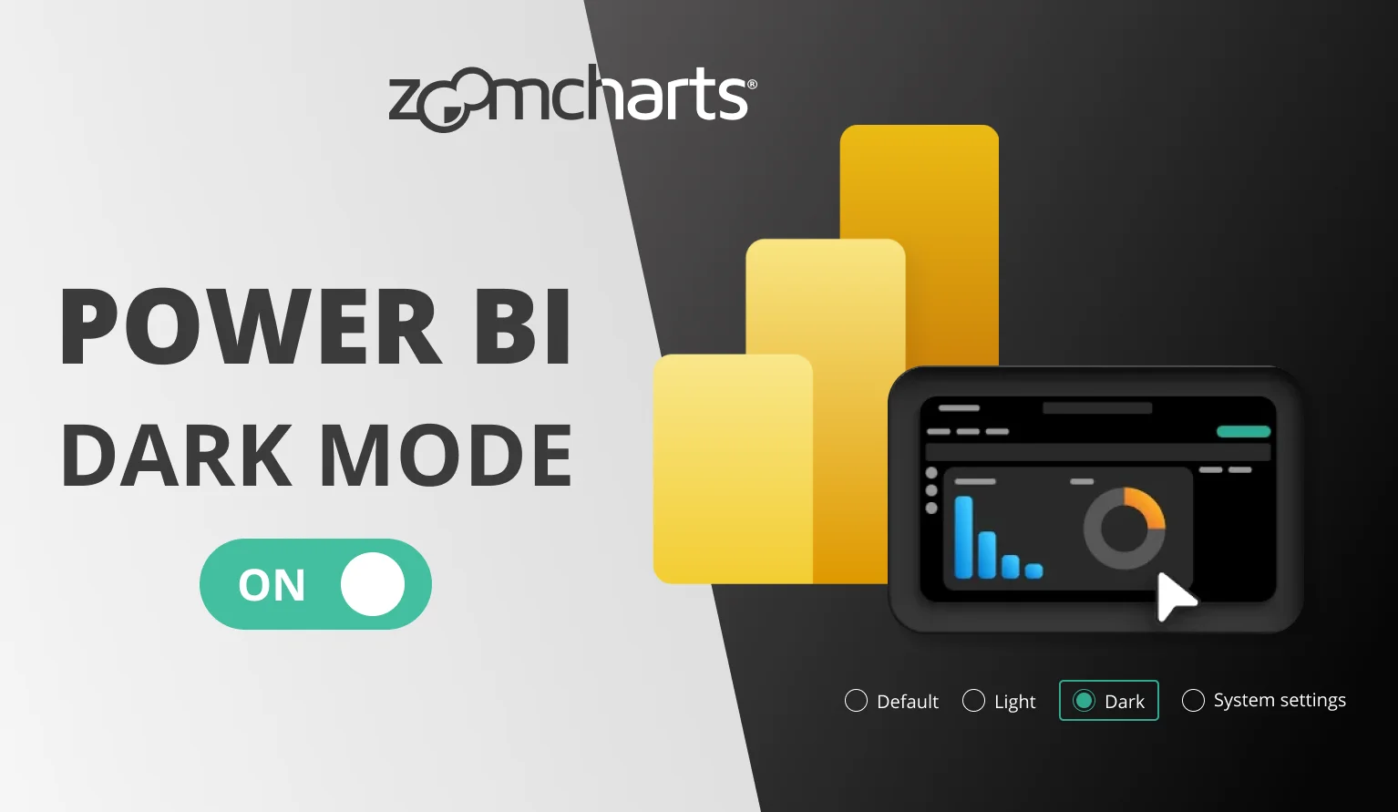
Dark mode has arrived in Power BI! Read how to enable the dark mode in Power BI, plus insights and opinions from our team.

Dark mode has arrived in Power BI! Read how to enable the dark mode in Power BI, plus insights and opinions from our team.
What is Power BI Dark Mode?
With the September 2024 update, Microsoft has introduced the much-requested dark mode to Power BI Desktop. Currently, Power BI dark mode is released as a ‘preview’ feature, which means that it could be changed in future updates and users should enable it at their own risk.
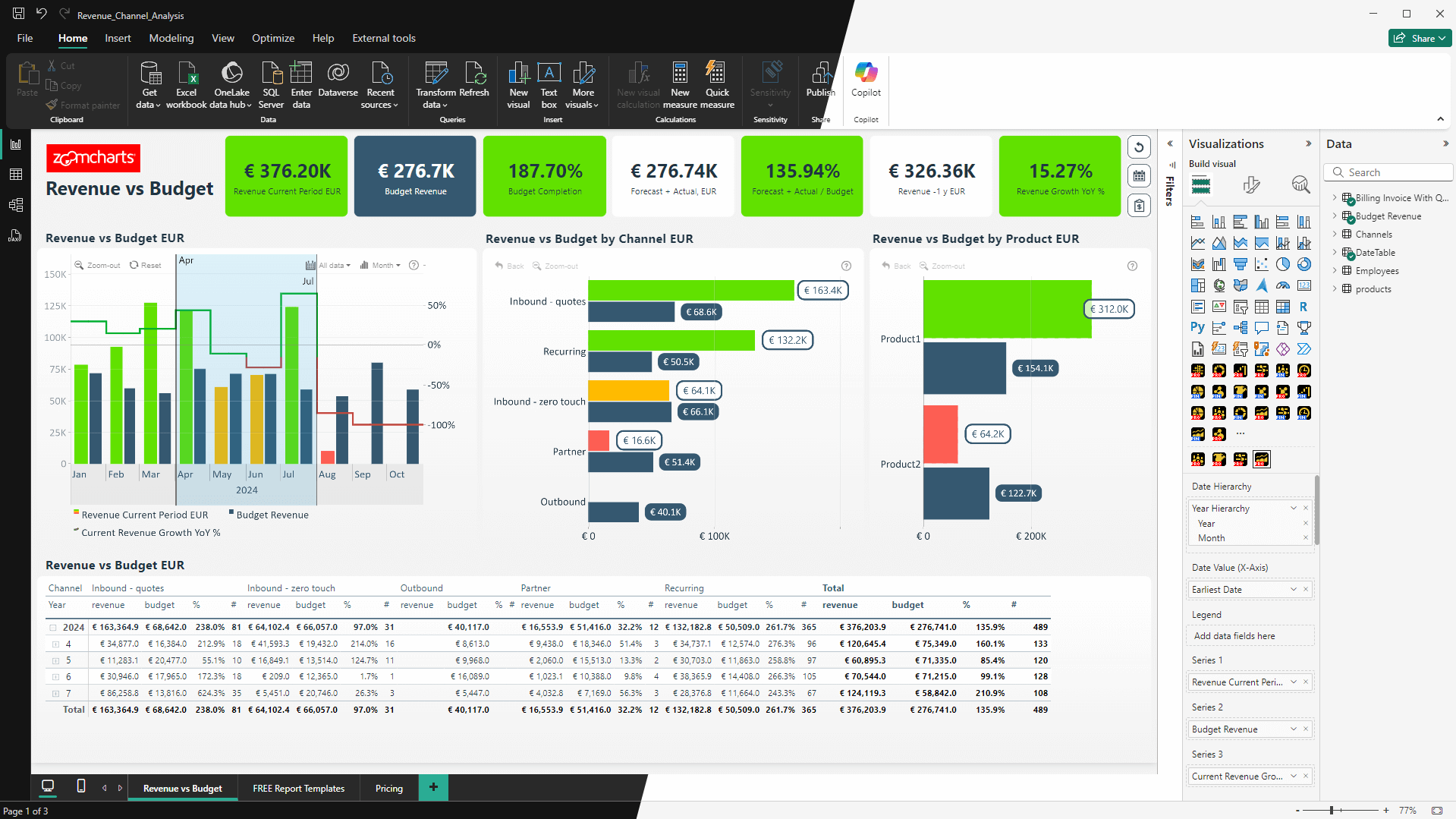
Enabling the dark mode will change the appearance of the Power BI workspace (including the ribbon menu, side panes, Table and Model views, and other UI elements) to one that uses darker tones. Power BI dark mode will not affect the report canvas.
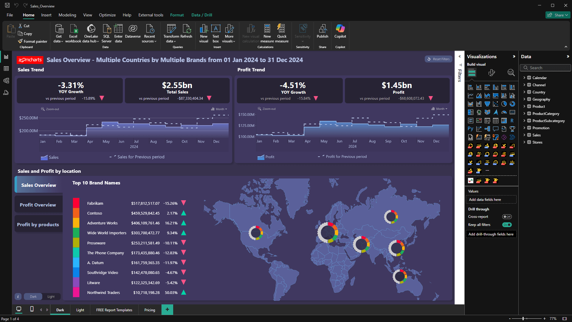
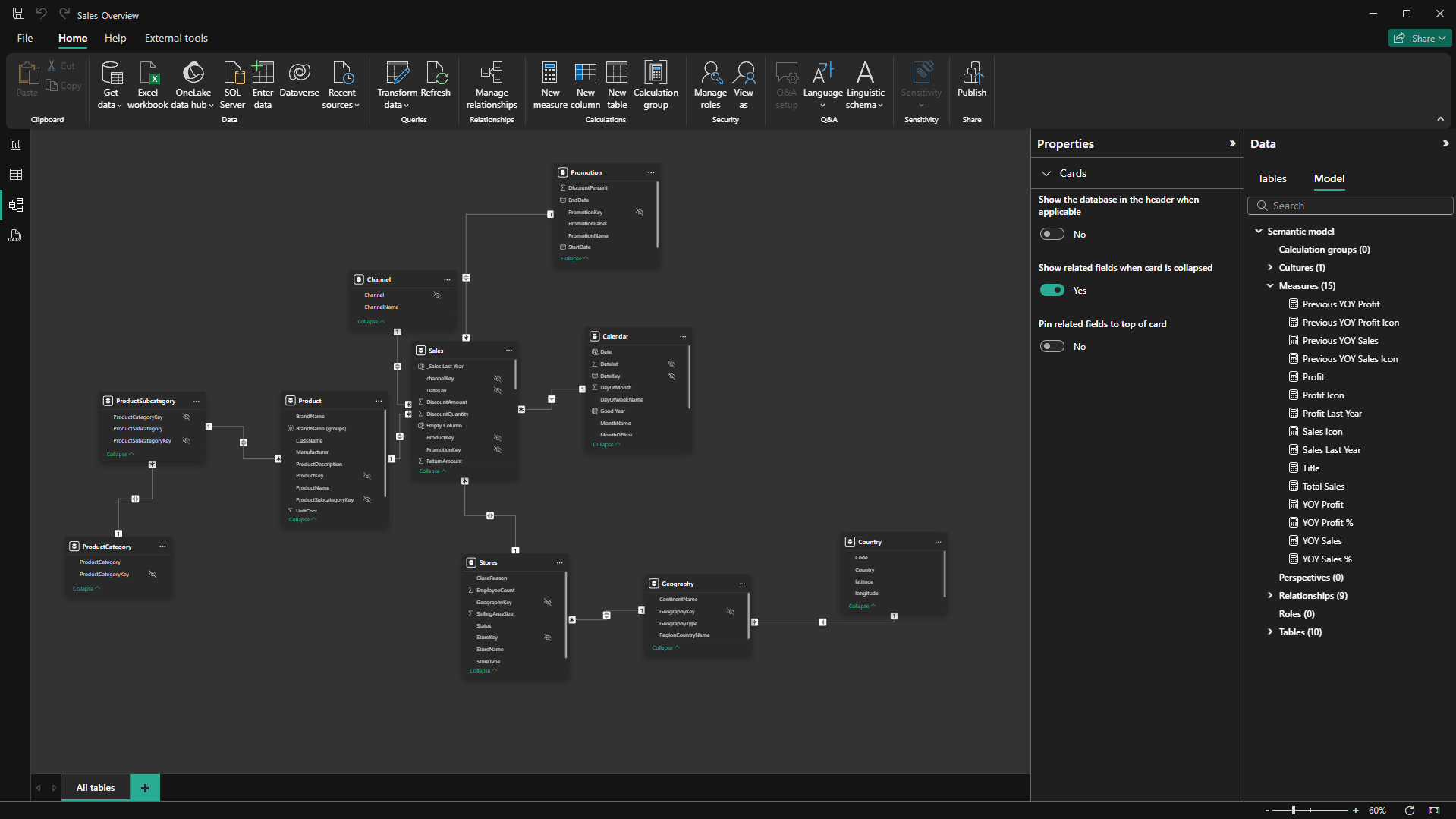
This feature brings Power BI Desktop in line with various software products like Windows 11, Microsoft Office, Teams and others that offer dark modes, allowing you to create a workspace that’s most comfortable for you.
Dark modes are a popular choice because they reduce the overall screen brightness, which results in less eye strain when working in dimly lit environments – perfect for us night owls! In addition, dark modes work especially well with OLED displays which can turn the black pixels off entirely.
How To Enable Power BI Dark Mode
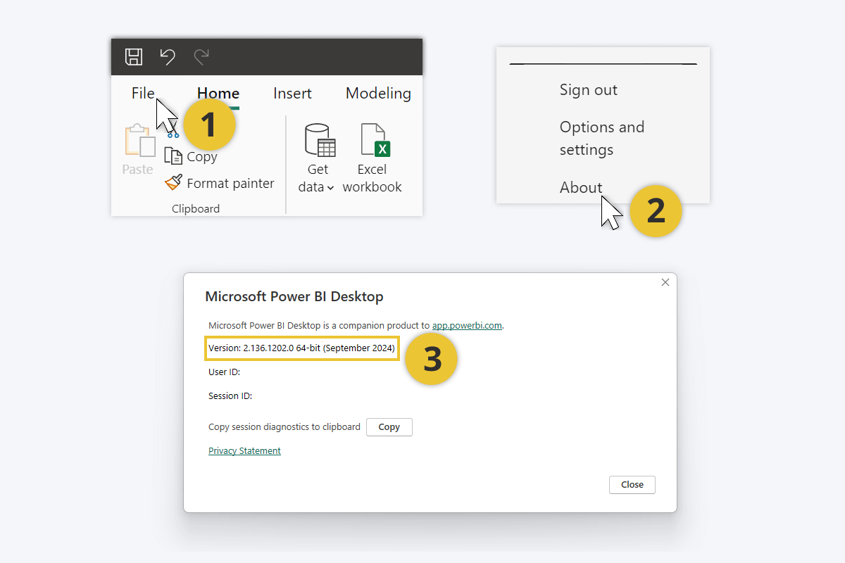
The new personalization setting, which includes dark, light, and legacy themes, is available in the September 2024 version of Power BI Desktop. You should receive the update automatically, but you can check your current Power BI version by selecting the File tab on the top ribbon and pressing About in the bottom left corner.
If you have the latest version of Power BI Desktop, you can select your theme in the settings.
- Head to the File tab in the top ribbon.
- Press Options and settings on the bottom left corner.
- You will see two items – click on Options to open the settings menu.
- In the settings menu, select Report settings under the Global.
- Under Personalization, select your preferred theme from the drop-down menu.
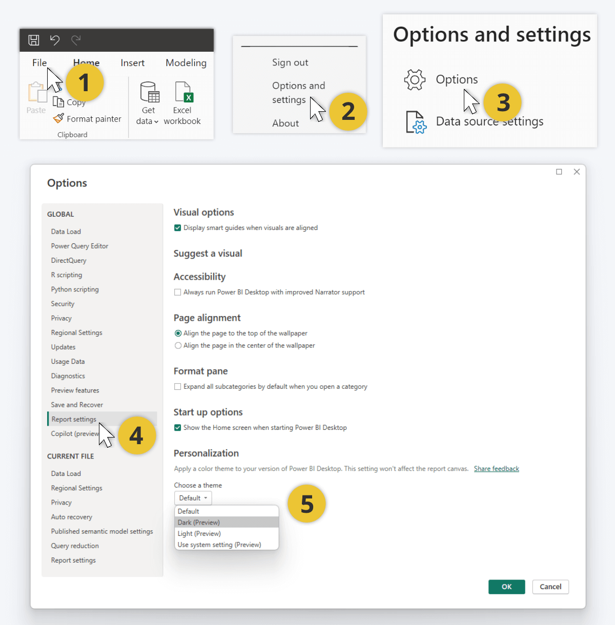
You can choose between four options. The Default theme looks exactly like before, with off-white backgrounds, gray title bar, and dark icon outlines and text. Choose Dark (Preview) if you wish to enable the new Power BI dark mode – the backgrounds and menus will turn black, but the icon outlines and text will become white or light gray.
In addition, the update introduces the new Light (Preview) theme which is similar to the classic theme but with a white title bar. Furthermore, the Use system setting (Preview) option will automatically switch between Power BI dark mode and light mode based on your current Windows system theme.
What We Think About the Power BI Dark Mode
At ZoomCharts, we develop custom visuals for Power BI and design ZoomCharts Experience Reports for our customers, which means that we spend thousands of hours looking at Power BI Desktop windows. We are keen to try out any new addition to the platform, and the dark mode has been one of the most requested features within the Power BI community.
The dark mode is finally here, but was it worth the wait? Will we use it, what do we like about it and what would we like to see improved? We asked the opinion of our ZoomCharts team to see what they think about the Power BI dark mode.
Aivis Pavlovs (ZoomCharts Senior Product Expert): “The most important thing is that Power BI report creators can adjust their work environment to suit their preferences. Choice is always a good thing, after all. I’ve talked with a lot of report creators from our community who participate in ZoomCharts Report Challenges, and the Power BI dark mode is one of the hottest topics at the moment. Many report creators are genuinely excited that it is finally here, and they seem to love the new theme – they say it is easier on the eyes when working for hours in Power BI.
One thing I’d love to see added to Power BI would be an option for report creators to design multiple color schemes for each report page, so that users can toggle between ‘dark’ and ‘light’ report themes. We often include a dark mode ‘toggle’ in our ZoomCharts Experience Reports, which is basically a bookmark to a duplicate report page but with a darker color scheme (like in this Sales Overview Report) so it would be awesome to have a native solution.”
Andžs Auders (ZoomCharts VP of Product Design): “I am a big fan of dark modes, and when the Power BI dark mode was released, I tried it out immediately. It is pitch black, which looks stunning on OLED screens. However, it is a bit too dim for my liking, so I will probably stick to the light theme – but I appreciate the choice. I can’t wait to see how they finetune the dark mode in future updates; ideally, I’d like to see a dark grey variation that isn’t purely black.”
Jānis Volbergs (CEO of ZoomCharts): “I think that the Power BI dark mode is a great addition. I always adjust the settings so that they suit my work environment. During the day, when the office is bright, I prefer light UI themes. However, I must admit that I tend to stay late at work, which is where the dark mode comes in to reduce eye strain from the bright screens. I activated the Use system setting option, so Power BI and all my other work apps automatically switch to dark mode whenever I need it.
The dark mode in Power BI Desktop is a good start, but I hope that it arrives in Power BI Service as well. It would allow more people to enjoy the benefits of the new personalization options, since a significant part of Power BI users explore reports via the web version.”

Want more info like this?
Subscribe to our newsletter and be the first to read our latest articles and expert data visualization tips!
