Jan 09, 2024
Customer Story: unibz Streamlines Academic Data Analysis With Power BI & ZoomCharts
When working with academic and demographic data that involves thousands of students and more than 300 active research projects, the right data visualization tools are a force multiplier when it comes to efficiency.

When working with academic and demographic data that involves thousands of students and more than 300 active research projects, the right data visualization tools are a force multiplier when it comes to efficiency.
We chatted with Łukasz Karolak from the Free University of Bozen-Bolzano to explore how Power BI and ZoomCharts visuals can be used in an education and research institution and how they have impacted their data analytics process.
About unibz (Free University of Bozen-Bolzano)
Located in South Tyrol, the northernmost province of Italy, the Free University of Bozen-Bolzano (unibz) is an international hub of academics and research that provides trilingual education in Italian, German, and English.
Founded in 1997, unibz provides undergraduate and postgraduate education to 4100 students across more than 30 study programmes, achieving high university rankings both in Italy and internationally.

unibz Campus Bozen-Bolzano: Main Building. Image Credit: unibz
Challenge: Analyzing Academic Data for 4000+ Students
The Free University of Bozen-Bolzano has adopted Power BI as the main tool for their data analysis and reporting needs. While many universities already use big data to gain insights about their students and staff, unibz met unique challenges that required leading-edge business intelligence and data visualization solutions.
Since unibz is a truly international institution that provides education in three languages, and more than 35% of lecturers and 17% of students have come from abroad, the university requires a tool that allows them to quickly perform a deep and granular analysis of complex demographic data and didactics.

unibz Campus Bozen-Bolzano: Library. Image Credit: unibz
Their Power BI reports require the ability to filter data by various criteria, including sorting per faculty and study programme, demographic data such as student origins, age, degrees, and their academic achievements. Furthermore, reports need to swiftly analyze scientific publications of various dimensions and typologies, since unibz currently has more than 300 active research projects, and in 2022 more than 1000 publications were affiliated with unibz.
In addition, these reports must be easy to explore and intuitive to use, since unibz Power BI dashboards and reports are used by various departments and stakeholders within the university.
How unibz Uses ZoomCharts to Create User-Friendly Reports
By combining the data analytics capabilities of Power BI with the interactive ZoomCharts data visualizations, unibz has built a data infrastructure that makes it easy for any user to quickly explore complex data and make data-driven decisions.

Since adopting Drill Down Visuals, unibz has enjoyed an increased rate of engagement and user satisfaction with their Power BI reports. The visuals have made it easy to visualize complex multi-layer data in a clear and readable way, providing valuable insights already at the first glance, while allowing the user to dive even deeper with just a few clicks or taps.
The intuitive on-chart interactions make it quick and easy to gain even more value from the same report and reveal more detailed insights about a particular faculty, demographic group, student, research project or other dimensions. This way, any user can easily drill down or filter data to find the necessary answers to make confident and informed decision.

Furthermore, unibz highlighted the wide range of customization options provided by Drill Down Visuals, which has allowed them to adapt Power BI for various use cases and create visually pleasing reports that adhere to the unibz brand identity.
In ZoomCharts Drill Down Visuals, color can also be used as a valuable data storytelling tool. For example, each of the five unibz faculties has its own brand color (grey for Engineering; red for Design and Art, etc.). The report creator can assign each color to the slices, columns or other chart elements pertaining to the specific faculty, and any stakeholder will immediately understand their significance without even reading the labels.

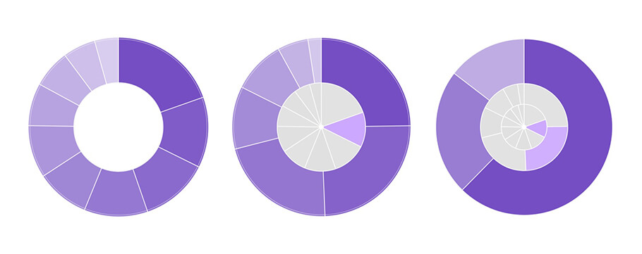
When visualizing student data, Drill Down Donut PRO is the go-to for unibz. Since almost everyone knows how to read pie or donut charts, this visual presents data in a familiar and easy-to-understand way.
However, ZoomCharts has expanded the capabilities of the donut chart by introducing up to nine levels of drill down, which allows users to click on a specific slice and reveal a deeper level of data. And, with cross-chart filtering, the donut chart can also be used as an interactive filtering and navigation tool for the entire report.
The Importance of User Experience in Data Analytics
Even though the term business intelligence is mostly associated with the corporate world, it’s hard to overstate the importance of data analytics in other spheres as well, including education. This use case by unibz showcases how a robust data infrastructure, used together with cutting-edge visualization tools, can increase the efficiency of operations in an education and research institution.
It also highlights the importance of presenting the data in a way that makes the process of exploring the report effortless and engaging. With ZoomCharts, unibz can create reports that empower users of any experience level to thoroughly analyze data and find meaningful insights, which, in turn, has strengthened the data culture and increased the adoption rate of Power BI reports within the university.

Simulated example
Since most business users work with data via reports and dashboards, focusing on a seamless and intuitive user experience for Power BI reports is an efficient way to increase the value of investment into the business intelligence infrastructure – for any organization. Explore our Report Examples Gallery (with live demos and .pbix downloads) and see how ZoomCharts visuals can be used to create state-of-the-art Power BI reports for various industries and use cases!

Want more info like this?
Subscribe to our newsletter and be the first to read our latest articles and expert data visualization tips!


