Apr 05, 2023
Why You Need a Power BI Sales Dashboard
Analyzing your company’s sales process can mean diving into countless metrics. An interactive sales dashboard helps business users compile all metrics of interest into a compact report. By choosing the right custom visuals, in-depth sales dashboards can retain large amounts of information without overwhelming the user.
Analyzing your company’s sales process can mean diving into countless metrics. An interactive sales dashboard helps business users compile all metrics of interest into a compact report. By choosing the right custom visuals, in-depth sales dashboards can retain large amounts of information without overwhelming the user.
What are sales dashboards?
Power BI reports and dashboards are incredibly helpful data analysis tools. By visualizing data into an easy-to-understand chart, you can communicate important information about actionable insights to your users at a faster rate.
By making these dashboards interactive, you can compact more information using multiple drill down levels. Users can get a hold of the big picture and analyze all of their collected data in full, leading to a more accurate representation of your company’s sales performance.

What should a sales dashboard do?
A Power BI sales dashboard should display up-to-date data in an accessible way that lets your sales team take the necessary actions and adjust your company’s sales strategy accordingly.
A sales dashboard should indicate the progress of your company in relation to its sales goals, KPIs, benchmarks. It should also reveal where you should tweak your existing strategy if needed. Attempting to analyze this amount of information from static Excel sheets can be a daunting task and users become disengaged quite soon.
Once your organization has acquired an impressive amount of data, interactive dashboards are a lifesaver. Upon successful implementation, they can become an essential tool to helping your business reach its long-term goals.
Why choose an interactive sales dashboard?
Excel certainly has its place in managing daily operations. However, rows and tables of data can fall short when it comes to data-driven decision-making due to their simple and uniform appearance.
An interactive sales dashboard created in Power BI will display all of your sales data and metrics in an intuitive format. Visual representation of data in the form of charts in known to communicate information much faster.
After all, donut and bar charts are far more efficient in displaying information about ratios and proportions in comparison to a regular table. In addition, Power BI reports supply these charts with a degree of interactivity, letting users easily focus and visually reveal metrics that are of interest.
However, there are still ways to go with interactive reporting. Using custom visuals to create Drill Down Reports that put the utmost focus on user experience, the data analysis process becomes a faster and pleasurable experience. In turn, users can expect an increase in data literacy, accuracy, and speed in finding actionable insights.
Drill Down Visuals for interactive dashboards
Drill Down Visuals for Microsoft Power BI are built with the end user in mind. This arsenal of custom visuals focuses on ensuring an intuitive data exploration experience for report users. In addition, they offer vast customization options to let report creators easily create a sales dashboard that solves even the most challenging tasks.
Here are a few of the ways Drill Down Visuals can enrich interactive Power BI dashboards:
Cross-chart filtering
Filtering is a key part of the data exploration process when using Power BI reports. Drill Down Visuals improve the default filtering experience with in-built cross filtering. No more tedious slicers - with the Drill Down Visuals selection, each chart seamlessly affects the rest, making data exploration a breeze.
On-chart interactions
All interactions by Drill Down Visuals take place on the charts. This means that there are no hidden controls and users can expect a more hands-on approach to data analysis compared to the default Power BI experience. For example, you can perform multi-level drill downs by clicking directly on the charts themselves, reducing the number of clicks needed to get to the same result when compared to default Power BI visuals.
Smooth and fast animations
Drill Down Visuals perform all interactions through smooth and fast animations. This helps guide the user’s eye when drilling down to the next data level, without making the whole report too flashy.
Touch device compatible
All Drill Down Visuals are touch device compatible and mobile friendly. This means that Power BI reports made with Drill Down Visuals can be opened and interacted with on any device, letting the user dive into their data anywhere at any time.
Choosing the right metrics for your sales dashboard
Each sales dashboard will be unique due to being tailored to company’s needs which can vary from business to business. While some points might be found across all sales dashboards, to properly determine what information to include, you should first go about asking the right questions.
What metrics are most often seen in the company’s reports?
The information you’ve gathered up to now can be used as a solid basis for your interactive Power BI sales dashboard. If there is a pattern in what sales metrics keep reappearing in your reports, those will be your starting point. Perhaps your company has already established its main KPIs.
What metrics is the sales team most interested in?
You should also interview your intended userbase to gauge out what they aim to gain from their sales dashboard, including what sales metrics they are most interested in monitoring. After all, the report will be used by them, so it’s vital that you accommodate their data needs as much as possible.
Will the report be used by multiple sales teams?
If the company you’re building the sales dashboard for is larger in size, it might come with multiple sales teams. In that case, it can be a good way to tailor each instance of the sales dashboard to suit the needs of each sales team.
For example, using Drill Down Waterfall PRO for a dashboard that depicts net total changes, you can customize the sequence of each value. If you plan to show this report to different teams, you can use this feature to place all the metrics relevant to each respective team first.
Use cases of sales dashboards
Our Report Example gallery features various use cases of interactive Power BI dashboards and reports. That includes sales dashboard templates to supply report creators with inspiration and give users an insight into intuitive data exploration. Let’s take a look at our best sales dashboards made with Drill Down Visuals.
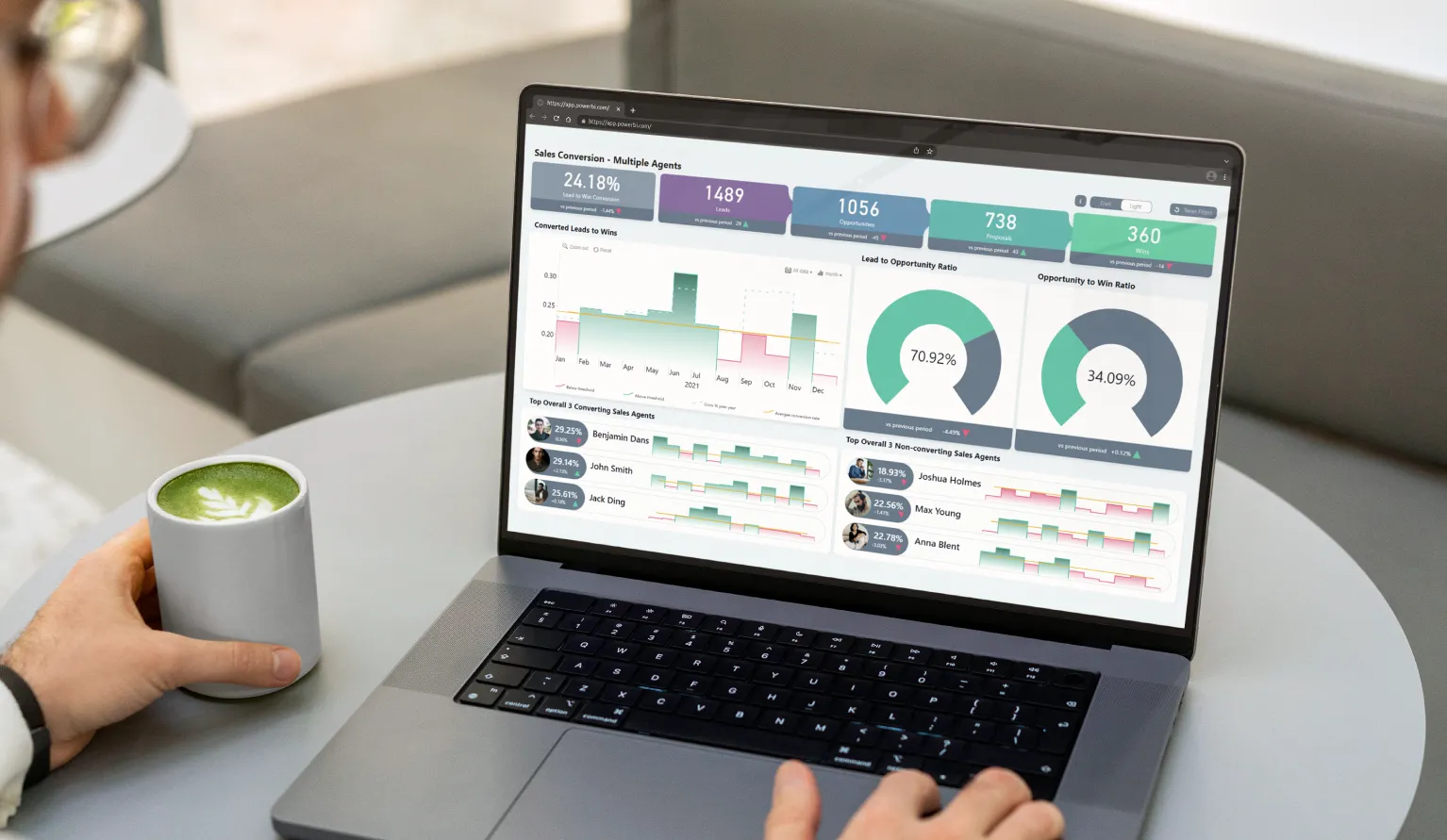
Sales Conversion Analysis

This Sales Conversion dashboard depicts the sales conversion progress and all of its relevant metrics. On the upper part of the report, there is a neat pipeline depicting each stage of the conversion process, along with displaying the total Lead to Win conversion rate.
This sales dashboard uses Drill Down Timeline PRO to compare the increase or decrease of the conversion rate in comparison to last year’s results.
You can use the timeline chart to compare spikes and falls in Converted Leads to Wins. The bright threshold represents the average conversion rate, acting as a visual benchmark for analysis purposes.
The lower part of the report uses smaller instances of timelines to represent each sales agent’s performance regarding how often they’ve closed a deal and automatically ranks them accordingly.
This report lets you filter by clicking on the chart of interest. For example, you can explore a specific sales agent’s timeline or apply a filter by clicking on their timeline. If you filter by choosing a specific time period on Drill Down Timeline PRO, the rankings will adjust to display the Top 3 converting and non-converting sales agents for that selection.
In addition, you can display a sales agent’s overall progress on the larger timeline chart by clicking on their avatar.
In addition to seamless cross-chart filtering and drill down capabilities, this dashboard also comes with neatly placed buttons for convenience. That includes a Reset button for the report’s filters, a Light/Dark theme switch, and a toggle for an informational overlay which can be used to quickly give visual rundown of all available interactions.
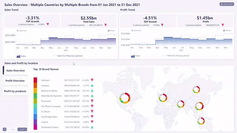
Sales Overview

This sales dashboard depicts these metrics:
- Product performance
- Brand performance
- Year-Over-Year growth
- Total profit
- Total sales
Due to the smart design of this Sales Overview dashboard, it manages to pack an impressive amount of information into one Power BI report without getting too cluttered, letting users thoroughly follow the progress of their sales strategy.
The main visuals used in this sales dashboard are Drill Down Timeline PRO and Drill Down Map PRO. These custom visuals work together to show temporal data combined with a geographical context. Due to the in-built cross-chart filtering feature present in all Drill Down Visuals, data analysis with this report becomes a breeze.
Using this dashboard, users can compare sales and profit trends over time. Depending on the time period selected within the timeline, the rest of the report will automatically filter to reflect that selection. Additionally, the KPI cards that show YOY Growth, total sales and profit will adjust in a dynamic way.
Using the three visual switches next to the map chart, users can analyze information regarding the Top 10 Brand Names and switch between viewing their Profit Overview, Sales Overview, and Profit by Product. By clicking on a specific brand of interest, the report will automatically apply a filter for that brand. This means that all valuable insights all literally just a few clicks away.
Of course, business users must retain the ability to navigate the sales dashboard at their own pace. To help with that, this sales dashboard also offers a Reset button for each chart, as well as the entire report, letting users easily drill down into their data from a different angle.
Conclusion
Interactive sales dashboards are the sign of a carefully monitored and well-established sales process. Using the capabilities of business intelligence platforms such as Power BI and top-class custom visuals like Drill Down Visuals, report creators can fulfill the data needs of business users and solve difficult tasks. With features such as interactive multi-level drill downs and in-built cross-chart filtering, it is now possible to pack a large amount of data points into a neat and easy-to-navigate Power BI report.
If this article got you thinking that you're in need of a well-made sales dashboard, then our team will be happy to help. We invite you to check out our Report Overhaul service and work with our team of professional report creators and UX designers to build or improve your sales dashboards!

Want more info like this?
Subscribe to our newsletter and be the first to read our latest articles and expert data visualization tips!


