Mar 29, 2023
Top 10 Power BI Tips and Tricks for Better Reports
No matter how experienced you are at report creation, there will always be some Power BI tips and tricks that you can use to improve even further. In this article, we’ll share some of our favorite bits of knowledge that you can use when creating reports!

No matter how experienced you are at report creation, there will always be some Power BI tips and tricks that you can use to improve even further. In this article, we’ll share some of our favorite bits of knowledge that you can use when creating reports!
Whether you’re just starting out with Microsoft Power BI, or you already are a complete data wizard, this platform always offers something fresh and exciting to learn. Ranging from general user experience recommendations to performance tweaks, we’ve collected some of the best Power BI tips and tricks. Let’s get started!
Power BI Design Tips
The most impactful part you can improve in your Power BI report is the design, because it’s the first thing the user sees and interacts with. If your report is designed well, you can save your users’ time and make finding relevant data faster and easier. Here are some of the best Power BI design tips.
Power BI Tip #1: Keep Your Reports Clean
Quoting Antoine de Saint-Exupéry, “perfection is finally attained not when there is no longer anything to add, but when there is no longer anything to take away”. This is a great motto for any report creator, because it exemplifies the core philosophy of efficient and fast Power BI reports.
Avoid featuring too many visuals on the same report. You should aim for around three to five chart visuals and a couple of KPI cards, gauges, and other elements. Be merciless when removing all that’s not essential, because any additional visual will increase load times and negatively impact performance.
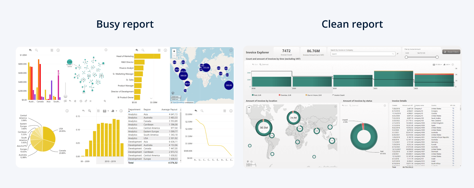
Of course, there might be times when you need to pack a lot of data into a single report’s page. How to do it in a way that doesn’t saturate the page with too many visuals? One way is by using custom visuals like Drill Down Visuals by ZoomCharts.
For example, Combo PRO, Combo Bar PRO, Timeline PRO, TimeSeries PRO and TimeSeries PRO allow you to feature up to 25 different series on the same chart, giving you the ability to compress a lot of data into a screen-space efficient package without sacrificing readability.
You can read more about making efficient, easy-to-use and visually appealing reports in our article "Top 5 Power BI Report Design Mistakes You Should Avoid"!
Power BI Tip #2: Use The Full Potential of Tooltips
Expanding on the previous point about clean and uncluttered reports, it’s worth mentioning tooltips as a powerful way to feature additional data without placing yet another visual on the report.
Even though Power BI Desktop has a lot of options for tooltip customization, we still see some report creators neglecting them and reducing tooltips just as a way to expand the already featured values. We believe that they can also give additional context to the user. For example, you can perform calculations such as the sum of the selection and others.
Some custom visuals, like Drill Down Visuals, include a custom tooltip option that gives additional features, such as the ability to show relevant data from another series, which means that you can give your users extra data without cluttering the report.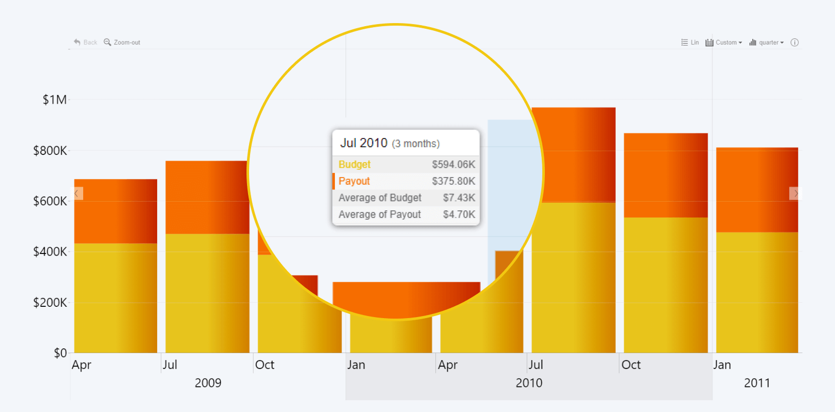
Power BI Tip #3: Use Report Page Tooltips
That being said, the regular tooltip will display that data as just numbers. If you need to show an entire visual to your users without actually adding it to your report or dashboard, then report page tooltips are exactly what you need. The tooltip will show a snapshot of a dedicated report page, and the visuals on that tooltip will display data that you filter on the actual page you’re using.
You can do that by creating a brand-new page on your report, and selecting Canvas settings -> Type -> Tooltip on the Format tab of the Visualizations pane. You can also choose a custom size if you want something other than the preset – but use a size that’s compact enough to not cause any inconvenience. Make sure that the checkmark Allow use as tooltip is ticked in the Page Information menu.
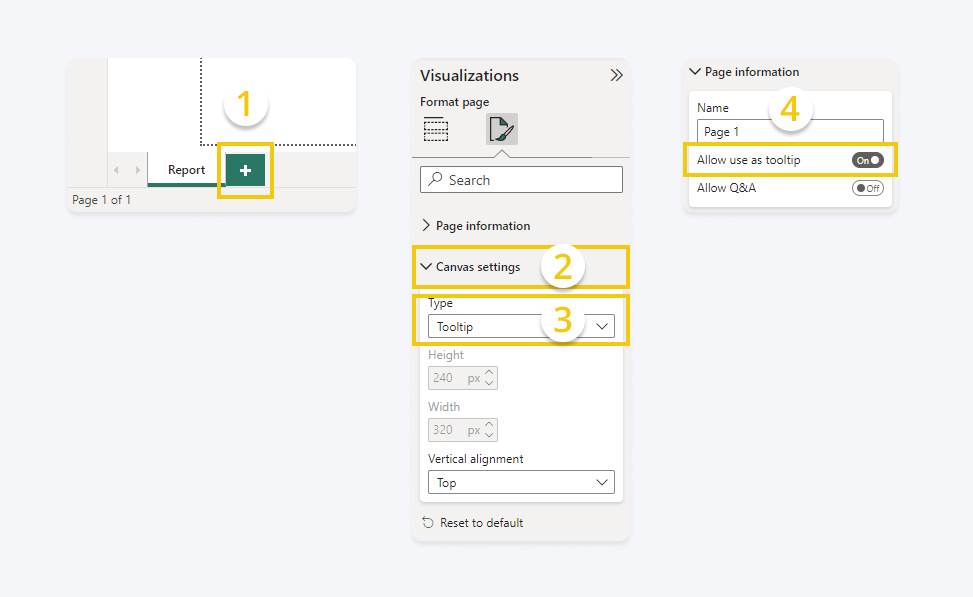
Once that is done, simply add the visuals you want to show on this tooltip page. Now go to the main report page and select the visual for which you want to create the report page tooltip, and go to the General tab in the visualizations pane. Pick Tooltips- > Type -> Report Page and choose the newly created tooltip page. Keep in mind that if your visual has a custom tooltip enabled by default, you will have to pick Power BI Tooltip in the Visual tab to see the report page tooltip.

Power BI Tip #4: Make Your Report Accessible & Inclusive
The number one rule for creating an efficient report is taking your audience into account and tailoring it to their needs and expectations. That being said, there are some general accessibility guidelines that are applicable to any audience and will always make your report better. After all, more users comfortably reading your report is always a good thing.
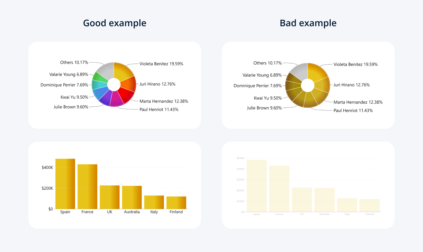
For example, you can avoid making your report hard to read for people with vision deficiencies or color blindness by carefully choosing the size and color of your report elements. The most obvious recommendation would be using a solid background instead of an image to not clash with the text and visual elements.
Use contrasting colors to differentiate between various columns, pie chart slices, areas or other elements on your reports. Don’t forget about the text readability too! Use contrasting color for your labels, legends, titles and other text. You can read more tips on how to make any design colorblind-friendly in this article by Smashing Magazine.
Power BI Tip #5: Use The Right Visuals for Your Data
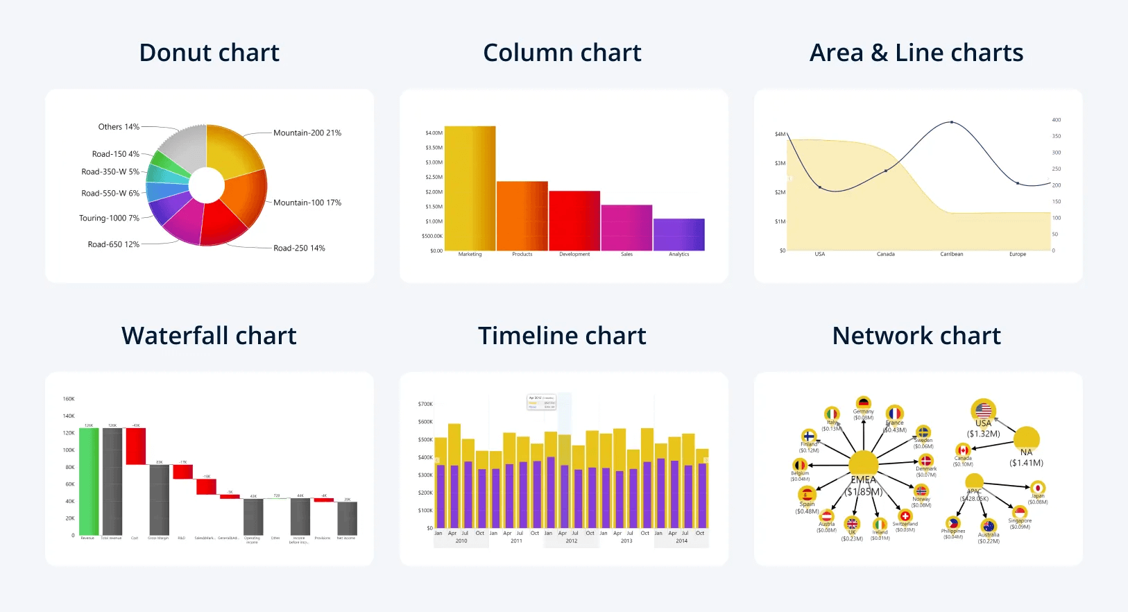
The last tip in this category might seem a bit obvious to experienced Power BI creators, but it’s still worth bearing in mind. There are so many different ways you can show the same data. For example, categorical data can be displayed as a bar chart, a network chart, a pie chart or a variety of other visuals.
But, despite them being compatible with your data, there will always be some visuals that are better suited than the others for the task at hand. Before choosing the visuals for your report, you should consider what narrative you want to tell your users and what is the best, most accurate and effective way to show your data.
Going back to the example of categorical data, let’s imagine that you have two fields – category and value. Which visual should you choose? Let’s explore the various options.
- Do you need to compare each value’s proportional size against the whole series? Try pie or donut charts.
- Want to compare the difference between multiple values more accurately? A column or bar chart would be the best option.
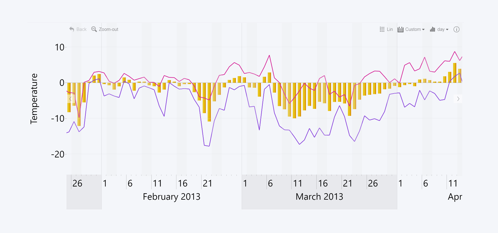
- Need to see the change between values? Try a line or area chart, or a waterfall if you need to see the exact contributors to the changes.
- If the categories are based on units of time, the best tool for the job would be a timeline or time series chart.
- If your categorical data has an intricate hierarchy of subcategories, the most intuitive way to display their relationships will be a network chart.
This was just one example, which proves why there are so many custom visuals for Microsoft Power BI. In addition, you can use Drill Down Map PRO if you need to display geographical data, Drill Down Graph PRO for complex node-based relationship graphs, and more.
We recommend checking out Visualizing Data: A Guide to Chart Types by Berkeley Advanced Media Institute, which is an article detailing various chart types and how they are used to display and analyze data in different ways.
Power BI Performance Tips
We’ve also assorted a few tips that you can use to improve the performance of your report, such as load speeds, responsiveness, and other factors. By focusing on performance, you can improve the overall feel and experience of your reports and reduce the frustrations and the amount of time your users waste by waiting.
Power BI Tip #6: Optimize the Queries
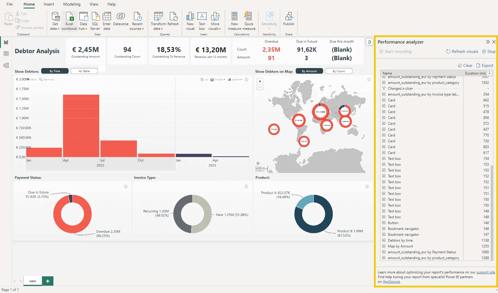
Don’t leave anything unnecessary in your report. Any additional query, DAX calculation or visual will send a request to the server and add additional milliseconds to the load time of your report. If you’re struggling to find the cause of slowdowns, Power BI Performance Analyzer is a useful tool for identifying the culprits. This tool will log each query and measure its impact on the performance in milliseconds.
If you see that certain queries take longer than expected, see how you can optimize them. For example, you should avoid using complex DAX calculations for tables with filters. Here’s an excellent guide by Chris Webb on how to optimize table render speeds.
Basically, the fewer the queries, the faster the load times will be, so use only as many of them as you need to tell a coherent data narrative.
Power BI Tip #7: Clean Up Your Data
On a similar note, it’s good practice to avoid entire raw data sets. Power BI loads the entire table in your device’s memory, so unnecessary columns may contribute to slower load times. If it’s not possible to delete the unused columns from the data source, consider creating a summary table
In addition to the performance benefits, having a clean data source will also help with data security. For example, there's no reason to have the geographic coordinate column if you’re not showing that data on a map.
Power BI Tip #8: Don’t Set the Default View Too Wide
Power BI will request all the necessary data for the view that's selected. The wider the range of the data, the longer it will take to load. So, if your default view spans multiple years on a timeline chart, the initial load time will take a drastic hit.
Choose the default view carefully and try to set it so that shows the data that's relevant to your audience. The user can always drill down or up as they need, but the initial load time will affect every user of your report.
Power BI Creator Tips
These are some general tips that you can use to improve your Power BI workflow and make the creation process smoother.
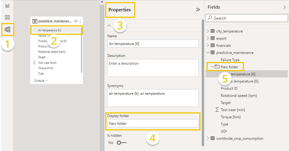
Power BI Tip #9: Organize Your Dataset
When your dataset has tens, hundreds or even thousands of fields, things can quickly get out of hand. If you want to introduce some order into the chaos, you can sort the fields by folders. This way, you can group related fields together so they’re always where you need them to be.
You can do that by heading to the Model view in the left sidebar. In the Fields pane, left click on the field you want to categorize, which will open the Properties pane. Enter the name of the folder that you want to create in the Display folder field. You have created a display folder, and you can drag and drop other fields into it for easy access.
Power BI Tip #10: Get Inspiration from Other Power BI Developers
There’s always something you can improve in your reports. The best way to get some ideas on what you should work on is by checking out what other Power BI developers are doing for their reports. Try out demos and take note of how they visualized the data or how they solved certain issues or limitations. For example, you can visit our use case gallery to try Drill Down Reports for free.
We also recommend immersing yourself in the tight-knit community of Power BI developers, and one of the easiest ways to do that is by following blogs. You should follow the Microsoft Power BI blog to read the latest info about most recent releases, and Community Blog to read useful tips, tricks and guides by the community members.
Other blogs we want to highlight include PowerBI.Tips, Guy in a Cube, Power BI Weekly, Data Savvy, and Chris Webb. You can also subscribe to our newsletter to keep in touch about the latest info about ZoomCharts Drill Down Visuals, Drill Down Reports and other news.

Want more info like this?
Subscribe to our newsletter and be the first to read our latest articles and expert data visualization tips!


