Aug 24, 2023
Power BI Chart Types: Choosing the Right Visuals for Your Data
Power BI chart types can make a big difference in the effectiveness of your report. In this article, you'll learn about the different types of charts available in Power BI and how to select the most appropriate one for your data.
Power BI chart types can make a big difference in the effectiveness of your report. In this article, you'll learn about the different types of charts available in Power BI and how to select the most appropriate one for your data.
For a Power BI report creator, a blank page can be daunting and exciting at the same time. Like an artist who’s staring at blank canvas, the report creator starts feeling thousands of ideas bouncing around in their head. What do I want to tell with this report? Who will use it, and for what purpose? And, among all, what visuals should I use?
Each Power BI visual is like a building block, working together to build a strong data storytelling narrative. It’s up to the creator to decide which ones to use. Some of the questions to ask before placing the visuals on their report include:
- What’s the target audience for my report? Will they be familiar with these visuals?
- Is this visual suited for the specific data? Will it portray it accurately? Does it work with the data at all?
- What do I want to tell with this visual? Does it provide meaningful insights to the user?
Power BI already includes a wide variety of visuals, and the choice doesn’t get easier once you add the vast selection of custom visuals that you can get on AppSource. That’s why we decided to create this Power BI visualization guide, which covers all the basics regarding Power BI chart types.
We’ll list the most popular Power BI visualization types, talk about their purpose, strengths and/or weaknesses, and what data they are best suited for.

Power BI Pie chart
Almost everyone has seen a pie chart in their lives, whether it’s in a business report, newspaper article, or maybe a high school presentation. With a pie chart, you can show the relative proportions of each category in relation to the total. These charts are simple to read, and they can give quick insights into your data.
Power BI Pie Chart Uses
Pie charts are suited for numerical values in category-based data. It’s best used to provide a quick overview of how the total value can be separated into subcategories. For example, if you want to visualize voting data, where out of 1523 people 843 voted “Yes”, 520 voted “No”, and the remaining 160 abstained, the pie chart will show each of these values as appropriately sized slices. Their size will be determined by the percentage of each value compared to the total which must always be 100%.

This is just a rudimentary example to illustrate the basics, but Power BI pie charts can work with more complicated data as long as each category has a value assigned to it.
Furthermore, you can utilize pie charts as a navigation tool for your report, where each slice can be used to filter data in other charts via cross-chart filtering.
Read more in our article "Power BI Pie Charts: All You Need To Know"
Power BI Pie Chart Limitations
If you need to accurately show a comparison between multiple categories, there are better Power BI chart types for this purpose. Pie charts simply provide a visual representation of the proportional make-up between multiple categories. It’s great for a quick glance to get an overall idea about the data, but it’s also merely a starting point for a thorough analysis.
If there are multiple similarly sized values that you need to compare, it might be a better idea to visualize your data with a column or bar chart. Also, due to the inherent design of the pie chart, the total must always add up to 100%, so if you need to visualize a production surplus or an overspend in the budget, this is not the way to do it.
Power BI Donut Chart
Donut charts in Power BI are closely related to pie charts. They fulfill the same purpose and share most of the benefits and disadvantages. However, just as the delicious naming convention would suggest, pie charts are filled circles, whereas donut charts have a space in the middle.

Power BI Donut Chart Uses
Some report creators opt for donut charts in lieu of pies purely for aesthetic purposes. However, one practical use for the donut hole is placing a label or total value in the middle. Some custom visuals (like Drill Down Donut PRO) also use this space for navigation controls, such as displaying previous levels of hierarchy.
Similarly to pie charts, donut charts can be used as a “steering wheel” for your report. Since it’s one of the most visually prominent elements on a report, it can be the user’s first point of contact with your data. With cross-chart filtering, the rest of the report can respond to user’s actions by providing relevant data as they filter or drill down on the donut chart. See this concept in action in the Invoice Explorer report from our Use-case Gallery!
Read more about this chart type in our article "Power BI Donut Chart"!
Power BI Donut Chart Limitations
Owing to its similarity to pie charts, this visualization type shares many of the same drawbacks. Namely, the data must always add up to 100%, and it’s not the best choice for a detailed comparison between multiple similarly sized categories. This issue is amplified by the donut-shaped design, and with no center part where all the slices stem from, it’s even harder to distinguish the minute details.
Power BI Column Chart
Another staple in the world of data visualization is the trusty ol’ column chart. It’s the most straightforward way to visualize multiple categories and directly compare them against each other. The larger the value, the taller the column becomes.
Usually, Power BI column charts show each category as a single bar. However, depending on the capabilities of your visual, you can also display multiple values or even categories either as a cluster or as a stack.

Power BI Column Chart Uses
Need to visualize the difference between multiple categories? Column chart is the go-to choice, and for a good reason. They are simple to read, and almost everyone has had experience with them. Sure, they may not be the most imaginative choice, but they get the job done.
As long as your data is separated into categories and each of them has a value, your data will work as a column chart. Expenditures per each department, sales per each model / brand / product category / region, or maybe website visitors per each browser or platform – almost any industry can find a use for a well-made column chart.

Power BI Column Chart Limitations
If you’re building a tightly packed Power BI report, you’ll have to keep in mind that column charts usually take up a lot of space – especially if you have a lot of categories or need to visualize a very detailed comparison. For the most efficient use of space, you’ll have to choose the perfect balance, because as the chart becomes larger, the difference between category values will become more pronounced.
Furthermore, column charts work best when the category values do not deviate too much between each other. For example, if you are comparing the price of your product against market competitors, the value range will be relatively narrow. However, if the values can range from very low to very high, the y axis will have to accommodate the highest value, which will affect the scale of other values and make them harder to compare against each other.

Some report creators remedy this by choosing a non-zero starting point for the y axis, but this may skew the perception of the data and lead to misleading conclusions. Another solution is using a secondary axis, in which the outliers are shown at a different scale – but report creators should be careful to not confuse the user.
Power BI Bar Chart
Basically, bar charts are column charts turned sideways. Whereas column charts display data vertically on the y axis, bar charts do it horizontally on the x axis. As such, they inherit the same pros and cons as Power BI column charts.

Power BI Bar Chart Uses
There are certain scenarios where Power BI bar charts are a better choice than a column chart. For example, bar charts may fit better in your specific report design, especially if you lack horizonal space but have plenty of vertical pixels to spare. They are also more accommodating for long text in category labels (such as website URLs or email addresses) without requiring specific changes in the formatting settings.
It’s also a better choice if the order in which the data is displayed is important to the narrative (such as rankings or competition results), because reading top-down is more natural – just like a book.
Read more about this chart type in our article "Everything You Need To Know About Power BI Bar Charts"!
Power BI Bar Chart Limitations
Bar charts can still take up a lot of space on your report. Furthermore, just like with column charts, you have to be careful with how you display your data if it has massive outliers, because they will affect how the entire series is scaled.
Power BI Line Chart
While column or bar charts are meant for categorical data and show each value as an individual element, line charts work for numerical data and join data points together with a line. For this reason, line charts are better suited for showing changes over time and spot trends.

Power BI Line Chart Uses
This chart type is best used to visualize changes across data points. It’s a great way to spot trends and visualize growth. They’re more widely used in a time-based context (for example, YoY revenue growth – we’ll return to timelines later in this article), but they can also find uses in other scenarios as well, such as performance benchmarking or average score evaluation across multiple categories.
Power BI Line Chart Limitations
Line charts are incredible for specific purposes – monitoring growth, visualizing changes across separate categories. However, for accurate comparison between different categories, column or bar charts are a better fit.
Whereas column charts show each data point as a separate entity, line charts blend them all together, thus making each separate value less distinct and harder to read.
Power BI Area Chart
Power BI area charts are very similar to the previously described line charts. They also connect multiple data points within the same axis with a line. The main difference is that area charts have the sector below the line filled with a color to make it visually distinct.

Power BI Area Chart Uses
Area charts are excellent for stacked charts because it’s a simple and clear way to clearly portray the cumulative nature of the data. For example, if the above example was visualized with a line chart, it wouldn’t be immediately apparent to the user that the values are added together, not compared against each other.
Power BI area charts also are useful if you’re combining multiple chart types on the same visual (i.e., combo charts). In such examples, the column chart may be in the foreground, drawing focus to the most important data, while area charts can act as background data for additional context.
Power BI Area Chart Limitations
Area charts are rarely used on their own – their strength lies in stacking multiple areas on top of each other or complementing other data series and providing background context. For standalone use, line charts are more often used to visualize trends or ongoing data series.
That’s because the color fill is handy if the area is used as a background element, but in the foreground, it can make the series clunkier and harder to read at first glance.
Power BI Combo Chart
As the previously discussed column, bar, line, and area charts prove, there are multiple ways to visualize numerical data on an axis. Each of them has its strengths and weaknesses, but what if you needed to combine all of these chart types into one super-chart? You can place multiple chart types on the same visual – a combo chart.
A combo chart efficiently uses the space on your report by combining multiple series on the same axis (or axes, depending on the capabilities of the Power BI visual). You can then choose to display each series as a column, line, area visualization, thus giving a more comprehensive visualization of your data within a single visual.
Read more about this chart type in our article "Power BI Combo Chart: Tips & Best Features"!
Power BI Combo Chart Uses
From a versatility standpoint, combo chart visuals for Power BI are a great choice. If you want to build a classic column, line, or area chart, you can do that and simply feature that chart type. However, they also give you the option to mix & match any combination of these chart types to dramatically enhance your data storytelling narrative.
As shown in the example below, you can visualize the total sales as a line, cost of goods sold (COGS) as columns, and profits as an area on the same chart. Each series visually distinct and easily readable, all on a single space-efficient visual – excellent!

Other examples include weather charts, where the temperature could be an area (automatically colored by conditional formatting, of course!), and precipitation could be displayed by columns. Since this is a very versatile chart type, it can be applied to a wide range of use cases and it’s up to the report creator to decide how they’ll build their own combo chart!
Drill Down Combo PRO custom visual for Power BI is a multi-tool in that regard. You can build a simple column, line, or area chart, or combine all three types to build a multipurpose combo chart with up to 25 series and enjoy a wide range of customization features. If you want to do the same, but horizontally, we also offer Drill Down Combo Bar PRO.
Power BI Combo Chart Limitations
By combining multiple chart types, you can cover for each individual chart type’s weaknesses. However, building a purposeful and efficient combo chart requires more planning than a simple column, line, or area chart. It’s incredibly easy to go overboard and make your combo chart confusing or hard to read.
If you feature multiple series on the chart, make sure that you set the layering order properly (so the most important elements are in the foreground, while contextual info is in the background). Furthermore, pay close attention to colors, shapes, outlines, labels, and other customization options so your combo chart looks clean, easily readable and aesthetically pleasing.
Power BI Time Series Chart
Time series charts display your data on a chronological timeline instead of categories. This means that you can give your numerical values a time-based context to visualize growth or compare certain time periods.
Read more about this chart type in our article "Make Power BI Time Series Charts Easily"!
Power BI Time Series Chart Uses
This kind of visualization is often seen in finance reports, visualizing YoY growth in profits or revenue. In addition, you can compare the production output across multiple months or visualize website traffic or social media engagements. Basically, it’s the go-to for data that can be categorized by years, months, weeks, days or hours.
In the case of Drill Down TimeSeries PRO, you can combine up to 25 different series on the same chart and display them as columns, lines or areas. Furthermore, the timespan and unit size can range from milliseconds to even decades. However, if you want to use DAX measures, they're supported by Drill Down Timeline PRO.

In a time-based context, each of these chart types has their own use. Columns are best used to show values as independent data points to compare each against another (such as unique website visitors), whereas lines or areas can show ongoing growth over time (for example, paid subscribers).
It can also be used as an interactive filter, with other visuals filtering to relevant data as you select a specific period on the time series chart – just like in this Sales Conversion report.
Power BI Time Series Chart Limitations
Obviously, time series charts in Power BI inherit most of the traits of column, area, and line charts – namely, large space requirements and axis scaling in case of outliers. In addition, time series charts have certain drawbacks on their own.
While drill down interactions may be supported by some time series visuals, you may want something that’s easier to use. Drill Down TimeSeries PRO custom visual allows the user to “zoom in” and inspect a more granular view with intuitive on-chart interactions. This visual will group all data points within the same year/month/day and then will use the smallest unit available to provide a more detailed view upon a drill down.
Power BI Waterfall Chart
At the first glance, Power BI waterfall charts may look like column charts. While both share certain similarities, waterfall charts have a specific purpose – visualizing the components that make up a total value.
Of course, a stacked column chart could do a similar task, but waterfall charts display the addition as a process, providing the user with a detailed and easy-to-read breakdown of the data. You have control over the sequence of each data point and the succeeding column can start where the previous one ended, instead of zero.

Power BI Waterfall Chart Uses
Power BI waterfall charts are a regular sight on finance reports. It’s a clear way to visualize the process of how your profits, revenue, expenditures, or other metrics were achieved. For example, if you were to create a chart to visualize your profits vs. revenue, the waterfall chart would start with the total revenue, then remove operating expenses, manufacturing costs, taxes, and other expenditures until you arrive at net profit.

Similarly, Power BI waterfall charts can be used for project management to visualize the costs, resources or time associated with each task. Basically, any process that can be broken down in steps can benefit from a waterfall chart, including manufacturing, staff management, marketing, medicine, etc.
Read more about this chart type in our article "Power BI Waterfall Charts: A Detailed Guide"!
Power BI Waterfall Chart Limitations
Since waterfall charts are related to column charts, they share many of the pros and cons. The main drawbacks include the huge amount of space they can take on a report. Furthermore, waterfall charts can very quickly become too complex and hard-to-read if you include too many categories. That, however, can be mitigated with clever use of customization features, such as colors, connection lines, labels and other options found in Drill Down Waterfall PRO.
Power BI Scatter Chart
Scatter charts in Power BI are used to visualize the relationship between two variables. This chart type is great for identifying positive or negative correlations and trends, understanding the distribution and spotting outliers and clusters.
Scatter charts consist of two axes (X and Y), and data points. Each data point must have an X and Y coordinate to determine its position on a coordinate plane. Unlike many other chart types, scatter charts are well suited for large data sets with hundreds or even thousands of data points.
Power BI Scatter Chart Uses
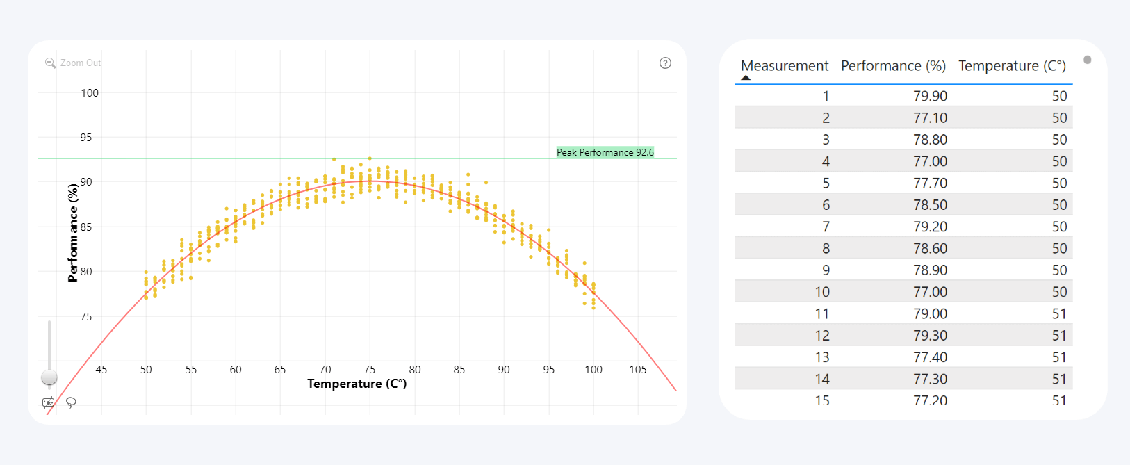
The main purpose of this chart type is to visualize how changes in the variables affect the data point distribution. The classic example is science and R&D, where scatter charts are used to visualize experiments or research.
Let’s say you are developing a new hardware product, and you want to find out its optimal operating temperature. In this case, one axis could represent the temperature, the other axis could be a performance benchmark, and each data point would visualize an observation. The scatter chart would visualize how changes in temperature affect the performance and determine what temperature range produces the best results.
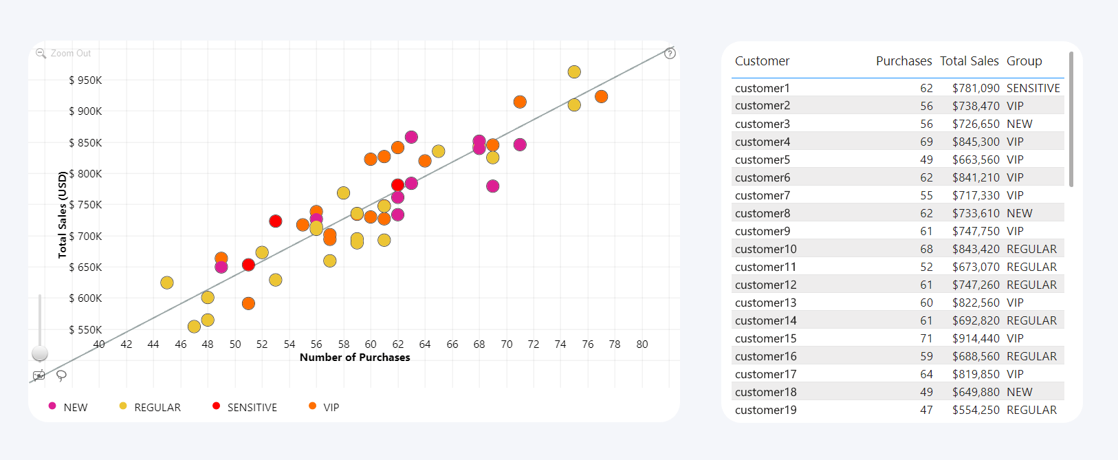
Another use case for Power BI scatter charts is demographics and social sciences – for example, to visualize how variables like age or income affect personal savings or entertainment spending). It’s also widely used in finance (i.e. how operational efficiency impacts profitability), sales and marketing (i.e. how product pricing affects customer demand), and many other facets of business.
For instance, this Power BI scatter chart example shows the relation between the sales revenue and the amount of purchases per each customer to analyze customer behavior. Each data point represents a customer, and the markers are color-coded based on the customer segments.
Power BI Scatter Chart Limitations
One of the main challenges when using this chart type is overplotting. If you are visualizing hundreds or even thousands of data points, it can be hard for the user to take away valuable insights or find data that’s relevant to them.
The Drill Down Scatter PRO custom visual solves overplotting with drill down, which allows combining and aggregating multiple data points of the same category into one marker. The user can simply click to drill down for a more detailed view. Furthermore, users can freely move the chart around and zoom in or out to quickly find what they’re looking for.
An important thing to remember when using scatter charts is that correlation does not always imply causation. Even if a scatter chart reveals a trend or pattern, it is not always directly caused by the variables, and it could be explained by some other factor. That’s why it is important to create Power BI reports that analyze data from multiple perspectives. Scatter PRO supports cross-filtering, and selecting data in one chart will apply a filter that will show the same data in another visual, allowing users to get more complete insights.
Power BI Map Chart
Map charts in Power BI are useful if your data has geographical context. Sure, you could build a column or pie chart where each category is labeled as “North America”, “Europe”, “Asia”, etc. However, by putting your data on a map, the users will find it easier to visualize the global scale and location of your data.

It’s not just on a continental or even national level – for example, Drill Down Map PRO can drill down to specific regions, cities or even buildings, as long as your data contains a field for GPS coordinates. Furthermore, you can choose between various base layer options, for example, tile servers such as Azure Maps, OpenStreetMap or Google Maps, or add your custom image for specific use cases like a floor plan of your facility.

Power BI Map Chart Uses
As businesses are becoming more global, map charts are useful to give your data a location-based context. For example, Power BI map charts can be used to visualize and analyze sales performance across different regions. It can also be used as a handy tool to monitor your revenue, expenses, or resources across multiple locations – no matter the scale.
For example, if your company is a restaurant chain with a dozen venues across one state, you can visualize all your restaurants on a map of the state. If you’re a global enterprise with multiple regional headquarters, dozens of factories, retail locations and other facilities, you can set the map to a global scale.

When featured on a report, Power BI map charts will naturally attract the users’ attention and serve as a visual centerpiece for the entire page. It can also be an intuitive navigation tool (pun intended) for their data exploration journey (this pun also intended), allowing the user to instantly filter data across multiple charts to the region they’re interested in. Try this Sales Overview Report demo to see this idea in action!
Read more in our article "Tips and Tricks for Power BI Map visualizations"!
Power BI Map Chart Limitations
Earth is a rather sizeable place, so, naturally, a map of it will also have to be large, especially if you have lots of data. Power BI map charts will take up a significant portion of your report space, and it will become the centerpiece of your users’ attention. It’s something you need to take into account if you decide to feature a map chart on your Power BI report.
Furthermore, most map charts use external tile servers by default. Any external resources usually add to the load times of Power BI reports. While it won’t cripple usability and user satisfaction, it’s something to keep in mind. You can reduce load speeds by setting up a custom image as the base layer that’s stored within the report itself, or even opting to go blank, with custom shapes doing all the talking - just like in this example.

Power BI Network Chart
Sometimes you need to visualize the relationships between data points. For example, you need to show the hierarchy of your organization, resources spread across multiple departments, or your product range under multiple brands. That’s where Power BI network charts come in.
Each data point is represented as a node, and they are connected by links – lines or arrows that show that one node belongs to another. Network charts can span from just a handful of nodes to even intricate networks with thousands of branching nodes.

Power BI Network Chart Uses
For many types of hierarchical data, Power BI network charts will be the top choice. They put the spotlight on the node relationships, which makes it easier for the user to make sense of complex hierarchies at a glance.
Since this is a versatile tool, the kinds of networks you can show with a network chart can be equally diverse. Ranging from org charts or chains-of-command, website traffic analysis, social network mapping and key influencer analysis, to fraud detection and supply chain analysis, you can use network charts to lay out your categorical data in an interactive way.
Read more about this chart type in our article "How to Make Power BI Network Charts Step-By-Step"!
Power BI Network Chart Limitations
Since this is a more complex kind of visualization, there are certain requirements that your data needs to meet before it can display properly. Some network chart visuals accept categorical data, whereas others need to have clearly defined relationships between each node, with an entry and exit node for each data point.
For this purpose, we provide a choice of two visuals for these kinds of charts – Drill Down Network PRO for categorical data, and Drill Down Graph PRO if you want to manually define node relationships. Furthermore, Drill Down Graph PRO can support DAX calculations.
Network charts can be overwhelming at the first glance, especially if they have hundreds or thousands of nodes tangled together in a yarn of connection lines. That’s why Drill Down Network PRO and Drill Down Graph PRO provide various ways to find data more easily with a multitude of drill down and filtering features.

Furthermore, you can use the Focus Node feature within Drill Down Graph PRO, which will collapse non-focus nodes in the default view to reduce clutter. You can read more in our article “Create a Power BI Org Chart & More with Drill Down Graph PRO”
Conclusion
There are so many Power BI chart types, each designed for a specific kind of data. While we highlighted the most popular kinds of Power BI visuals, there are many others that we just couldn’t fit in this guide, such as scatter plots, bubble charts and more. It’s up to the report creators to decide which tool is the best for the job.
We hope that this guide was useful to you, and it helped you decide which Power BI chart type is best suited for the story you want to tell in your report. If you want to try these chart types with state-of-the-art interactivity, various drill down and filtering interactions and other data exploration features, wide customization options, and full touch support, check out Drill Down Visuals by ZoomCharts!

Want more info like this?
Subscribe to our newsletter and be the first to read our latest articles and expert data visualization tips!


