Feb 16, 2023
Power BI Combo Chart: Tips & Best Features
A Power BI combo chart is a great way to combine a lot of data into a simple and easily readable package. It can contain multiple series and various chart types on a single visual, giving report creators a lot of options. In this article, we will explore what you can do with Drill Down Combo PRO and how you can best use the wide variety of options that it offers.

A Power BI combo chart is a great way to combine a lot of data into a simple and easily readable package. It can contain multiple series and various chart types on a single visual, giving report creators a lot of options. In this article, we will explore what you can do with Drill Down Combo PRO and how you can best use the wide variety of options that it offers.
What’s the difference between a Power BI combo chart and a column chart?
Column charts are an incredibly popular way to display category-based data because each column gives a simple visual representation of their numeric values. Whether you’re working in finance, marketing, production, or simply reading today’s newspaper, the chances are that you’ll see column charts used fairly often.
They are created on two axes – x and y – one for the category, and the other for the values. A column chart displays each of the category values as a vertical column, just as the name suggests. While column charts are the most ubiquitous among this kind of visualizations, there are additional variations available as well.
For example, line charts will connect each of the values in a single line, allowing you to spot trends. There’s also the area chart, which is similar to a line chart, but it differs by filling the entire area under the line with a color or gradient for added visual impact.

However, sometimes you need to display multiple series on the same chart, which is where the combo chart in Power BI comes in. It allows you to combine multiple columns, lines, and areas on the same chart, giving you a lot of options when building compact and data-rich visualizations.
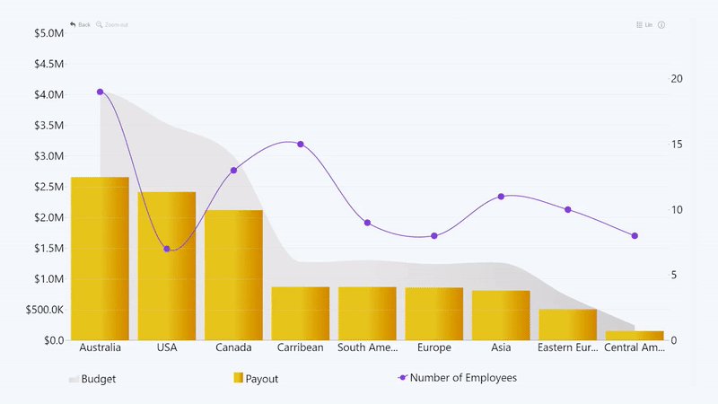
This is a great way to create visuals with a high data-to-ink ratio, as Edward Tufte would say. You can also use the various chart types to give additional context to your data. One of the examples would be combining production volumes, displayed as columns, with the net revenue from sales, displayed as an area behind it.
What can you do with a Power BI combo chart?
Drill Down Combo PRO custom visual is like a Swiss army knife of data visualization. Its main strength lies in its versatility. For example, if you need to create a simple Power BI column chart, line chart or area chart, you can simply use that specific tool for your visualization. Each of these chart types can enjoy a wide range of formatting options to suit your needs.
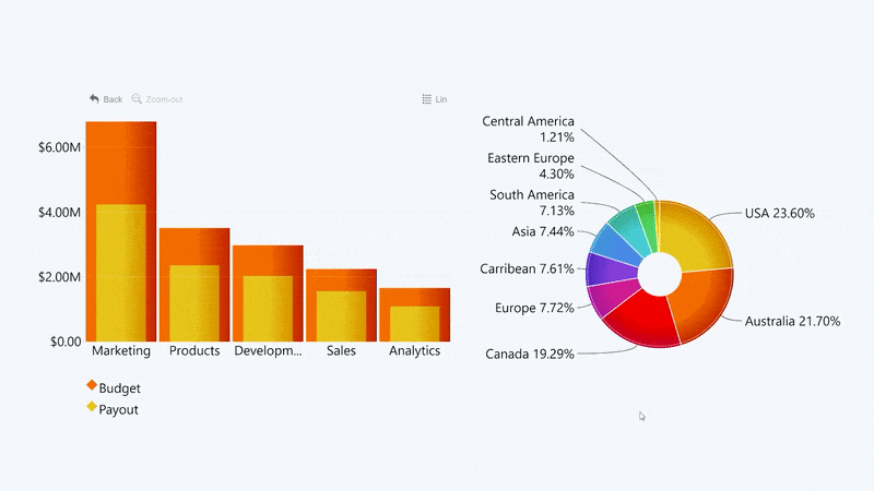
However, if you want to combine multiple chart types in one, you can feature up to 25 different series on the same visual. This way, you can mix & match any combination of column, line, and area charts to tell a rich narrative and give additional context to your data. Let’s delve deeper into each chart type that you can use in Drill Down Combo PRO!

Column chart
This chart type needs no introduction because it’s just as widely used as it’s easy to understand. Column charts are excellent for comparison of the data between multiple categories because the size difference between multiple columns will be immediately apparent and easily discernible.
You should use this chart type if the categories are separate, and you need to directly compare them. For example, if you are analyzing your sales performance, then each column can represent a certain product line for comparison between the sales volumes. Similarly, an HR report can feature a chart in which each column represents the salary total for each department.

Line chart
Unlike a column chart which represents each category value with a rectangular shape that starts at the Y axis and ends at the value, a line chart simply plots all category values as dots and connects them with a line.
This chart type is best suited for when you need to spot trends. The most well-known example, of course, would be a stock index, which shows the changes in stock prices over time. However, if you need to display time-based data, we recommend checking out visuals that are better suited for that, such as Drill Down TimeSeries PRO or Timeline PRO. You can read more about how to create a Power BI timeline in this blog post.
Timelines are not the only use for a line chart. You can also monitor changes in the dependent variables based on the independent variables. This will prove useful if you are visualizing your research data or performing benchmarks. In addition, the line chart can complement other Power BI combo chart elements by acting as a baseline or a variable KPI.

Area chart
At first glance, area charts don’t seem to be that much different from line charts. However, the main difference lies in the fact that the area between the values and the axis is filled by a color or gradient. There are many ways in which report creators can use this visual, and here are some of them.
Since it’s so similar to a line chart, some report creators use this chart type to fill the area with a color or gradient simply to give the data some visual emphasis. That comes especially handy if you use conditional formatting which will provide various ways to automatically color the chart based on certain data conditions.

In addition, when you’re combining multiple chart types on the same visual, the columns or lines can be the focus in the foreground, but the areas can provide additional context in the background. For example, in an income analysis Power BI combo chart, columns can display net profit, while the area can show revenue.

Lastly, stacking multiple areas proportionally across the entire y axis is a visually striking and effective way to show a part-to-whole relationship on a Power BI combo chart. If you want to create this kind of chart, you’ll be delighted to see the wide choice between various stacking options in the Drill Down Combo PRO visual.

Special features of Drill Down Combo PRO that you’ll love
This Power BI custom visual is a true multi-tool, giving you a lot of options to create exactly the chart that you need. Whether you’re using just a single chart type or creating a multi-purpose Power BI combo chart, you’ll find the wide range of features and customization options incredibly useful. Let’s look at the standout features that our users love the most!
Intuitive on-chart interactions
One of the main things you should consider when creating a report is the user experience, because it will make finding data faster and easier, thus saving time. With interactive drill down capabilities, your users can easily get more insight and perform quick ad hoc analysis.
With Drill Down Combo PRO, you can create an interactive and easy-to-use Power BI combo chart with intuitive on-chart interactions. What’s more, this visual is optimized not just for mouse and keyboard, but also touch screens. So, whether your users like to click and scroll, or tap and pinch, this visual will be equally usable on all devices – computers, presentation screens, tablets, and even smartphones.
If you want to take a deeper look into a particular column, simply click on it and the visual will drill down one level. In addition, you can hide or show any series by clicking on their legends. You can also select one or multiple categories by pressing the left mouse button while holding CTRL.
This visual also supports cross-chart filtering, which means that if you feature it in a Microsoft Power BI report, your combo chart will effortlessly work together with other visuals to bring you data that’s relevant to the context. For example, selecting one or multiple categories on your Power BI combo chart will also filter other charts to show related data, and vice versa. No need for slicers! Try out our Drill Down Reports to see this feature in action.
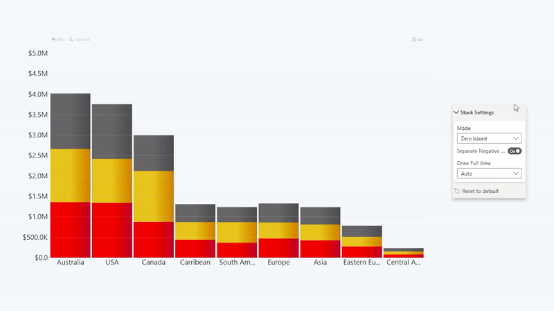
Stacks & clusters
If your data has multiple values in the same category, you can display it in various ways. For example, in a column chart, you can show them as a cluster, creating a group of multiple columns. It’s best used when you need to compare these columns side-by-side.

On the other hand, you can combine all these values into a stacked column chart. This choice will let you see the total size of each column as if it was one category, while still displaying the difference between all the values that make it up.
Stacking is also available for area charts, allowing you to create beautiful and eye-catching stacks from multiple series with just a few clicks. There are three different stacking modes available in this combo chart Power BI visual.
- Normal: The column or area will stack all the values on top of each other normally.
- 100% proportional: The column or area will fill the entire y axis and display the values based on percentage.
- Zero based: The column or area will overlap all values. Excellent for comparing two values in a lipstick column chart.
No data policy
There might be times when you won’t have a value for every single category in a series. It’s not always a zero; it just means that there isn’t data available for the particular category. If it’s a column chart, the solution is simple – just don’t display a column at all. However, line and area charts are trickier because there’s a solid continuous line connecting all the values.
That’s why Drill Down Combo PRO gives you four different options on what to do with categories that have no value. Each has their benefits and drawbacks, so it’s up to the creator to decide which option to use.
- Join: The line or area will connect the two nearest values, acting as if the category with no data doesn’t exist. It’s the most visually pleasing solution but be aware that it might be misleading.
- Skip: The line or area will create an empty gap over the empty values. It’s the most accurate way of displaying no data, but it’s hard to deny that the gaps will make your chart less attractive.
- Zero: The visual will display all empty fields as if they’re zero values and connect the line or area to the start of the y axis. Keep in mind that not all empty values are synonymous with zero, so consider whether this option will show your data accurately before using it.
- Zero in Range: This setting will act similarly to Zero, but unlike the former option, Zero in Range will ignore empty values at both ends of the chart’s range to make the chart more visually pleasing.

Thresholds & conditional formatting
In Drill Down Combo PRO, there are two useful features that you can use to compare your data against your performance targets, financial goals or other KPI – thresholds and conditional formatting. You can use them individually or combine them together to enrich your visual narrative.
With thresholds, you can define a certain value, and the chart will display a distinct line or area against which you can compare your data. You can enable up to four thresholds on the same chart.

In addition to various visual customization settings, you can also choose the way the threshold’s value is determined. The most straightforward option is manually entering the value (or value range in the case of an area threshold), but you can also use the following settings that will dynamically adjust based on your data.
- Percentile: While Constant value setting operates with an exact number, this option will allow you to enter a percentage instead.
- First: The threshold will use the first value in the selected series. Useful for monitoring progress or changes.
- Last: The threshold will use the last value in the selected series. A great way to show your growth and display how far your business has come.
- Minimum: The threshold will use the smallest value in the selected series. Can be used to set a baseline of expectations.
- Maximum: The threshold will use the largest value in the selected series.
- Average: The threshold value will be determined by calculating the mean value of the selected series.
- Median: The threshold value will be determined by calculating the middle value (median) of the selected series. Useful if your data has deviations that skew the average too much in either direction.

Another formatting tool that will make it easy for your users to see how your data stacks up against your KPIs is conditional formatting. With this feature, you can set certain conditions and the visual will apply specific colors or gradients to the columns, areas or lines based on whether the value meets the specified conditions.
For example, you can specify a certain KPI as the condition, and if the column or part of the line or area exceeds it, it will be colored green, but if it doesn’t, it will be red. That’s just one use case for this feature, and you can read a more thorough explanation in our blog article about conditional formattin
Power BI combo chart secondary axis
When you’re fitting multiple types of charts in a single visualization, they will not always use the same axis. For example, your Power BI combo chart can feature a column chart of your employee count, which is measured in tens, hundreds or thousands, and a line or area chart of your salary expenditures, which can reach millions.
If you were to feature both on the same axis, the latter would completely dwarf the former. As a solution, Drill Down Combo PRO gives you the option to create a secondary y axis. When this feature is enabled, the visual will create an additional axis on the right side of your chart that you can use to scale the values properly.

Customization
Last but definitely not least, Drill Down Combo PRO gives report creators a lot of customization options. From various ways to adjust your chart to fit your needs to a tee, to small and minute details, you’ll find a lot to like in the visualization pane of this custom visual.
After you drag and drop your data set in Power BI Desktop, you can start choosing the chart type, settings, and behaviors right away. You can choose between applying the same defaults for all your series, or configuring each series individually, including colors or gradients, outlines, width, opacity, legend marker shape, and more.
You can also enable stepped outline for line or area charts, and choose between solid, dashed, or dotted lines or area outlines. Furthermore, you can adjust the size, position, color, font, and visibility of your legends, data labels and other text.

Our custom tooltip will also give you a lot of options. For example, you can choose which series the user can see when they hover over or make a selection. You can also adjust the display units or how many decimals should be displayed in the values.

That’s a lot of settings for a single visual in Power BI. So, if you want to learn more before getting started with Drill Down Combo PRO, you can visit ZoomCharts Academy to watch our product expert Aivis walk you through this visual and learn how to create a combo chart in Power BI!
Conclusion
If you want a true multi-purpose visual that gives you the option to create either regular column, line or area charts, or make stunning combo charts that feature up to 25 different series, here it is.
Get Drill Down Combo PRO and create a visually impressive, data-packed and easily readable Power BI combo chart!

Want more info like this?
Subscribe to our newsletter and be the first to read our latest articles and expert data visualization tips!


