Aug 07, 2023
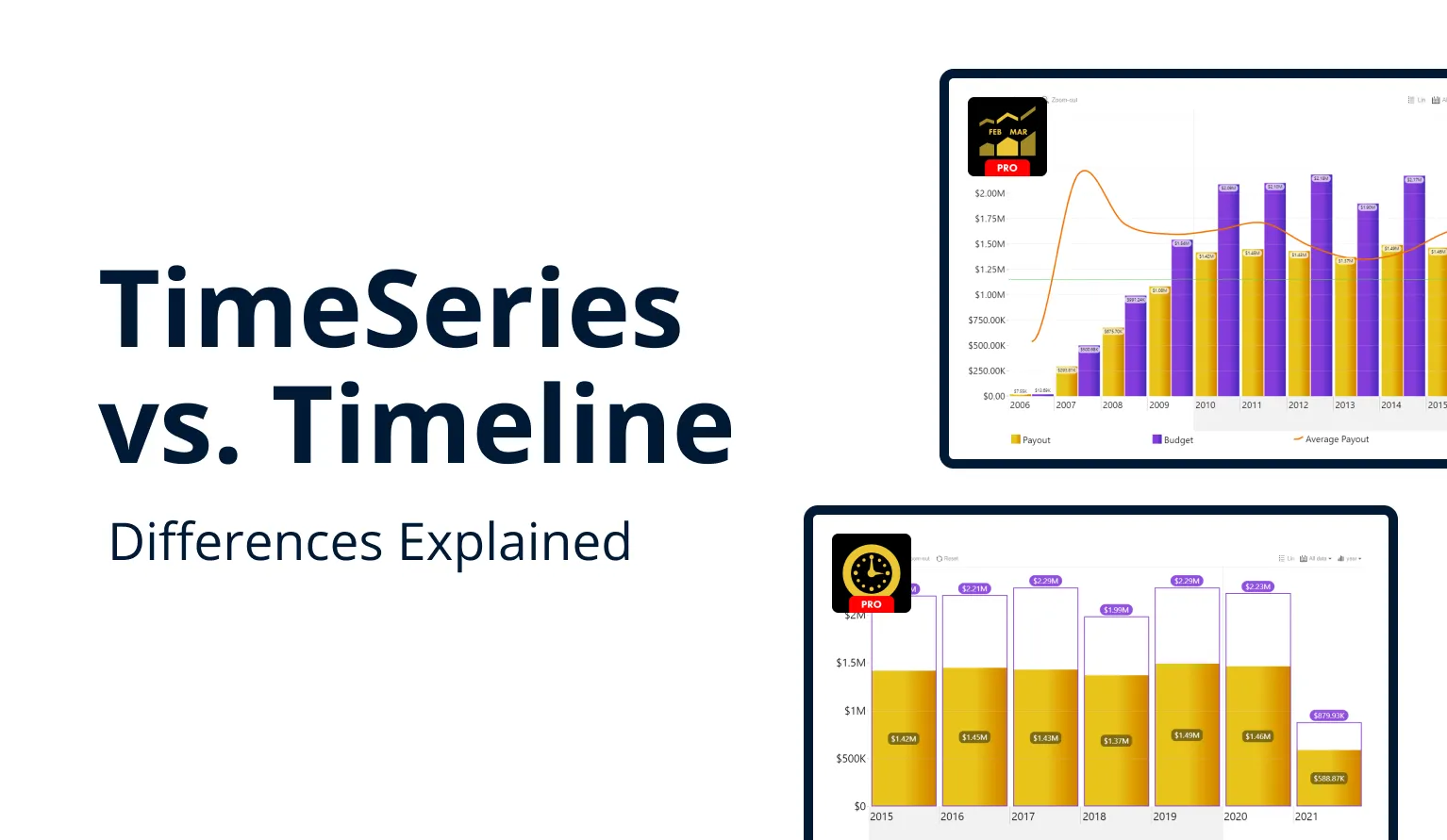
Drill Down TimeSeries PRO vs Timeline PRO: Differences Explained
This article explores the similarities and differences between TimeSeries PRO and Timeline PRO to help you decide which of our two Power BI visuals for time-based data is for you.
This article explores the similarities and differences between TimeSeries PRO and Timeline PRO to help you decide which of our two Power BI visuals for time-based data is for you.
Our most eagle-eyed customers may have noticed that we offer not just one, but two Power BI custom visuals for time-based data – Drill Down TimeSeries PRO, and Timeline PRO. Even though both look similar, and both will achieve similar goals, there are specific things that set them apart. This article is intended to explain these differences, so you can make an informed decision on which visual is best suited for your needs.
Both visuals will let you create intuitive and visually impressive timeline visualizations with on-chart interactions to easily drill down and explore your data in closer detail. However, the reason why we offer two different products for a similar task is to provide report creators with more choice and flexibility by having tools that are perfectly suited for specific purposes.
The biggest differences can be found under the hood. TimeSeries PRO uses table date structure to sort and visualize data. Timeline PRO, however, employs matrix data structure, which has allowed us to introduce more ways to customize your timeline and build the perfect visual for your report, including DAX-calculated measure support, conditional formatting, and other features.
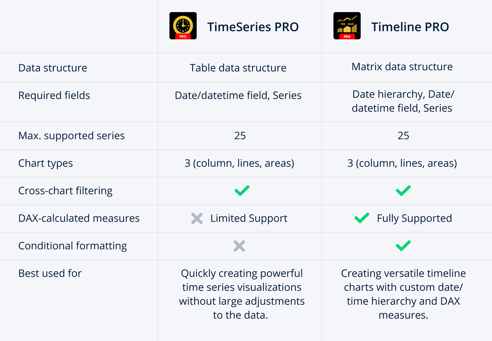
So, if you find yourself stuck choosing between TimeSeries PRO and Timeline PRO, here’s a quick summary. Want to quickly and easily build a time series chart with multiple levels of drill down and with preset date and time units ranging from milliseconds to decades, without the need to use DAX measures? Can’t go wrong with Drill Down TimeSeries PRO.
Need to use more sophisticated calculations (DAX measures) on all date/datetime unit levels and require conditional formatting? Drill Down Timeline PRO will be your go-to choice.
Read on as we delve deeper into both visuals and thoroughly dissect the similarities and differences between them.
What is Drill Down TimeSeries PRO?
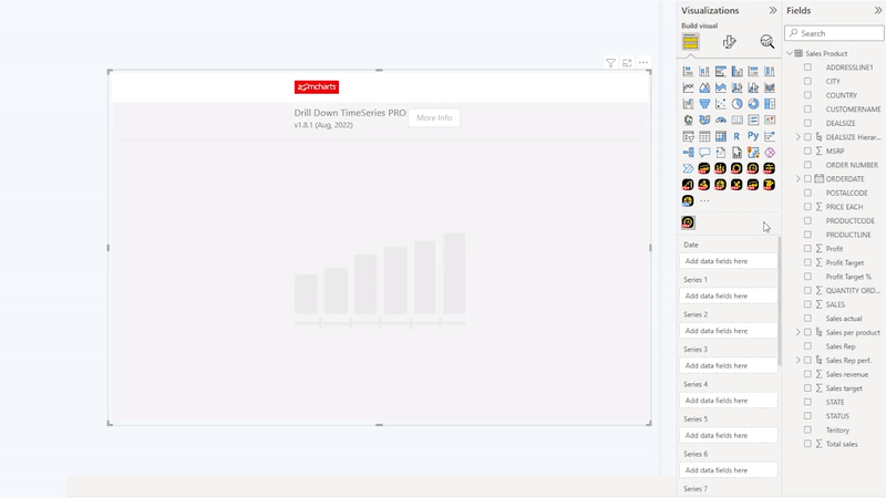
As we continue to expand our family of Drill Down Visuals with new products, TimeSeries PRO has steadily remained as one of our most popular custom visuals for Power BI. Our customers have noted how quick and easy it is to set up, allowing them to build a beautiful and user-friendly time series chart with just two fields – series and date/datetime.
The visual will automatically group and sort values by their time or date units. For example, if you have set the initial display to a monthly view, it will add up all the values in each month and show it as a total. Click on a specific month to drill down and see a more granular view that shows the values for each day separately. TimeSeries PRO can display your data ranging from decades down to milliseconds, depending on what's the smallest unit in your dataset.
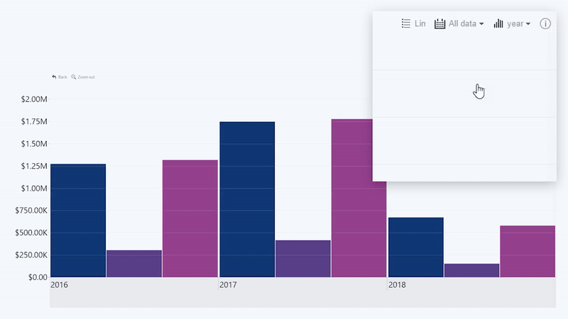
Your time series chart can also work as an interactive filter for the entire report with the use of cross-chart filtering. As you drill down or make a selection on the chart, other visuals can respond by showing only data that’s relevant to that specific time period. It’s a simple way to instantly make your Power BI reports more interactive and user-friendly.
Lastly, you can choose between three different ways to visualize each series – either as columns, lines or areas. You can also mix and match up to 25 different series on the same chart to build an immersive narrative with your data.

You can read more about Drill Down TimeSeries PRO in our article “Make Power BI Time Series Charts Easily”.
What’s Different in Drill Down Timeline PRO?
After the release of TimeSeries PRO, our team started exploring new and exciting features to add to the visual. We quickly found out that many of our planned additions, including DAX measure support, would require switching to the matrix data structure.
We knew that this was a huge change that could disrupt the existing workflow for many TimeSeries PRO users, which is why we made the decision to introduce a new visual – Timeline PRO. It was built ground-up to provide a similar user experience, but with a new data structure and added features. We maintain and offer both visuals side-by-side so our customers can choose according to their preferences and requirements.
You can read more about Drill Down Timeline PRO in our article “Creating interactive Power BI Timeline charts: A Full Guide”.

Timeline PRO carries over all the signature features from TimeSeries PRO, including on-chart interactions for easy drill downs, cross-chart filtering, and 3 different series types (columns, areas, and lines). Timeline PRO can feature up to 25 series on the same chart.
In addition, Timeline PRO now also supports conditional formatting, which enables automatic adjustment to certain settings (like fill color or gradient) based on their values and specific conditions as defined by the creator. We’ve thoroughly explained this feature in its own blog post – “Using Power BI Conditional Formatting in ZoomCharts Drill Down Visuals”.

Matrix Data Structure
The biggest change, without question, is the introduction of matrix data structure. The main benefit of this change is the ability to use DAX-calculated measures on any level (which we’ll explain in more detail in a further section). In addition, you can now have full control over the way you build your time/date hierarchy.
Timeline PRO has three mandatory fields –date hierarchy, date/datetime, and series. With these three fields, you can either use the hierarchy that’s automatically created by Power BI, or manually create a custom time/date hierarchy yourself. This video from the ZoomCharts Academy shows you how to do it.
This has enabled the report creators to have more flexibility in the way they structure their data. You can fully customize the time/date hierarchy and choose the exact drill down levels for your chart to ensure a logical and cohesive data storytelling narrative.
Furthermore, you can even customize the scale and units for each level. It’s not limited just to the regular minutes, hours, days or months, and you can even choose specific amounts – for example, 15-minute intervals, financial quarters, or decades.

DAX Measures
The switch to matrix data structure has enabled us to implement full support for DAX measures. It’s basically the “language” of Power BI that allows you to enter specific formulas and perform calculations or other actions with your data directly within Power BI. You can read more about DAX in this article by Microsoft.
TimeSeries PRO has no measure support for levels other than the lowest date/datetime unit, and data aggregation is limited to sum as you move up the date/datetime hierarch.
Timeline PRO allows you to apply DAX measures to any level. It’s not just sums, subtractions or multiplications, but also averages, medians, and other arithmetic actions. Furthermore, you can apply different filter contexts to aggregate the specified value.
Another practical way to use DAX measures in your timeline chart is by using the custom ZoomCharts tooltip in Timeline PRO. When enabled, you can use the predefined calculations or add custom DAX expressions that will apply custom calculations and show the results to the user based on their selection. It’s a neat way to provide more insights to the user in a compact way.

TimeSeries PRO vs Timeline PRO - Which Visual is for You?
Two visuals, so similar on the outside yet so different under the hood. Each of them is best suited for specific use cases, creator preferences or data sources, which is why it’s important to explain the benefits and drawbacks of each visual and visualize them with use cases where each visual shines.
Drill Down TimeSeries PRO is For You If…
You have a data set which already contains two columns – series and date/datetime, and you want to quickly create a stunning and user-friendly time series chart. Simply add the visual to your report and add the required fields, and you will have a time series chart with drill down interactions in mere seconds.
It’s perfect for automated logs in which each value is accompanied by a time stamp (such as sales events in CRM or e-commerce systems, website activity logs, and more). It also makes it incredibly easy to import data from Excel, SQL databases, and other systems for use with TimeSeries PRO.

Drill Down Timeline PRO is For You If…
You want to have full control over the way you build your timeline chart and you want to use DAX measures on all data levels. You want to manually create a date/datetime hierarchy or use Power BI’s automatic date hierarchy. In addition, you can use conditional formatting to enhance your data storytelling based on your data.
You trade the simplicity of TimeSeries PRO in favor of having the power to create the perfect visual for your use case.

Conclusion
We hope that this article made the choice between both visuals easier and that we cleared up any questions about either product. Feel free to contact our team if you require additional info! We’ll be happy to talk to you via e-mail ([email protected]), phone (+44 333 555 2505), or an online meeting.

Want more info like this?
Subscribe to our newsletter and be the first to read our latest articles and expert data visualization tips!


