Feb 05, 2023
Creating interactive Power BI Timeline charts: A Full Guide
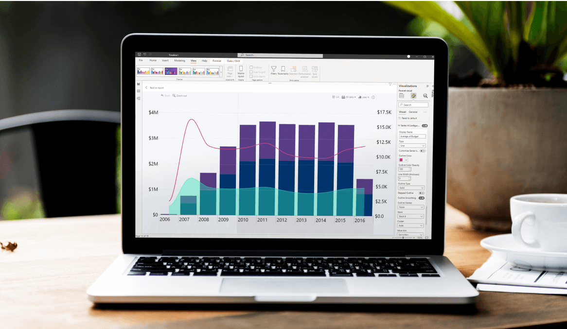
How to create a timeline in Power BI? There are many ways to do that, but in this article, we will explore a purpose-made timeline visual for creating stunning Power BI timeline charts that are smooth, interactive and let you feature up to 25 series on the same chart. Read on as we dive deep into the features of Drill Down Timeline PRO and give you tips on how to get started!
How to create a timeline in Power BI? There are many ways to do that, but in this article, we will explore a purpose-made timeline visual for creating stunning Power BI timeline charts that are smooth, interactive and let you feature up to 25 series on the same chart. Read on as we dive deep into the features of Drill Down Timeline PRO and give you tips on how to get started!
What is a Power BI timeline chart?
A timeline chart, at its core, is a regular column chart with an X and Y axis. While most charts of this kind will have one axis for value, but the other axis for a category, timeline charts will substitute that with a chronological measure of time. It’s a convenient way to show changes in data during a set period of time.
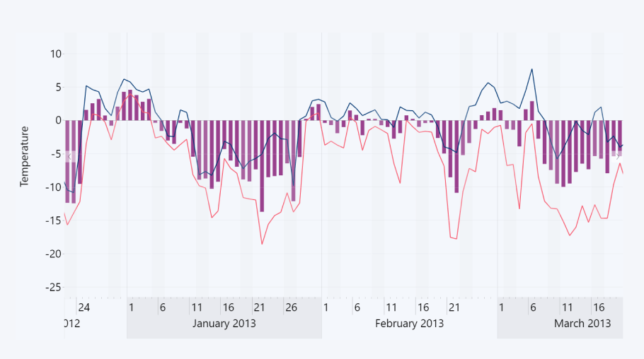
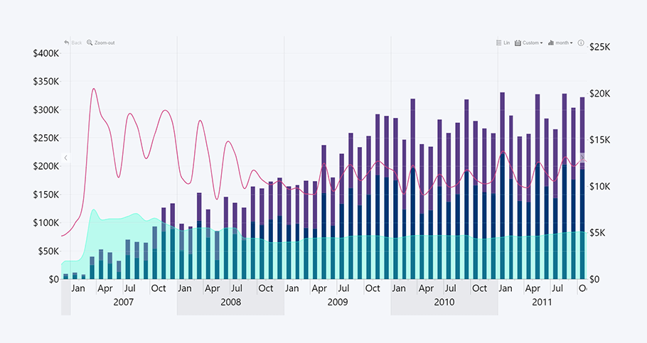
There are various types of timeline charts suited for different kinds of chronological data. For example, if you need to display the revenue or production amount during each time period, you can use bars/columns. However, if the series is ongoing and you need to display only the changes through time, for example, subscriptions or stock value, lines will be a better choice. There might even be times when you need to mix & match all of them on the same timeline visual in Power BI.
One of the biggest misconceptions about timeline charts is that they can only be used for dates, months, or years. In fact, you can use a timeline chart for any time unit, ranging between milliseconds to even decades. For example, if you want to analyze the foot traffic of your stores and determine your peak hours, a timeline chart is just the tool for the job.
Or how about motorsports telemetry, where each millisecond is important? When analyzing lap times, engineers use telemetry to view the speed, RPM, throttle response, brake efficiency, G-forces, and other data to find areas where to improve and trim off as much time as possible.
Microsoft Power BI has a built-in way to show chronological data, but if you want to enjoy a fully featured data visualization experience, you should try out Drill Down Timeline PRO by ZoomCharts.
What is ZoomCharts Drill Down Timeline PRO?
Drill Down Timeline PRO is a brand-new addition to Drill Down Visuals, taking all that was great about TimeSeries PRO and adding much-requested features including DAX calculation support, tooltip customization features and custom date hierarchy. Drill Down Timeline PRO works with matrix data structure, unlike TimeSeries PRO which used table structure.
This Power BI timeline custom visual is perfectly suited for chronological data, giving you a lot of options when displaying chronological data. Let’s go through some of the standout features of Drill Down Timeline PRO!
Multiple chart types
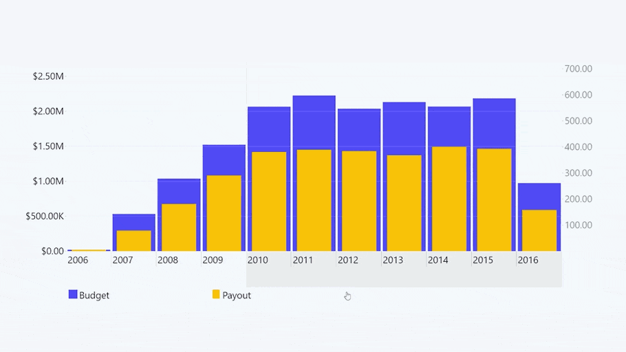
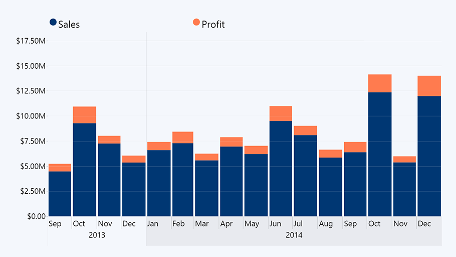
Just like Drill Down Combo PRO and Combo Bar PRO, ZoomCharts Drill Down Timeline PRO visual will give you the option to show up to 25 data series on the same chart. Mix & match any combination of lines, columns, and areas to create your perfect Power BI timeline visualization.
You can use this feature to directly compare two similar data series or provide additional context to your narrative by including relevant complementary data. For example, you can overlay a column chart of your sold units over a line chart of your revenue.
This is one of the features that make Timeline PRO a valuable data storytelling tool, allowing you to create an information-rich Power BI visual timeline that does not compromise on readability and ease-of-use.
DAX calculated measures
With Data Analysis Expressions (DAX), you can automate data acquisition for any of the series on your timeline chart. If you have used formulas in Microsoft Excel, then you’ll feel right at home when creating and implementing DAX measures in Power BI.
This feature is a massive time-saver when you need to extrapolate data from other fields or perform calculations based on certain conditions or rules. Whether you’re doing arithmetic calculations across multiple fields or performing conditional data filtering, DAX measures will simplify this process.
Immersive drill down capabilities
With Drill Down Timeline Power BI custom visual, you can create interactive charts that are a pleasure to use. All custom visuals from the Drill Down Visuals bundle support smooth and seamless multi-touch gestures, making it easy to navigate and find exactly the data you need on PCs, presentation screens or mobile devices alike.
This Power BI timeline visual is designed with convenience and ease-of-use in mind, and you can drill down to the data you need in an intuitive and natural way. Simply make a selection on the timeline, and it will drill down to that time period.
What’s more, with intuitive cross-chart filtering, all other ZoomCharts visuals on the same report will show relevant info as you interact with the chart in question. For example, if you’ve created a sales report, the user can select a date range on the timeline, and a donut chart next to it can show a detailed breakdown of the best-performing product categories. All of that will happen intuitively and without slicer menus.
Wide customization options
You can use the wide range of formatting options and special features to make your reports visually pleasing and functionally suited for the task at hand. Colors, labels, threshold lines, tooltips – we’re just getting started! Here are the most exciting advanced customization features you’ll find in Drill Down Timeline PRO.
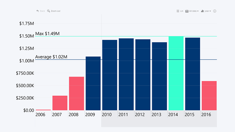
Conditional formatting
You can choose custom colors or gradients for each of the series to visually enhance your report and make the most important data stand out. Furthermore, with conditional formatting, you can set certain rules to automatically apply certain colors. For example, on a financial timeline you can set a threshold, and quarters that exceed it can be colored green, while the underperforming quarters can be marked red.
Custom tooltips
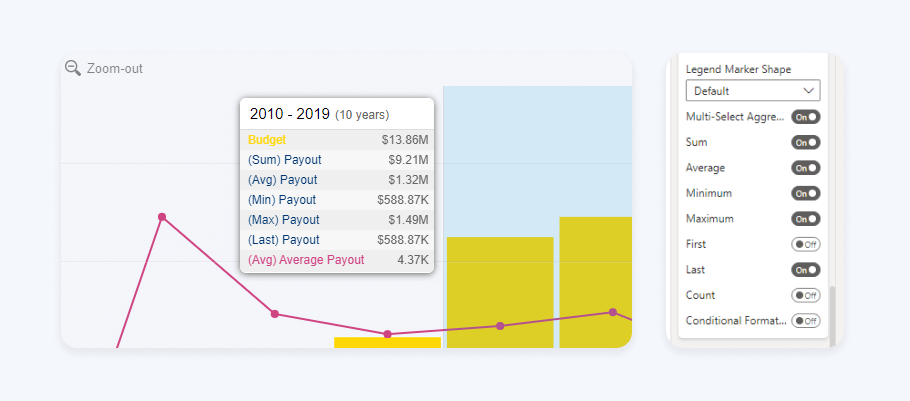
Tooltips are a great way to provide additional context to your data without cluttering the visual with too much information. Simply hover over a data point, and the tooltip will display the relevant information from multiple categories. Furthermore, you can highlight a section on your Power BI timeline visualisation to see data about the selected time period.

When selecting a certain time period on the timeline chart, Power BI default tooltip will show the sum of all values within the selection, or other calculations. However, we’ve expanded on this functionality in our custom tooltip by offering a selection of additional calculations that can be shown on the tooltip. Lastly, you can even include additional series on the tooltip, even if they are not displayed on the timeline chart.
Use cases for Power BI timeline charts
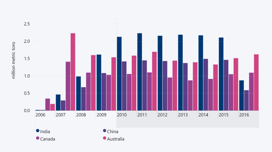
One of the best things about Drill Down Timeline PRO is that you can feature up to 25 data series on the same chart, and you can display them as columns, lines, or areas. This flexibility makes this visual an excellent tool for any kind of chronological data.
Add in a wide range of customization options, DAX calculations and interactive drill down features, and you’ve got a multi-tool in your hands. How are you going to use it in your next report? We’ve provided some ideas below, but, if you want to see more examples of Drill Down Timeline PRO in action, head to our Use-case Gallery!
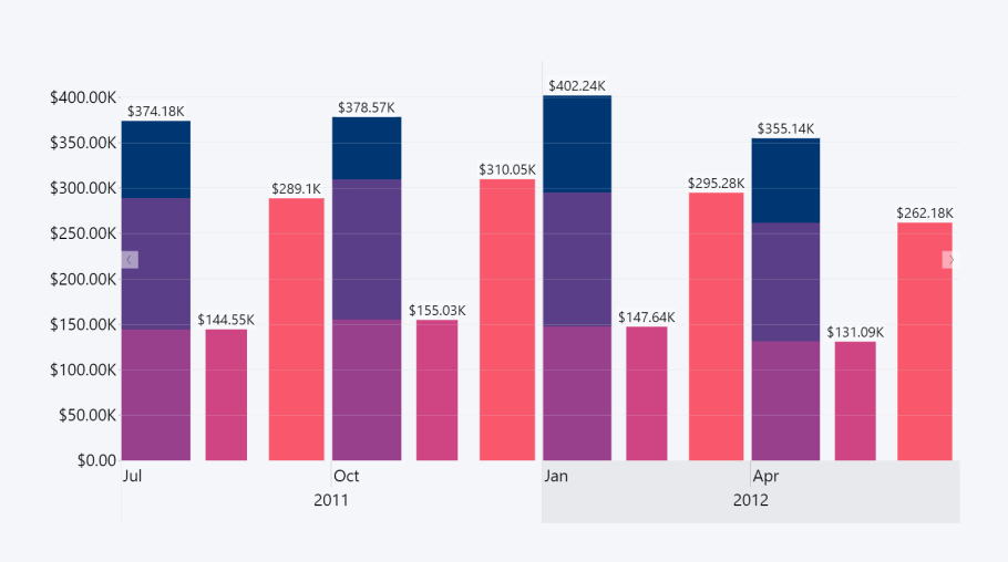
Finance
One of the first associations that comes to mind when hearing the words ‘Power BI timeline chart’, certainly, is financial data. After all, financial reports are created on yearly, quarterly, or monthly basis, so putting your data on a timeline chart in Power BI will give an easy-to-read overview of your past performance, making it easy to spot trends and set targets or create forecasts for the future.
With Drill Down Timeline PRO, you can create truly interactive financial reports that are easy to navigate. If you want to inspect a particular time period, you can select it on the timeline and drill down. With cross-chart filtering, other ZoomCharts visuals on the report will automatically show data that’s relevant to the selected interval.
Production
Whether your business operates multiple manufacturing facilities or it’s a small-scale operation that produces handmade craft products, you need a tool to track your production numbers. A well-designed production time series can be used to not only see how your numbers stack up against your KPIs, but also monitor for downtimes.
Furthermore, the variety of chart types and the ability to overlay multiple series over each other on the same timeline will allow you to compare your total production amount with your failure rate or costs.
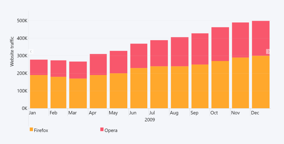
IT & Communications
Drill Down Timeline Power BI visual will be a helpful ally on your way to five nines availability. You can use a timeline to track your service uptime and investigate any issues. Similarly, this will also be a great tool to monitor your web traffic and spot any outliers. You can then use =DISTINCTCOUNT to include only unique visitors or requests on your chart, vastly decluttering your data when creating your Power BI timeline graph.
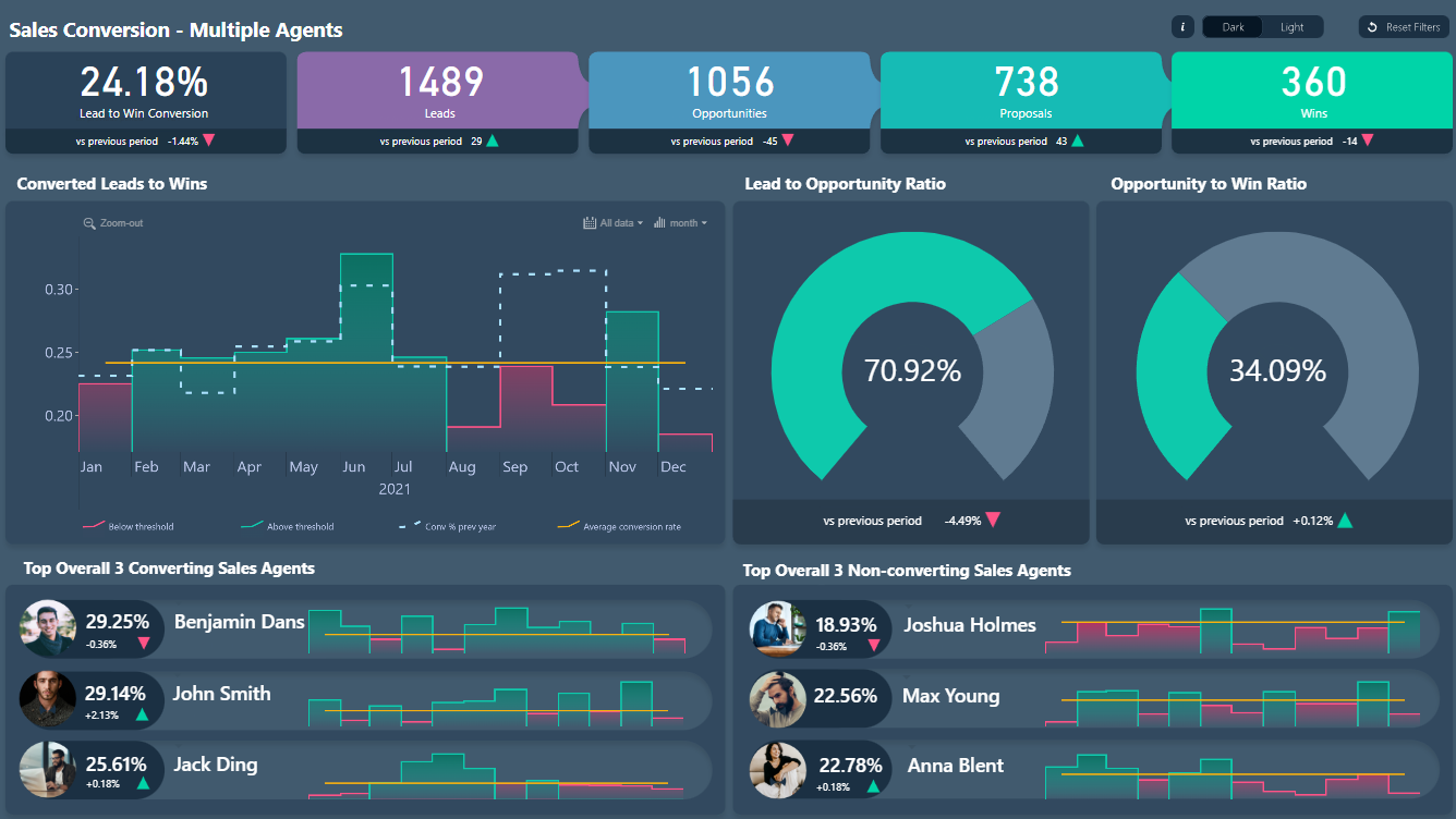
Sales & Marketing
Visualizing your sales data on an interactive timeline chart will help you notice trends and correlation in your agent performance or customer behavior. You can use this info to adjust your sales or marketing strategy, shift your focus to a specific target audience or optimize your sales funnel.
It’s just as useful for day-to-day tasks as it is for big picture data visualization, with some of the best daily examples including web traffic, leads, or social media followers, engagements, and conversions.
Conclusion
Drill Down Timeline PRO expands on the functionality of our previous TimeSeries PRO visual by adding a variety of advanced features, making it possibly the best timeline visual Power BI has in store. It’s an incredible tool that will find its place on any financial report or other visualizations, and you can try it out yourself by getting the 30-day free trial!

Want more info like this?
Subscribe to our newsletter and be the first to read our latest articles and expert data visualization tips!


