Jan 13, 2025
Top 5 Power BI Report Design Mistakes You Should Avoid
Ideally, Power BI report design should make data exploration faster, easier and more efficient. But things do not always go according to plan, and certain design mistakes may creep up. Here are five of the most common mistakes that you should avoid when designing your reports!

Ideally, Power BI report design should make data exploration faster, easier and more efficient. But things do not always go according to plan, and certain design mistakes may creep up. Here are five of the most common mistakes that you should avoid when designing your reports!
Mistake #1: Doesn’t Meet the Users’ Needs
Power BI reports are usually created by people with a strong background in data analytics. After immersing yourself in this field for a while, you will inevitably start viewing data in a way that most people don’t. As a result, there will be data that may seem crystal clear to you, a data expert, but will not make any sense to your colleagues with backgrounds in management, law, marketing etc.

Here’s a question. What’s the primary job of a report creator?
Sure, they develop and disseminate Power BI reports, but these are just tools, not the entire trade. At the very core, the responsibility of a report creator is to interpret and curate data, and then present it in a way that the end user can understand. Basically, a report creator is a medium between data sources and the end user.
It’s extremely easy to experience tunnel vision when creating Power BI reports – after all, the data makes sense to you! You can gain insights and explain what the numbers mean, what does each visual represent and how to navigate the report. But can the user?
That’s why it’s important to approach Power BI report design from the perspective of your user. Before designing each report, ask yourself:
- Who is the user, and what is the main goal of this report?
- What data is the most important to them? What data will just introduce confusion?
- What visuals and other report elements will help them gain the most valuable insights?
- Can the user understand data with their current knowledge? If not, what can I do to help with that?
- How can I create a layout and navigation experience that’s familiar and intuitive to them?
Taking a user-centric approach to Power BI report design will make the data exploration process faster, easier, and less frustrating for the people. Furthermore, they will be more likely to trust the data, allowing them to take clearer and more confident decisions. And lastly, if the report does not cause frustration or confusion, your users are more likely to thoroughly explore them before making important decisions, thus building a stronger data culture within your company.
Solution: Talk to Your Users
While this suggestion might sound obvious at first, there are still many ways the communication between the report creator and users can be improved. It shouldn’t start and end with just a few emails or chat messages.
Before you start working on a new report, take time answering the five questions we outlined above. Identify who the users will be and what’s the main goal of the report. For example, if you’re building a sales overview report, don’t be shy and set up a brief meeting with the sales manager. Talk about what data is the most important to them and what answers they are looking for in a report.
During the Power BI report design process, it’s important to keep the communication lines between the report creator and users open. It’s a back-and-forth process, and you can show rough drafts and ask for suggestions before delivering the full report. And, after the report gets in the hands of your users, don’t hesitate to ask for their feedback, because you can use it to improve the current and future reports.

Mistake #2: Poor Aesthetics
What do all great Power BI reports have in common? They look good. There are three reasons why good Power BI graphic design should be your top priority.
Firstly, a good-looking Power BI report will leave a better first impression, and your users will be more motivated to start using them and explore data more thoroughly. Research has shown that it takes around 50ms for a user to decide whether they’ll stay at a website or leave (Lindgaard, Fernandes, & Dudek, 2006). This study shows how important the first impression is, and we can apply similar logic to Power BI report design as well.
Secondly, you can use Power BI graphic design to integrate your reports deeper within your corporate brand identity. By using your company’s signature fonts and colors, the report will look more professional and you will gain more brand awareness and perception about your identity and goals. Not just among your coworkers, but also for any external stakeholder who views your reports.
Last, but not least: things that look great usually also work great. The same design principles that are used to make a report aesthetically pleasing will also make your report more readable and easier-to-use. Here are some of the mistakes that we’ve seen in many bad examples of dashboard design:
- Dissonant color palette: may cause a poor first impression and make it unpleasant to use the report.
- Bad font choice: some fonts may be hard to read, while others (like script or comic typefaces) are not suited for professional environments.
- Poor color contrast: may reduce readability and accessibility.
- Too many visuals: may cause a poor first impression and make it harder to focus on what matters.
- Unfitting visuals for data: using chart types not suited for your data may lead to misleading conclusions.
- Overdesigned: redundant design elements like image backgrounds may distract and reduce readability.
Each of these Power BI report design mistakes come with various negative effects on the user experience, so you should try to avoid them. You should strive for reports that look professional and visually pleasing, with no sacrifices to the usability or readability.

Solution: Follow Good Design Principles
It’s clear that aesthetics is an integral part of Power BI report design, and it should not be relegated to a mere afterthought. Visual design should be given serious thought during the planning stages and the creation process. Here are some tips you should bear in mind when designing your report:
- Design a consistent and visually pleasing color palette that aids readabilty
- Choose appropriate visuals for the type of your data
- Remove any element that does not directly enhance your data storytelling narrative
- If you do need to show a lot of data within a report, consider creating multiple pages
- Ask for opinions from your colleagues before disseminating the final version of your report
If your company has a brand design guidebook, it’s an excellent starting point to develop a good-looking color palette. However, if you need to make one from scratch, Coolors is a quick and easy way to generate a visually pleasing color scheme.
It’s also important to consider the meaning of most colors as a means of communication. For example, in many cultures, green is used to indicate good results, but red is used to highlight data that needs attention. Similarly, certain colors are associated with specific brands or product categories (for example, green often represents eco-friendly solutions).
When used wisely, colors can become an important part of the data storytelling narrative. You can learn how to automate this process in certain visuals by reading our article "Using Power BI Conditional Formatting in ZoomCharts Drill Down Visuals".

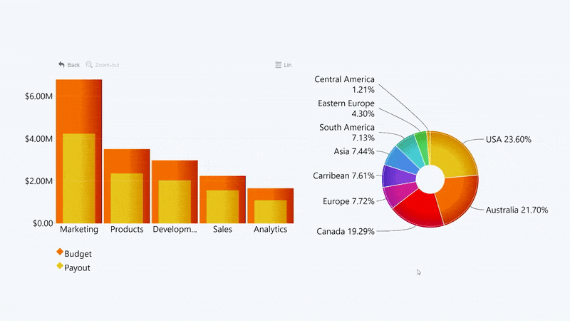
In this example, conditional formatting was used to automatically color all values above the manually defined KPI threshold ($2.5M) green, and those below it - red. This will give a quick overview on which brands or departments are performing well, and which ones are underdelivering.
Before you realize your idea, make sure that Power BI and your choice of visuals have all the necessary features to make your plans a reality. We’ve included a variety of customization features in Drill Down Visuals that you can use not only to make a visually pleasing report, but also enhance your data storytelling capabilities.
Mistake #3: Lacking Data Exploration Features
One of the main benefits of using Power BI for business intelligence is the vast selection of data exploration features. Report creators can provide the users with all the necessary tools to deviate from the default view and explore data in closer detail. Filters, sorting, drill downs, drill throughs, you name it.
Despite that, we’ve seen multiple Power BI reports that have just a few of these features or do not utilize them fully. By doing so, they’ve created a Power BI report that’s more suited for data presentation, and not data exploration.

Power BI can be so much more than that.
Good Power BI report design examples will allow the user to explore data from multiple angles and easily find the data that they need. Let’s take a quarterly sales report as an example. Sure, the user can already get insights on how well the company is doing in general, and how much the sales performance has changed over time.
However, if your data model has a solid hierarchy and the report features drill down interactions, the user will be able to delve deeper and analyze data about particular product categories or brands. It’s an intuitive and simple interaction that can provide lots of value to the user.
Of course, the opposite is equally true – overloading the report with too many features, controls and other elements will make it not just harder to use, but also slower from a performance standpoint. That’s why report creators should find a perfect balance between both ends of the scale, and choose features that add meaningful value to the particular type of data.
Solution: Drill-down focused design
If your report provides useful data exploration tools, and they are intuitive and readily apparent to the user, they will be more likely to analyze data in closer detail and use the report to make well-informed and data-driven decisions.
Drill downs are one of the most important interactions for data exploration, because they directly expand on data that the user is interested in. It’s a simple and intuitive way for the user to interact with the data and gain more insight.
Learn more about setting up and implementing drill downs in our article "Power BI Drill Down: The Ultimate Guide"
There are two things you need to do if you want to bring more focus to the drill down functionality within your report. Firstly, your data model should contain hierarchies or relationships.
After that, you should start planning how the user is going to use these drill down capabilities. Some reports have separate buttons near the chart to initiate drill downs, while others do it via the right-click menu. You can also set the on-chart clicks to perform a drill down, instead of the default ‘Highlight’ behavior.
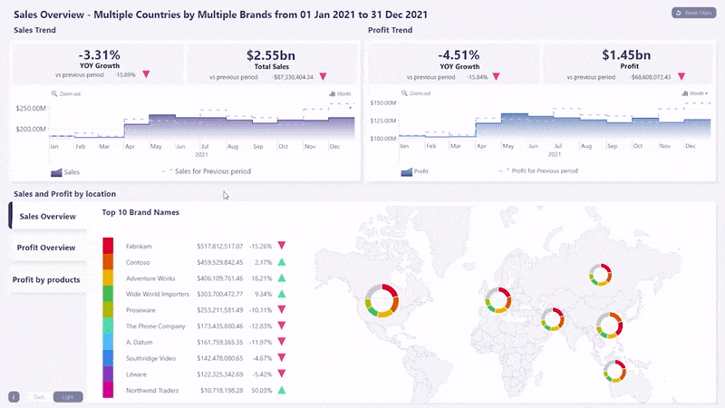
In this example, we can see how users can drill down to deeper levels within a column chart with on-chart interactions. Thanks to cross-chart filtering, the donut chart automatically adjusts the view to show relevant data.
If you want to create Drill Down Reports – Power BI reports which are designed ground-up to provide the best drill down experience to the user – then you will need to use custom visuals that are specifically created for this task. Drill Down Visuals are designed to make deep data exploration easy for anyone.
Mistake #4: No Interactivity
UX design does not exist in a vacuum. Most people are already used to the sleek and intuitive user interfaces in modern consumer devices and apps. For example, the weather app on their smartphone shows a weekly overview, and if they want to see the forecast for a specific day, they just tap on it.
They didn’t even think about whether it would work, because it’s a logical assumption that it should. So, when the users transfer the same expectations to your Power BI reports, they’re going to click or tap on any UI element that they think should be interactive. For example, pie charts essentially invite users to click on each slice , and columns on a combo chart attract mouse cursors like a magnet.
Unless the user is already used to the old ways of navigating Power BI reports – slicer menus, right click menus, toggles, etc. – they’re going to feel disappointed and frustrated when they click on charts and they don’t behave as expected.

Interactive and easy-to-use report design makes the user experience consistent and more enjoyable, which in turn encourages them to use your reports more. Moreover, a lot of time (and therefore money) will be saved in the long run if your users don’t have to look around for the secret combination of slicer settings to reveal the data they need.
Solution: Intuitive UX
Before you start creating your Power BI reports, carefully plan out the entire user experience. You can do this even with pen and paper! Think about the most important things in your report, and lay down all the ways your users can access them. For the most used filtering states, report pages or other interactions, you can create bookmarks and place a simple button that activates them.
While slicer menus and other off-chart controls are very useful to provide the user with a wide range of data exploration features, they shouldn’t be the main or only navigation controls. Instead, you should place the most used interactions (such as drill downs or filtering) directly on the chart so they are simple and intuitive.
Read more about various filtering features and interactions in our article "Filters in Power BI: All You Need To Know"
Your ability to enable on-chart interactions depends on the visuals you use. The built-in visuals in Power BI Desktop already support certain on-chart interactions, with the default behavior being highlighting upon left click. However, custom visuals will give you more options and even smoother UX.
Our Drill Down Visuals, for example, are built ground-up to provide an intuitive drill down experience. Each of these visuals is developed with carefully thought-out interactions that make data analysis simple and intuitive for any user. Furthermore, each drill down interaction is accompanied by a subtle animation that shows precisely where the data is coming from.
See how our visuals work together in an intuitive and effective Power BI report! Head to Use-Case Gallery to try our professionally designed reports in action.
Mistake #5: Limited Touch Support
It’s easy for a report designer to assume that reports will mostly be used on desktop PCs or laptops – after all, that’s what most employees have at the office. We’ve seen many bad dashboard examples and reports that are exclusively optimized for PC, with touch support being completely neglected or added just as an afterthought. Some of the biggest pitfalls include:
- Small and dense visuals, labels, legends, and other elements. They may look fine on a 23” monitor, but they will turn into unreadable gibberish on a 10” tablet.
- Tiny buttons and other controls that require sniper-like precision with fingers.
- No support for touch gestures such as swipes, pinch-to-zoom and others.

Focus on designing a report that supports both keyboard/mouse and touch controls. It should also be just as readable on a tablet as it is on a massive presentation screen. Touch-supported reports will incentivize users to analyze data more often and use it for making data-driven decisions. Anywhere. At the office, while working from home, during travels, or maybe even at a business dinner with a potential investor.
Solution: Design for All Devices
Thankfully, you don’t have to choose between focusing on desktop or mobile when designing Power BI reports. By following certain report design principles, you can make sure that your users can explore data anywhere, whether they’re using desktops, laptops, tablets, presentation screens or embedded systems.
- Use screen-space effectively with visuals that have rich drill down and filtering capabilities.
- Choose visuals that support mouse/keyboard and multi-touch gestures at the same time.
- Implement touch-friendly and intuitive on-chart interactions.
As you can see, the first and most important step towards touch-supported Power BI report design is your choice of visuals. That’s why we developed our Drill Down Visuals with a focus on equally great user experience on mobile devices and desktop alike. Try them out and feel the difference!
Conclusion
It’s not the end of the world if you catch yourself making some of the mistakes described in this article – after all, we’ve all been there and done that. Whether you’re a Power BI newcomer or a professional report creator, there will always be something you can do to make your reports even better. You can use the tips and examples listed above to improve your Power BI report design even further.
Furthermore, if you want a professionally designed Power BI report, our ZoomCharts Experience Reports service is made just for you! This package includes the development of a report tailored specifically to your requirements, report development training for your team, and a custom licensing plan for your business.
FAQ
What are the most common design mistakes in Power BI reports?
The top pitfalls include ignoring user needs, poor aesthetics (clashing colors, bad contrast, over-design), lack of interactivity, limited data exploration tools, and neglecting touch support.
How can I make a Power BI report more interactive?
Use on-chart interactions, drilldowns, slicers, buttons, and bookmarks so users can explore data intuitively rather than just reading a static report.
How do I design reports that align with users’ needs?
Talk to your end users first: identify their goals, what metrics matter most to them, and build the layout and visuals around their workflows.
Related content

Want more info like this?
Subscribe to our newsletter and be the first to read our latest articles and expert data visualization tips!


