Dec 17, 2024
Customer Story: Visualising Healthcare Data with Power BI + ZoomCharts
How did a major healthcare provider upgrade their data infrastructure from thousands of Excel sheets to fully interactive self-service Power BI reports in just a few years? Let’s find out!
How did a major healthcare provider upgrade their data infrastructure from thousands of Excel sheets to fully interactive self-service Power BI reports in just a few years? Let’s find out!
We had a talk with Elisio Santos, Business Intelligence Advisor at Arkin, to discover what were their biggest data challenges, and how they resolved them with Power BI and ZoomCharts. We also explored two real-life report examples that provide inspiration for using Power BI in healthcare.
About Arkin
With 4,000 employees across 70 locations (including 14 clinical care centers, 20 outpatient clinics and 20 consultation centers), Arkin is one of the largest providers of mental healthcare services in the Netherlands.
Around 40,000 clients every year receive services from Arkin, including treatment for addiction, PTSD, trauma, anxiety, depression, and bipolar disorder; urgent care for acute psychological distress; and guidance for reintegration.
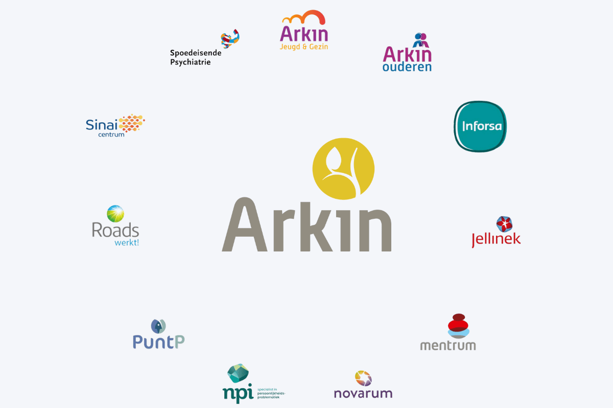
Arkin consists of 11 branches (Arkin Jeugd & Gezin, Arkin Ouderen, Inforsa, Jellinek, Mentrum, Novarum, NPI, PuntP, Roads, Sinai Centrum, and Spoedeisende Psychiatrie), each of which is specialized in its own area of mental healthcare.
Data Challenges in Mental Healthcare
Any organization of this size and structure would face the same challenges when working with data - data fragmentation, low data quality, slow updates, and limited analysis capabilities. However, working in healthcare introduces additional challenges on top of that.
Most treatments provided by Arkin are covered by the client’s medical insurance. To successfully receive payment from the insurance agency, Arkin needs to declare invoices and provide accurate information in a timely manner. This data cannot contain any irregularities or outdated information, otherwise the compensation may be denied, or they can even risk receiving penalties.
Another important factor to consider is patient data protection. The electronic health record for each patient contains sensitive information, which is why this data must be secure against external data breaches and have the capability to limit access only to parties that are directly involved with the patient.

Before Arkin adopted Power BI, their data workflow consisted mainly of Excel worksheets and various decentralized databases. Data about patients and procedures was tracked by each specialist in a separate Excel file, which would then be submitted and merged into a larger data base.
Processing hundreds of Excel files is not just a labor-intensive and inefficient process – it also poses security risks. Furthermore, updating data takes multiple days and each worksheet must be manually updated to ensure that the data is current. Arkin was looking for a centralized solution that ensures that all data is correct and up to date, which is why they chose Power BI.
How Arkin uses Power BI for Healthcare
After trying out a different business intelligence platform, Arkin eventually switched to Microsoft Power BI in 2019. The adoption process was gradual – initially, Power BI was implemented for use in healthcare administration, but over a year it was rolled out across the entire organization. Now, almost every employee benefits from Power BI every day.
Read more in our article "Top 9 Benefits of Power BI"!
Elisio notes that adopting Power BI was easy for the employees, and they are happy with it. Now, instead of receiving Excel files, they can explore interactive reports and be sure that they are getting accurate and up-to-date information. Previously, every change took several days to sync, but now it shows up almost real-time, which also makes it faster to spot and correct errors and prevents conflicts when multiple employees submit changes to the same data simultaneously.
Before Power BI, Arkin had to create and distribute thousands of separate reports which filtered data for each specific team or employee. Now, they can make just one report for the entire organization – and with Row-Level Security, each user will see only data that’s relevant to them and what they’re permitted to access. Not only does this save a lot of time and work, but it also improves data security and prevents leaks of sensitive information to unauthorized parties.
Making Every Employee a Data Analyst with Power BI + ZoomCharts
How users interact with data is just as important as the data itself. In Arkin’s case, most users are not experienced data analysts – they are healthcare professionals who work with patients every day. What they want from a report are simple and actionable answers to their questions, and they have no time to wrestle with confusing and clunky UIs.
Power BI doesn’t just gather and process data – it also visualizes it in interactive reports, making data analysis more engaging for any user. In addition, Arkin uses Drill Down Visuals by ZoomCharts, which are designed to provide a more intuitive and user-friendly user experience for Power BI reports.
ZoomCharts visuals put Power BI’s built-in drill down and filtering capabilities at the forefront of the user experience – simply click or tap on the data you want to explore deeper and the visual will drill down. Each user interaction will also dynamically cross-filter other visuals on the report, allowing to see relevant data instantly and analyze it from multiple dimensions.
It’s intuitive to our workers to drill down and, for example, go from teams to individual specialists with just a click. In the default visuals, it takes extra clicks. Why didn’t Microsoft invent this?
Elisio Santos, Arkin
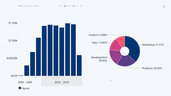
Elisio aims to create reports that contain less data on screen, and that is done by making sure that the space is used as efficiently as possible. He showed us two reports that are widely used across the organization and explained their impact on the data analytics process. Note: The example screenshots in this article have been anonymized with simulated data and placeholder values.
Example 1: Power BI Case Management Report
One of the examples he showed us was a management dashboard that’s viewed by 150 managers every day. This healthcare management report presents a clear and easy-to-read overview of the service quality, efficiency, worker productivity, and financials.
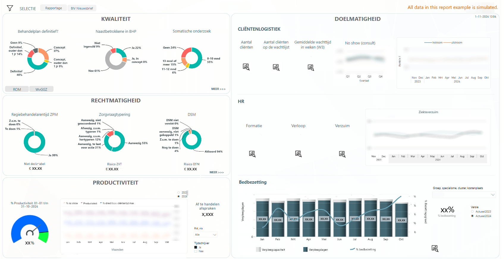
The report can be easily filtered to specific branches or locations. With row-level security, the report shows data that is relevant to each user – for example, the administrative department can explore all Arkin data, but specific branch managers can focus on their own specialty.
Crucially, the dashboard also visualizes the statistics on data integrity, which is important because each case must be filed accurately and according to the procedure to receive insurance compensation.
Ideally, all three Donut PRO charts in this section would be green, which means that all cases are cleared. But, if there are any issues, they can be quickly identified by clicking on the donut chart, which will drill through to a report page that shows a more detailed look at wrongly filed cases or other problems.

Simulated example
Since adopting Power BI + ZoomCharts, Arkin has significantly reduced the amount of rejected insurance claims, which in turn has saved thousands of euros for Arkin and the clients alike. One reason for that is the regular refresh cycle that provides the most up-to-date info to all users, and the other is the user-friendly reporting which makes it easy to find irregularities and swiftly correct them before it’s too late.
Example 2: Power BI Healthcare Overview Report
Elisio also showed us a healthcare dashboard in Power BI that’s used to identify cases at risk of not receiving insurance compensation. The initial view shows a holistic overview of the entire organization, displaying not just the amount of at-risk cases but also their costs.
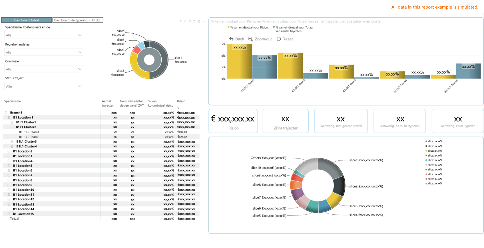
The user can then click on slicers or the interactive visuals to drill down to a specific branch, cluster, or team, and quickly find any specific case that needs attention – all with just a few clicks. Once the user filters data or drills down in one visual, the entire report will cross-filter, revealing valuable insights from multiple angles. Here's a visualization of how it would look in action:
Both examples use ZoomCharts visuals not just for data visualization, but also as an intuitive navigation and filtering tool that can replace complex slicer menus, making the report more interactive and space-efficient. Other reports used at Arkin have similar interactions, such as filtering data for patients in addiction treatment by their addiction type, or a time series chart that visualizes and allows exploring mental health trends on a timeline (e.g. seasonal depression).
Arkin’s Power BI reports with ZoomCharts are easy to understand and they provide a smooth and intuitive user experience. The reports tell more than just names and numbers - they visualize insights and put them in context to tell an engaging story from the data. You can see this concept in action by exploring our Report Gallery which offers a variety of professionally designed reports, each with a downloadable .pbix template file and a live demo.
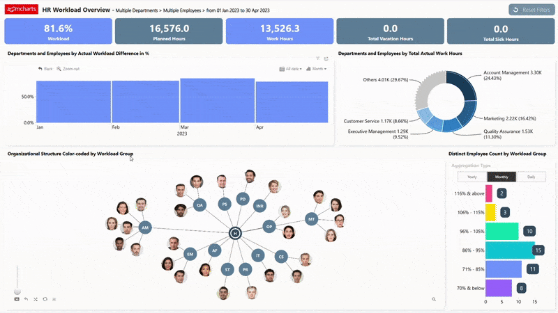
HR Workload Overview Report by ZoomCharts. View in Report Gallery
When reports are engaging to explore and they provide accurate and useful answers with just a few clicks, more workers can take part in the analysis process and use data every day – which is evidenced by the increase in report usage at Arkin, especially among workers and the management.
As soon as people see colors, buttons, and other familiar elements in a report, they feel an invitation to ‘zoom into’ the data – “Oh, you can click on everything?” And they start to click on everything. For them, it’s the natural feeling of processing the data.
Elisio Santos, Arkin
Key Takeaways
Arkin replaced their outdated data workflow (thousands of Excel worksheets) with Power BI, which made work with data more efficient and provided multiple benefits:
- Instant data updates
- Higher data quality and minimized errors
- Better data security and access control
- ‘One report’ approach
In addition, Power BI + ZoomCharts has enabled Arkin to create user-friendly reports that provide quick and valuable insights to healthcare specialists and data analysts alike.

Want more info like this?
Subscribe to our newsletter and be the first to read our latest articles and expert data visualization tips!


