May 10, 2019
Reveal your true organizational structure using Drill Down Graph PRO Visual and Power BI
ZoomCharts Drill Down Visuals family has a newcomer – the long-awaited Graph PRO visual. This is the first visual for Microsoft Power BI platform, which enables true graph data visualization, exploration and analysis
ZoomCharts Drill Down Visuals family has a newcomer – the long-awaited Graph PRO visual. This is the first visual for Microsoft Power BI platform, which enables true graph data visualization, exploration and analysis
ZoomCharts Drill Down PRO Visuals family has a newcomer – the long-awaited Drill Down Graph Visual. This is the first visual for Microsoft Power BI platform, which enables true graph data visualization, exploration and analysis.
Graph structures are all around us. Whether it’s sales, finance, HR, security or operations, all of these are not possible without a communication. This very fundamental information exchange process can be invisible in day-to-day business cycle; however, it may reveal many important aspects about your company. For instance, do you know who is communicating with whom in your company? How often? Communication frequency or lack thereof can help you identify the true inside-influencers, that may put your company at risk. Lack of communication may shed a light on slackers and help identify problems early on.
With these few examples in mind, let’s look at how you can use Drill Down Graph Visual already today to explore the true communication of your company.
Visualize, explore and analyze email communication among your employees
As digital communication is becoming more and more important everyday component of literally every-size business, communication analysis is critical to identify the true communication channels in your organization. In the graph context, every email address should be considered as a vertex (node) and every related email (recipient, cc, bcc) should be considered as a related vertex and the email then determines the relationship among those emails. For example if [email protected] sends an email to [email protected], both John and Sue would be vertices and they would be linked together with an edge which represents this particular email.
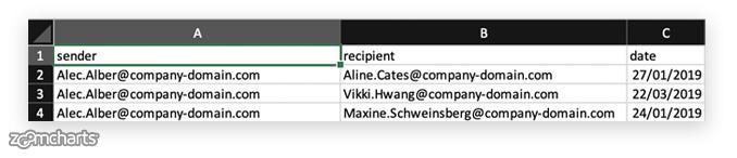
To proceed with the visualization, we therefore need data. Microsoft Power BI provides you countless data-connectors making it connectable to virtually anything (databases, APIs, spreadsheets, etc). For this example, we will use a basic Microsoft Excel file that contains the list of emails that have been sent for the period of interest. Each row contains, sender, recipient and date. Note, there may be multiple recipients in the same column separated by comma.
(Note, you can download this sample data file here )
To proceed, we need to start Power BI Desktop or Power BI Service and add data (Not sure how to add data? Read more here).
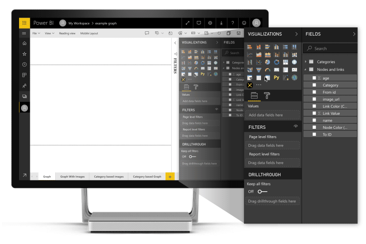
Now, with data loaded in Power BI, it’s time to build the report with the Drill Down Graph Visual. You can add the Graph Visual from the in-app marketplace (here is how), or if you would like to try the newest pre-release features you can download it here and then use “import from a file feature” to add the visual to the report.
Once, added it will appear on the Visualizations block as yellow cross mini-network on black background:
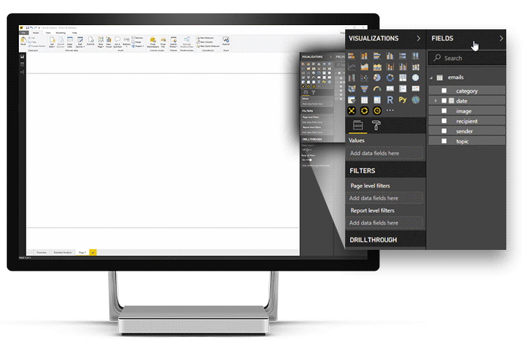
Next, click on that new icon to add the visual to the report. Once that is done, now you need to setup the data for the visual – drag “sender” into “source nodes”, “recipient” into “target nodes”. Finally, we need a value – in this case we will simply use count of the rows – to do that, just drag “sender” in “Value” field and choose “count”.
In this graph visualization we can see and identify the following:
- Who is sending emails to whom?
- How many emails person has sent?
- Zooming in on links would reveal actual emails between any two users.
Now, let’s add additional Drill Down PRO Visuals to further analyze the data. In this example we are using:
- Drill Down Donut Visual v1.4 for grouping emails by sender and recipient (we will use this visual as slicer/filter)
- Drill Down TimeSeries Visual v1.4 for grouping emails by time and day (this will act as time slicer/filter as well)
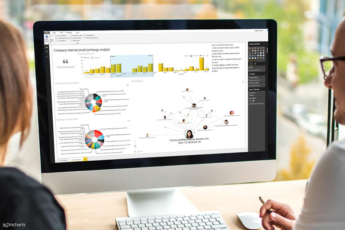
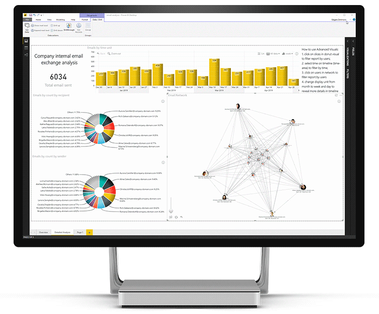
And here is the result:

In this report you can see:
- Total number of emails sent.
- Emails group by weeks (you can change this to days/years/hours/minutes/seconds).
- Senders by amount of emails sent.
- Recipients by amount of emails received.
- Graph structure among senders and recipients.
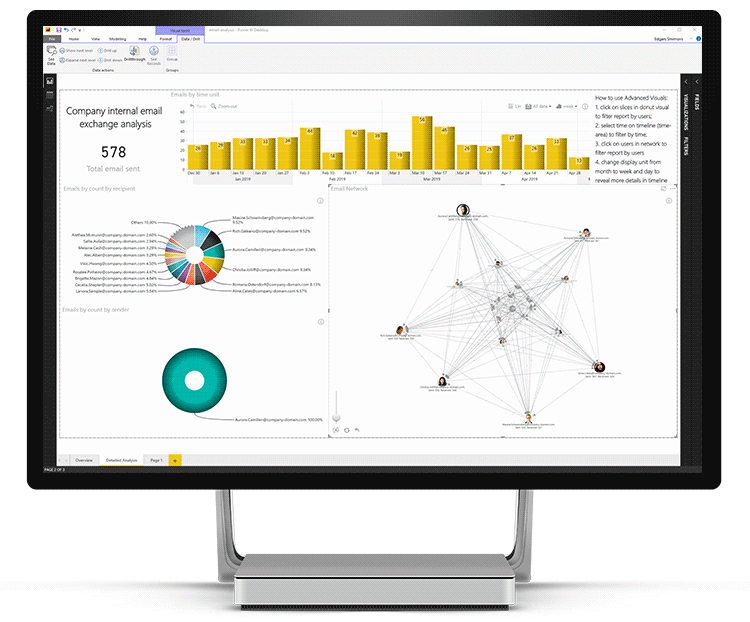
As all new Drill Down Visuals (version 1.4+) support cross-filtering, we can analyze data using filtering with a simple touch. Let’s say we want to explore the emails sent only by Aurora Camilleri. To do that, we can click on Aurora in the Graph Visual:
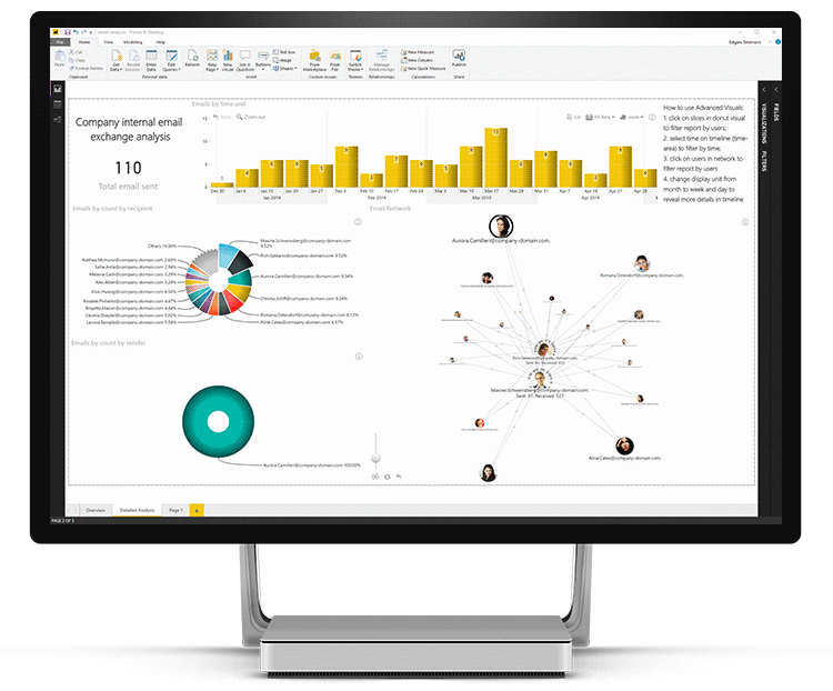
Now, in the recipient chart, let’s select Maxine and Rich (use shift+click) to reveal how often they communicate:
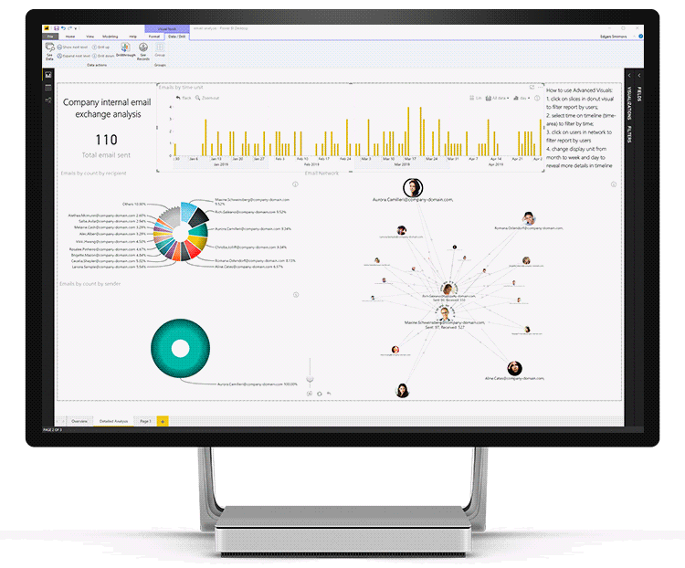
To further explore communication by days, we can toggle days in the Drill Down TimeSeries Visual to reveal more granular data:
From here we can select any time interval the same way as you select text click and drag on the Timeseries visual to filter specific time period. For instance, here is how communication looks like in March:
Live demo
Now, that you know how to use the Drill Down Visuals, we welcome you to explore this example to get a taste of the possibilities that these visuals unlock:
Customization
What sets Drill Down Visuals apart from other visuals, besides the super-easy drill-down and selection experience is customization. In the Drill Down Graph Visual, you can configure the size, color and shape of the vertices and edges; you can have data-driven color for nodes, and links. Node and link labels can be data driven as well. You can define your own categories and set styles for different categories including images.
Making analysis seamless
At the moment of writing this use-case, you can download version 1.2 of the Drill Down visuals from the in-app Marketplace. However, you can get the 1.4 version (which is used for this use-case) of the Drill Down visuals from ZoomCharts Drill Down Visuals website by logging into your account (don't have an account? start a free trial) – 1.4. is the most significant update of the visuals since their inception – you can already get a taste of what’s coming:
- Cross-visual filtering and support for multi-visual simultaneous filtering
- Performance updates for big data
- Custom theme support
- Various updates across the entire Advanced Visual family.
Conclusion
Connections can be observed in every aspect of business. Exploring and understanding the connections is tricky, but the Drill Down Graph Visual in combination with other Advanced Visuals makes it simple, powerful and productive. Just imagine what else you could explore with this approach in your company and what new improvements could become possible. We welcome you to start using the Drill Down Visuals today.

Want more info like this?
Subscribe to our newsletter and be the first to read our latest articles and expert data visualization tips!


