Dec 12, 2022
Top 5 Best Power BI Dashboards
When you look at the best Power BI dashboards, you’ll notice that they have a lot in common. They’re fast and easy to read, and responsive to mouse or touch inputs alike. On top of that, they’re visually pleasing and eye-catching.
When you look at the best Power BI dashboards, you’ll notice that they have a lot in common. They’re fast and easy to read, and responsive to mouse or touch inputs alike. On top of that, they’re visually pleasing and eye-catching.
A well-designed report can save the creator and users a lot of time and money. That’s why we will share our five best Power BI dashboards examples for your inspiration, briefly explain what kind of data they are for, what makes them so great and provide links to our Drill Down Reports so you can use them for your own data! In addition, we will give you some tips on Power BI dashboard design best practices.

Our best Power BI dashboards
What makes a great Power BI dashboard? Most importantly, it displays your data in a way that makes sense and gives a thorough insight. But, in addition to that, there are some less tangible yet equally important criteria that will vastly improve your users’ experience and speed up data navigation. Here are some of the signs that the Power BI dashboard is great.
-
It’s quick and easy to navigate. You can find the data you need with just a few clicks. With smart drill down interactions and filtering capabilities, your users will save a lot of time, as shown in this video.
-
It’s smooth and responsive to use. Your dashboard should be easy and intuitive to use. Furthermore, there are no frustrating lags or hold-ups.
-
It supports touch controls. Your dashboard should provide top-tier user experience regardless of whether your users use it on their PCs, presentation screens, tablets or even smartphones.
-
It’s interactive. Using Power BI to build plain old static dashboards is like buying a supercar just to do the groceries. A great dashboard will push Power BI’s capabilities to the max to deliver the best in data storytelling.
-
It’s exciting to use. A dashboard that’s fun to explore will motivate the users to pay more attention to the data and use your dashboard to make data-driven decisions.
With these criteria in mind, we have selected some of our best Power BI dashboard design examples. In addition, you can try out a live demo of each of them and download the sample file. Each of these dashboards is created using ZoomCharts Drill Down Visuals, and they follow Power BI dashboard best practices.
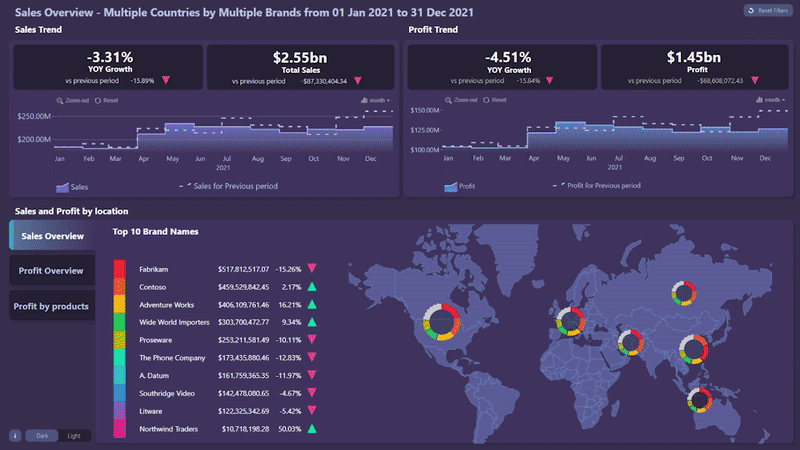
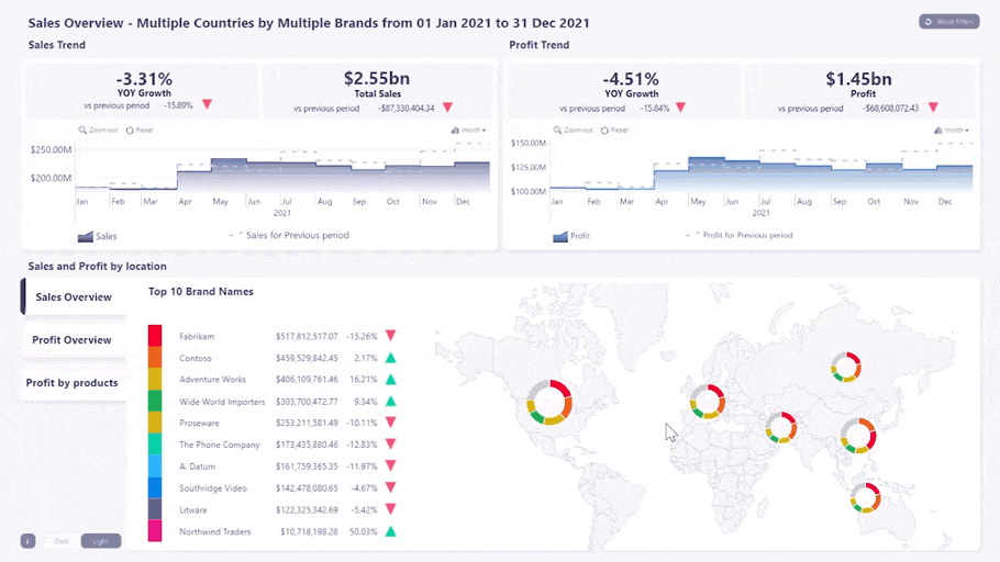
Power BI Dashboard #1: Sales Overview Report
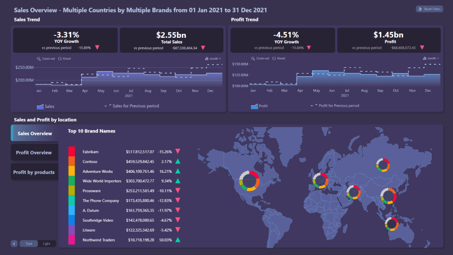
Visuals used: Drill Down Map PRO, Drill Down Timeline PRO
What’s it for: This dashboard shows a comprehensive overview of your sales performance, including sales revenue, profit, yearly growth, and sales by region.
What makes it great: If you’re looking for the best Power BI sales dashboard, here it is. The most important information – total sales revenue, profit, and YOY growth for each - is placed on the top of the dashboard so you can get an insight in your sales performance at first glance. However, if you want to delve deeper into your data, there are two interactive timeline charts – one for sales revenue, and the other for profits. In addition, you can see an overview of your sales performance per region on a map chart, and a list of your most successful brands or product categories.
The most impressive part of this dashboard are the intuitive on-chart interactions that make finding the data you need a matter of just a few clicks. For example, if you filter a certain time period on the timeline, all other charts will automatically adjust to show relevant data for the selected interval. Similarly, pick a certain country or region on the map chart, and the rest of the dashboard will dynamically show only data for the selected markets.
Furthermore, there’s a reset button on the top right corner that you can use to quickly return to the default view, and a dark/light theme switch. This is one of our best looking Power BI dashboards, and it will make exploring sales data exciting for your users.
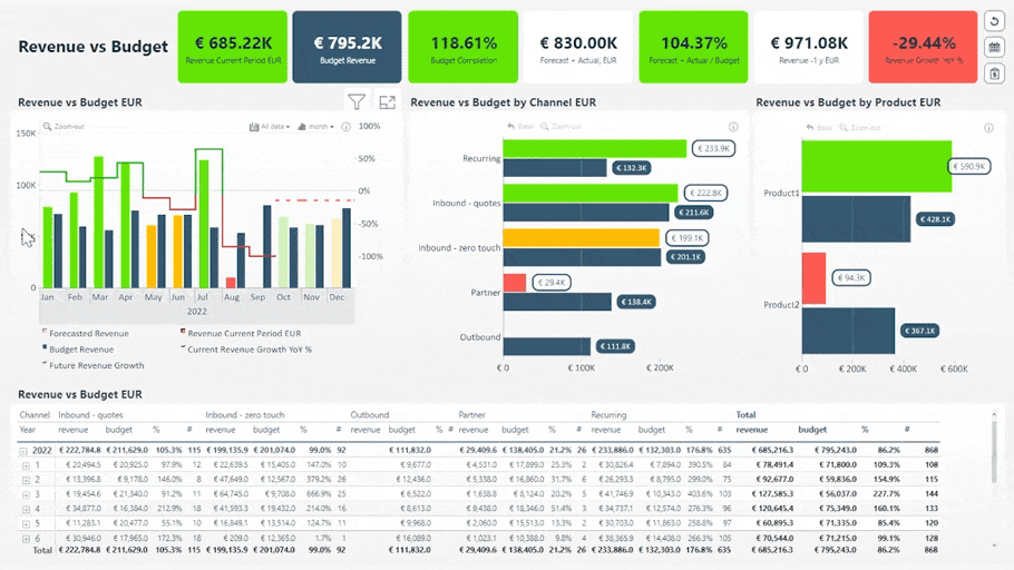
Power BI Dashboard #2: Revenue vs Budget Report
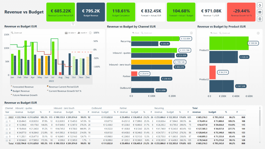
Visuals used: Drill Down Combo Bar PRO, Drill Down Timeline PRO
What’s it for: Get an overview of your business performance and see if you meet your targets with this finance dashboard.
What makes it great: Just like you’d expect from a finance dashboard, you can quickly get an insight into your main financial performance KPIs – current period revenue, budget revenue, budget completion, forecast, revenue growth, and more. With conditional formatting, these indicators will be color coded – if you see red, you’ll definitely know that some things need your attention.
Below you’ll find a timeline chart that shows per-month changes in the data. You can select a specific time period, and all other visuals will show data relevant only to that interval. There’s also one bar chart for a revenue vs. budget comparison per channel, and another one for products. Lastly, the table at the bottom will show you the raw numbers so you can cross-check them for accuracy.
Users will enjoy the clean and easy to understand design that combines quick scannability and great drill down capabilities. Report creators, on the other hand, will have a wide range of customization options at their disposal. The visuals used in this report - Drill Down Timeline PRO and Combo Bar PRO - give them the option to display up to 25 series as a combination of bars/columns, lines, and areas.
Power BI Dashboard #3: Sales Conversion Report
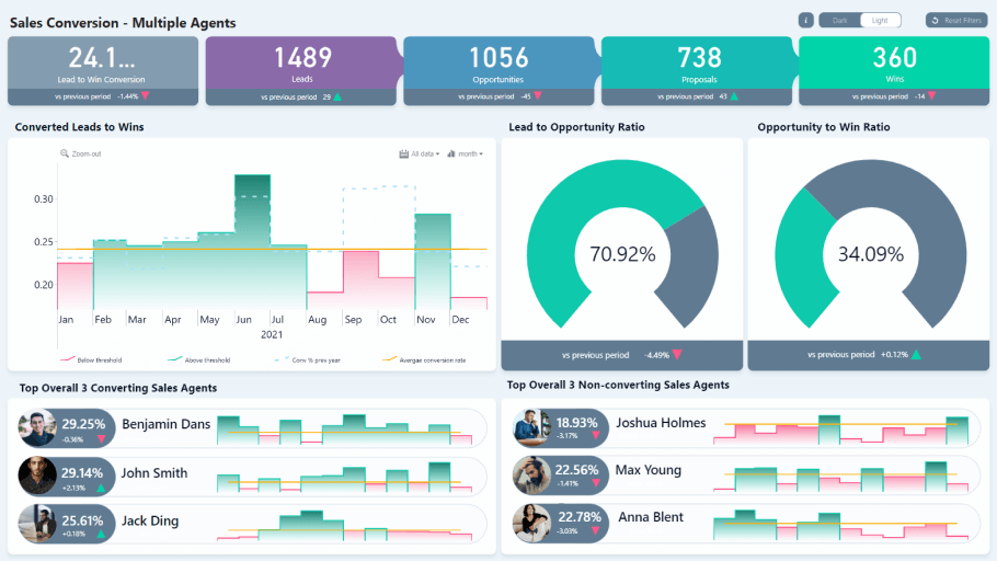
Visuals used: Drill Down Combo PRO, Drill Down Timeline PRO
What’s it for: Monitor your sales conversion rate, see the performance of your sales team, and identify the weak links in your sales process.
What makes it great: This dashboard gives an overview of your entire sales process, with KPI cards showing total leads, opportunities, proposals, and wins in the selected period, in addition to comparisons with the previous period for each. This dashboard will be a useful tool for sales managers.
On the upper left corner, you can see the lead to win conversion percentage, but the two gauges will show the lead to opportunity and opportunity to win ratio. There’s also a timeline chart that will show changes in leads to wins conversions. The average conversion rate will be displayed as a threshold, and with conditional formatting columns that fail to reach it will be marked in red. In addition, the last year’s results will be displayed as a dashed outline.
What’s more, you can see a top 3 of sales agents with the most conversions, and the bottom 3 with the least conversions. It’s a great way to identify which agents use sales methods that work, and which team members need to change their approach.
We invite you to try this dashboard for yourself because you will be astonished by how intuitive the interactions are. For example, if you select a certain time period on the timeline, the KPI cards and gauges will show the data from the selected interval, and the top and bottom 3 lists will adjust accordingly as well. In addition, your users can choose between dark and light theme.
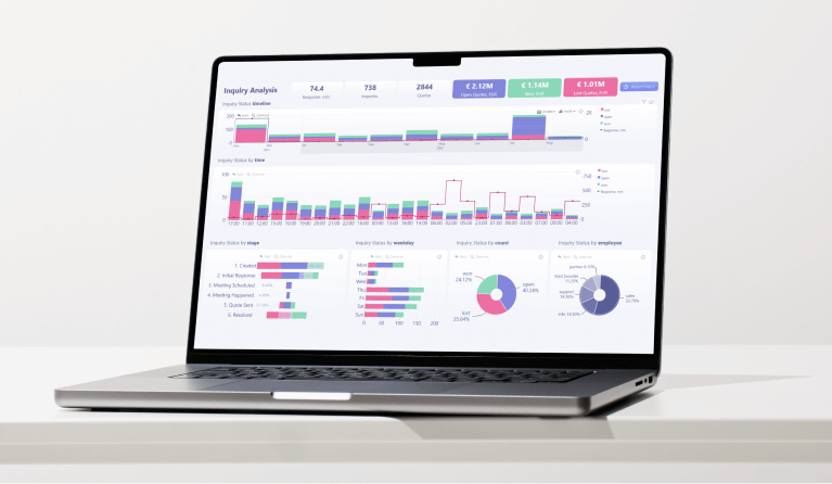
Power BI Dashboard #4: Inquiry Analysis

Visuals used: Drill Down Combo PRO, Drill Down Combo Bar PRO, Drill Down Timeline PRO, Drill Down Donut PRO
What’s it for? Monitor all your inquiries and see which of them are open, won and lost. The dashboard will calculate the value of these inquiries, your average response rate and other info.
What makes it great: Performing an inquiry analysis and finding the reason for possible lost quotes is not easy, which is why this dashboard features various visuals that will display your data from multiple perspectives.
For example, there are two different timeline charts, one of which displays a monthly view, and the other – an hourly view. The inquiries will be displayed as stacked columns, but the average response time will be shown as a line. In addition, you can use the bar, column, and donut charts to drill down further.
Just like the other dashboards mentioned in the article, the main benefit is the interactivity. With cross-chart filtering, you can see relevant info on all charts at the same time as you drill down. For example, if you select a specific employee on the donut chart, the dashboard will be filtered to inquiries processed by them.
Power BI Dashboard #5: Debtor Analysis
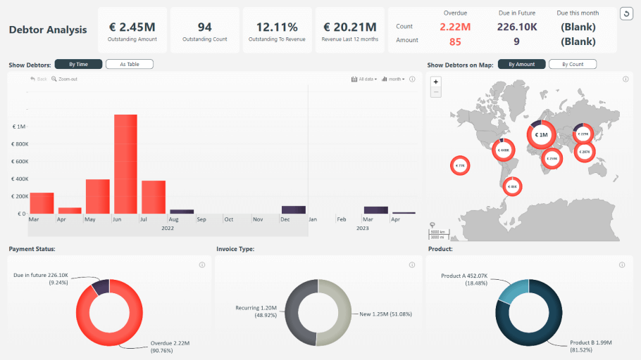
Visuals used: Drill Down Map PRO, Drill Down TimeSeries PRO, Drill Down Donut PRO
What’s it for: This dashboard will display all your outstanding and overdue payments so you can quickly perform a thorough debtor analysis.
What makes it great: Keeping track of all your debtors can be tricky, but this dashboard vastly simplifies this process by giving you an overview across multiple interactive charts. The KPI cards on the top of the dashboard will show you the total outstanding amount, count and ratio to revenue, in addition to other crucial data.
Below you’ll find an interactive TimeSeries PRO chart that will give you a monthly view of all your debtors. Furthermore, there’s an interactive map that you can use to see where your debtors are located, in addition to three donut charts that will visualize the percentage of due and overdue payments, invoice types and products.
The dashboard will dynamically filter the relevant data as you drill down on any of the visuals. For example, when you select a certain period on the timeline, the other charts will show data from that interval. You can also display the data as a table by pressing the As table button. If you want to return to the default view, simply press the Reset button on the top right corner.
Power BI Dashboards vs. Reports – what’s the difference?
Many believe that Power BI dashboards are the same thing as reports and use these terms interchangeably. As with all things, the devil is in the details. While both might seem similar at first glance, they fulfill different purposes.
Dashboards are single-page overviews that are designed to give a quick insight into your data. In most cases, they are used by the C-level and other decision makers, and they provide a big-picture overview of various metrics from multiple data sources in one place.
Reports can feature one or multiple pages and, in most cases, they provide interactive analysis of a single data source. Unlike dashboards, reports are designed to offer a deep insight into the data in question, offering a lot of drill down features.
Our Drill Down Reports blur the line between both definitions. They are designed to bring the most important data in focus and be easily scannable, just like the best Power BI dashboards. However, they also provide various ways to drill down deeper into the data with interactive visuals and features like cross-chart filtering.
Benefits of having a well-designed dashboard
On its own, data is just numbers - it’s up to the report creator to decide what to do with it. There are many decisions you must make when you’re creating your dashboard, such as what visuals to include, what colors to use, and how to lay it all out in a single view. All these factors are important to ensure top-notch user experience.
Some creators make their dashboard from scratch, while others prefer downloading a professionally designed template such as Drill Down Reports and adjusting it to their needs. Both methods are equally valid, and it’s up to you and your preferences to decide which route do you go.
Here are some of the main reasons why upgrading your data visualization workflow with premium visuals and dashboards is a sound investment.
Save time and money
While a couple of seconds might seem insignificant, they do add up in the long run. A dashboard that offers valuable insight already from the first glance will save an incredible amount of time. Furthermore, if your dashboard is intuitive and responsive, each interaction will take less than a second, and the user won’t have to waste time finding the data they need.
In a dashboard with intuitive drill down features and cross-chart filtering, each interaction can take up to 90% less time. Seconds add up to minutes, and if you multiply that by the total amount of users, you can see how a good dashboard can save a lot of hours in the long run.
Just imagine how much shorter your meetings can be when your team is spending less time navigating the dashboard and more time talking about the data!
Make more confident decisions
Many people believe that the purpose of a dashboard is to simply visualize numbers. We, however, believe that the best dashboards in Power BI tell a narrative. Data storytelling is an important factor that you need to take into consideration when choosing the tools with which you visualize your data.
A great Power BI dashboard that includes appropriate visuals will give the necessary context for your data, allowing you make swift data-driven decisions. Intuitive drill down features will allow you to choose between seeing the big picture or focusing on the minute details.
In a truly interactive dashboard, the visuals will work together to bring you relevant data across all charts so you can view and analyze the data from multiple contexts at the same time. When your business intelligence is this thorough, your team will make your decisions more confidently.
Motivate your team to embrace Power BI
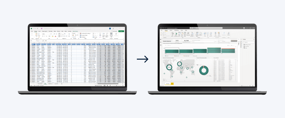
We can’t deny that we have a soft spot for Microsoft Excel. Initially released in 1985, it started a revolution in spreadsheet software. Even today, it provides a lot of powerful features, which is why many companies still use Excel for their data analysis.
However, with more than 37 years under its belt, Excel has started to show its age and is vastly outclassed by more recent software that are more suited for their jobs. For example, Power BI is an incredible tool for business intelligence and data visualization. Making the switch will vastly improve your data workflow.
One well-made dashboard might be just enough to impress your team and convince them to make the switch to Power BI. You can even import your Excel files into Power BI to use your already existing data.
Improve user experience
Some benefits can be measured with numbers, such as saved time or money. Others, however, are intangible, yet equally important. For example, if your dashboards are aesthetically pleasing and visually coherent, your users will find more joy in data exploration and be more enthusiastic about using them.
In addition, if your dashboards are used in meetings with partners or other stakeholders, they can leave a positive impression of your company. You can use the wide range of customization features to implement your organization’s brand guidelines, making the dashboard unmistakably yours.
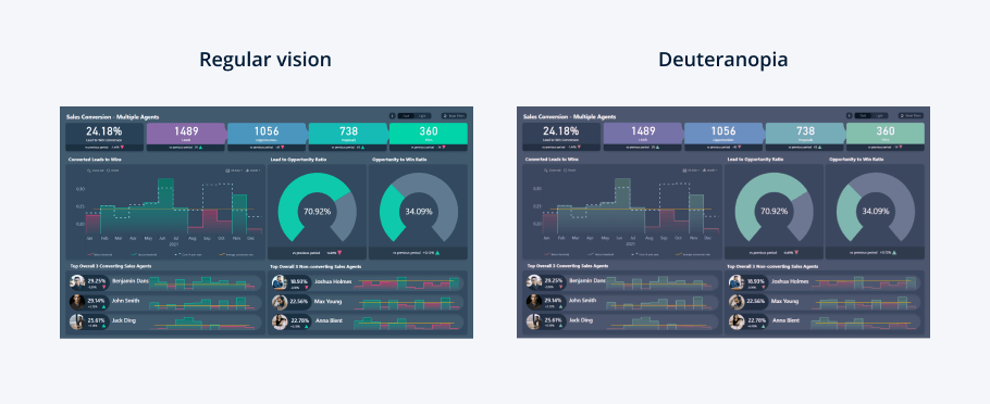
Lastly, your reports and dashboards should be designed in a way that removes accessibility barriers for colorblind users. Colors and other visual effects can be used as an accent, but your dashboard should be equally salient for people who have color vision deficiencies.
Conclusion
These are some of our best Power BI dashboard templates that combine easy readability and quick insights with rich functionality and interactive drill down capabilities. Check out our Use-case Gallery to see all our reports and try out the live demos to find the best dashboard Power BI can offer!

Want more info like this?
Subscribe to our newsletter and be the first to read our latest articles and expert data visualization tips!


