Jun 18, 2025
NEW VISUAL: Drill Down Line PRO for Power BI
Say hello to Line PRO, the latest addition to the ZoomCharts family of custom visuals for Power BI! It takes the best ZoomCharts features – interactivity, customization and user experience – and delivers a focused and streamlined solution for Power BI users who are looking to take their line charts to the next level.
Say hello to Line PRO, the latest addition to the ZoomCharts family of custom visuals for Power BI! It takes the best ZoomCharts features – interactivity, customization and user experience – and delivers a focused and streamlined solution for Power BI users who are looking to take their line charts to the next level.
Show more than just the numbers. Tell a story with your data.
What do you imagine when you hear the phrase “line chart”? You probably think of a line that connects points on X and Y axes and shows the changes in numbers. A simple and intuitive visualization type that is familiar to almost any business user. When you’re tracking trends, monitoring KPIs, or visualizing changes, line charts are the classic choice.
However, what if your line charts were smarter, more interactive, and more customizable? What if they were more than static graphs for surface-level insights, but rather an invitation to thoroughly explore data for confident and fully informed decisions? And what if they seamlessly integrated with other visuals on the report to instantly cross-filter and reveal the complete picture?
If the line chart that we just described sounds like music to your ears, then our brand-new Drill Down Line PRO visual for Power BI is just what you need. Like all other members of our Drill Down Visuals family, it is designed for creators who want to build the most insightful, intuitive, and beautiful reports and push the data visualization capabilities of Power BI to the max.
Here are the standout features of Line PRO; click to jump to its section and read a more detailed description.
- Interactivity: Seamless user experience with intuitive on-chart interactions, smooth animations, and full support for mouse/keyboard and multi-touch devices alike.
- Drill down: Easily create a hierarchy with up to nine category fields. Drill down for deeper insights with just one click directly on the chart.
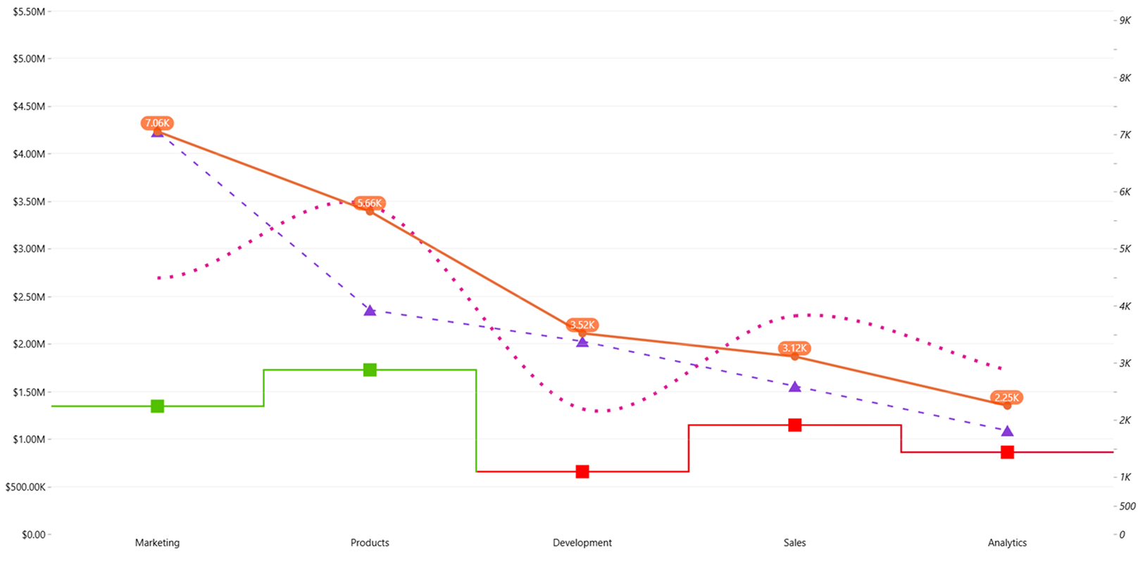
- Up to 25 series: From a simple line plot to advanced charts with multiple lines – create the perfect visual for your use case. Use the same default settings for all or configure each series separately.
- Multiple line styles: Craft the perfect line for your story – whether it’s solid, dotted or dashed; sharp, curved or stepped; and with or without markers and value labels.
- Conditional formatting: Use colors to tell a narrative – apply data-driven formatting conditions to the line itself, its value label text and label background.
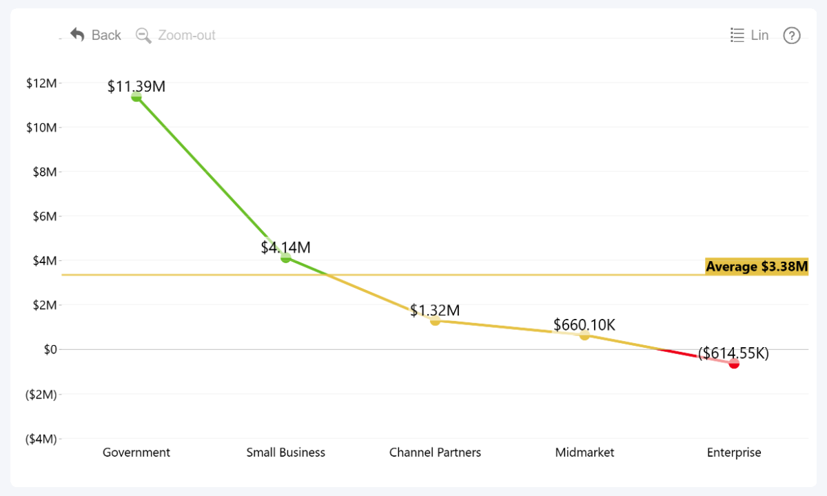
- Thresholds: Visualize KPIs or benchmarks with up to four horizontal lines and areas at constant or calculated values. You can even compare two values and show the difference as an arrow.
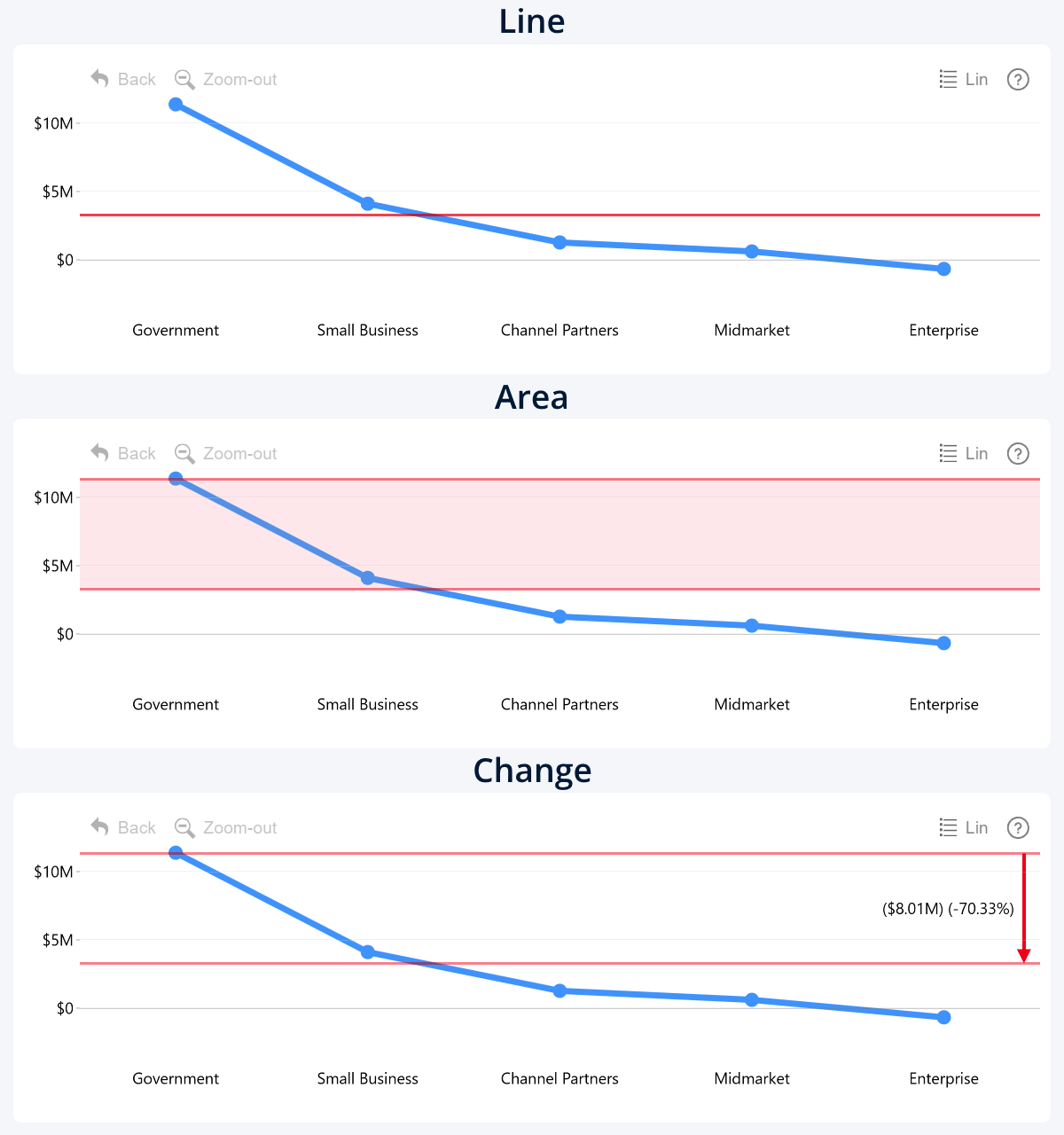
Drill Down Line PRO shares all these features with our popular Combo PRO visual. However, whereas Combo is an all-in-one multitool with three different chart types (columns, areas, and lines), the new Line PRO visual is a focused tool with just one purpose – create the best line charts that Power BI can offer.
Class-Leading Interactivity
Drill Down Visuals by ZoomCharts are characterized by their smooth and interactive user experience, and Line PRO is no exception. Go beyond static line charts and make your data come alive with our thoughtfully designed and responsive on-chart interactions:
- Click or tap on data to drill down.
- Hover to reveal tooltip that shows all values on the category.
- Drag sideways to scroll horizontally.
- Drag up/down to zoom in or out.
- Long press or Ctrl+click to select data.
- Triple click to invert selection.
- Click on legend items to hide/show the series
These interactions are designed to make exploring data easy and engaging for users of any experience level. Each interaction is accompanied by a smooth animation that makes the report feel responsive and reveals where the data is coming from. What’s more, Line PRO will seamlessly integrate in your report and instantly cross-filter to reveal focused insights from multiple perspectives, allowing you to create smart and insightful Power BI reports.
On-Chart Drill Down
Line charts with drill down are nothing new in Power BI – but Line PRO differs by putting it front and center for the users. In other visuals, drill down is usually accessible with a context menu button or some other off-chart interaction – and, if the user doesn’t know that it’s possible to do that, they’ll miss out on valuable insights.
However, in ZoomCharts, drill down takes the center stage – it is the default tap or left click interaction. Want to delve deeper? Simply click directly on data, and the chart will instantly reveal the subcategories underneath. Line PRO supports up to nine category fields for your drill down hierarchy, allowing you to create sophisticated and detailed charts that deliver complete insights – but only when the user needs them.
Up to 25 Series
From a simple line plot with just one series, to complex visualizations that compare many different series or measures – Line PRO has the potential to realize the exact type of line chart that you need for your report. It has 25 (yes, you read that correctly, twenty-five!) separate fields for value columns or measures.
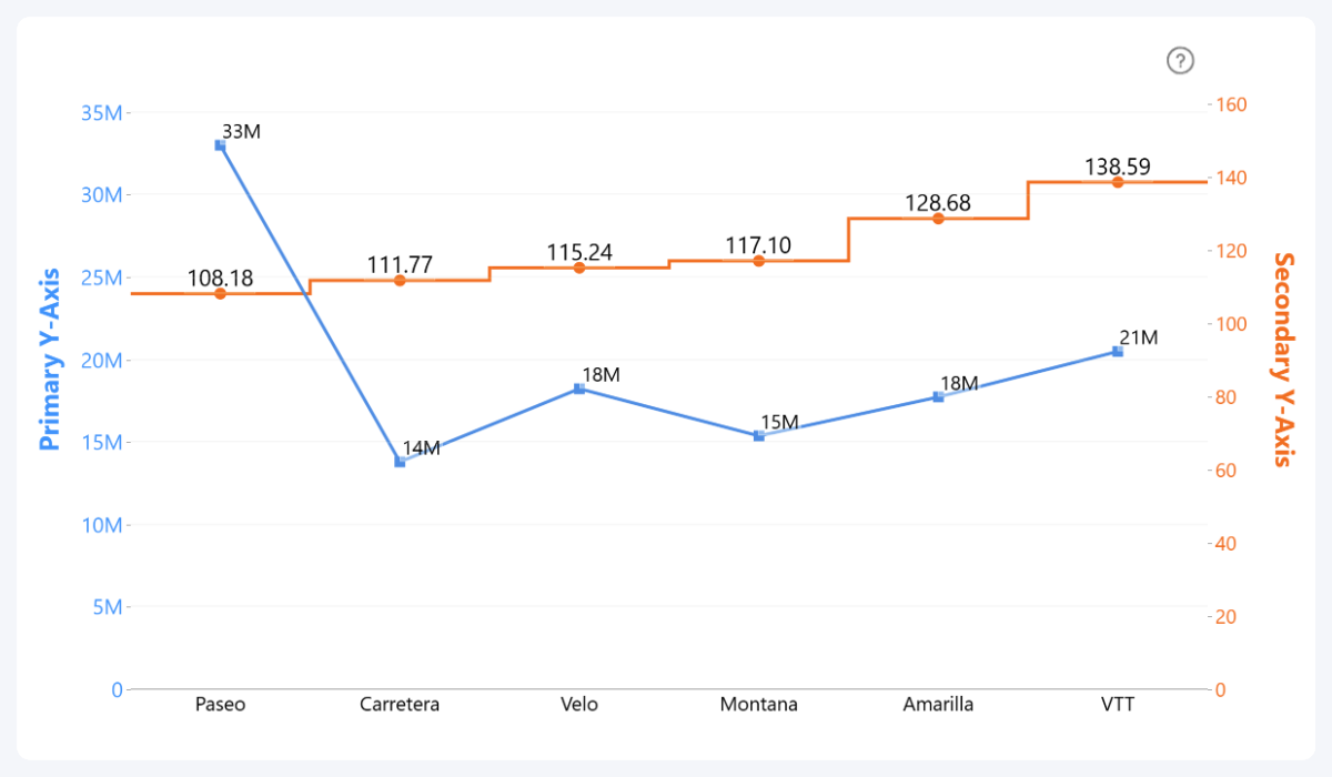
Visualize as many lines as you want, compare them against each other or create stacked line charts. Or, if you want to deliver on-demand insights, use the “Enabled by Default” toggle to choose which series is visible in the initial view, and which series will be displayed only after the user clicks on their legend items. You can also enable a secondary Y-axis for your line chart and choose which series uses which axis.
And, best of all, you can apply the same default settings to all series, or configure each series separately with their own settings – including line and marker appearance, value labels, stacking, no data policy, and more.
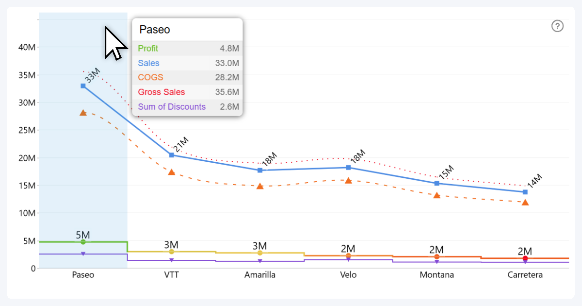
What’s more, the fan-favorite custom ZoomCharts tooltip is also available in Line PRO! When the user hovers over a category, the tooltip will show all series values (unless you manually exclude the series with Show in Tooltip toggle), plus all text or numeric columns/measures you have added to the Tooltip Content field. This way, users can access detailed and accurate values on demand.
Multiple Line Styles
Tell your data story the way you want! In Line PRO, you can configure various line appearance settings, including:
- Line Type (solid, dotted, dashed): Choose the line appearance for the series. Use case: solid for actual values and dashed for projections or targets.
- Stepped Outline (on, off): You can enable “stepped” appearance that connects each value with right angles. Use case: when comparing different values against each other, instead of visualizing change as a continuous line.
- Outline Smoothing (on, off): Choose if the line directly connects each value with a straight line, or eases the corners for a sleeker, more appealing appearance. Use case: To emphasize the “flow” of change across categories, plus aesthetic preferences.
- Markers (none, circle, square, rhombus, triangle, inverted triangle): Enable and configure markers that show where the values are on the line.
- Value Labels (on, off; reveals additional settings): Show the values directly on the chart with labels, and configure font, background, placement and other settings.
- No Data Policy (join, zero, zero in range, skip): Choose how the line treats categories with empty or missing values – does the line keep on going over empty categories to maintain sleek appearance, show them as zero values, or skip them entirely for maximum accuracy?
Combine this with the ability to configure each series separately, and with Line PRO you can craft truly powerful and insightful visualizations where each line is tailored for the type of data it is visualizing. Whether it’s a Power BI dotted line, dashed line or smooth line chart, Line PRO can handle it.
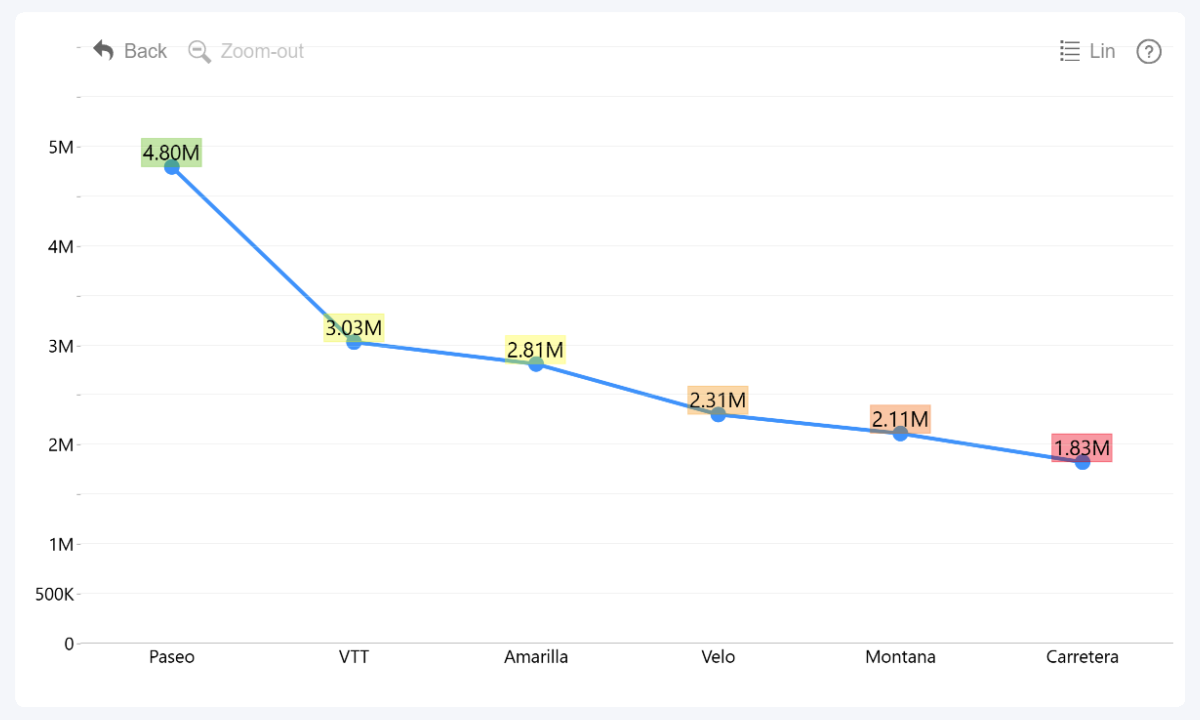
Conditional Formatting
We love colors. They’re not just a way to make your report beautiful and eye-catching – they are also a valuable tool for data storytelling. That’s why Line PRO includes conditional formatting for the line color, value label font, and value label background.
Define up to three color points and apply them as solid colors, a linear gradient, or stepped color scale based on your conditions to change the Power BI line color based on value:
- Constant value: Manually enter numeric values to place the color points.
- Calculated value: Set color points at calculated series values (Min, Max, Average, Percentile, etc.).
- Another series: Compare one series against another and apply color rules if the value exceeds its counterpart in the other series.
- ‘Color’ field: Provide a column or measure with color names, hex or HSL codes to apply them to its adjacent value in the series.
This is a powerful way to deliver instant insights at the first glance and give an additional dimension to your data.
Thresholds
In Line PRO, you can enable up to four thresholds that will be displayed in the chart background – either as a horizontal line, a shaded area between two values, or a change indicator that compares two values and shows the difference as an upwards or downwards arrow.
You can choose the threshold type and configure its appearance for each of the four thresholds separately. Here are the ways you can determine the line placement, area boundaries or the two values for comparison:
- Constant value: Manually enter the Y-Axis value where it will be displayed. Useful when comparing data against static KPIs or targets.
- Calculated series values: Reference any of the available series and use its first, last, average, median, minimum, maximum, or percentile as the threshold value.
Start Building Smarter Reports with the new Line PRO
Line PRO is a part of a bundle with more than 20 Power BI custom visuals. They will seamlessly work together to create dynamic and engaging reports that deliver fast and accurate insights with each click. Sign up for the free 30-day trial and get unlimited access to all our visuals - try all features and feel the difference!

Want more info like this?
Subscribe to our newsletter and be the first to read our latest articles and expert data visualization tips!


