Dec 20, 2022
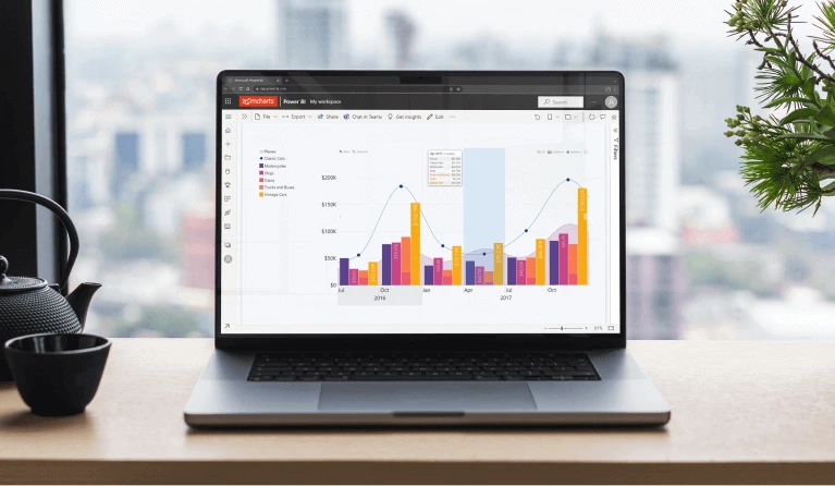
Make Power BI Time Series Charts Easily
Time is of the essence. This is also true for data. When assessing the performance of a business, people want to look at quantifiable results to develop their future strategy. However, looking at data from a time-based perspective can reveal valuable insights into seasonal trends. Using this information, companies can adjust to any changes that plain numbers fail to show. That’s where a Power BI time series chart comes into data visualization.
Time is of the essence. This is also true for data. When assessing the performance of a business, people want to look at quantifiable results to develop their future strategy. However, looking at data from a time-based perspective can reveal valuable insights into seasonal trends. Using this information, companies can adjust to any changes that plain numbers fail to show. That’s where a Power BI time series chart comes into data visualization.
What is a time series chart?
Time series charts use two axes – the horizontal axis represents time, and the vertical axis depicts values. The chart itself is filled with data points that correspond to both a value and the moment of time when that value was recorded.
When we connect these data points in chronological order using lines or columns, we are greeted with a jagged chart that shows various drops and peaks. Considering the context of time, we can learn a lot about the financial growth of a business, its productivity, seasonal trends, and much more. We can also extract different insights, depending on if we’re going by years, months, or maybe even minutes.

A time series chart is an invaluable tool for your reports if you want to thoroughly examine how your company is doing. For this purpose, we’ve created our own custom visual for Power BI - Drill Down TimeSeries PRO lets users examine time-based data more efficiently than before.
Why use a Power BI time series chart?
If you want to understand how your data behaves over time, Drill Down TimeSeries PRO is a must for creating seamless Power BI time series charts. By adding a time-based context to your data, you can spot trends and unprecedented changes. Add in other types of data sets or metrics, and this type of chart will help you find valuable correlations. In turn, you will be one step closer to properly addressing these changes.

A well-made time series chart will help end users see and identify any trends, analyze changes over time, or spot any cyclical or seasonal patterns. Users can see if the behavior of certain metrics is influenced by factors related to time. This will help them plan accordingly and use this information to their advantage.
What is the difference between our timeline and time series charts?
Our arsenal of Drill Down Visuals contains ten different custom visuals for Power BI, fitting even the most advanced data visualization needs. Upon taking a closer look, you can find two custom visuals built to display time frames – Drill Down TimeSeries PRO and Drill Down Timeline PRO.


While appearing similar at first glance, these two visuals have their own specific use when it comes to building Power BI reports with them. The major difference to keep in mind is that Drill Down TimeSeries PRO does not support DAX calculated measures, unlike Drill Down Timeline PRO.
If you happen to use a DAX measure within TimeSeries PRO, it will be limited to the lowest level of the hierarchy. The visual will not let you drill up in the hierarchy, making you stuck at one level.
However, that also means Drill Down TimeSeries PRO is simple to set up and does not require extensive knowledge in data modeling. If you are interested in more advanced depictions of timeline data, we recommend you check out Drill Down Timeline PRO!
Use cases for Power BI time series charts
You can usually find time series charts for data visualization in reports that focus on statistics, finance data, price monitoring, or any instance that has time-based measurements. For ideas, we’ve written up a few use cases for Power BI time series charts.
Monitor stock prices
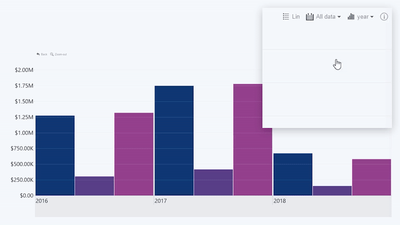
Power BI time series charts will work perfectly for monitoring changing stock prices. By obtaining the necessary data, creating such a time series chart would be very easy, as the visual can automatically aggregate time units.
Using Drill Down TimeSeries PRO’s impressive drill down capabilities, users can easily drill down from a yearly, to a monthly, and even daily view. A higher hierarchy level, meaning a monthly view, could reveal insights into a seasonal correlation with stock price changes.
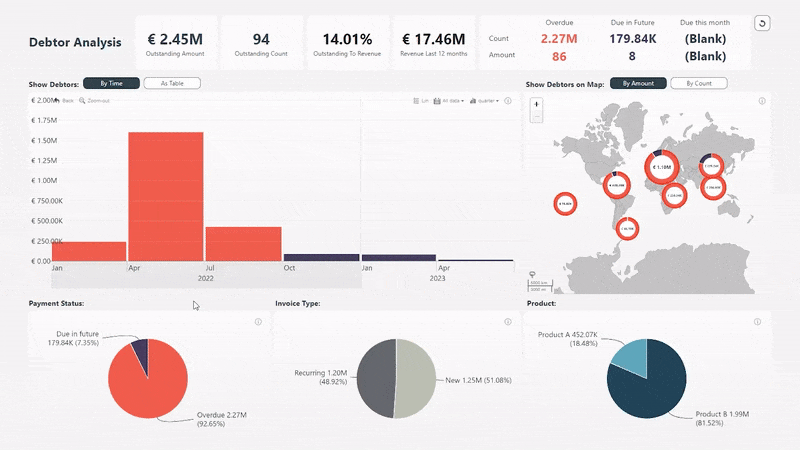
Debtor analysis

This report from our Report Example Gallery combines Drill Down Timeseries PRO with other Drill Down Visuals – Drill Down Donut PRO and Drill Down Map PRO. All these visualizations work together to bring a comprehensive report of all upcoming and outstanding payments the company needs to collect on a global scale.
Drill Down TimeSeries PRO works excellently here to show when an invoice has turned overdue or is due in the future. This type of data storytelling requires a timeline depiction. The columns show the total amount that is owed.
Using Drill Down Visuals’s impressive cross-chart filtering capabilities, users can easily click on any point in the chart that interests them. For example, a user can click on the Power BI time series chart, and it will immediately affect the rest of the chart and let users explore further in detail. The donut charts can also be used as filters for the rest of the report. Meanwhile, the time series and map charts will adjust to reveal information pertaining to that category.
Forecasting budget

Drill Down TimeSeries PRO can be used for forecasting data just as well as Drill Down Timeline PRO. The difference comes down to how well each visual handles DAX measures. For example, if you have a pre-calculated forecast coming in from your data source, that means your values act as calculated columns and can be summed up. In this case, Drill Down TimeSeries PRO will be the best fit.
If you want to use DAX calculated measures that rely on report context, then use Drill Down Timeline PRO to avoid being confined to the lowest level of the hierarchy. However, that also means the setup will include more steps. It just comes down to evaluating how complex the data you want to visualize is.
How to make a Power BI time series chart
The setup for Drill Down TimeSeries PRO is quite simple, making that its biggest strength. After downloading the custom visual, just follow these next steps:
Step 1: Add your data
To create your time series chart, you will need to add your data. The data you add will be used for the Date and Series fields.

If you want to practice, you can head to ZoomCharts Academy to create an instance of Drill Down TimeSeries PRO with our sample data.
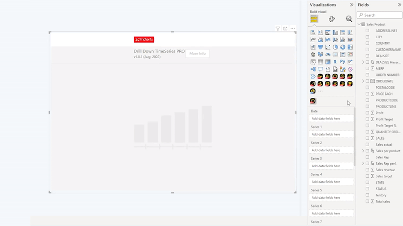
Step 2: Place the visual on your report
After adding the necessary data, it’s time to import Drill Down TimeSeries PRO. This can be done by selecting the custom visual from the list of icons in the visualizations panel on the right. If you haven't acquired Drill Down TimeSeries PRO yet, you can do that by heading to our product page or visiting the AppSource. If you have already purchased the visual from our website, simply import the visual from a file.

Step 3: Select the data
The main fields you need to fill in are Date and Series. The Date field accepts a singular column as a regular date column.
Take note that this visual does not support date hierarchy, because we are working with different custom time periods – hour, half an hour, and seconds. The built-in Power BI hierarchy does not support these elements, which is why you must use a regular date field.
After, drop in all the data for your series. These will be the numerical values on your time series chart. In total, Drill Down TimeSeries PRO supports up to 25 series.
To enhance your Power BI time series chart, we’ve listed a few ideas on how you can customize this visual. Of course, you can also learn all the ins and out of Drill Down TimeSeries PRO by visiting ZoomCharts Academy!
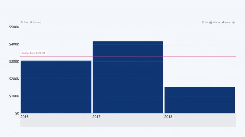
Add thresholds
Drill Down TimeSeries PRO lets you add and combine up to four thresholds. The first option is just a simple line.

And so, you have a line chart that displays temporal data on one axis.
The next thing you can do is change the threshold type to Area. This will, in turn, present you with two values – From and To. These can be used to determine what values your area threshold will occupy. Change the chart position from Above to Under, and now you have a threshold area behind that chart!
Like that, you can combine up to four thresholds and color them accordingly to determine whether the column values are above or below certain benchmarks. You can also combine them as a line and area.

Additionally, instead of using static values for your threshold, you can also use dynamic values. For example, if you want a line threshold that shows the average payout throughout, simply change the value type to Average. Make sure you don’t forget to enable labels, so that your users can see the values themselves!
Choose different chart types
Drill Down TimeSeries PRO lets you choose from three chart types – column, line and area. Depending on how you’re using thresholds, you can choose the chart type you believe is better for visibility.

Similarly to Drill Down Combo PRO, Drill Down TimeSeries PRO also has the option to use stacked or clustered column charts. If you want to compare multiple series within a category, use clustered column charts. However, if you want to show proportional data to give an insight into how much each series contributes to the whole, use stacked column charts.

Customize all aspects
Drill Down Visuals for Power BI aim to deliver the utmost freedom to report creators in the customization area. Drill Down TimeSeries PRO is no exception. To make your chart visually appealing while enhancing the user experience, Drill Down TimeSeries PRO lets you do this in a variety of ways.
You can add and customize value labels, choose the legend markers for each series, use tooltips, and combine areas, lines, and columns. And that’s just the tip of the iceberg! With Drill Down TimeSeries PRO, the sky really is the limit.

Similarly to Drill Down Combo PRO, Drill Down TimeSeries PRO also has the option to use stacked or clustered column charts. If you want to compare multiple series within a category, use clustered column charts. However, if you want to show proportional data to give an insight on how much each series contributes to the whole, use stacked column charts.
Conclusion
If you need a visual that will let you easily create a time series chart while still delivering full customizability, Drill Down TimeSeries PRO will be up for the job. Using its vast customization options and intuitive interactions, report creators can create Power BI reports that will immerse users into their data.
To get started with Drill Down TimeSeries PRO, start your free trial now!

Want more info like this?
Subscribe to our newsletter and be the first to read our latest articles and expert data visualization tips!


