Power BI has become the market-leading business intelligence platform for a reason. More than 250,000 organizations worldwide use it to turn raw data into decisions. But knowing that it is widely used is different from knowing why it might be the right choice for your business.
This guide covers the nine biggest benefits of Power BI, from its data connectivity and Microsoft 365 integration to its AI capabilities and custom visual ecosystem, with enough detail to help you decide whether it belongs in your organization.
| # | Benefit | In one line |
|---|---|---|
| 01 | Data connectivity | Connect Excel, SQL, cloud services, and 500+ sources in one place |
| 02 | Microsoft integration | Native integration with Teams, SharePoint, Azure, and Microsoft Fabric |
| 03 | Data analytics capabilities | From simple tables to snowflake schemas with DAX and Copilot AI |
| 04 | Security and governance | Row-level security, sensitivity labels, and Microsoft Entra integration |
| 05 | Industry leadership | Named Gartner Magic Quadrant leader for BI platforms in 2024 |
| 06 | Cost and scalability | Free desktop version, affordable Pro tier, enterprise capacity available |
| 07 | Self-service analytics | Drag-and-drop reports without technical training or IT dependency |
| 08 | Mobile and web support | Native iOS and Android app with touch-optimized interaction |
| 09 | Report creation and visualization | Interactive reports with drill-down, cross-filtering, and custom visuals |
What is Power BI?
If your company is looking to adopt a data-driven approach to decision-making, your choice of business intelligence platform is crucial. It is the main component of a data-driven culture and will directly affect how you work with data and how users interact with it every day.
Power BI is a business intelligence platform developed by Microsoft that connects to multiple data sources, transforms raw data, and visualizes it as interactive reports and dashboards. Its core purpose is to turn large amounts of data into insights that users can explore and act on without needing technical training.
Power BI is available across multiple pricing tiers, from the free Power BI Desktop application to enterprise-scale Premium capacity. If your organization already uses Microsoft 365, Power BI Pro is included in the E5 subscription. Power BI is also a core component of Microsoft Fabric, the unified data analytics platform launched in 2023.
Top 9 Benefits of Power BI
Wide Data Connectivity
Connect, clean, and reshape data from virtually any source
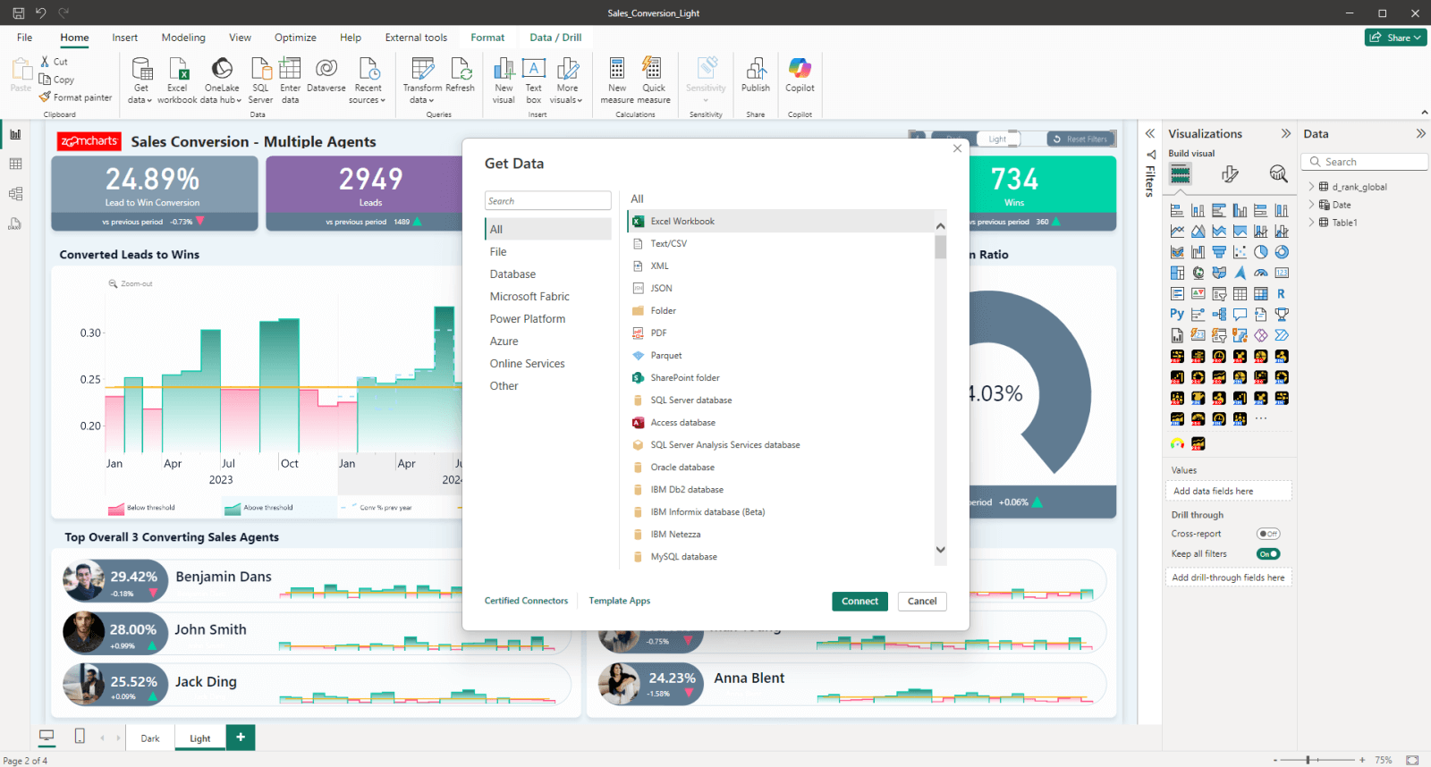
Power BI uses Power Query as its built-in data transformation engine, enabling connections to hundreds of data sources without writing a single line of code. From Excel spreadsheets and SQL databases to cloud data warehouses and third-party services, Power BI can gather, transform, and visualize that data all in one place.
This provides a lot of flexibility, making it suitable for almost any business and their requirements. Whether processing a few spreadsheets, pulling from Salesforce, connecting to Amazon Redshift, or querying a large Azure data lake with the use of connectors, the same tool handles all of it.
Deep Microsoft Ecosystem Integration
Works natively with Teams, SharePoint, Azure, and Microsoft Fabric
If your organization already uses Microsoft products, Power BI fits in without friction. It connects natively to Azure cloud services, Dynamics 365, SharePoint, and Active Directory. On the user side, reports can be shared directly in Microsoft Teams, exported to PowerPoint, or embedded in SharePoint pages.
Furthermore, Power BI is a part of the Microsoft Fabric unified data platform, which consolidates data ingestion, warehousing, processing, and reporting into a single environment. Power BI is the reporting and visualization layer of this ecosystem, allowing easy self-service data analysis.

Image source: Microsoft Azure Blog
Power BI Pro is included in Microsoft 365 E5. If your organization is already on E5, you may already have access without an additional license.
Powerful Data Analytics Capabilities
From simple tables to complex snowflake schemas with DAX and Copilot AI
One of the biggest Power BI benefits is its versatility. It can be as simple or as complex as your requirements demand, ranging from a single flat table to complex snowflake schemas with multiple fact tables. For large semantic models, aggregation tables reduce queries and maintain performance at scale.
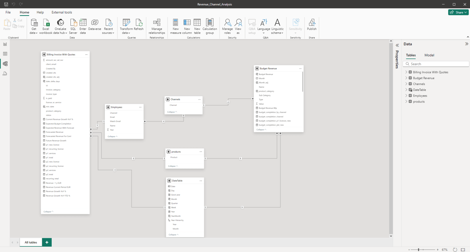
Power BI Model View example
Data analysts can create custom calculations and measures using the DAX (Data Analysis Expressions) formula language, which unlocks advanced analytics capabilities well beyond standard pivot tables. Microsoft has also tightly integrated Copilot AI into Power BI, which can assist analysts with creating DAX functions and, for end users, can generate text summaries and surface insights using natural language prompts.
Our guide to 12 essential Power BI DAX formulas covers the calculations every report creator uses daily, with syntax, real examples, and use cases for each.
Enterprise-Grade Security and Data Governance
Row-level security, sensitivity labels, and Entra ID access control
Data security is one of the most important factors when choosing a business intelligence platform, and Power BI excels in this area. It adheres to a wide range of global, regional, and industry-specific regulatory compliance standards, including GDPR, HIPAA, and PCI DSS.
Power BI uses Microsoft Entra ID for identity and access management. Report administrators can apply Row-Level Security (RLS) to restrict which data each user sees, and Microsoft Purview sensitivity labels extend your organization's data classification policy directly into the BI layer.
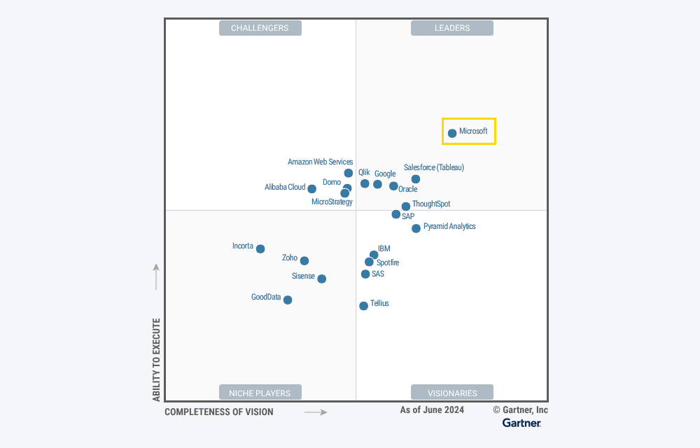
Gartner Magic Quadrant Industry Leader
Recognized as the leader in BI platforms for multiple years running
There are many business intelligence solutions on the market, but Microsoft Power BI has emerged as the clear leader, overtaking competitors like Tableau and SAP Analytics Cloud. In Gartner's Magic Quadrant for Analytics and Business Intelligence Platforms 2024, Microsoft was named the industry leader, placing highest on both ability to execute and completeness of vision.
This recognition reflects Microsoft's consistent investment in Power BI's capabilities, from data connectivity and AI features to enterprise governance and Fabric integration. For organizations evaluating BI platforms, Gartner's positioning provides independent validation that Power BI is not just popular but objectively the leading choice.
Cost-Efficiency and Scalability
Free to start, affordable to scale, cheaper than its main competitors
One of the reasons for Power BI's growing popularity is its cost-effectiveness, especially compared to other top BI tools like Tableau or SAP Analytics Cloud, both of which cost significantly more per user. Power BI offers four pricing tiers, allowing each business to choose the best solution for their size and requirements.
| Tier | Price | Best for |
|---|---|---|
| Power BI Desktop | Free | Individual report creation without sharing |
| Power BI Pro | $10/user/month | Teams publishing and sharing reports |
| Power BI Premium | $20/user or capacity | Advanced features, Copilot AI, paginated reports |
| Power BI Embedded | Capacity-based | Embedding analytics in custom apps or public websites |
As your business expands, Power BI scales with it. Power BI Pro is also included in Microsoft 365 E5. Check your existing agreements before purchasing standalone licenses.
Self-Service Data Analytics
Drag-and-drop report creation without technical training or IT dependency
Power BI's interface uses a familiar Ribbon UI, making it easy to learn for anyone already using Microsoft Office. Creating a report is as simple as dragging and dropping visuals and data fields onto the canvas. Data preparation can be left to data engineers while business users create ad hoc reports on demand without technical knowledge.
This ease of use makes Power BI a powerful driver of data democratization. By empowering more users to find insights independently, Power BI strengthens the data-driven culture within your organization and reduces the bottleneck on data teams for every reporting request.
Power BI supports custom visuals like ZoomCharts Drill Down Visuals that expand its capabilities with multi-level drill-down and cross-chart filtering. See our guide: Power BI Chart Types: Choosing the Right Visuals for Your Data.
Mobile and Web Support
Full report access on any device with touch-optimized layouts
In addition to Power BI Desktop, this platform is available on the web and via the Power BI Mobile app on iOS and Android. Users can access reports from any supported device including smartphones, tablets, Mac, and Linux computers. Power BI can also send push notifications to alert about critical changes in data.
Report creators can build dedicated mobile-friendly layouts that automatically adjust to fit the screen size. For organizations with field-based users such as retail managers visiting store locations and operations leads on the shop floor, this means your BI investment reaches the people who need it most, not just office-based analysts.

ZoomCharts Drill Down Visuals are designed for mouse, keyboard, and touch input with full feature parity across all three, making them the natural choice for reports that need to work equally well on desktop and tablet.
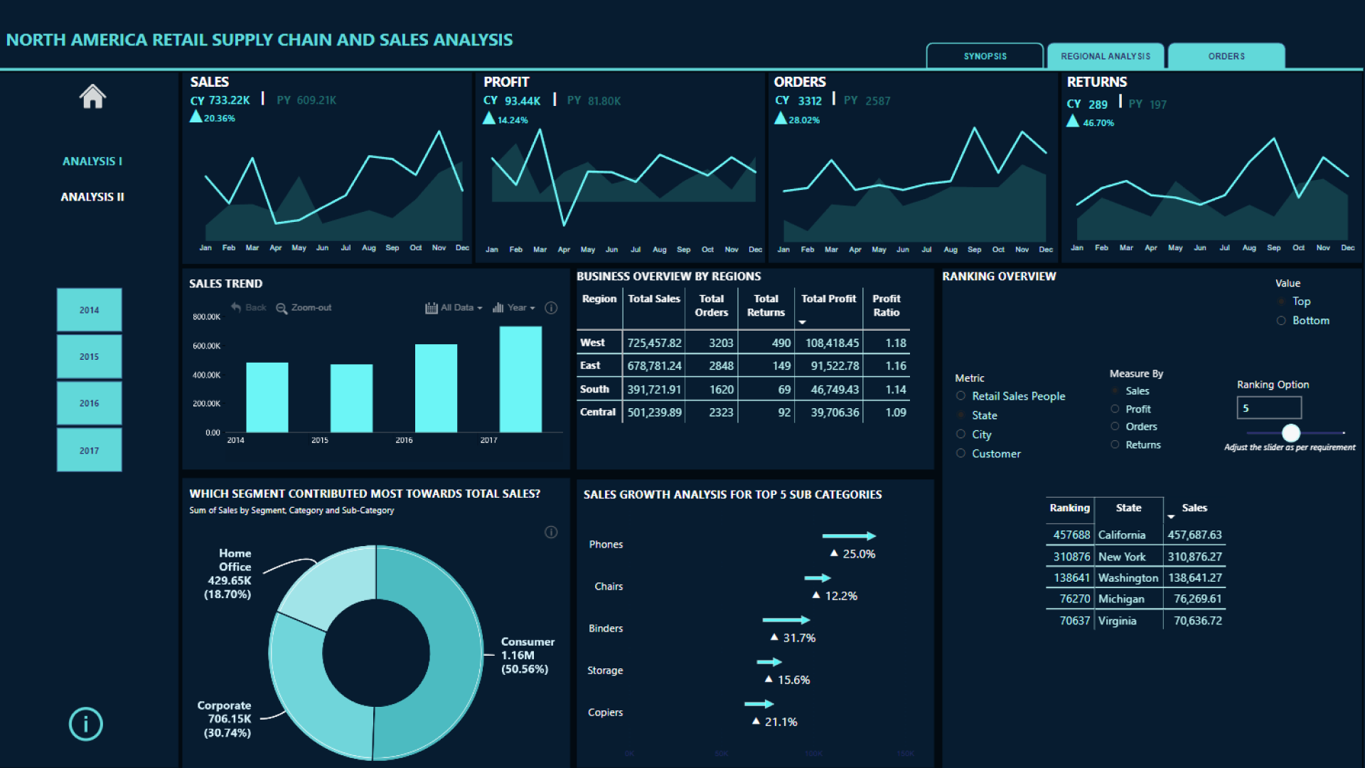
Interactive Report Creation and Visualization
Dashboards users actually explore, not just read
Power BI is one of the best business intelligence platforms for visualizing data. With various filtering, drill-down, and drill-through interactions, users can explore data more thoroughly and find detailed insights beyond just the top-level results. Drill-down allows users to instantly access more granular data within the same visual without leaving the page.
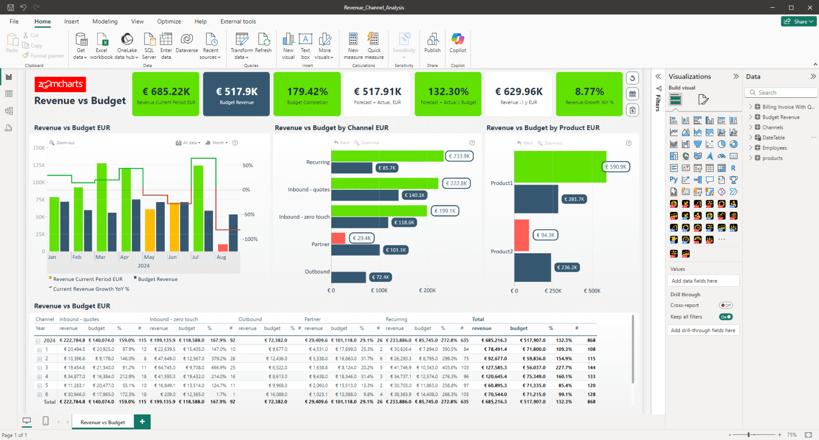
When Power BI's visualization capabilities are combined with custom visuals from AppSource and good report design, the platform produces genuinely intuitive and insightful reports. Well-designed Power BI reports make it easy for any user to find relevant data, interpret it correctly, and get involved in the data exploration process. Read more in our guide: Power BI Drill Down: The Ultimate Guide.
Interactive Power BI supply chain report built with ZoomCharts. View live demo
Power BI's visualization capability is only as valuable as the report design behind it. The 4U Reports framework gives developers a structured approach to building reports that users actually adopt, covering visual hierarchy, intuitive navigation, interactive exploration, and insight-first design.
Interactive Power BI drill-down example. View live demo
From Power BI benefits to reports people actually use
Power BI gives you the platform, the data connectivity, the visualization tools, and the AI capabilities. But research consistently shows that fewer than 30% of employees actively use BI tools on a regular basis. The gap is not in technology. It is in how reports are designed.
The 4U Reports framework was built specifically to address this. It gives Power BI developers a structured approach to report design that moves users from first attention through to confident, informed decisions, covering visual hierarchy, intuitive navigation, interactive exploration, and insight-first design.
Frequently asked questions
What are the main benefits of Power BI for business?
The main benefits of Power BI are its wide data connectivity (500+ sources), deep Microsoft ecosystem integration including Fabric and Teams, flexible data modeling with DAX, interactive dashboards with drill-down and cross-filtering, enterprise-grade security with Row-Level Security, cost-effective pricing starting from free, self-service analytics for non-technical users, mobile support on iOS and Android, and AI capabilities including Copilot for natural language reporting. Microsoft has also been named the leader in Gartner's Magic Quadrant for BI platforms for multiple years.
Is Power BI free to use?
Power BI Desktop is completely free to download and use for building reports. Sharing reports with colleagues requires a Power BI Pro license at $10 per user per month. Power BI Pro is also included in Microsoft 365 E5. For enterprise-scale deployments, Power BI Premium includes unlimited viewer access, advanced features, and Copilot AI and is available per user at $20 per month or as a capacity subscription.
Is Power BI better than Tableau?
Power BI and Tableau are both leading BI platforms with different strengths. Power BI is more cost-effective, integrates more deeply with Microsoft infrastructure, and has stronger DAX-based data modeling. Tableau has historically had more visualization flexibility and a larger independent community. For organizations already on Microsoft 365 or Azure, Power BI is typically the more practical and cost-efficient choice. Gartner ranked Microsoft as the leader in its 2024 Magic Quadrant for BI platforms, above Tableau.
What is the difference between Power BI and Excel?
Excel is a spreadsheet tool designed for individual data analysis and manual calculations. Power BI is a dedicated BI platform for connecting multiple data sources, building scalable data models, creating interactive dashboards, and sharing insights across an organization. Power BI handles much larger datasets, refreshes data automatically from live sources, and produces interactive reports rather than static spreadsheets. For any scenario requiring collaboration, live data, or reports shared across a team, Power BI is the more appropriate tool.
What is Microsoft Fabric and how does it relate to Power BI?
Microsoft Fabric is a unified data analytics platform launched in 2023 that consolidates data ingestion, warehousing, data science, and business intelligence into a single environment. Power BI is a core component of Fabric, providing the reporting and visualization layer. Organizations adopting Fabric get Power BI capabilities built in, with tighter integration between their data pipeline and their reports than was previously possible.
What is Power BI used for?
Power BI is used to connect to data sources, transform and model data, build interactive reports and dashboards, and share insights across an organization. Common use cases include executive KPI dashboards, financial reporting, sales and marketing analytics, supply chain and operations monitoring, HR analytics, and customer experience reporting. Any scenario where structured data needs to be visualized, explored, and shared benefits from Power BI.
Start building Power BI reports that get used
Power BI gives you the platform. ZoomCharts Drill Down Visuals give you the interaction patterns to build reports that users actually open. Explore the visual library or see the 4U Reports framework for the design principles that bring both together.
Explore ZoomCharts visuals Read the 4U Reports introduction


