Apr 12, 2023
Top 5 Data Visualization Trends of 2023
What will be the biggest data visualization trends of 2023? What can we expect from Power BI in the future? While we won’t admit or deny that we have a crystal ball in our possession, we want to share some of our predictions for the future of data visualization in this article.

What will be the biggest data visualization trends of 2023? What can we expect from Power BI in the future? While we won’t admit or deny that we have a crystal ball in our possession, we want to share some of our predictions for the future of data visualization in this article.
We asked some of our data visualization experts their views. This article won’t feature science fiction akin to Star Trek, such as holographic presentation screens or virtual reality board meetings. Instead, we will focus on the industry trends that every report creator should consider when creating data visualizations that are future-proof. Let’s begin!
Data Visualization Trend #1: Interactive Reports
It’s incredible to see how much has changed in the field of data visualization in the past decade. Back in 2013, when we started, most data visualizations were displayed as static charts, which is why we set out to make data exploration more interactive and fun. A decade ago, Power BI was still in its infancy, so seeing the leaps and bounds this platform has taken to become the business intelligence powerhouse it is now is simply astonishing.
Reports too have evolved, and most users nowadays expect more than the usual menus upon menus upon menus. They want data visualization solutions that don’t waste their time and immediately show the data they need with just a few clicks. The report should just work – quickly and intuitively.
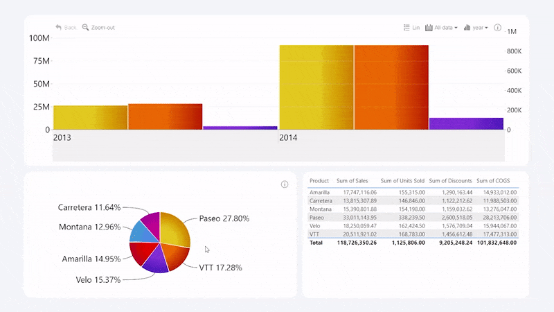
Here’s an example – you’re browsing a financial report that has a timeline chart of your revenue, profit and units sold. Below there’s a pie chart that displays the percentage of your organization’s most sold product brands. What if you want to see the financial timeline of a specific product? Exactly – you just tap on a pie chart’s slice, and other visuals will respond accordingly by showing the relevant data.
This is just one example of how a truly interactive report can make data exploration more enjoyable and save your users’ time. Intuitive and interactive visuals also remove the barrier of entry for data analysis, paving the way for data democratization – a point we’ll expand on later in the article.
While the industry is still way off Tony Stark-style holographic heads-up displays for data visualization, you can already create stunning and interactive reports that look like they’re from the future – today. Take a look at our Drill Down Reports and see how all the visuals work together to bring the relevant data to you with just a few clicks!
Data Visualization Trend #2: AI & Machine Learning
AI has been the main topic of many water cooler conversations recently – possibly even at your company - and for a good reason. We’ve seen the releases of ChatGPT, DALL-E, Google Bard, Midjourney and various other exciting AI and machine learning projects, which is why almost everyone is talking about AI and its implications for the future.
While we can’t deny that asking an AI to write a catchy poem about why donut charts are a part of any balanced breakfast is funny, we believe that AI will find its use in business as well. According to Forbes, AI may automate up to 80% physical work when it comes to big data.
AI can play a part in various parts of the data analysis process, such as data collection, processing, and clean-up. With AI doing the lion’s share of the busywork, data analysts can save a massive amount of time. However, keep in mind that AI still has its limitations, and its performance is dependent on the quality of your data.
AI for Power BI Data Gathering
Let’s start with the data gathering. For example, if you have thousands of JPEG images, Power BI AI Insights can turn them into data by automatically analyzing their contents and providing descriptions or tags. It’s incredibly useful and timesaving if you are analyzing IoT device data or monitoring social media content.
Another thing that Power BI AI Insights can automate is sentiment analysis, which will be a blessing to any product researcher, marketing strategist or social scientist. Set up properly, the entire process of opinion mining can be automated, and the AI will then analyze the general sentiment of the message and assign “Positive”, “Neutral” or “Negative” labels to each data point. Learn more about Power BI AI Insights in this Microsoft article!
AI for Data Processing & Cleanup
Ask any data analyst what’s the most tedious part of business intelligence, and they’ll reply in unison – data cleanup. Thankfully, many AI features in Power BI are designed specifically to reduce the time spent by analysts on data cleanup.
Power BI comes with all the necessary tools for building a dataflow that can help you automatically classify data into categories with the help of machine learning algorithms. Here’s a tutorial on how to automate data classification with Power Query Editor.
That’s, of course, the big one, but there are some smaller AI-based features you can access via Power Query that are helpful for data cleanup, such as Fuzzy Match to group items that are similar, but not exact match; and automatic data type detection. And AI doesn’t show any signs of stopping, which is why we’re excited to read the change log of any new Power BI release to see what new AI features they’ve added!
AI for Better Data Insights
AI capabilities in Power BI are not just making creators’ life easier; they can also make the reports more engaging and insightful for the user. One of the most exciting Power BI AI features is Natural Language Q&A. It’s an intelligent search bar which can be used to serve the user relevant data with natural language questions such as “What were our gross sales in Texas in 2021?” Furthermore, Power BI can use AI to predict trends, detect anomalies, and even create a text summary of the data on your report.

AI will fulfill a similar role in decision-making as GPS navigation for driving. If you blindly follow the arrow on the screen and the robotic voice directions, you’re going to end up in a ditch. But, if you combine the GPS suggestions with what you see out of your windshield with your own eyes, it’s an incredibly valuable tool that helps you not get lost.
“It will still be the humans who make the decisions because no one’s going to blindly trust the algorithm if they don’t know how it reached the conclusion. If you follow the AI suggestions without analyzing the data yourself, you’re likely to make faulty decisions. Therefore, more than ever before, it is important that your business intelligence reports are easy-to-read and intuitive to explore. Such reports help you see the big picture and to seamlessly drill into all dimensions of the underlying data to be more confident that you’re making the right choices.” - Jānis Volbergs, CEO of ZoomCharts
Of equal importance is the art of presenting this data in a neat and easily digestible way, which is where report creators still shine.
Data Visualization Trend #3: Going Mobile
Business isn’t confined to the walls of your office anymore. More and more people are working from home, on the bus, at the coffee shop or anywhere else. This also means that your workflow should accommodate your employees by being compatible with laptops, tablets, smartphones, and other mobile devices.
Moreover, many conference rooms across the world are getting presentation screens with high-resolution multi-touch panels, making data analysis during the meetings faster and more engaging. It’s clear – your reports in 2023 must support touch controls.
By supporting swipes, taps, pinch-to-zoom, and other multi-touch gestures, you can make your reports more intuitive and accessible to your users. To do that, you’ll need visuals that are made ground-up to support touch inputs, such as Drill Down Visuals.

Data Visualization Trend #4: Inclusivity
Back in the olden days, data was not accessible to everyone. Making sense of spreadsheets, waterfall charts, formulas and algorithms required deep knowledge in the fields of business intelligence and data analytics, and decision makers or other stakeholders could only rely on simplified excerpts and summaries. However, modern technology breaks down barriers in both life and business.
Microsoft Power BI has done wonders for the democratization of data. With this platform, report creators can build easy-to-use dashboards and reports that allow anyone to get the full picture and find exactly what they need. When everyone is on the same page, your company can make faster and more confident decisions.
We share the same vision of data democratization, which is why our Drill Down Visuals and Drill Down Reports are designed to provide valuable insights to anyone. Business analysts can use our data visualization solutions to display complex data in a simple and easily readable way that’s fun and engaging for any employee. With a smooth UX and intuitive on-chart interactions, finding the relevant data you need to make decisions is a breeze.

Data Visualization Trend #5: No More Static Dashboards
In the world of business intelligence, there exists a strict dichotomy between dashboards and reports. Whereas dashboards are static pages of various gauges, visuals, and other elements to provide a quick overview of the most crucial data at a glance, reports, on the other hand, are rich and interactive, giving the users the opportunity to explore data in more detail.
Lately, the line between the two is blurring. The main reason why dashboards were lacking in interactivity and features was the lack of space. Everything had to be tightly packed into one page and provide only the necessary info, leaving little to no room for anything else. However, with visuals getting more interactive and screen-space efficient, that’s changing.
Take a look at our Top 5 best Power BI dashboards, for example. Visually, they look exactly like a regular dashboard, providing a comprehensive overview on a single page. However, as you play around with the visuals, you’ll notice that you can easily drill down and quickly get a deeper insight – just like from a report. It’s the best of both worlds, combining the readability and ease-of-use of dashboards, and the functionality of reports.

This can be achieved by using cutting-edge custom Power BI visualizations that feature intuitive on-chart interactions and cross-chart filtering. The latter makes it so that when you drill down in one of the visuals, others respond by automatically filtering down to the relevant data without any slicer menus, giving you multiple perspectives of the same context.
Will this kind of report replace dashboards entirely? Maybe. In the business world, habit is a very powerful thing, and switching from dashboards that have already proven effective to something new might not seem necessary. However, the benefits of Drill Down Reports become crystal clear once you’ve tried them in everyday use, so feel free to contact us to request a demo!
Conclusion
These are some of the most significant data visualization trends that you should consider in 2023. With data-viz becoming more accessible and convenient, more people will be able to make data-driven decisions. Furthermore, big data is going to be less time-consuming to process and work with, thanks to AI and machine learning. The future of data visualization looks bright, and we can’t wait to see what the future trends in data visualization will be.

Want more info like this?
Subscribe to our newsletter and be the first to read our latest articles and expert data visualization tips!


