Jun 03, 2024
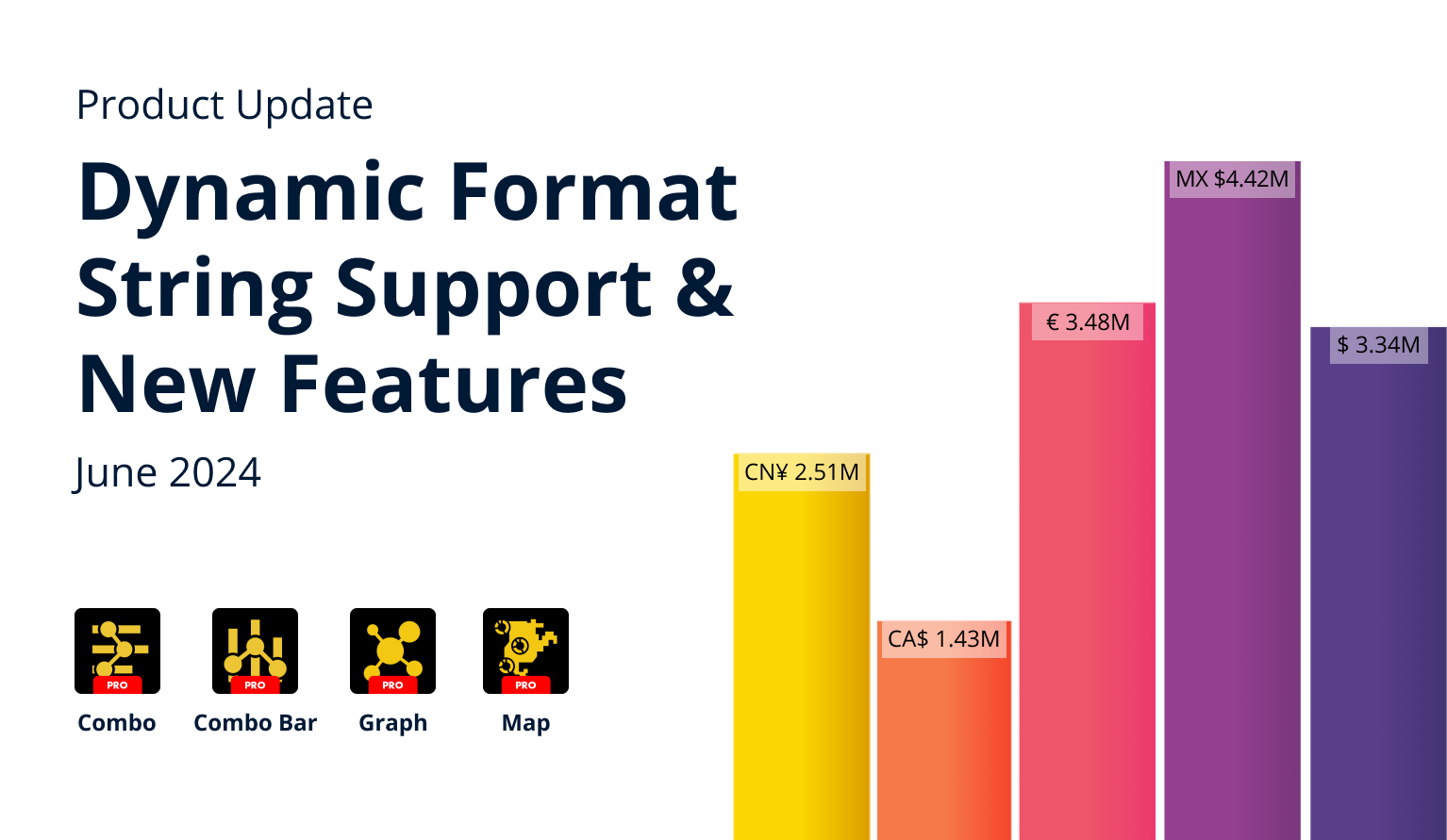
June 2024: What's New in ZoomCharts Visuals
We have updated our Combo, Combo Bar, Map and Graph visuals with new features and improvements. In addition, all our visuals now support dynamic format strings in Power BI.
We have updated our Combo, Combo Bar, Map and Graph visuals with new features and improvements. In addition, all our visuals now support dynamic format strings in Power BI.
Your visuals should update automatically from AppSource. If you do not see the new features, make sure your visuals are on the latest version by pressing the “?” (Info) button at the top right corner of the visual, or by right-clicking the visual’s icon in the Visualizations pane and opening the About screen.
Dynamic Format Strings Support
All ZoomCharts Visuals now support the Dynamic Format Strings feature in Power BI (read more about it at Microsoft Learn). This means that you can conditionally apply specific formatting rules to your measures, which will affect how they are displayed in value labels, tooltips, and axis scales.
Previously, you could use the Value Affixes, Value Decimals, and Display Units settings to customize how the values are displayed, but these settings were applied to the entire series. With Dynamic Format Strings support, you can now apply custom formatting rules to specific values based on the conditions in your DAX expression.
Here's how to create a Dynamic Format String for use with ZoomCharts Visuals:
- Step 1: Select the measure you want to transform in the Data pane and then open the Measure tools tab in the top ribbon.
- Step 2: Change the Format to “Dynamic”.
- Step 3: The formula bar will now display a new dropdown menu. Choose Format to enter or modify dynamic format strings.
- Step 4: Enter your DAX expression in the formula bar.
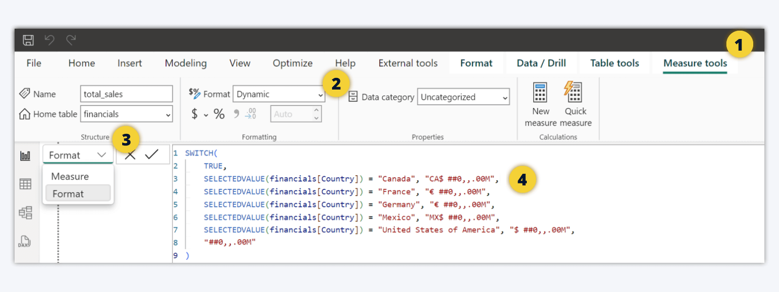
Keep in mind that dynamic formatting strings will work only with measures and not columns. In addition, make sure that you have set Display Units to ‘None’ in the visual’s settings to ensure that the dynamic formatting strings are applied properly.
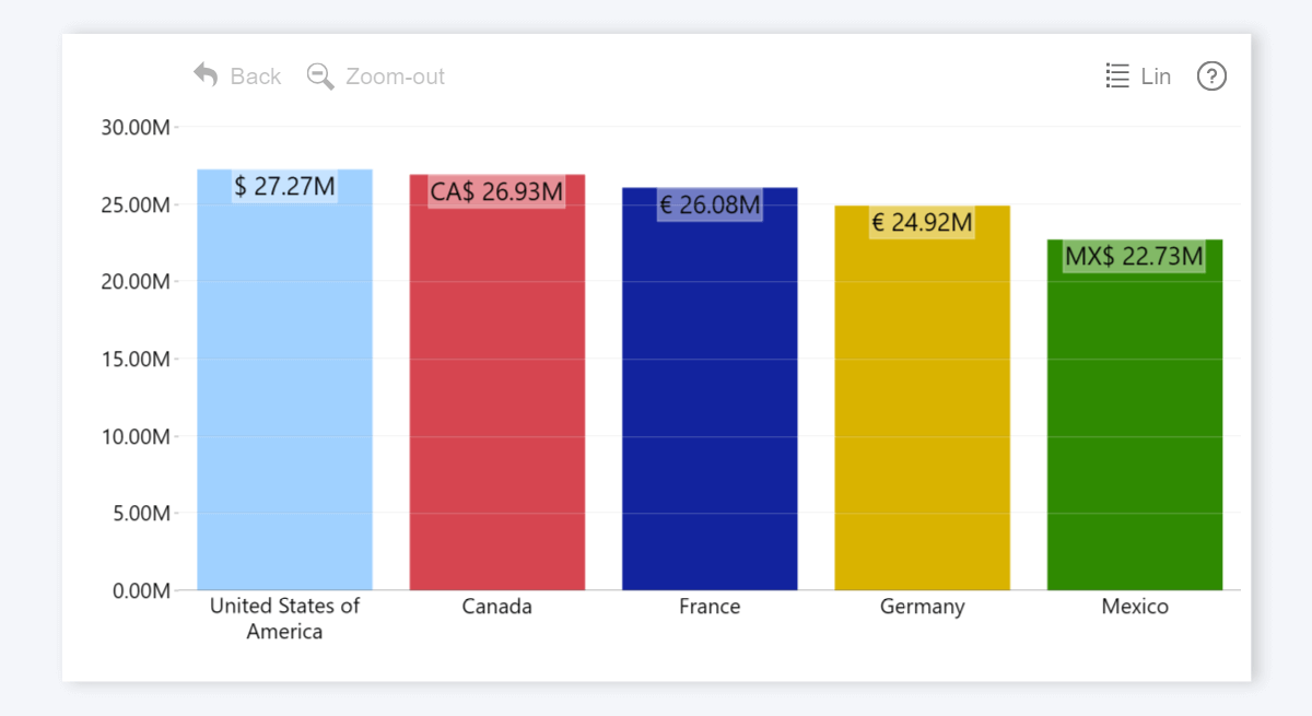
In the above example, we have created an expression which will reference an adjacent column with country names (financials[country]) and add a prefix with the appropriate currency symbol – for example, $ for USA or € for Germany and France. This will become especially useful once you filter the visual to a specific category via slicers or other visuals – the axis scale, value labels and tooltips will display the correct currency symbols.
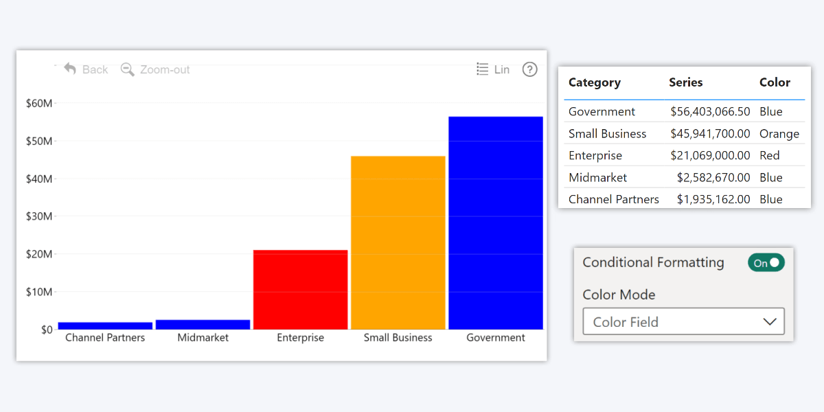
Combo & Combo Bar: 'Color' Field
The v1.11.29.0 update for Drill Down Combo PRO and Combo Bar PRO visuals introduces a new field – ‘Color’. With this field, you can apply custom colors to each category using rules defined in data.
You can use a column or measure that has the following data:
- HTML color names (red, green, blue, etc.)
- Hex codes (#FF0000, etc.)
- RGB codes (rgb(255,0,0), etc.)
Even though both visuals already have a setting called Category Colors which allows you to manually pick colors for each category, the ‘Color’ field will provide additional flexibility to report creators, allowing them to provide color values manually for each row or use DAX measures to automate formatting.
Once you have added data to the ‘Color’ field, head to the Series X Configuration section and enable Conditional Formatting. Then, set the Color Mode setting to Color Field. Unlike other conditional formatting modes, which derive the category formatting rules from the series values, the ‘Color’ field allows you to have full control and reference not just the series, but also categories or other columns in your DAX measure.
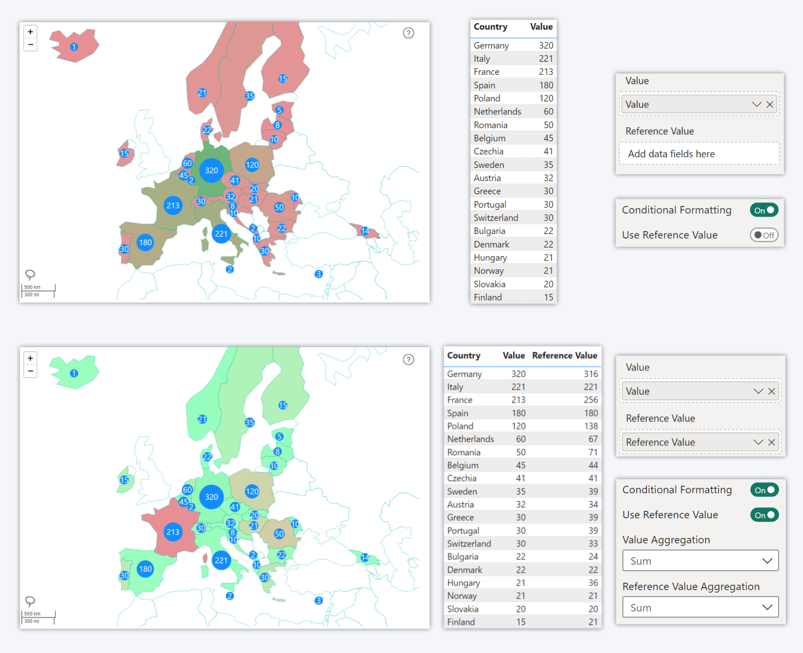
Map: Reference Values for Conditional Formatting
One of the features in Drill Down Map PRO is conditional formatting that can automatically adjust fill color for shapes in the shape layer based on reference values. In the previous versions, the color scale was determined solely by the minimum and maximum values. However, this may not be suitable for use cases where each area must be compared against its own target, instead of other areas.
That’s why in the v1.11.29.0 update for Map PRO, we have introduced the ‘Reference Value’ field. Now, once you enable the Use Reference Value toggle in Shape Layer X Settings->Conditional Formatting, each shape’s color fill will be determined by how close the ‘Value’ is to its respective ‘Reference Value’.
This feature will come in handy when you’re comparing countries, states, regions, or cities against their own targets, KPIs or benchmarks – for example, actual sales vs. sales goals, budget completion, etc.
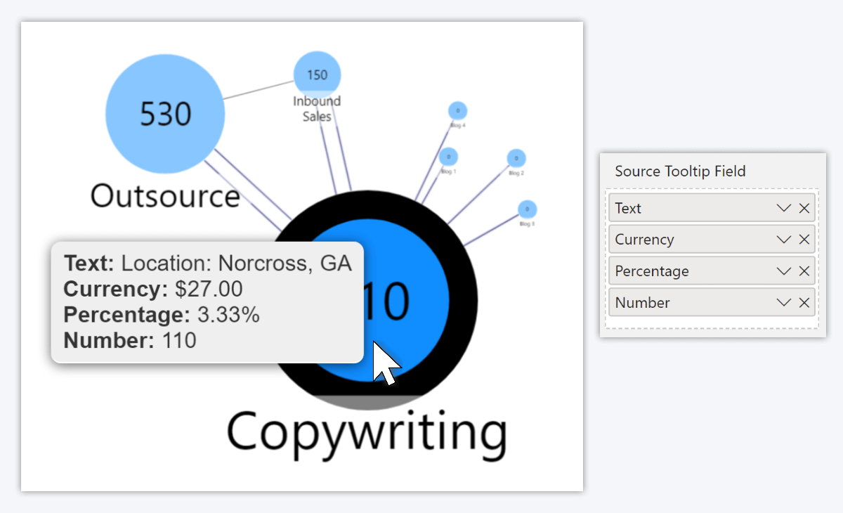
Graph: Different Formats for Tooltip Fields
Previously, if you added multiple columns to ‘Source Tooltip Field’ or ‘Target Tooltip Field’, they were all displayed in the tooltip using the value format of the first column in the field. For example, if the first column contained decimal numbers, but the second column had percentages, then both columns would be displayed as decimal numbers.
The v1.11.25.0 update for Drill Down Graph PRO now allows you to use different value formats for each column or measure in Tooltip Fields, and their content will be displayed correctly in the tooltip. You can choose the value format by selecting the column or measure in the Data pane and choosing your preferred option in the Format dropdown menu from the top ribbon (in the Column tools or Measure tools tab).
Get Started with ZoomCharts
Be sure to download the latest version of ZoomCharts Visuals to enjoy these new additions, along with hundreds of other features! With a free trial available, you can see for yourself how these powerful visuals can take your Power BI reports to the next level.

Want more info like this?
Subscribe to our newsletter and be the first to read our latest articles and expert data visualization tips!


