Sep 02, 2022
Power BI Design Tips: Make Your Reports More Efficient
What are some of the best design practices and most important tips for designing a great Power BI dashboard? How can you design a report that is both appealing and efficient at conveying business information? Learn more in this article!

What are some of the best design practices and most important tips for designing a great Power BI dashboard? How can you design a report that is both appealing and efficient at conveying business information? Learn more in this article!
As much as we boast about the seemingly endless capabilities of Power BI visuals regarding data analysis, that does lead to a question - what are some of the best design practices and most important tips for designing a great Power BI dashboard? How can you design a report that is both appealing and efficient at conveying business information?
Aldis Ērglis, who has been a part of the data visualization industry for over 20 years, offers us some Power BI design tips in his 'Power BI Zoom Factor' presentation where he talks about the user experience considerations you need to keep in mind when developing stunning visuals and reports.
Power BI Design Tip #1: Use Your Screen-Space Efficiently
Data charts are usually compiled into a dashboard. As Ērglis states - the point of a dashboard is to get insight in the shortest amount of time. Dashboards allow for charts to be compiled into a story; they allow for quick data comparison. So, keep in mind that your dashboard design should fit in one screen. That’s right. One screen. Singular. Any amount of extra scrolling is discouraged in most cases.
Once you account for extra screen space and additional scrolling, your Power BI visuals lose report-reading speed. Fitting all the necessary Power BI visuals can require quite some mastery in report-making and may seem like a daunting task, but the effort is worth it to quickly develop the best business strategy, as well as separates the experienced report-makers from the amateurs.
Power BI Design Tip #2: Show Data That Matters
Data context can either make or break your Power BI visuals. Yes, we have the necessary numbers for our chart, but what are we essentially comparing – units sold, employee distribution, sales income, etc.? All of these convey different data contexts and require their own legends.
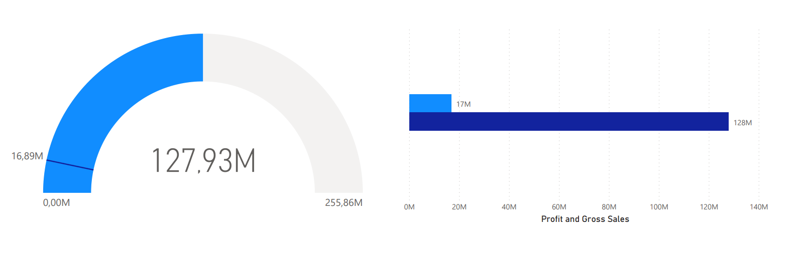
The worst you can do is include no context for your numbers at all. Remember to define what they mean and show that information in an obvious place on your chart.
Consider the following - what's the most important information that you have to visualize? Quantitative or non-quantitative? Do you have to build a report for strategic or analytical purposes? What story are you trying to tell when designing your report? Are you comparing sales or finance? Or maybe you have to build a report that shows a correlation between different types of data, for example, marketing in relation to sales based on location?
What really helps is putting yourself in the report consumer’s shoes. Preferably one with less experience with Power BI visuals than yourself, even if the actual potential readers of your report have a decent amount of experience with Power BI.
Power BI Design Tip #3: Use Shapes & Colors Carefully
Stick to basic shapes and an overall light color scheme when creating your Power BI visual design. Ērglis recommends using dark color schemes for data visualization that fits thematically, such as a chart that shows the various phases of the moon. However, Power BI visuals tend to be mostly used to render business information, such as data regarding sales or human resources. A dark color scheme would just seem too dramatic.
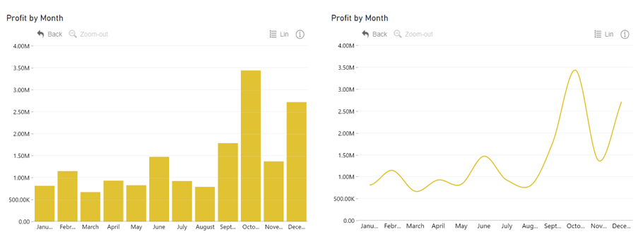
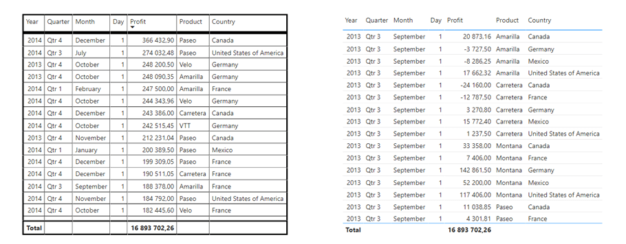
Pie charts are great for proportional comparison but lose their strength when multiple values must be compared. Bars are great for comparative values. Tables are the worst overall, but great for absolute values. Each type of graph or chart has its strengths and weaknesses, and it’s up to the developer to assess their usage accordingly.
Power BI Design Tip #4: Bring Focus to the Important Parts
When building Power BI visuals, we can identify certain pixels that bring in information, and pixels that don’t bring in information. Ērglis recommends leaving non-data-related pixels bare or at minimum opacity. The pixels that stand out should only be data-related or help with reading the data.
As we can see, when charts display fewer visual cues, the data becomes more readable, it becomes easier to compare values and proportions displayed on a 2D base, as well as finding certain numbers. The ease of readability also adds an immediate aesthetic value to most Power BI visuals.
Another Power BI design tip is taking the density of the compiled data into consideration. The human brain tends to be more accurate in memorizing small multiples of bar charts rather than data that's laid out as a treemap. However, maybe your main task at hand is to represent the entire ecosystem of data.
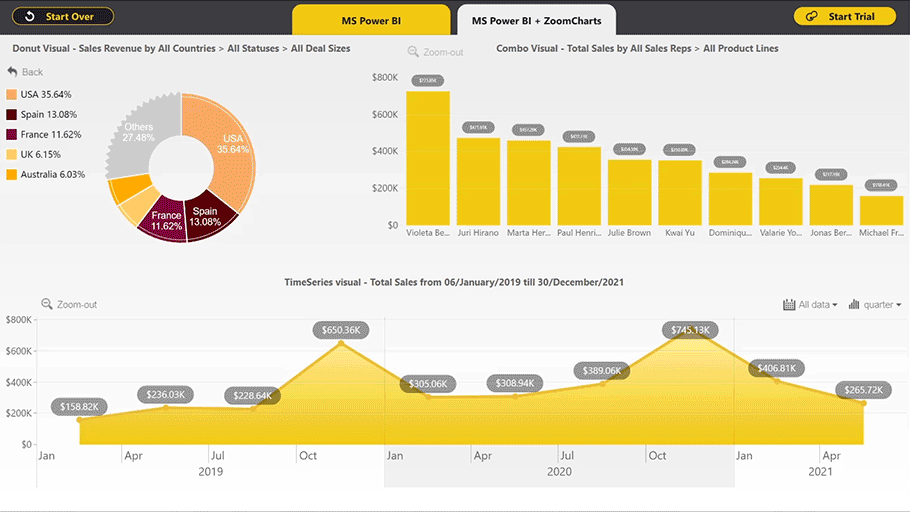
The interactive nature of Power BI visuals offers a solution – we can represent both an entire treemap of data and drill down to retrieve more accurate data to still contain user-friendliness and readability.
This is why it’s important to explore all Power BI visuals as well as try out interactive charting libraries. These can prove to be your saving grace when looking for an answer for simultaneously showing the whole network of data and the ability to easily oversee more specific datasets.
Final Thoughts
When we add the interactivity that Power BI visuals offer, we open a whole new world to displaying and reading data. We can resolve many of the pitfalls posed by even the most advanced static charts. Color-coding specific data is useful but can become overly saturated and confusing once we exceed a specific number of data points. With interactive Power BI visuals, we can sort through at the density we wish. We can drill down or up at will, thus transforming the story of the data with just a click. In that sense, a report really is worth a thousand words.
So, now that you know exactly how to pick the perfect visuals, you'll need the right resources that will really complement all that you've learned. Unfortunately, regular Power BI visuals can feel just a bit too limiting.
Custom visuals such as ZoomCharts Drill Down Visuals PRO were developed by data engineers looking to expand the capabilities of Power BI reports. Check out Drill Down Visuals to see what true customization for your visuals can really do.
Head to the Microsoft AppSource and try out the visuals 30 days for free!
For more information check out:
Storytelling with Data by Cole Nussbaumer Knaflic.
39 studies about human perception in 30 minutes by Kennedy Elliott.
Watch the full presentation by Aldis Ērglis here

Want more info like this?
Subscribe to our newsletter and be the first to read our latest articles and expert data visualization tips!


