Sep 28, 2023
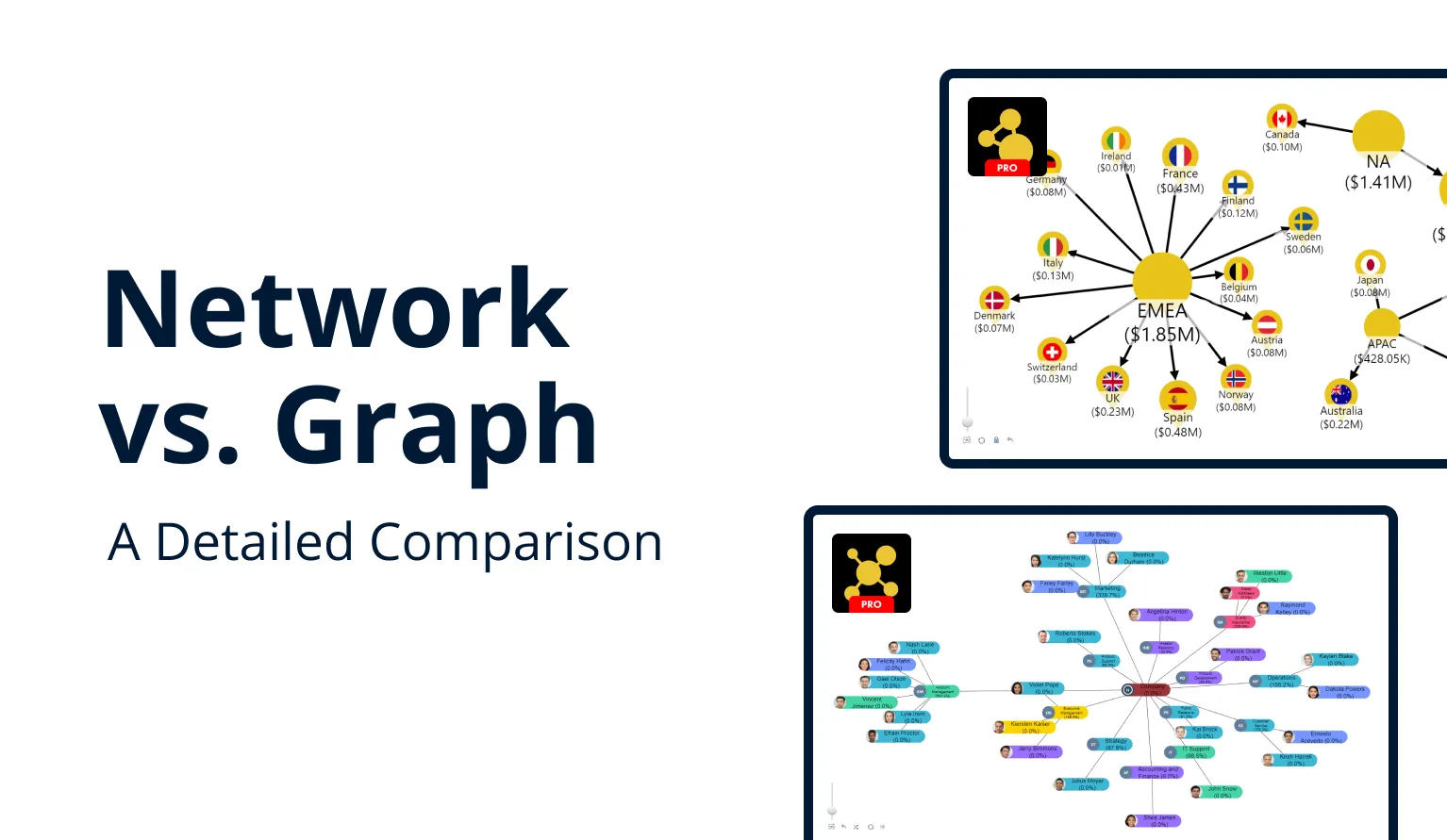
Drill Down Network PRO vs. Graph PRO: A Detailed Comparison
In this article, we explain the main differences between Network PRO and Graph PRO visuals, and compare them head-to-head.
In this article, we explain the main differences between Network PRO and Graph PRO visuals, and compare them head-to-head.
Our roster of Power BI custom visuals includes two products for visualizing relationships in your data – Drill Down Network PRO, and Graph PRO. Even though both visuals may seem similar at the first glance, there are critical differences that make each product better suited for specific use cases. That’s why we created this article – to shine light on these differences and help you make an informed decision on which visual should you choose.
Both visuals are an efficient and interactive way to visualize the relationships between multiple data points. Each data point is displayed as a node, and they are connected with links to denote relations with other nodes, making it easy to understand complicated structures or hierarchies. Org charts are the most obvious example for this kind of visualization, but there are endless ways to utilize them.
So, what’s the difference between Drill Down Network PRO and Graph PRO visuals? Why do we offer two products, and which should you choose? In short – they offer two different ways to achieve similar goals, and each is tailored for specific creator preferences, data types or requirements.

Network PRO works with categorical data, and it will visualize each category as a node and automatically detect relationships and make connections between nodes based on their category structure. If your data already has a category structure, then displaying it on an interactive network chart is as easy as dragging and dropping each field into the appropriate places in the Visualizations pane.
Graph PRO, however, uses a different data structure that requires each data point to have Source node and Target node fields to denote relationships between the nodes. While you may need to make manual adjustments to your data to get started with Graph PRO, this data structure grants more control over the node relationships, advanced customization features, and DAX-calculated measure support.
So, to summarize the main difference between both visuals – Network PRO is an additional way to effortlessly visualize the categorical data that you may already have. Graph PRO allows you to manually create relationships and gives access to advanced features to adapt your Power BI reports for even the most unique use cases. Read on as we thoroughly explore the main features that set both visuals apart!
What is Drill Down Network PRO?
There are many ways to visualize categorical data in Power BI. Pie and donut charts, column or bar charts, and more to choose from depending on your use case. With Drill Down Network PRO, you can use your categorical data to quickly create an interactive network chart that makes relationships between each data point readily apparent and easy to read. Simply drag your data into the Nodes field, and Drill Down Network PRO will automatically detect relationships between data points based on their category structure.
Let’s explore an example. Imagine that you are creating a network chart to visualize your sales data per market, and your data has Region and Country fields. If you add all of these categories into the Nodes field, the visual will create separate nodes for each region (North America, Europe and Middle East, Asia, etc.), and all the European country nodes (Germany, France, Spain, etc.) will then be linked to the EMEA node. Then, simply add values to the Measures field, and the visual will show the sales amount for each node. It can even dynamically resize each node based on its value.

The network chart is designed to provide a consistently smooth and intuitive experience for touch devices or mouse and keyboard alike. You can easily select nodes, move the chart around or zoom in with intuitive touch gestures or with just a few mouse clicks. Furthermore, interactions in one visual will affect others as well, making your entire report more dynamic and immersive.
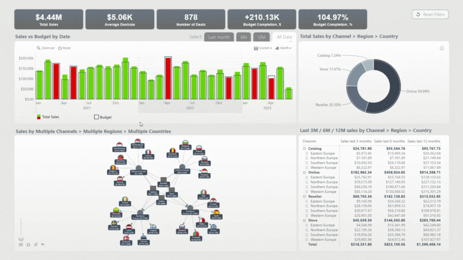
Drill Down Network PRO provides a variety of customization features. For instance, you can select node shapes, fill colors, or even include custom images. You can also customize the node labels – enable or disable them, adjust their size, color, font, and position, and value display settings. Furthermore, you can customize the links – line thickness and style (solid, dotted, dashed, etc.), decorations, and more. You can either apply these visual customization settings to the entire chart, or specific categories.

Network charts created with this visual can have force-directed layout, which means that the nodes will be arranged in a way that uses the entire viewport and prevents multiple nodes from overlapping. You can also enable the fit-to-screen setting, which will dynamically resize the chart to adapt to the visible data as you explore the chart.
Read more about Drill Down Network PRO in our article "How to Make Power BI Network Charts Step-By-Step".
What’s different in Drill Down Graph PRO?
We received positive feedback from Drill Down Network PRO users, praising the way that this visual allowed report creators to display their existing categorical data in a unique and interactive way. However, one of our clients – a large Fortune 500 company operating across the entire world – requested a way to manually create relationships between different nodes as a part of our Custom Visual Development service.
After developing and delivering the new visual, we quickly realized the potential of the new data structure and all the new features that we could implement by taking full advantage of it. We added all the new features and released the visual – Drill Down Graph PRO – to the public, alongside the existing Network PRO. This way, our customers can choose the perfect visual for their data, use case, and creator preferences.

Drill Down Graph PRO provides a similar user experience to Network PRO, including all our signature features - touch and mouse/keyboard support, intuitive and user-friendly on-chart interactions, and cross-chart filtering. However, with the new graph data structure, we have found ways to expand the functionality even further. Let’s dive in!
You can read even more about Drill Down Graph in our blog article "Create a Power BI Org Chart & More with Drill Down Graph PRO"!
Graph data structure
Unlike Network PRO, which automatically detects relationships based on categories, Graph PRO doesn’t use a categorical data structure. Instead, each data point has three mandatory fields – source node, target node, and value. The visual uses this data to connect nodes, which also means that you have full control over the data hierarchy and the ability to create relationships.
Let’s look at an example – we’ll refer to a node as B, because it is preceded by A and followed by C. If you need to show that node B succeeds A, then the Source node field will contain A, and the Target node field will contain B. The visual will then link node A with B and all other nodes which have “A” as their Source node. Conversely, to link B and C, you would add a data row where B is the Source node, and C is the Target node.

This data structure may require the report creator to manually adjust the data for use with Drill Down Graph PRO, but it provides not just additional features, but also more flexibility. For example, the categorical data structure in Network PRO only works in one way, but Graph PRO enables two notes to be mutually connected by two links, one for each direction. This visual also supports DAX measures.

Let’s explore each of the benefits enabled by the switch to graph data structure!
Enhanced Customization
In addition to the mandatory fields, each data point can have additional fields that contain node-specific formatting data, including Source/Target Node Image, Color, Shape, Aura, and more. This means that you can apply specific customization settings to each node, and not just entire categories or the final level of data hierarchy like in Network PRO. You can also create custom labels for each node or feature additional data in a tooltip – such as e-mail addresses, hyperlinks, or other info.

It doesn’t end with nodes - each link can have specific formatting settings in Link Color, Width, Category Class and other fields that will override the global settings for the visual. Furthermore, you can create labels or tooltips with Link Label (numeric/textual) and Link Tooltip fields accordingly – great for explaining the significance of the specific relationship.
Another new way to customize your chart in Drill Down Graph PRO is Auras. If you want to visually group similar nodes that may or may not be directly connected by links, you can use the Auras feature. It will create a colorful area that encircles all nodes which have matching data in the Auras field – not just enhancing the readability of your chart, but also making it more visually striking. You can customize the name, color, opacity, outline, and shadow of each aura.

Layout Settings & Navigation
In addition to the default force-directed layout, Drill Down Graph PRO now offers you more ways to organize the nodes on your chart. You can choose between three layouts – Dynamic, Hierarchical, and Radial. Dynamic will automatically spread out the nodes and use the available viewport space to ensure that the nodes do not overlap. Hierarchical mode will arrange the nodes in a single direction to denote a hierarchy – for example, an org chart. Radial will arrange the nodes in a circular layout, placing the parent nodes in the middle with child nodes branching outwards.

Drill Down Graph PRO also introduces a new way to simplify the navigation for your users, especially if your graph has hundreds of nodes. The Focus Nodes feature can be used to declutter the chart and show only the most important nodes in the initial view, and collapse all child nodes until the user expands them with a tap or a mouse click.
To do this, you’ll need a Focus Nodes field, which contains 1 (or true) for all focus nodes and 0 (or false) for all other nodes. Additionally, you can configure how many levels of nodes are automatically expanded around each focus node, and how many levels (and in which direction) will be revealed with subsequent clicks or taps.
Drill Down Network PRO vs Graph PRO – Which Should I Choose?
Both of these visuals are best suited for specific purposes, so the choice should come down to what kind of visualization do you intend to build. Here’s a brief summary:
You should choose Network PRO if…
You have categorical data that you want to visualize in a way that puts the spotlight on the relationships and hierarchy between the data points, and you want to do this without making significant adjustments to your data set. Simply drag-and-drop the required fields, and Network PRO will make an interactive network chart that’s smooth and responsive, visually appealing, and user-friendly.
You should choose Graph PRO if…
You need to have full control over the way you build hierarchies and relationships. Certain adjustments to your data may be required, but, in turn, you will be able to manually define each relationship, build mutual two-way connections between nodes, and fully customize each specific node or even link.

Conclusion
Network PRO and Graph PRO. Two similar visuals, two different use cases, each with its own strengths. We hope that this article was informative and helped you choose the most suited visual for your use case! If you have any additional questions, we’ll be glad to answer them – contact us via email ([email protected]), phone (+44 333 555 2505), or an online meeting.

Want more info like this?
Subscribe to our newsletter and be the first to read our latest articles and expert data visualization tips!


