Mar 28, 2025
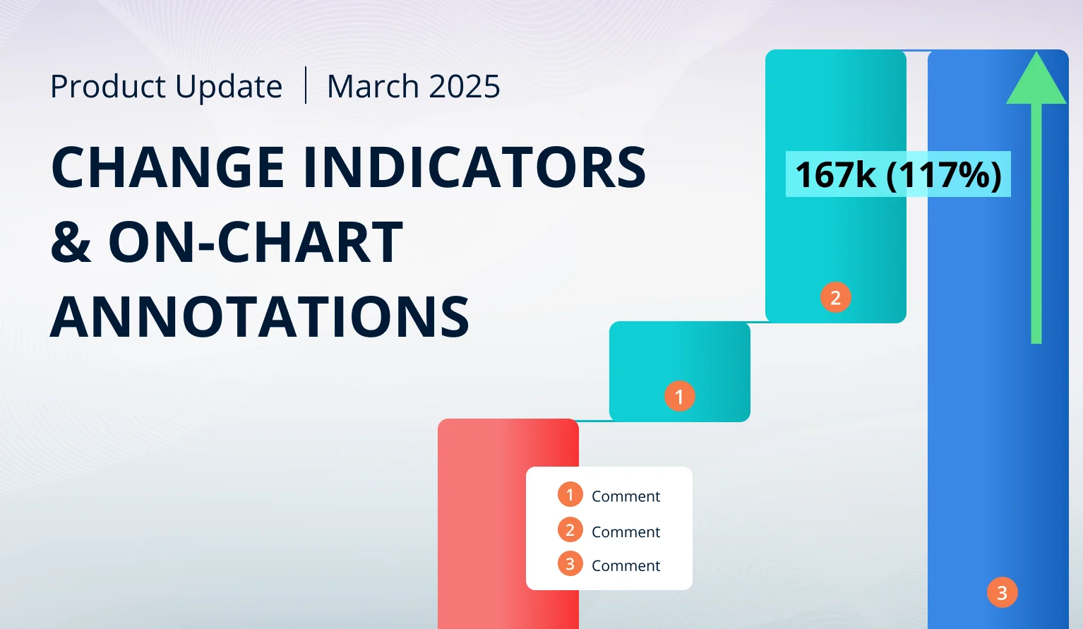
March 2025 Update: Show Difference Between Two Values
This month brings multiple new features for better data visualization: change indicator for comparison between two values; on-chart annotations for Waterfall; layout modes for Network, and other improvements.
This month brings multiple new features for better data visualization: change indicator for comparison between two values; on-chart annotations for Waterfall; layout modes for Network, and other improvements.
Your visuals should update automatically from AppSource. If your visuals have not received the updates automatically, read this documentation article that explains the manual update process.
Multiple Visuals: Display 'Change'
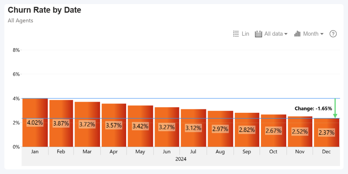
With the February 2025 update, we have introduced a highly requested feature to our Combo, Combo Bar, Waterfall, and Timeline visuals – ‘Change’ threshold type. This will allow you to compare two values and show the difference between them as a positive, neutral, or negative change.
The change will be displayed as an arrow, and you can show the difference between both values in the label. Since this feature works similarly to the already existing Thresholds feature, we have added it as an additional Threshold Type – enable it in the Thresholds section and set Threshold Type to ‘Change’.
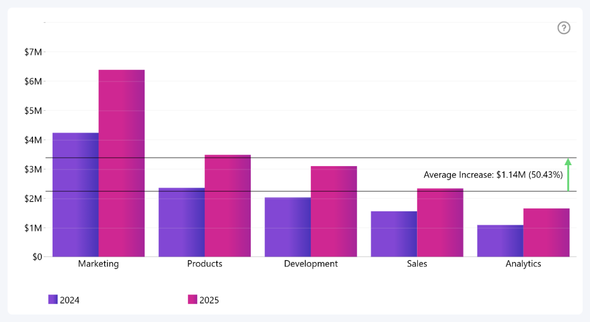
Use From-Value and To-Value settings to choose which two values are compared by ‘Change’. For each, you can manually enter a constant value, or use a calculation that will be applied to your selected series: First, Last, Minimum, Maximum, Average, Median, Percentile.
Here’s an example where From-Value is Series 1 average, and To-Value is Series 2 average: this will allow us to see the average budget increase across all departments between 2024 and 2025.
Other things you can configure include:
- Area between both values: fill color and opacity.
- Horizontal line at each value: fill color, opacity, thickness.
- Label: text, value (absolute, percentage, both), position, font, background, outline.
- Arrow: position, line thickness, line type (solid, dotted, dashed), arrowhead size.
- Arrow color: choose different colors for Positive, Zero, and Negative change.
- Documentation: Thresholds

 Drill Down Combo PRO
 Drill Down Combo Bar PRO
 Drill Down Waterfall PRO
 Drill Down Timeline PRO
Multiple Visuals: From and To Values for Thresholds
While implementing the ‘Change’ Threshold Type, we slightly changed how all thresholds work in Combo, Combo Bar, Waterfall, and Timeline . Previously, you could set a constant or dynamically calculated value that was used as the line position for Line thresholds, or the starting boundary for Area thresholds. However, when using Area threshold type, the ending boundary could only be placed at a constant value.
We have standardized the settings across all three threshold types (Line, Area, Change). Now, they are called From-Value and To-Value, and you can use constant or calculated value on both. Here’s how these values will work with each threshold type:
| From-Value | To-Value | |
|---|---|---|
| Line | Determines threshold line position | - |
| Area | Starting boundary for the area | Ending boundary for the area |
| Change | First value for comparison | Second value for comparison |
Waterfall: On-Chart Annotations from Data
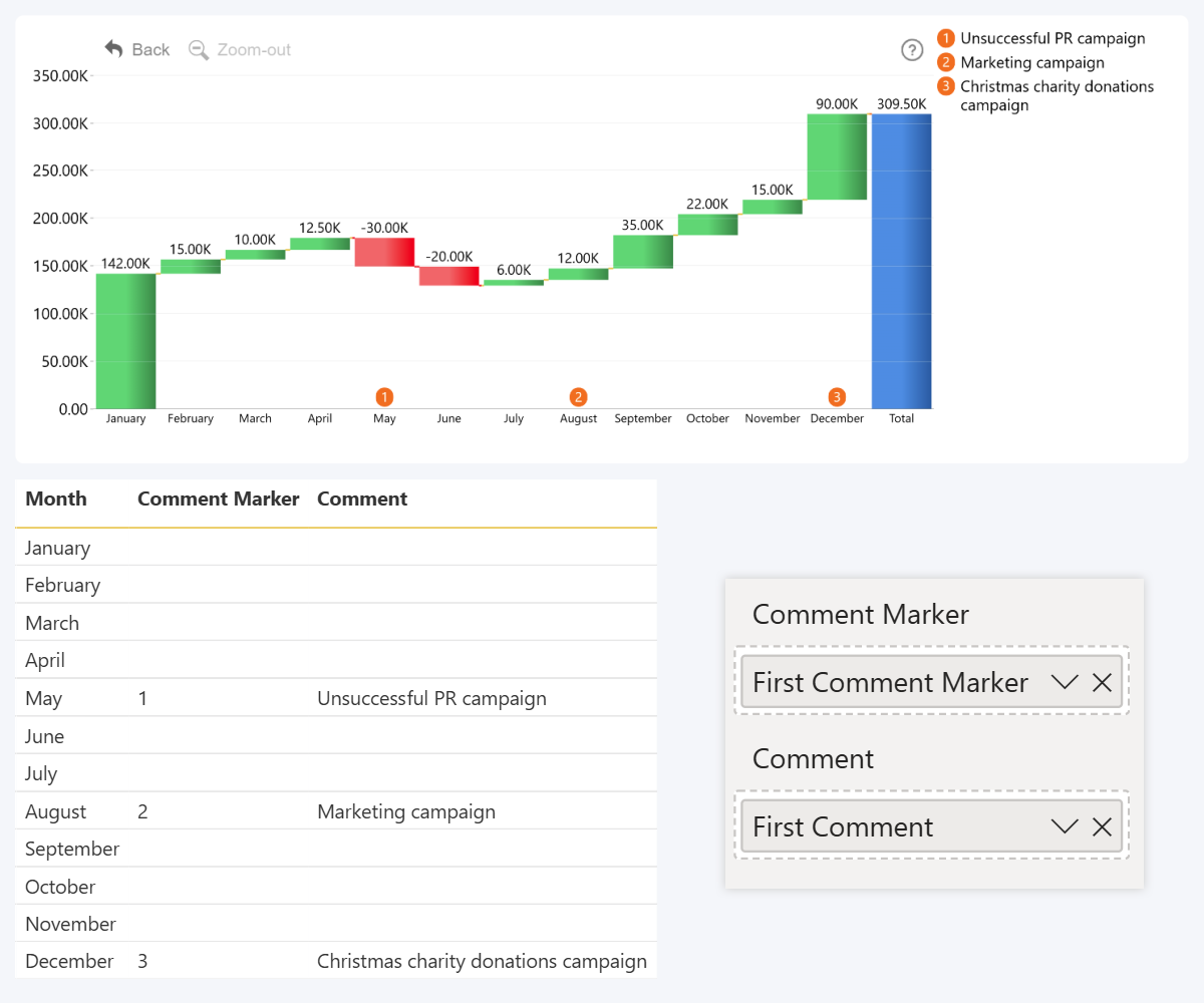
The February 2025 update for Waterfall introduces two new fields – Comment Marker and Comment. They can be used to visually distinguish certain columns and display a text annotation, thus providing additional context to the user.
To successfully display comments, you will need to populate both fields. Comment Marker field must contain a number or letter that will be displayed in the marker for identification – “A, B, C…” or “1, 2, 3…”, whereas Comment field contains text that will be displayed as the annotation in a panel next to the chart.
Once both fields have been populated, a new section will be revealed in the Format Visual tab – Comments. There, you will find various settings to adjust the appearance, including marker position, fill color, opacity, comment font color, size, and other options.
- Documentation: Comments
- Drill Down Waterfall PRO
Timeline, TimeSeries: First Day of Week
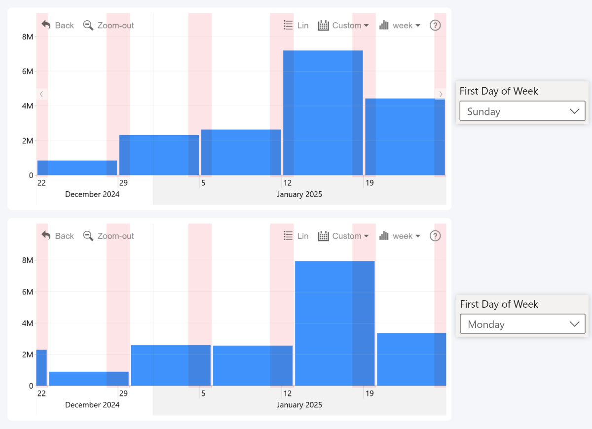
The February 2025 update for Timeline and TimeSeries introduces a new setting – First Day of Week. With it, you can choose if the visual starts weeks on Monday or Sunday. This will allow report creators to better adapt the visual for their locale, since more than 4 billion people start the week on Sunday, including countries like Canada, USA, Brazil, Japan, India and others.
This will affect how the data is aggregated when using Week as the display unit. Example: March 30, 2025 is on a Sunday; when starting the week with Monday, this date and its value will added to Week 13, but with Sunday, it will be a part of Week 14. You can find this setting in the X-Axis section of the Format Visual tab.
- Documentation: First Day of Week
- Drill Down Timeline PRO

 Drill Down TimeSeries PRO
Timeline: 15-second Interval
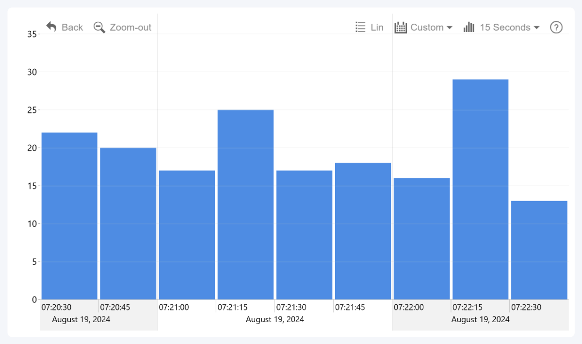
Our Timeline visual supports a wide variety of time units for use in your date hierarchy, ranging from 1 millisecond to 10 years (1 decade). You can view the full list of supported time units in this documentation page. As of February 2025 update, this visual also supports ’15 s’ or ’15 seconds’, allowing you to display 15 second intervals on the X-Axis.
Network: Chart Layouts & Save State
Previously, the only layout option available in the Network PRO visual was force-directed network chart; and other options like Hierarchy or Radial were exclusive to Graph PRO. This changes with February 2025 update, which introduces layout selection to the Network visual, bringing it in line with Graph. In the Layout section, you can select between the following modes:
- Dynamic: Force-directed layout that uses all available space.
- Big Data Dynamic: Force-directed layout optimized for larger datasets.
- Hierarchy: Places nodes top-down based on their hierarchy.
- Radial: Places parent nodes in the center, with child nodes branching outwards.
- Static: Disables automatic repositioning and node physics simulation. Intended for users to create their own layouts and save state.
To better illustrate the difference between the layout modes, here is an interactive JavaScript chart where you can instantly switch between Dynamic, Hierarchy, and Radial modes.
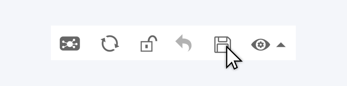
Another Graph feature that’s being brought to Network is the Save State toolbar button, which allows the user to ‘lock in’ the current position of nodes. Once the current state has been saved, the visual will restore the saved layout, even across multiple sessions or after reloading the report page.
Network, Graph: Switch Chart Layouts in Toolbar
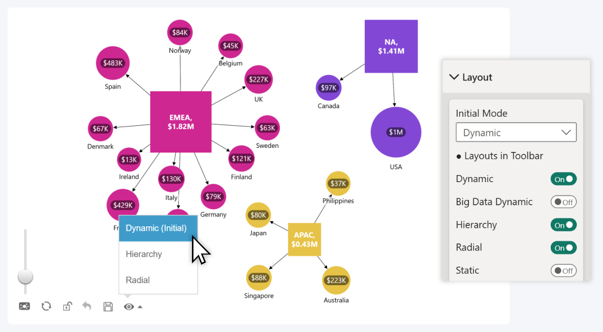
Another change related to the previously mentioned layouts is the addition of a new toolbar control that allows the user to instantly switch between different layout modes on-the-fly. It is available in the February 2025 update for Network and Graph visuals.
In the Layout section of the Format Visual tab, you will find the Initial Mode setting (the default layout for your chart), and a list of toggles – one for each layout. Each toggle that you have enabled will be included in the Layout menu of the toolbar, and the user will be able to switch between the enabled layouts.
Enabling a toggle will also reveal additional settings related to each layout mode. If you do not enable any toggles, the toolbar will not display the Layout menu, and the chart will only use your selected Initial Mode.
- Documentation: Layout
 Drill Down Graph PRO
 Drill Down Network PRO
Get Started with ZoomCharts
Be sure to download the latest version of ZoomCharts Visuals to enjoy these new additions, along with hundreds of other features! With a free trial available, you can see for yourself how these powerful visuals can take your Power BI reports to the next level.

Want more info like this?
Subscribe to our newsletter and be the first to read our latest articles and expert data visualization tips!


