Mar 02, 2024
What is Power BI Ad Hoc Reporting & How You Can Use It
Power BI ad hoc reporting is an approach to data analytics that allows every user to become involved in the report creation and analysis process. Let’s explore this method in more detail and compare it to other types of reports!

Power BI ad hoc reporting is an approach to data analytics that allows every user to become involved in the report creation and analysis process. Let’s explore this method in more detail and compare it to other types of reports!
Power BI has done wonders for data democratization, giving options to more and more people in your company to work with data regardless of their experience in data analytics and business intelligence (BI). With reports becoming easier to create and use, Power BI can empower end users to make quicker and more confident business decisions.
Usually, all things business intelligence are performed by dedicated data analysts who have the required expertise to interpret data and present it to other company employees in an easy-to-understand way. While having an expert prepare a report ensures its quality and accuracy, it also limits the speed and flexibility of the decision-making process.
However, when massive Excel sheets and Access databases were replaced by ad hoc reporting tools like Microsoft Power BI, they introduced a new approach to data exploration. If your company has configured the data sources properly, users can easily create a quick report to find data-driven answers for almost any business questions they are interested in.
To understand the ad hoc report meaning, we need to define both approaches and find out the pros and cons of each. The former method is widely known as canned reports, whereas the latter is referred to as ad hoc reporting and analysis. While they might seem like polar opposites of each other, savvy businesses can use them both at the same time to get the most of their data.

What is a Canned Report?
Canned reports are the commonly used name for the tried-and-true approach to business intelligence in which a data analytics expert creates and distributes reports that answer a specific business question. This is a smooth and systemized process that usually is performed on a regular basis by using prepared Power BI templates. For example, quarterly revenue reports are a classic example of this approach.
By leaving this process to the data analytics experts, canned reporting can provide high quality and data accuracy, allowing the decision-makers to focus purely on the data, not its curation. This also results in a predictable and smooth reporting process.
Canned Report Definition
Canned (adj.) – Preserved and sold in a metal container (Cambridge Dictionary)
Obviously, you won’t find canned reports in the preserved food aisle of your nearest Walmart. If only it was that easy… Instead, canned reports in Power BI refer to reports that are prepared to be used as-is, with no expectation that the user will be able to adjust it for different purposes or make edits to it.
In most cases, this process is made more efficient by developing a previously created template (hence the term canned report) that can be reused for each issue.

Canned Report Benefits
Curated & Accurate Data
When the report is created by an expert with specific knowledge and experience in the data analytics field, you can be more certain that each canned report will feature relevant and fact-checked data. The report will have hand-picked data that answers the questions, without any irrelevant info that might cloud judgement or steer the conversation off-topic.
Predictable & Reliable Process
If your company prefers to operate in a systematic manner that accounts for every minute and each penny, you might find the predictability of a recurring report creation process very useful for management.
Easy for the End Users
Since canned report creation is centralized, users can fully focus on simply exploring the data. Only the report creator needs deep knowledge in data analytics and Power BI. This means that you don’t need to onboard and train your users in Power BI to get insights from the report.
Canned Report Drawbacks
Slow & Inflexible
When your canned reports are produced on a monthly, quarterly or yearly basis, it will not be up-to-date when a user needs to see the most current info, say, in the middle of the quarter. In addition, if a user needs a quick answer for a specific question that’s not covered by the report, it will take time to create a report for that purpose, or, in the worst cases, the request might be denied.
High Barrier of Entry
This approach draws a very thick line in the sand between report creators and report users, limiting their ability to make edits or adjustments or perform ad hoc analysis. Onboarding new employees to report creation or analysis is a lengthy process.
What are Ad Hoc Reports?
Put simply, it’s the ability for anyone to create Power BI reports, not just your BI or data analytics department. It’s a great way to quickly get data-driven answers for a specific question that isn’t covered by canned reports.
A powerful BI tool like Microsoft Power BI enables your users to become report creators themselves. To implement the ad hoc reporting and analysis method in your business, the data sources should be set up to be easily accessed by all the required parties. For example, Power BI can be set up to work with SQL databases or cloud data sources, allowing any employee who’s granted access to perform ad hoc reporting in Power BI.

Power BI ad hoc reporting is a rather straightforward process. Here are the main steps on how to create ad hoc reports in Power BI:
- Create a blank report in Power BI
- Choose your data source
- Add the visuals that you need to analyze your data
- Select the desired data fields for each visual
Et voilà! You have a report. Sure, it won’t be as slick and well-designed as a professionally made canned report, but it will give quick answers to relevant questions.
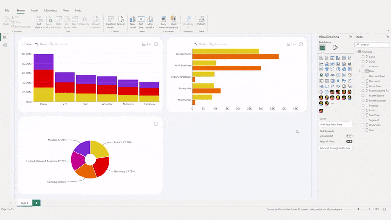
Simple ad hoc reports can be created with the built-in Power BI visualizations. However, with custom visuals like Drill Down Visuals, this process can be taken even further. With these visuals, you can quickly create an interactive and visually pleasing report that is touch-compatible by default, and the intuitive on-chart interactions make it even easier to perform ad hoc analysis.
Ad Hoc Report Definition
Ad hoc (adj., originally Latin “for this”) - for a particular purpose or need, especially for an immediate need (Cambridge Dictionary)
As the name implies, Power BI ad hoc reporting allows users to create a report to quickly fulfill a specific need. In most cases, they are designed to quickly find out a specific answer for one-time use. Unlike canned reports which are created by specific employees, Power BI ad hoc reporting can be done by the users themselves.
Some examples of ad hoc reports include a quick finance or sales report for a specific time period before a board meeting. Another ad hoc reports example would be a report that’s made just to investigate a specific issue or find an answer to a particular question.
Ad Hoc Report Example - Supply Management
Let’s imagine a situation where your company is a local restaurant chain with multiple locations across the city. You have noticed that last week there was a massive surplus of chicken meat in one location, causing the stock to go to waste. At the same time, there’s another location on the other side of the city which couldn’t meet the demand for multiple poultry dishes like Tandoori Chicken, resulting in several bad Yelp reviews.
The restaurant chain manager in this case creates a quick Power BI ad hoc report to compare the stock of each kitchen against the most popular orders in each venue. They’ll just have to add a pie chart to see the most popular dishes, and a timeline chart to see how many of them were ordered each day. As a cherry on top, they can also add an interactive map chart for easier navigation.
With this ad hoc report, the manager found out the possible cause of the shortage and determined that it’s a seasonal surge of demand due to a nearby event. They will take that into account next year and prepare by stocking more poultry in that location. That can be done by redirecting the excess supply from other locations.

Power BI Ad Hoc Reporting Benefits
Quick & Flexible
Power BI ad hoc reporting allows users to find data-driven answers and make decisions much faster than waiting for a professionally created canned report would be. In addition, users can use data that’s not covered by the canned reports.
Transparency & Involvement
When your users have access to the data and the ability to create reports themselves, they become more involved in the data analytics and decision-making process, which encourages a culture where every decision is backed by data. In addition, users can see and use the data that drives the decisions, thus increasing their confidence in the process.
Shifted Workload
When the responsibility of creating all reports lies with just a few data analysts and IT specialists, they can become overloaded, and the process can experience delays – that is especially true in a company with a large amount of employees. However, if users can create a report themselves, they won’t need to add a task to the already high pile on the desk of dedicated data analysts.
Power BI Ad Hoc Reporting Drawbacks
Requires Training
To implement ad hoc reporting in Power BI within your company, the users will require at least a brief training course in data analytics and report creation. While learning the basics of Power BI is not difficult for a technical user, for many it can still be a challenge, especially if their previous experience doesn’t expand outside of Excel.
Thankfully, there are many great online courses on how to create ad hoc reports in Power BI, and you can watch our webinar on Top 5 Power BI visualization practices as a starting point.
Not Applicable for All Use Cases
There’s no doubt that a finely tuned canned report template will always look and feel better than a quickly made ad hoc report. While canned reports are used for the most important business analysis tasks, ad hoc reports are mostly used for simpler everyday questions.
Power BI Ad Hoc Reporting vs. Canned Reports – Which Should You Use?
As you can see, each report solution has its pros and cons. While canned reports provide consistent quality and accuracy, ad hoc reporting introduces a faster and more flexible data analytics process within your company.
However, here’s the real kicker – this isn’t an ‘either/or’ kind of question. Most businesses actually have implemented a hybrid of both of these approaches. The periodic reports are still created in the classic manner, but for specific questions users can create specialized ad hoc reports. This way, the company can enjoy the benefits of both methods, with one mitigating the other’s drawbacks.
Alternative Approach: Drill Down Reports
How to combine the benefits of Power BI ad hoc reporting and pre-made reports in one report solution? We believe that the answer is a professionally-made report that allows each user to easily drill down and explore data to quickly find answers. We call them Drill Down Reports.

These reports are created using cutting-edge custom visuals and developed with ease-of-use in mind. Instead of clunky slicer menus or filters, users can drill down and filter data by clicking or tapping on the chart itself, and these interactions will be familiar to anyone who’s ever used a smartphone or a tablet.
Furthermore, drill down or filtering interactions on one visual will ripple through the entire report and all visuals will work together to display all data with contextual relevance. This will allow to view the same data through multiple perspectives, which, in turn, will allow you to make more confident decisions and avoid tunnel vision.
Read more: Filters in Power BI
Drill Down Reports will give the necessary tools to your users to find the answers to various questions within the same report, thus eliminating the need to create a separate ad hoc report in the first place. This versatility is possible thanks to the smooth and intuitive drill down interactions, which allow you to see both the big picture and take a closer look at the finer details.
Want to see how Drill Down Reports look in action? Try out this Sales Overview Report! It features multiple intelligent custom Power BI visuals, such as Drill Down Map PRO and Timeline PRO. It’s a interactive and all-encompassing tool for analyzing your sales data from multiple angles. You can see the sales performance of your product categories and brand names, the best-performing regions, and comparisons with previous time periods – all on the same report.

It’s just one of our Drill Down Report examples, and you can find other dashboards and reports for sales, finance, inquiries, debtor analysis, and more in our Use-case Gallery.
Read more: Top 5 Best Power BI Dashboards
With Drill Down Reports, your users can perform quick ad hoc analysis on a ready-made report. In most cases, there will be no need to create a dedicated ad hoc report just to answer a specific question anymore, because a Drill Down Report will already have the required data.
You can increase the ease-of-use and interactivity of your reports by using our cutting-edge Power BI custom visuals – Drill Down Visuals. With intuitive on-chart interactions for filtering and drill downs, full touch support, and cross-chart filtering, these visuals will take your reports to the next level. In addition, if you want to see how we can upgrade your existing Power BI reports, check out our Report Overhaul service!
Furthermore, you can request a custom Proof of Concept for your business, giving you the chance to experience how your data would look and feel in a brand new Drill Down Report.

Want more info like this?
Subscribe to our newsletter and be the first to read our latest articles and expert data visualization tips!


