Sep 22, 2020
Use case for a graph visual: mapping subsidiaries of an international organization
ZoomCharts Drill Down Graph PRO offers multiple layout options and unseen level of interaction. In this article we will explore a use case of mapping parent...

ZoomCharts Drill Down Graph PRO offers multiple layout options and unseen level of interaction. In this article we will explore a use case of mapping parent...
ZoomCharts Drill Down Graph PRO offers multiple layout options and unseen level of interaction. In this article we will explore a use case of mapping parent and subsidiary companies of an international organization, which nicely demonstrates the hierarchical and radial layouts of the visual.
You will learn:
- How to build a graph visual to explore hierarchical relationships
- How to use multiple interaction options for better data exploration experience
- How to apply multiple customization options offered by Drill Down Graph PRO
Exploration of hierarchical relationships is the one of the most common use cases for the graph visual. From mapping an organizational structure, listing teams, employees and supervisors, to creating an overview of IT infrastructure and even creating a detailed visualization of a value chain – all these are use cases in high demand from business decision makers. Unfortunately graph visual is still underused because of its complex nature and time resources required to build a quality visualization. However, with this use case we want to demonstrate how building a graph visual can be both- rather quick and easy. And most importantly – with a high value for business.
Let’s get to work and build a graph for parent and subsidiary entities of an international organization!
1. Setting up data
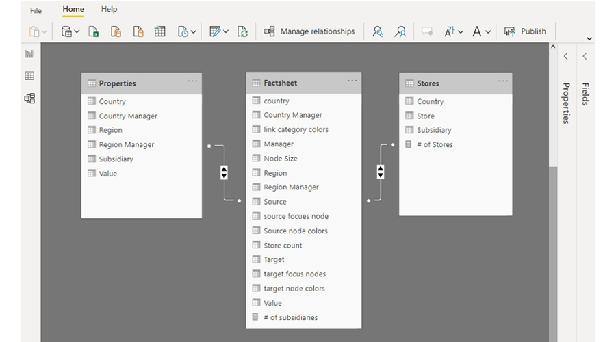
First things first – you will need data. To keep things simple, we are using an excel file that is being imported in the Power BI report. The excel file has 3 tables:
- Fact sheet – this is the main table listing all data necessary for the graph – source and target information (regions, countries, companies and stores), data used for graph customization such as node sizes, colors and link categories, and additional information we will want to display in the graph (region and country managers)
- Regional – additional dimension table to describe properties for each region, that will be used to add additional filters to the report
- Stores - additional dimension table to describe properties for each store, that also will be used to add additional filters to the report
When imported into Power BI, the relationship among these tables are set as in the image below.
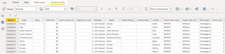
And the fact sheet table looks like this:
You can download the sample Excel file here, and sample .pbix file here, to explore the data setup in detail.
Now, to build the graph visual, you will need to acquire a Drill Down Graph Pro. That can be easily done via AppSource or Marketplace, and for 30 days you can use the full version of the visual for free. If you are new to custom visuals,follow these instructions to import the visual in you Power BI report. Once it’s done, Drill Down Graph Pro will appear in your visualizations tab.
Clicking on the visual will activate it, and you will need to drag the respective data fields into the visual to build the first version of the graph.
Drill Down Graph Pro is unique in the amount of data fields that can be used to build and customize the graph. It gives you as a report creator full control over the chart, and it’s possible to add a lot of information to nodes and links, that will be useful for the end user.
In this case, we will be using the following data fields:
- Source nodes – list of regions, countries and subsidiaries (column Source in the Fact Sheet)
- Target nodes- list of regions, countries, subsidiaries and stores (column Target in the Fact Sheet)
- Value – value creates a link between source and target nodes. In this case we are using value 1 for all instances, because its only purpose is to show that there is an existing relationship (column Value in the Fact Sheet)
- Source Node Color- will determine the color of the source nodes (column Source Node Color in the Fact Sheet)
- Source Node Radius - will determine the size of source nodes (column Node Size in the Fact Sheet)
- Source Focus Nodes – this field allows to determine, which is the main (focus) node when there are multiple hierarchy levels. Value 1 = true, value 0 = false (column Source Focus Node in the Fact Sheet)
- Target Node Color - will determine the color of the target nodes (column Target Node Color in the Fact Sheet)
- Link Category Class – is used to split links into multiple categories, which in return allows to customize each link category separately, e.g., set different color for each (column Link Category Colors in the Fact Sheet)
- Tooltip Content- will determine what information will appear in the tooltip (columns Manager, Regional Manager and Country Manager in the Fact Sheet)
Once you add these data, you first version of the graph will be ready!
2. Customizing chart and interactions
To make the graph visual more user friendly, you will need to tweak it. That’s where visual customization comes in. Drill Down Graph Pro has rich customization options, and in this use case we will demonstrate couple of them.
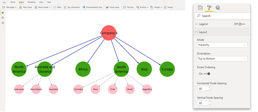
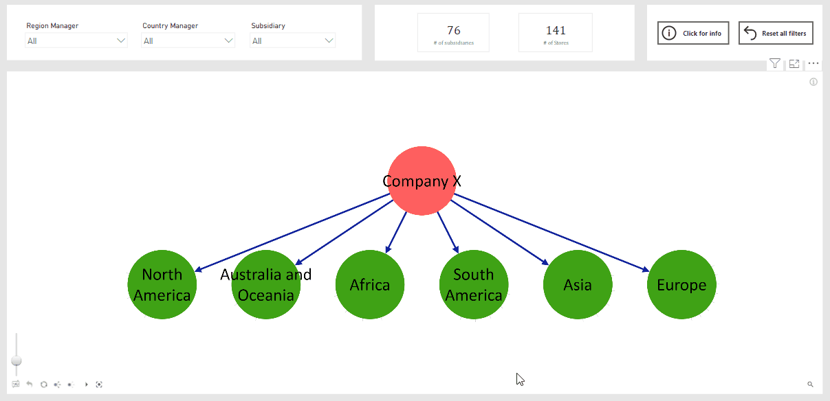
First of all, you will need to choose the layout for the graph. Since this use case focuses on the hierarchy of multiple entities of the organization, we are using a Hierarchy mode with the direction set to Top to bottom.
We are also turning on smart ordering. It helps with the positioning of the nodes by always placing the node with the largest number of child nodes on the right side of the branch.
Adjusting horizontal and vertical node spacing will also help you adjust the node positions in the graph.
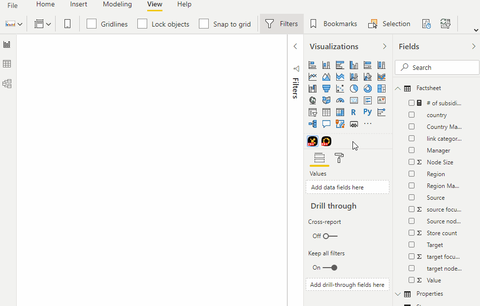
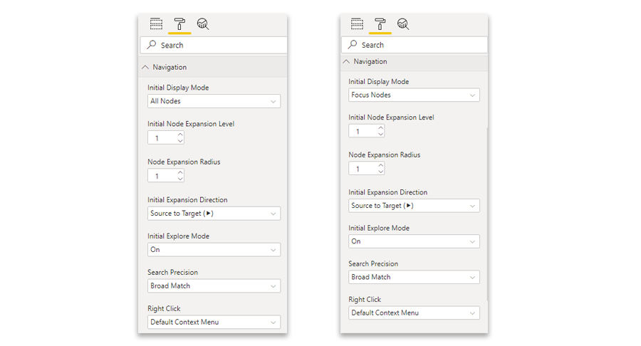
The next thing to customize is the navigation of the chart. Depending on your need, graph visual can be set to display all nodes at once (all nodes), or – you can choose to reveal child nodes as user explores the graph (focus nodes).
The customization setting you will need to use is Navigation. You can see the difference in the set-up for both scenarios in the image below.
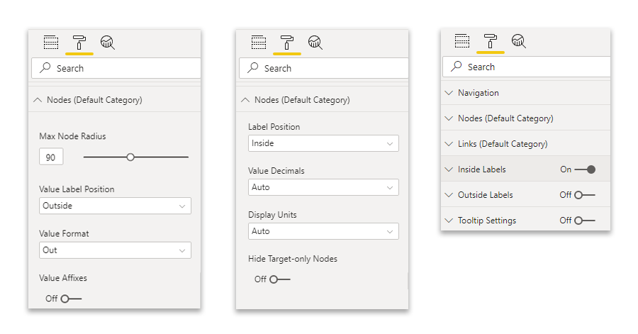
With Drill Down Graph PRO it is possible to display both – node name and node value. There are also multiple customization options available for both. Since in this use case we only need to display node name, not value, we are using a little “hack” to have it displayed the way we want:
- The label position for the node value is set to be “outside”
- The label position for the node name is set to be “inside”
- And here comes the “hack” - once node value is set to outside, you will be able to turn it off completely, as it is done for this use case
You can do all of the mentioned in the Customization tab >> Nodes (default category), Inside labels and Outside labels.
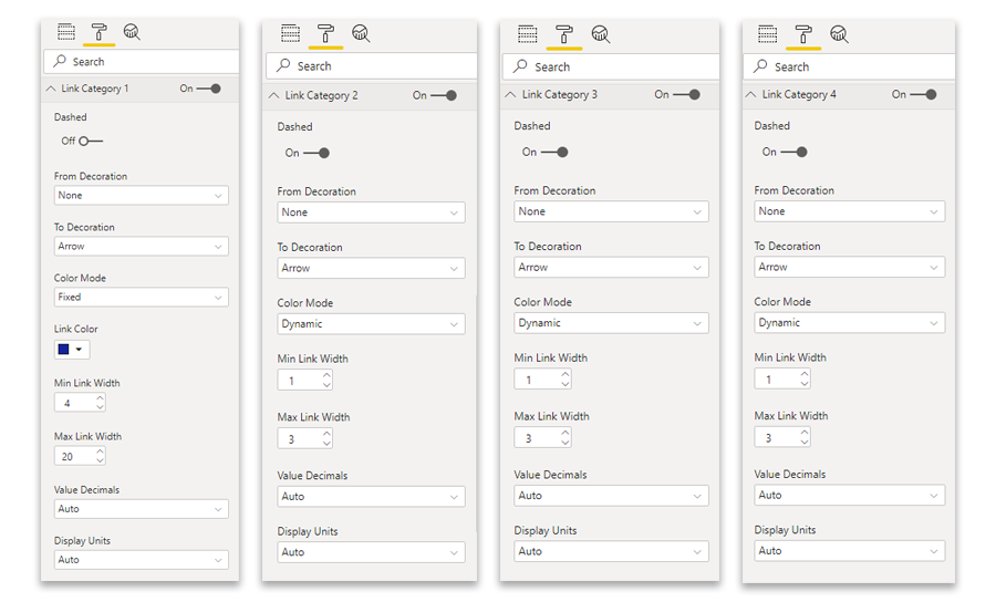
Another customization option used in this example is link categories. In data table we had a column specific for this purpose, splitting all links in 4 categories. Because of it in the customization tab you will see a section for each of the link categories. And in the image below you can see how they are set up for this use case.
There are other customization options applied such as adjusted node radius, fonts and toolbar items You will be able to see them all in the .pbix sample file.
3.Adding additional elements to the report
If all you need is a graph visual and your report ends users will be happy with that, you can stop here. However, in our experience we see that end users appreciate well design reports with additional data filtering options, that make their data exploration experience quick and easy.
Therefore, in this use case we are offering to add additional elements to the report to show how graph can be combined with other visuals.
If your users prefer to see fully expanded graph visual right away, you can add Drill Down Donut PRO visual that will work as a filter. With 2 drill down levels, drilling into region and country, users will be able quickly explore the graph and locate the subsidiary they are interested in.
If you are opting in for more interactive graph exploration experience, external filter for region/country might not be required. In this case graph alone might be enough. However, we have added additional slicers in case users wants to explore the graph and locate the entity for which a particular employee is responsible.
For these elements we are using data from additional data tables mentioned at the beginning of this article. They are separated from the Fact sheet table to make data structure simpler, easier to manage and report would use less resource (principle of the star schema)
In case you need help with setting up these elements in you report, refer to the sample .pbix file, where both - data fields and customization settings- will be available.
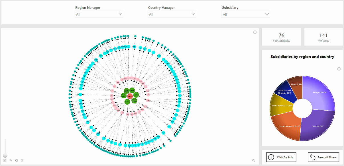
4. Demo report
If you have followed all the instructions, you should now have a report with graph visual mapping out a structure of an international company. Or - you can use the embedded report right here to show your colleagues and report end users what can be achieved with Drill Down Graph Pro.

Want more info like this?
Subscribe to our newsletter and be the first to read our latest articles and expert data visualization tips!


