Jul 05, 2023
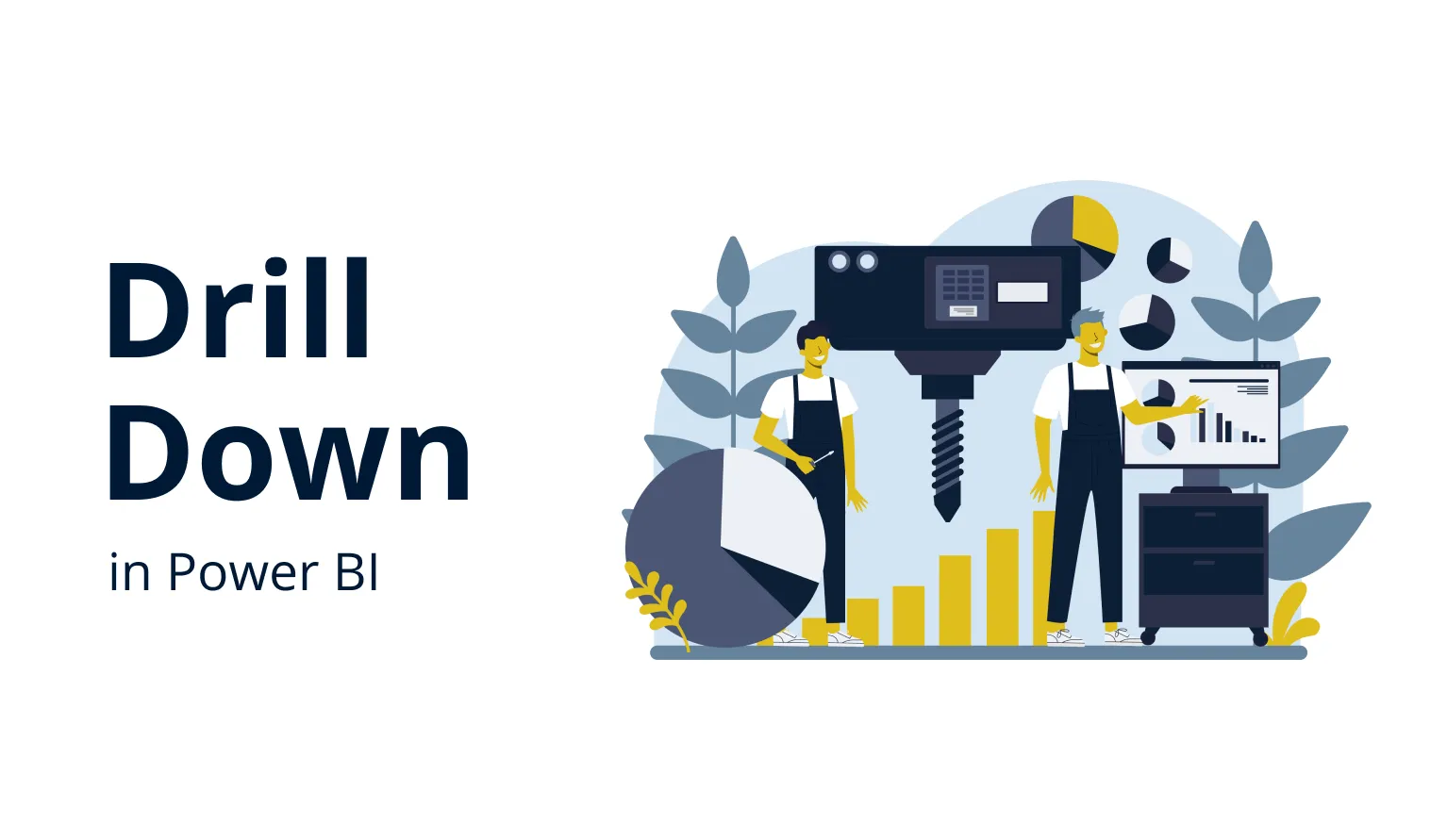
Power BI Drill Down: The Ultimate Guide
In this article, we’ll explain what are drill downs in Power BI, and give you some tips and practical examples on how to correctly implement them and make your reports more interactive.
In this article, we’ll explain what are drill downs in Power BI, and give you some tips and practical examples on how to correctly implement them and make your reports more interactive.
What is Drill Down in Power BI?
Drill down is an interaction that reveals a deeper level of data to the user.
It’s incredibly fun to say the phrase “drill down”, because it invokes the imagery of massive industrial equipment unearthing valuable minerals from the ground. In a similar fashion, when you drill down on a Power BI report, you dig deeper into a chart to get additional insights from the data that interests you.
Each visual has a default view that appears whenever you open the Power BI report. It will usually show an overview of the data as chosen by the report creator. By drilling down, you can go a level deeper and reveal additional information that you couldn’t see before.
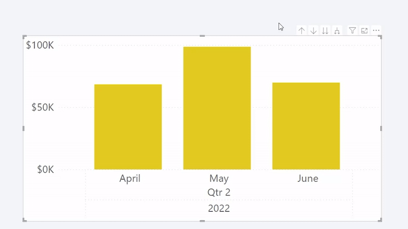
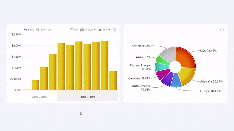
For example, you may use a financial report that features a timeline chart of your revenue. The default view is set to a monthly summary, and you notice a massive spike in May. By drilling down, you can expand May into a more granular view and see a daily view, which will help to pinpoint the reason for that spike – a successful sales deal that was closed on May 12.

Here’s another example – a column chart comparing the sales performance of various product categories. Columns will show the total sales of each category, but what if you want to take a closer look at your best performing products within a specific category? When you drill down, the view will shift to a more granular view.

These are just a few examples of how drill down interactions can be used to enhance the data exploration capabilities of your Power BI reports. In simple terms, it allows your users to “zoom-in” at specific data they are interested in to gain additional insights.
When implemented in an intuitive and easy-to-use way, drill down interactions are a force multiplier when it comes to the interactivity and versatility of Power BI reports.
How To Drill Down in Power BI?
You’re using a Power BI report and you see some data on a visual that you want to inspect more thoroughly. How can you do that? That depends, and in this section we’ll explore the most common ways to drill down in Power BI reports.
Keep in mind that not all Power BI reports support drill down functionality by default. The report creator must design the data model and the Power BI report to accommodate for these features.
Furthermore, the way users can activate them may differ depending on the visuals and their settings. In the default Power BI visuals, drill down features can be activated via the action bar which can be accessed by hovering over the visualization. If enabled, the action bar will contain controls for multiple data exploration features, including a drill down and up button.

Another way to provide drill down controls is by putting the button in a right-click menu. The user can access it by right-clicking directly on the visual. It’s a convenient and logical place for this button.
However, this approach may not be intuitive and readily apparent to users, and they may not even be aware that the visual offers drill down functionality unless they are told that beforehand (or they have a habit of manually right-clicking on any visual they see out of sheer curiosity).

The most intuitive way to drill down, however, is by clicking on the chart itself. That’s because the user does not have to look around for the ways to perform this interaction – they simply touch on the data they are interested in to get more of it.
There are many visuals that provide on-chart interactions, however the default behavior is rarely set to drill down – usually it’s highlighting. Depending on the visual and its capabilities, you can set other actions like filtering, drill down, or others as the default left-click behavior.
During the design process of Drill Down Visuals, we made the decision to focus on drill down as the main user interaction. We found out that most users click or tap in Power BI with the intention to reveal more data, which is why for Drill Down Visuals, it’s the default behavior for most left-click interactions.
How To Create a Drill Down in Power BI?
Adding drill down capabilities to your Power BI reports seems like a no-brainer. They provide immense value to the user, and they aren’t that hard to activate either. Power BI supports drill down, drill up and drill through features just like many other filtering and data navigation interactions, and how it’s implemented depends on the report creator’s choices, data model and the visualizations. Here’s what you need to create a drill down interaction in your Power BI report.
Step 1: Choose Drill Down Capable Visuals
First things first. You have to make sure that the visuals you want to use support drill down features in the first place. Nowadays it’s not an issue, since many of the default Power BI visuals are drill down capable, and a large part of custom visuals from AppSource provide some form of drill down interactions – though they may differ in the way they’re implemented.
As described above, some visuals may not place as much of an emphasis on drill down interactions as others. If you want to build a report which makes its drill down capabilities instantly apparent to any user and encourages more users to explore data in a deeper detail, you’ll want to choose visuals which are built ground-up to provide intuitive and simple-to-use on-chart interactions for data exploration – like our Drill Down Visuals!
Step 2: Make Sure Your Data Is Designed for Drill Down
The visual needs to know what to show in the initial view and what data to drill down to, which is why your data should contain a hierarchy. Data requirements differ between various visuals, but in most cases the hierarchy will signify the relationships among data categories.
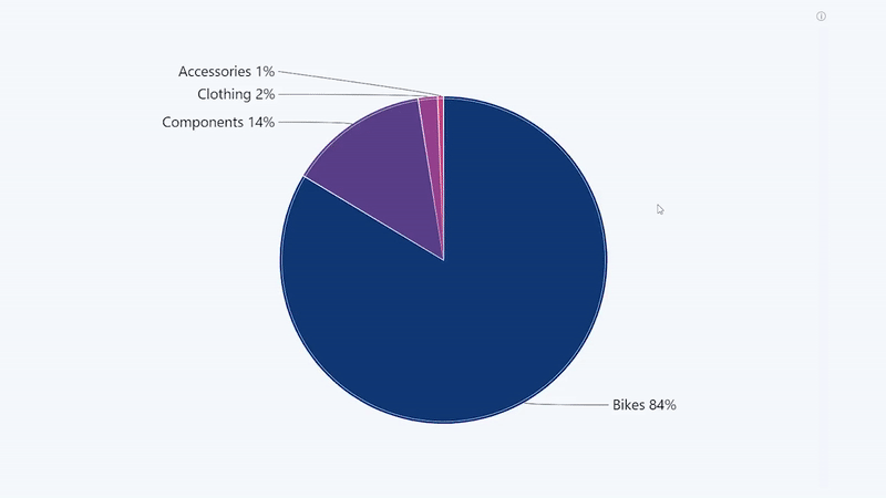
Categorical data (for pie, donut, bar, or similar chart types) should contain multiple categories that you can use to create a hierarchy. For example, in a human resources database, each employee may be assigned to their own team; and then each team can be assigned to a larger department.

For some data types, drill down will be a match made in heaven. For example, visuals like Drill Down TimeSeries PRO will use the time or date column to group data by years, months, days, hours or other time units, making it easy to implement drill down interactions. Similarly, Drill Down Map PRO can combine multiple nodes that are within a close proximity to each other into a compact donut or pie chart and expand them as you drill down.

Step 3: Enable Drill Down
Great – I have the visuals, and I also have the data for it. How can I get this drill down thing working in my visuals?
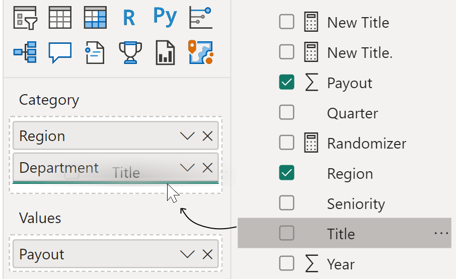
After you have placed the visual on your report, you must define the data fields that you want to use in the Build visual tab of the Visualizations pane. While this process may differ depending on the visual, in most cases you just need to drag the categories that you want to use into the relevant data field. Keep an eye on the order of your categories because it will determine the levels of your drill down hierarchy.
Power BI Drill Down vs Drill Through
You’ve probably seen these two terms – drill down and drill through. Even though they both talk about “drilling” into data to reveal more insights, they are not to be used interchangeably. Here’s a brief overview of the three drilling-related terms you are likely to encounter when using Power BI.
- Power BI Drill Down: When you perform this action, you change the visual’s view to one level below in the data hierarchy.
- Power BI Drill Up: This is the opposite of a drill down. If you want to return to the previous view, simply drill up to go one level above.
- Power BI Drill Through: This is an interaction which will reveal a more detailed and thorough look at the data, usually as a table or destination target page. The report creator can choose a specific selection of data or show all data at once. Depending on the visuals or settings, drill through is usually activated via right-click menu, toolbar controls, or a specific button manually placed by the report creator.

Why Drill Down is Important
As businesses gather and process more and more data, you will never be able to show the entire story on a single report page. If your report does not allow the user to drill down, you will either have to place several visuals on it to provide the necessary context, create additional report pages, or omit valuable information for the sake of clarity.
If the user does not have the capability to drill down to deviate from the default view and find the answers they are looking for, they’ll either walk away unsatisfied with the report and without a clear understanding of the entire picture or spend valuable time asking the data analyst team for an additional report that provides the answers they need.
Drill down in Power BI helps you avoid that.
By implementing drill downs as a core feature of your reports, you can enjoy three benefits that will vastly speed up the entire business intelligence process within your organization.
Drill Down Benefit #1: Better Insights
In a static report without drill down features, the creator has to make the tough choice of what should the initial view display. If it’s an overview, the data will lack resolution and the user will not be able to analyze it in detail; but if it’s too focused on one section of the data, the user may get tunnel vision and ignore the entire context.
However, if the visuals on your report allow the user to drill down, they will be able to get a more complete picture of your data and make better-informed decisions. The initial view can provide a holistic overview of the data, but if the user wants to drill down to specific sections they are interested in, it’s also possible.
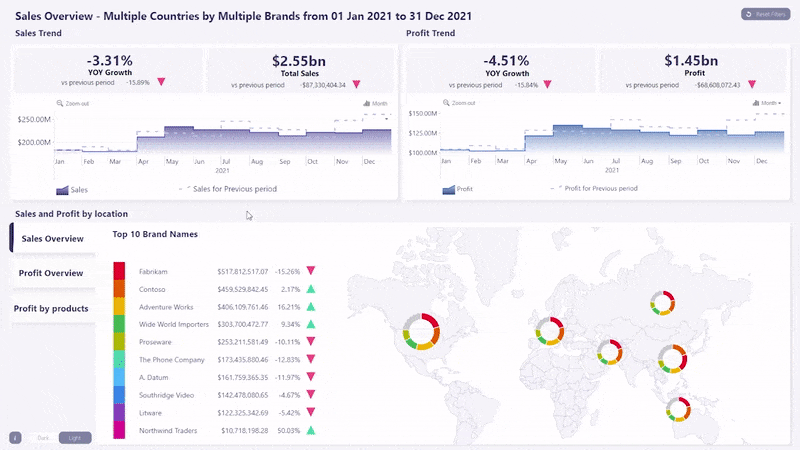
This will also satiate the user’s curiosity by answering more questions within the same report. For example, if the user wants to see how many products of brand X your company sold in South America during Q2 2021, they can simply drill down and get the answer they need in mere seconds – no additional reports required.
Drill Down Benefit #2: Cleaner Reports
When the report creator has drill down capable visuals in their toolbox, they open up more possibilities for report design. Since these visuals allow the user to explore the same data in various levels of hierarchy or magnification, you can use the same chart to fulfill multiple purposes.
For example, you can feature the same time series chart with the purpose of showing a yearly overview of your budget at the initial view, but with an expectation that the user will zoom in to specific months or weeks to take a deeper look at them.
And, if the same visual can fulfill multiple purposes and provide more answers, you will require fewer visuals on your report to tell the entire story with your data. You won’t need two of the same visual to show two different levels since the user can simply drill down, whereas drill through will make a dedicated data table on your report optional since it can be accessed on-demand.

Drill Down Benefit #3: More Intuitive & Engaging Reports
Whether it’s a website, a smartphone app or a desktop program, most user interactions – clicks, taps or keystrokes – are done with the intention of receiving more data. For example, the weather app on your phone, most likely, displays the current temperature and a weekly overview. If you want to explore the weather data for next Tuesday in more detail, you will instinctively click on that day. Technically, that was a drill down, and modern user interfaces have conditioned us to get more data with each interaction.
You can use a similar principle when designing Power BI reports. Many Power BI charts look so beautiful and clickable that the users will naturally try to interact with them. And, if they do not meet the user’s expectations of getting their clicks rewarded by more data, the user may experience frustration.
However, if the report functions in a similar way to their favorite apps, desktop programs or websites, where each click or tap gives them access to more data, they will find it easier to get up to speed with your reports and start using them more for data-driven decisions.
This is the core design pillar that we focused on when designing our Drill Down Visuals for Power BI. With intuitive and touch-friendly on-chart interactions, you can build intuitive and immersive reports that make data exploration easy, fast, and engaging.

What is a Drill Down Report?
We’ve talked a lot about enabling drill down features in Power BI visuals. What would happen if the entire Power BI report was designed in such a way to encourage users to explore the data, find answers they’re looking for and get a deeper insight?
The answer to that question is Drill Down Reports – a new approach to Power BI report design which empowers any user to get immersed into the data exploration process and participate in data analysis.
This kind of reporting differs from regular reports by following UI design practices that encourage users to click or tap on the report elements and make drill down interactions the main focus of the user flow. Each visual featured in a Drill Down Report must provide drill down capabilities, and they should be accessed with on-chart interactions such as clicks or taps, instead of being hidden behind menus or off-chart controls.
This way, the drill down capabilities will be more intuitive to use and readily apparent to the user, which will encourage them to interact with these features and explore data in closer detail. Furthermore, other visuals will provide contextually relevant info as the user drill downs or filters information on one chart, thanks to cross-chart filtering – making Drill Down Reports truly intelligent and dynamic.
That, in turn, will help your users become more excited, engaged, and interested in data analysis and avoid tunnel vision or complacency-induced errors. Furthermore, exciting and easy-to-use reports will bolster the adoption rate of Power BI reports within your organization, strengthening the data culture.
Drill Down Report Example
Here's an example, as imagined by our team of report creators and UX experts. Our Use-case Gallery contains multiple Drill Down Report templates you can download and take inspiration from, but we’d like to highlight our Revenue vs Budget report that allows users to easily take a look at the main financial performance indicators – revenue, profit, budget completion, and others.
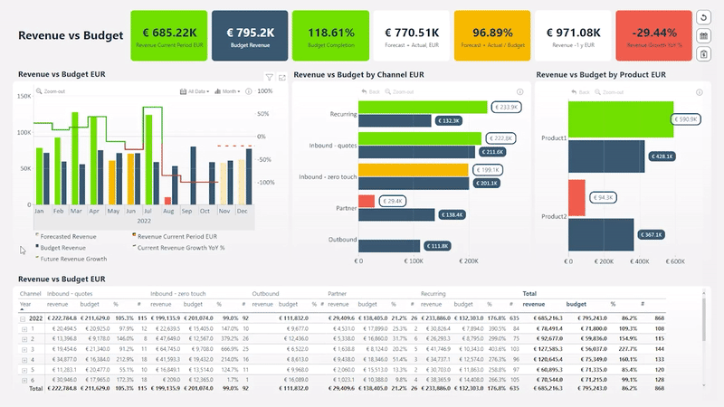
The finance dashboard's user-friendly design is clean and visually pleasing, combining quick insights at the first glance with excellent drill-down capabilities. For example, if you want to see a more detailed revenue and budget breakdown per a specific channel or product, simply click on the specific bar you’re interested in to drill down.
With cross-chart filtering, the entire report will echo your interactions, giving you a complete picture of your financial performance. For example, selecting a specific date range on the timeline chart will apply the filter to other visuals as well, showing only data in that time period.
Conclusion
If you are looking for ways to make your Power BI reports more interactive and versatile, implementing drill down functionality seems to be a no-brainer. It’s a simple way for user to explore the data in a closer detail, allowing them to draw better and more informed conclusions from your report.
With ZoomCharts Drill Down Visuals, you can build visually impressive, easy-to-use and highly functional Power BI reports that make data exploration swift and exciting – Drill Down Reports.

Want more info like this?
Subscribe to our newsletter and be the first to read our latest articles and expert data visualization tips!


