Enhance your Power BI reports with an eye-catching and easy-to-use line chart for categorical data that invites users to interact & explore. Create a drill down hierarchy to instantly provide deeper insights with just a click.
Get Developer License See it in action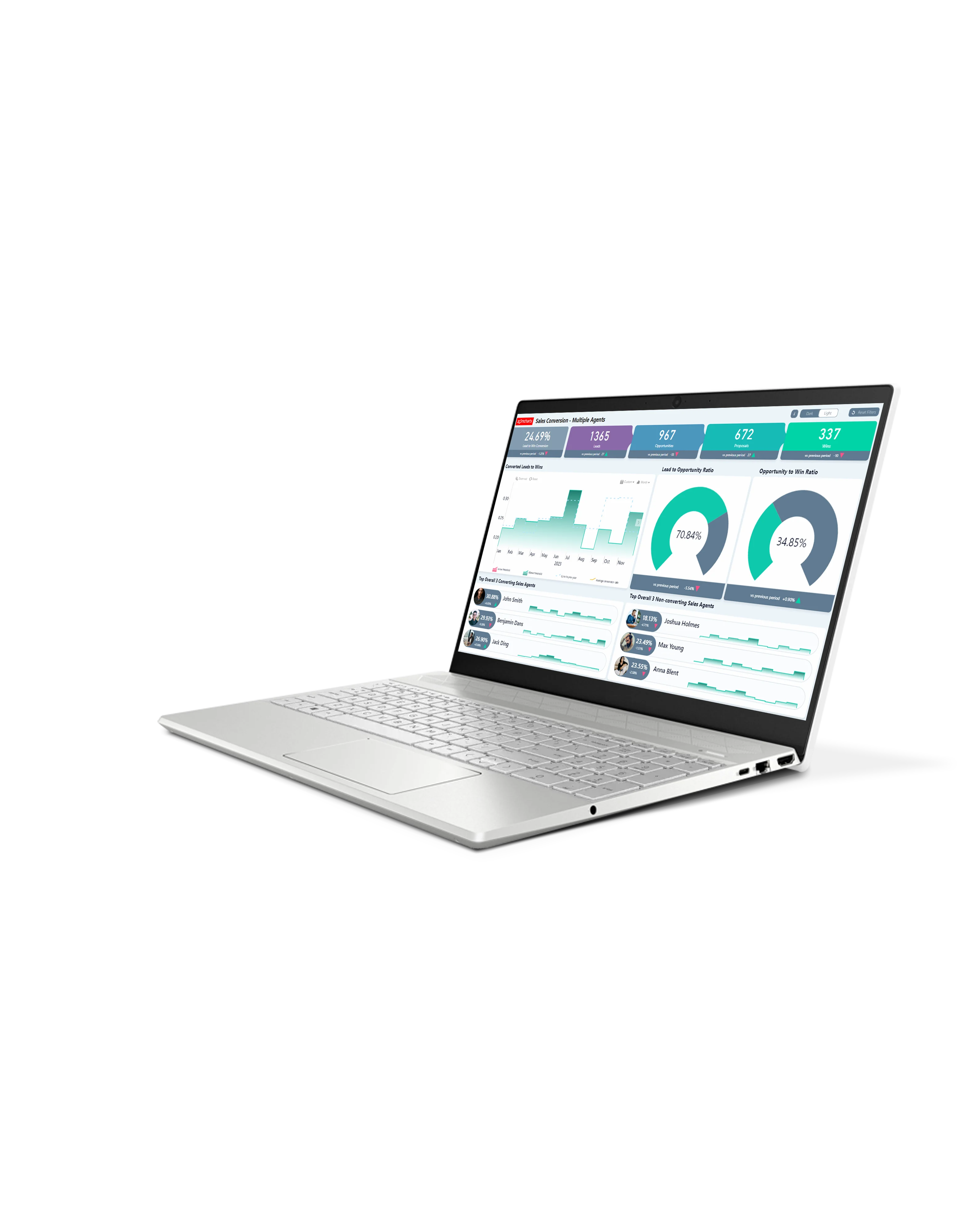
Enhance your data storytelling with visuals that perfectly balance data density with easy readability. Build interactive reports that make data exploration exciting.
ZoomCharts visuals provide intuitive user experience, allowing any user to explore data and quickly gain meaningful insights; even if it’s their first time using Power BI.
With ZoomCharts, data consultants can expand their services, increase customer satisfaction and foster stronger and more involved relationships with their clients.
Maximize the value of your investment in Power BI by increasing the user adoption rate with reports that users love to explore and start using every day.
Create and share reports that produce clear and reliable insights with no room for confusion. Strengthen data literacy and employee trust within your organization.
Enjoy peerless flexibility with more than 200 easy-to-use configuration settings in each visual and full support for touch screen devices and mouse/keyboard.
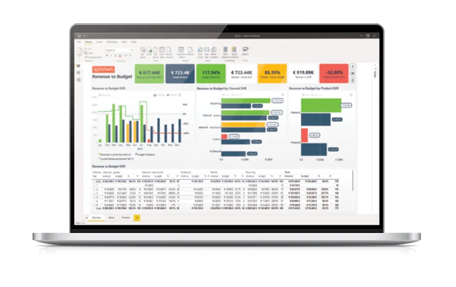
Our visuals seamlessy work together to create PRO Reports - the most immersive and user-friendly way to explore data.
See the full picture and uncover valuable insights by analyzing data across multiple visuals via cross-chart filtering.
Spend less time searching for answers. With ZoomCharts, the data you’re looking for is fewer clicks away.
See the full picture and uncover valuable insights by analyzing data across multiple visuals via cross-chart filtering.
Spend less time searching for answers. With ZoomCharts, the data you’re looking for is fewer clicks away.
Try live demos of incredible Power BI PRO Report examples created by ZoomCharts team and community members!
Choose between solid, dotted, or dashed lines, toggle line smoothing, and enable line smoothing. Customize color, thickness, markers, and other settings for each line.
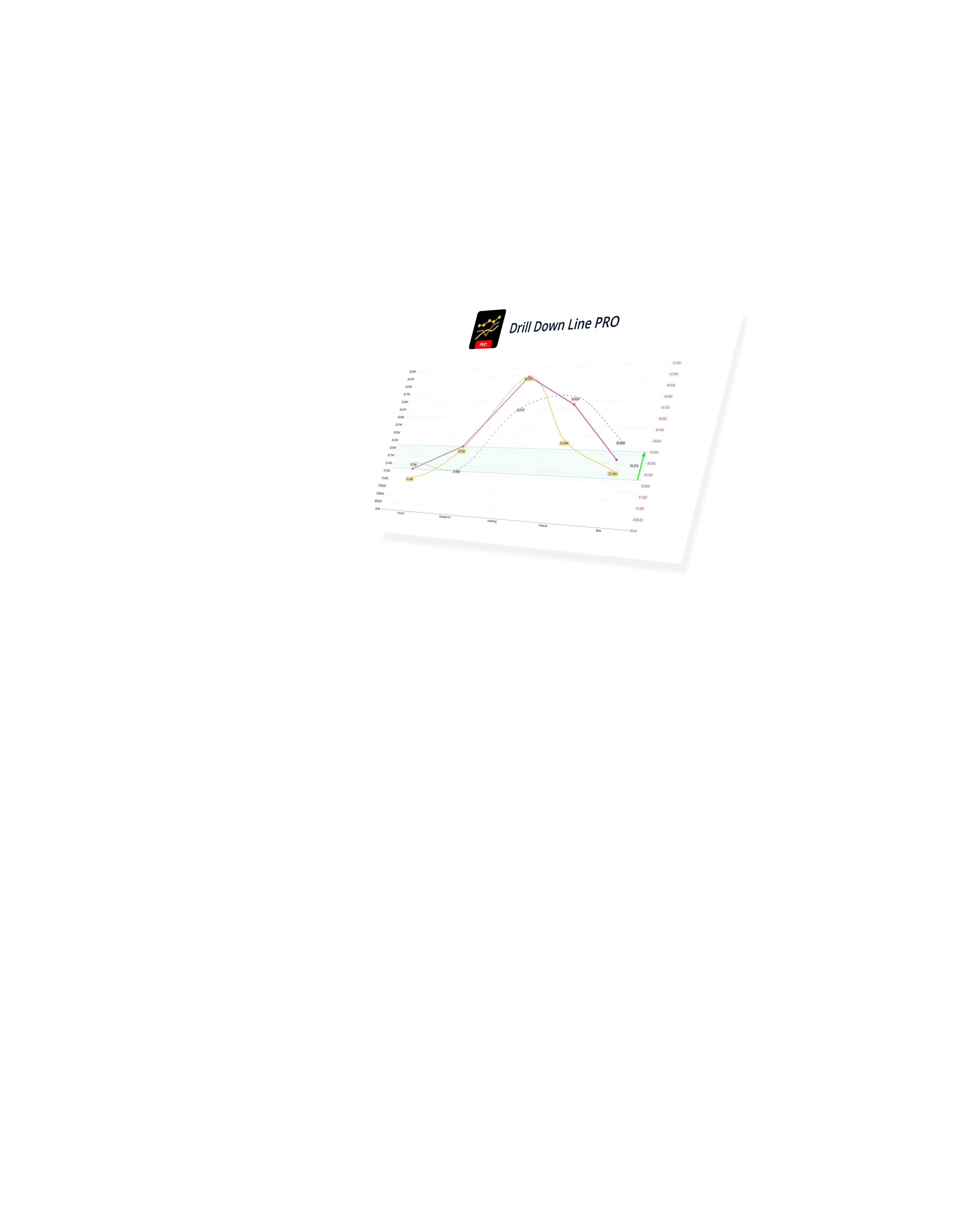
Whether you want to create a simple chart with just one line, or compare data across multiple series, Line PRO will easily handle that. Each series can be configured separately to visually distinguish your data.
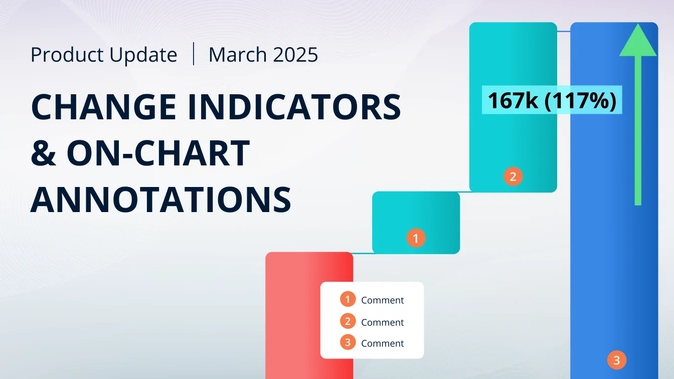
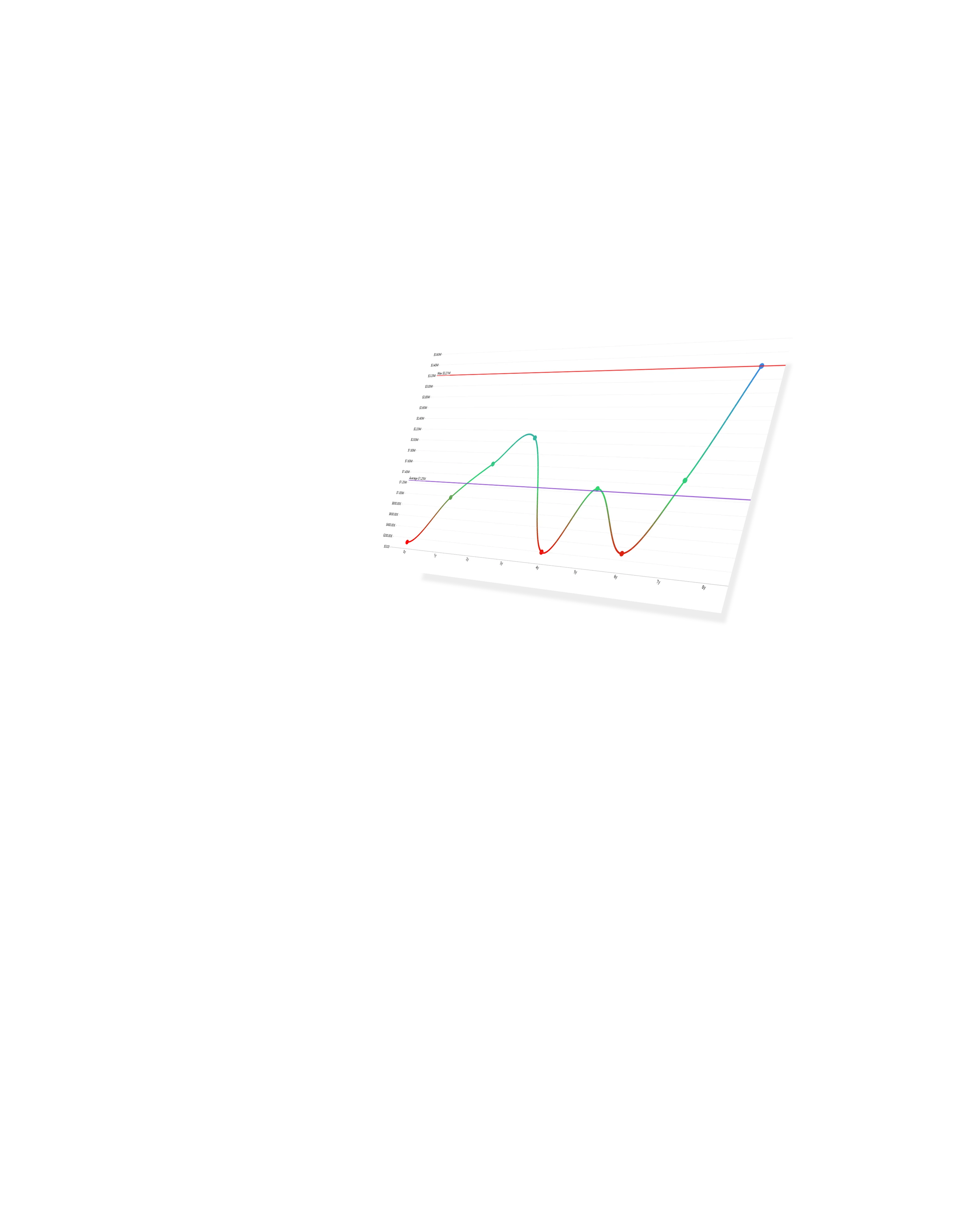
Visualize change or compare your numbers against KPIs, benchmarks, or projections by setting static or dynamic thresholds. You can feature up to four different thresholds simultaneously.
Set conditions that will automatically apply custom formatting settings based on your data, including color and opacity for the line itself and the value labels.
Choose how the chart displays values with no data: ‘Join’ to extend the line over that gap, ‘Zero’ to replace the empty space with a zero value, or ‘Skip’ to stop the line over empty values.
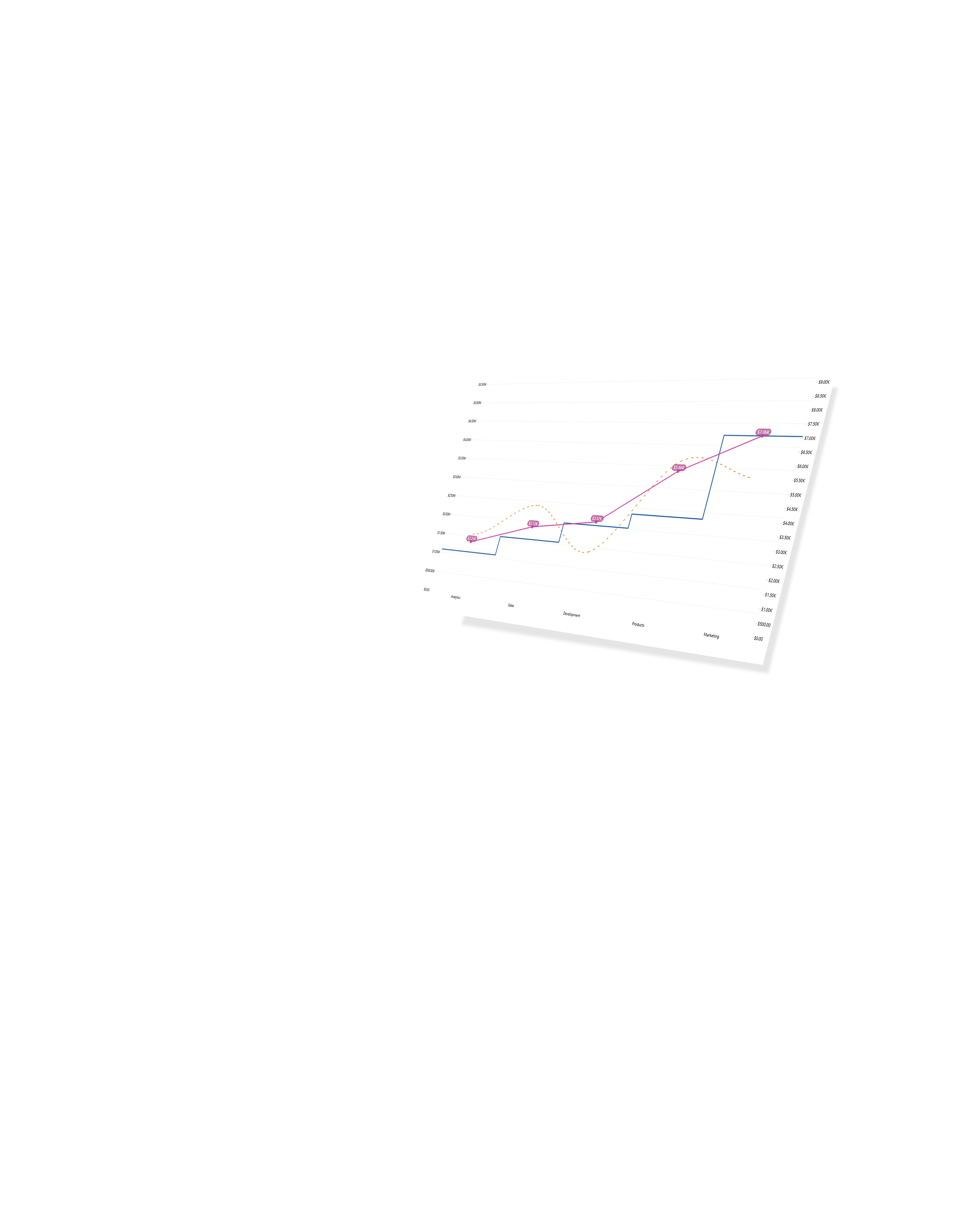
When you select data in Line PRO, it will also apply a filter to other visuals and vice versa so you can instantly analyze data from multiple dimensions. Build interactive and insightful reports – or, as we call them, 360° Reports.
Add a column to the Legend field, and Line PRO will instantly split the series values into subsegments and display each subsegment as a clickable legend item.
Add your own creative flair to your reports or make it fit your brand guidelines with a wide range of options, including axis customization, label and legend appearance, tooltip content field, and custom theme support.
Click and hold to select data, and triple-click to invert your selection. This way, you can quickly select all data except specific categories.
Share a few details in the contact form so we can better help you and your company!
Learn even more about report creation with Drill Down Visuals.