logo
For Power BI
  • Products
    • Drill Down Donut Pro Drill Down Donut PRO
    • Drill Down Pie Pro Drill Down Pie PRO
    • Drill TimeSeries Pro Drill Down TimeSeries PRO
    • Drill Combo Pro Drill Down Combo PRO
    • Drill Map Pro Drill Down Map PRO
    • Drill Scatter Pro Drill Down Scatter PRO
    • Drill Down Network Pro Drill Down Network PRO
    • Drill Down Waterfall Pro Drill Down Waterfall PRO
    • Drill Down Graph Pro Drill Down Graph PRO
    • Drill Down Timeline Pro Drill Down Timeline PRO
    • Drill Down Combo Bar PRO Drill Down Combo Bar PRO

    Video tutorials

    Watch Now

    More than 90 videos on how to enhance Power BI with ZoomCharts

    Learn more
    All visuals
  • Resources

      Resources

    • Documentation
    • Report Examples
    • Blog
    • Webinars
    • Video Tutorials
    • Visuals Gallery

    Support

    • ZoomCharts Assistance
    • Contact Sales
    • Contact Support
    • FAQ

    Challenges

    Challenges

    Improve your report creation skills by participating in free challenges for report creators.

    Learn more
    Start trial
  • Services
    • Power BI Report Development
    • Custom Visual Development
  • Challenges
  • Pricing
Request a quote Start Free Book a Demo Sign in
Get it now
Go back

Contents

Go back

Jan 15, 2025

January 2025: New Customization Options

We have added outline conditional formatting, color customization for selection and highlight areas, comma-separated source nodes for Graph, and a setting to hide empty values in the tooltip.

Title image
Title image

We have added outline conditional formatting, color customization for selection and highlight areas, comma-separated source nodes for Graph, and a setting to hide empty values in the tooltip.

Contents

Share this article

Your visuals should update automatically from AppSource. If your visuals have not received the updates automatically, read this documentation article that explains the manual update process.

Multiple Visuals: Selection and Highlight Customization

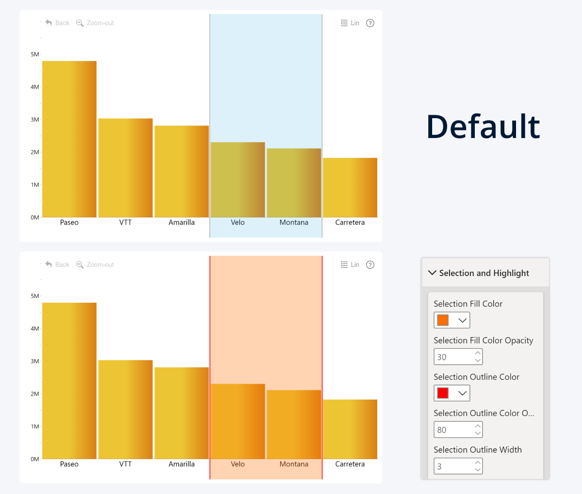
We have added new customization options to Combo (v1.12.30.0), Combo Bar (v1.12.29.0), TimeSeries (v1.12.19.0), Timeline (v1.11.26.0) and Waterfall (v1.11.23.0) to finetune the look and feel of the visuals even further. The new settings allow report creators to choose the color and opacity of the selection area and mouseover highlight.

Selection Fill & Outline

By default, whenever the user selects data on the visual, the selected area is marked with light blue fill at 15% opacity, and 2px light gray outlines at 50% opacity. With the new update, you can now change the default appearance to better fit your report theme or user requirements with the following settings:

  • Selection Fill Color: Choose the fill color for the selected area.
  • Selection Fill Color Opacity: Adjust the opacity of the selected area.
  • Selection Outline Color: Choose the outline color that marks the boundaries of the selected area.
  • Selection Outline Color Opacity: Adjust the outline opacity for the selected area.
  • Selection Outline Width: Adjust the outline thickness for the boundaries of the selected area.

Change Selection Area color in ZoomCharts Power BI Visuals

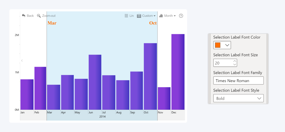
Selection Label (only in TimeSeries & Timeline)

When the user selects a certain timespan in TimeSeries or Timeline, the selection area can also show the start and end unit of the selection (i.e. March to October, or 2023 to 2025). The following settings can be used to customize the text appearance for the labels:

  • Selection Label Font Color: Choose the font color.
  • Selection Label Font Size: Adjust the font size.
  • Selection Label Font Family: Enter the name of the desired font family from the ones included in PBI.
  • Selection Label Font Style: Apply bold, italic, or bold + italic styles to the labels.

Selection Label Customization in ZoomCharts Power BI Visuals

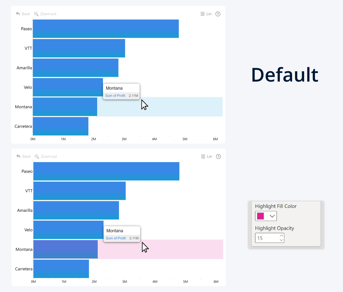
Highlight Fill & Opacity

Whenever the user hovers over the chart, the visual highlights the hovered area to provide feedback and indicate what data is displayed in the tooltip. The default fill for the highlighted area is light blue at 15% opacity, but with the new update, you can now change the following settings:

  • Highlight Fill Color: Choose the fill color of the hovered area.
  • Highlight Opacity: Adjust the fill opacity of the hovered area.

Change Mouseover Highlight Color in ZoomCharts Power BI visuals

The new settings can be located in the Selection and Highlight section in the Format Visual tab of the Visualization pane of the following visuals:

  • Documentation: Selection and Highlight
  • ZoomCharts Drill Down Combo PRO Icon ZoomCharts Drill Down Combo Pin IconDrill Down Combo PRO
  • ZoomCharts Drill Down Combo Bar PRO Icon ZoomCharts Drill Down Combo Bar Pin IconDrill Down Combo Bar PRO
  • ZoomCharts Drill Down TimeSeries PRO Icon ZoomCharts Drill Down TimeSeries Pin IconDrill Down TimeSeries PRO
  • ZoomCharts Drill Down Timeline PRO Icon ZoomCharts Drill Down Timeline Pin IconDrill Down Timeline PRO
  • ZoomCharts Drill Down Waterfall PRO Icon ZoomCharts Drill Down Waterfall Pin IconDrill Down Waterfall PRO

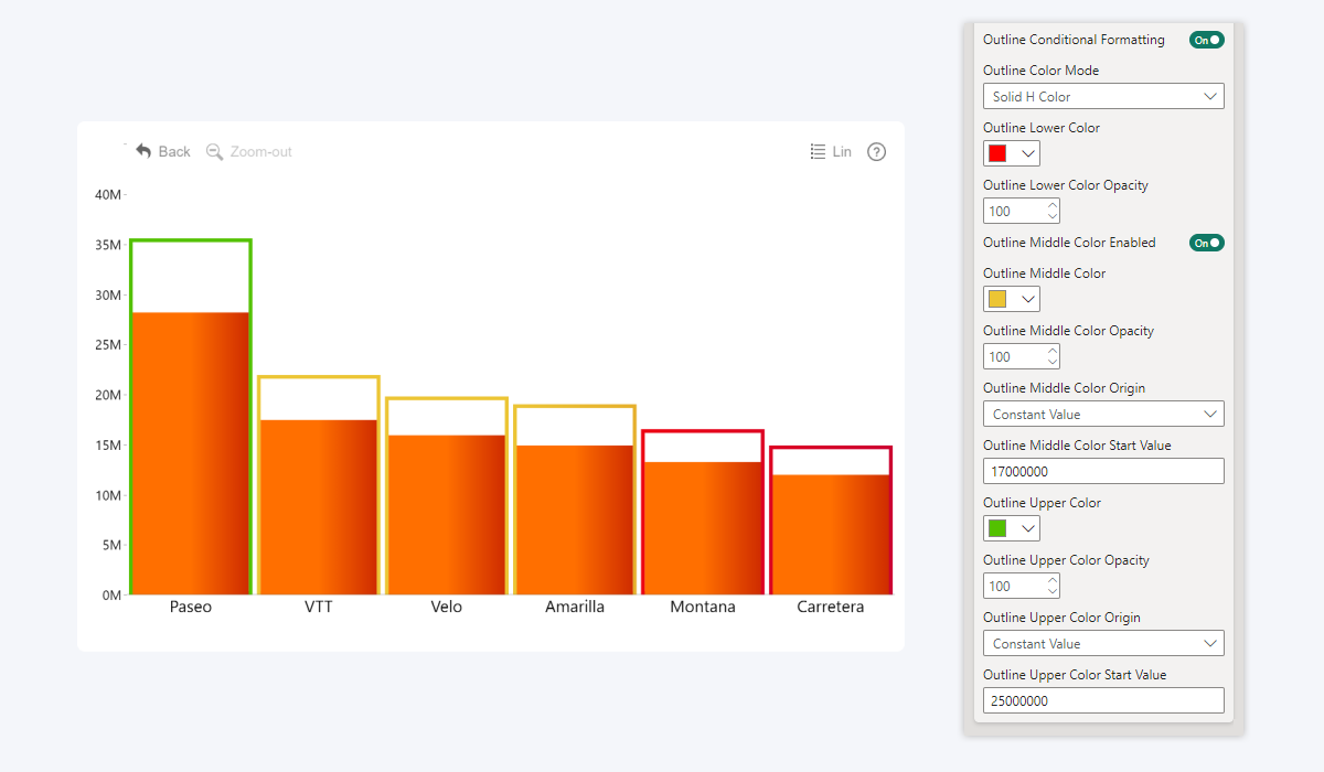
Combo, Combo Bar, Timeline: Outline Conditional Formatting

Column Outline Conditional Formatting in ZoomCharts Power BI Visuals

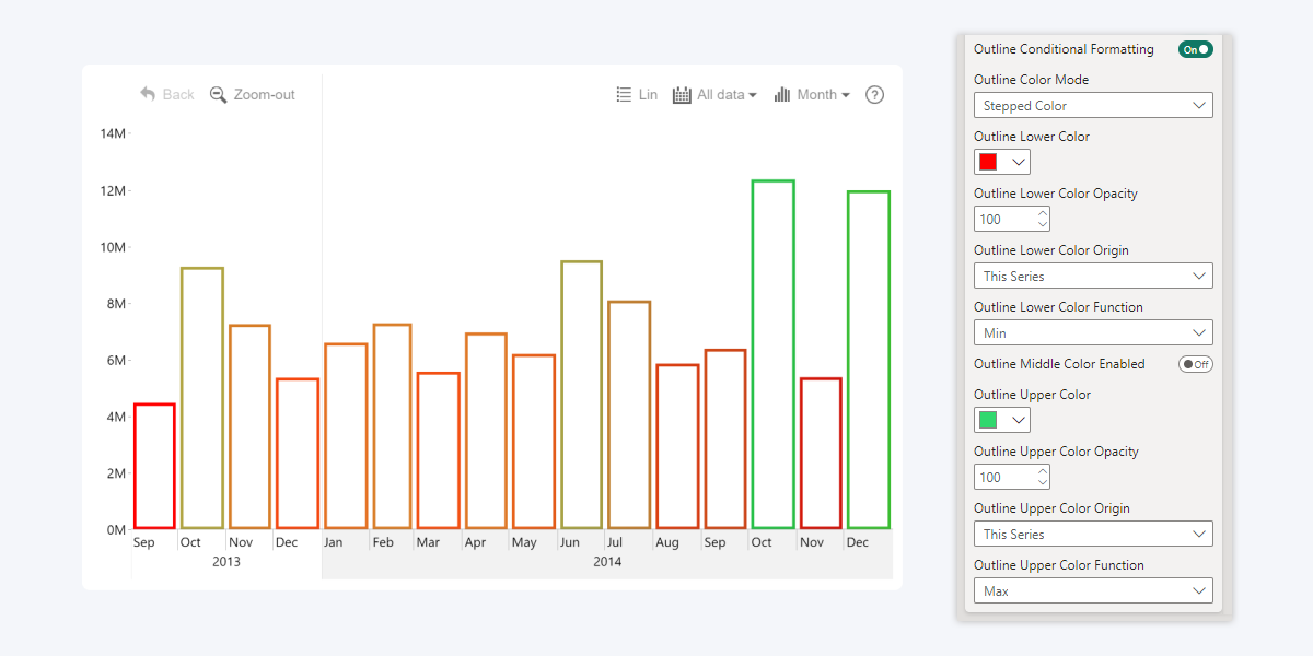
The previous Product Update brought new additions to conditional formatting, namely for value label text and backgrounds. We didn’t stop there, and in Combo (v1.12.30.0), Combo Bar (v1.12.29.0), and Timeline (v1.11.26.0), we’re bringing yet another new way to use conditional formatting that will enhance your data storytelling capabilities – Outline Conditional Formatting.

Whereas the default Conditional Formatting affects the fill color of the series (columns/bars, line, or area), the new Outline Conditional Formatting controls the series outline color instead. The new toggle can be located in the Series X Configuration section of each series, right below the existing Conditional Formatting toggle.

  • Documentation: Outline Conditional Formatting
  • ZoomCharts Drill Down Combo PRO Icon ZoomCharts Drill Down Combo Pin IconDrill Down Combo PRO
  • ZoomCharts Drill Down Combo Bar PRO Icon ZoomCharts Drill Down Combo Bar Pin IconDrill Down Combo Bar PRO
  • ZoomCharts Drill Down Timeline PRO Icon ZoomCharts Drill Down Timeline Pin IconDrill Down Timeline PRO

Once enabled, you can choose Lower, Middle (optional) and Upper colors and opacity values that will be applied to the series outline depending on your selected conditions. You can enter a custom number or dynamically calculate the values (Min, Average, Max, Percentile) by referencing the same series or a different series.

Furthermore, you can choose between multiple color modes that affect the appearance and behavior of how colors are applied to the series, or apply data-driven customization using values from the Color Field.

The new Outline Conditional Formatting settings will provide report creators with more flexibility. For example, you can apply subtle color-coding to the series outline without changing the fill color.

Bar Outline Conditional Formatting in Power BI ZoomCharts Visuals

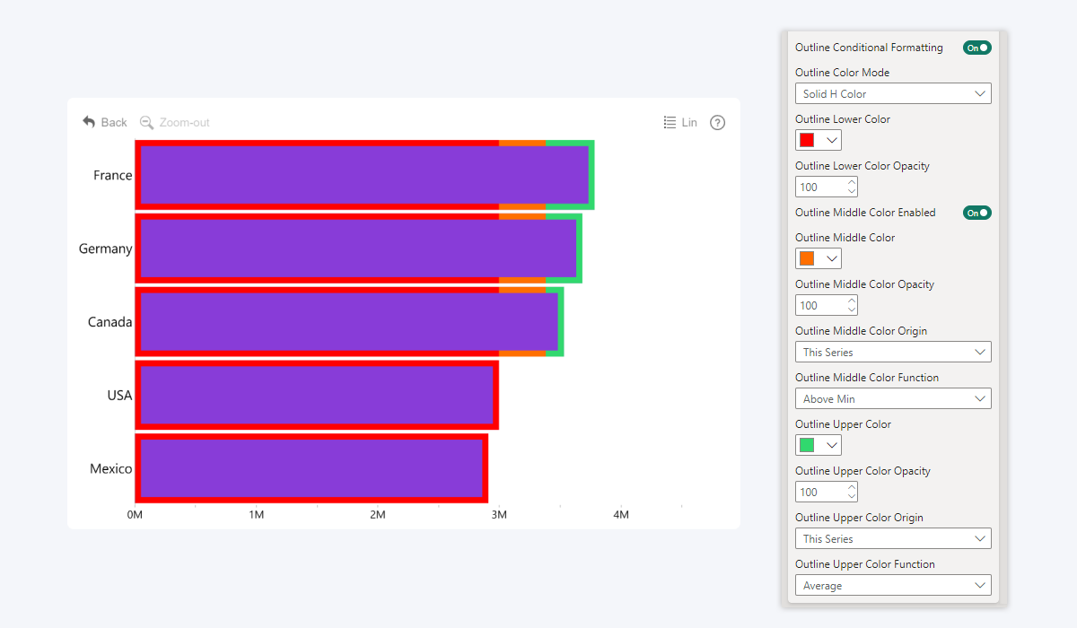
Another use case is in a lipstick chart (i.e. placing one series on top of another with Zero-based stacking mode for comparison) – you can now apply conditional formatting to a series outline while leaving 0% fill color opacity, which will be useful when visualizing KPIs, benchmarks, or other comparisons. 

Outline Conditional Formatting for a stacked column / lipstick chart in Power BI ZoomCharts custom visuals

Graph: Comma-Separated Values for Source Node Field

Comma-Separated Source Node Values in ZoomCharts Drill Down Graph PRO

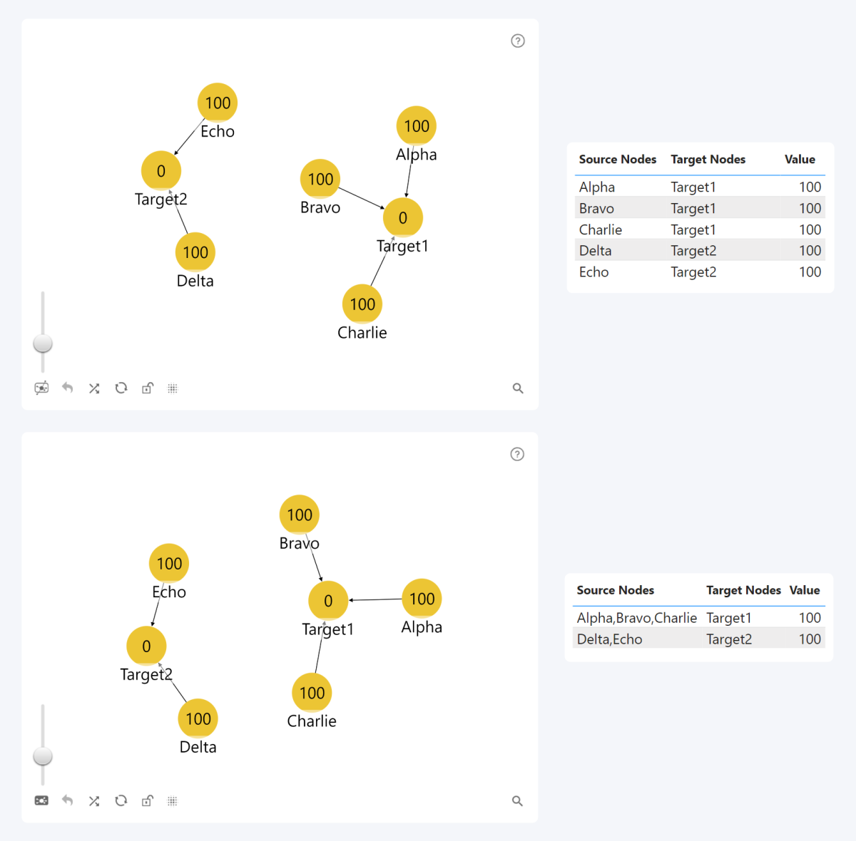
Previously, if you wanted to link multiple source nodes to the same target node, you would have to create a separate row for each source node. With the v1.12.23.0 update for Graph PRO, you can now provide multiple source node names in the same row, separated by comma. This was already possible with target nodes, but the new update brings this functionality to source nodes as well, allowing report creators to save time and simplify their data structure.

Instead of creating separate rows for source nodes “A”, “B”, “C”, you can now simply enter “A,B,C”. The adjacent columns (Target Node, Value, Source Node Image / Label / Radius / Class etc.) will be applied to all comma-separated source nodes within the row.

  • Documentation: Source Node Field
    • ZoomCharts Drill Down Graph PRO Icon ZoomCharts Drill Down Graph Pin IconDrill Down Graph PRO

Multiple Visuals: Hide Empty Values in Tooltip

Hide Rows with No Value in ZoomCharts Power BI Visual Tooltip

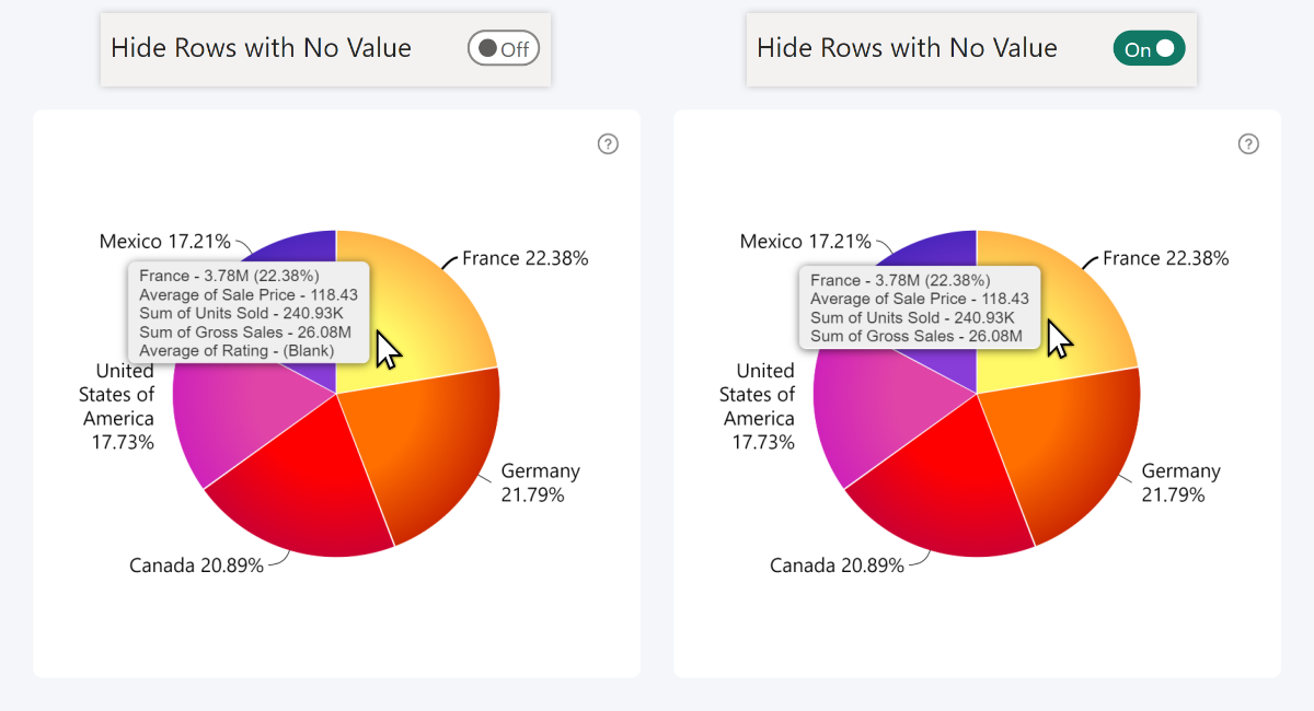
The tooltip in our visuals may display the value adjacent to each category/data point/node, in addition to columns in the Tooltip Content field or its equivalent. By default, the tooltip will show (Blank) or an empty value if a column has no data in that row.

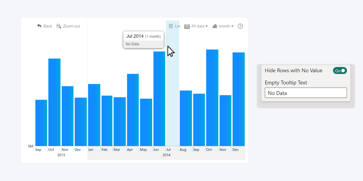
The December 2024 update introduces the Hide Rows with No Value toggle for many of our visuals. Once enabled, instead of showing a blank value, the tooltip will simply hide the entire column for that category/data point/node.

  • Documentation: Hide Rows with No Value
  • ZoomCharts Drill Down Donut PRO Icon ZoomCharts Drill Down Donut Pin IconDrill Down Donut PRO
  • ZoomCharts Drill Down Pie PRO Icon ZoomCharts Drill Down Pie Pin IconDrill Down Pie PRO
  • ZoomCharts Drill Down Combo PRO Icon ZoomCharts Drill Down Combo Pin IconDrill Down Combo PRO
  • ZoomCharts Drill Down Combo Bar PRO Icon ZoomCharts Drill Down Combo Bar Pin IconDrill Down Combo Bar PRO
  • ZoomCharts Drill Down TimeSeries PRO Icon ZoomCharts Drill Down TimeSeries Pin IconDrill Down TimeSeries PRO
  • ZoomCharts Drill Down Timeline PRO Icon ZoomCharts Drill Down Timeline Pin IconDrill Down Timeline PRO
  • ZoomCharts Drill Down Waterfall PRO Icon ZoomCharts Drill Down Waterfall Pin IconDrill Down Waterfall PRO
  • ZoomCharts Drill Down Shape Map PRO Icon ZoomCharts Drill Down Map PRO Icon ZoomCharts Drill Down Map Pin IconDrill Down Map PRO & Shape Map PRO
  • ZoomCharts Drill Down Scatter PRO IconDrill Down Scatter PRO

What will happen when there are no values to display in the tooltip?

In Combo, Combo Bar, TimeSeries, Timeline, and Waterfall, you may end up in situations where there are no rows to display for a category/datetime unit. In that case, the tooltip will show a “No Data” message. You can customize that message with the Empty Tooltip Text setting. Here's an example with our Timeline visual:

Hide Rows with No Value in ZoomCharts Timeline Visual

Conversely, our Pie, Donut, and Scatter visuals always display mandatory items in the tooltips, so you are unlikely to encounter this scenario in these visuals. 

In Map & Shape Map, if a node has no rows to display in the tooltip and you have also hidden the coordinates, the tooltip will simply not be displayed at all.

Get Started with ZoomCharts

Be sure to download the latest version of ZoomCharts Visuals to enjoy these new additions, along with hundreds of other features! With a free trial available, you can see for yourself how these powerful visuals can take your Power BI reports to the next level.

Explore ZoomCharts Visuals
envelope icon

Want more info like this?

Subscribe to our newsletter and be the first to read our latest articles and expert data visualization tips!


Find out more

May 08, 2025

Blog Thumbnail
Guides

Data Literacy: What It Is and Why Every Modern Professional Needs It

Data literacy is no longer optional - it’s essential for success in today’s data-driven world. From marketers to HR professionals, everyone is expected to analyze data, spot trends, and make smart decisions. This article explores what data literacy really means, why it matters, and how to build it across your team and organization.

Apr 30, 2025

Blog Thumbnail
Product updates

April 2025 Update: Multiple Links in Graph PRO & Total Labels for Stacks

Create multiple links between nodes in Graph, enable and customize value labels for stack totals in Combo & Timeline, and more – read about what’s new in ZoomCharts visuals in April!

Mar 28, 2025

Blog Thumbnail
Product updates

March 2025 Update: Show Difference Between Two Values

This month brings multiple new features for better data visualization: change indicator for comparison between two values; on-chart annotations for Waterfall; layout modes for Network, and other improvements. 

Feb 26, 2025

Blog Thumbnail
Product updates

February 2025: What’s New in ZoomCharts Visuals for Power BI

You can now enable extended axis labels in Combo, Combo Bar and Waterfall, assign lasso shapes to specific shape layers in Map, and enter custom display names for link categories in Graph. Read more about the latest update in this article!

Jan 31, 2025

Blog Thumbnail
Guides

Top 12 Key SaaS Business Metrics You Must Track in 2025

ARR, CLV, NRR, churn, and more – learn about the most important SaaS business metrics, their formulas, how to read and interpret them, and how to best visualize them. 

Jan 15, 2025

Blog Thumbnail
Product updates

January 2025: New Customization Options

We have added outline conditional formatting, color customization for selection and highlight areas, comma-separated source nodes for Graph, and a setting to hide empty values in the tooltip.
  • 1
  • 2
  • 3
  • 4
  • 5
  • ...
  • 11
  • »

Contents

Share this article

Want more info like this?

Subscribe to our newsletter and be the first to read our latest articles and expert data visualization tips!


Thank you!

Check your inbox to verify your email address.

logo
[email protected]
+44 204 577 3993
logo

Products

Drill Down Network PRO Drill Down Waterfall PRO Drill Down Graph PRO Drill Down Combo PRO Drill Down Combo Bar PRO Drill Down Donut PRO Drill Down Pie PRO Drill Down TimeSeries PRO Drill Down Timeline PRO Drill Down Map PRO Drill Down Scatter PRO All Visuals

Resources

Report Examples Webinars Blog ZoomCharts Academy Visuals Gallery Documentation Custom Visual Development Subscribe to News

Solutions

Custom Visual Development

Company

Pricing About Us Partners Leave feedback Join PowerGroup EU Funding

Help

ZoomCharts Assistance Contact Sales Contact Support FAQ

Drill Down Network PRO Drill Down Waterfall PRO Drill Down Graph PRO Drill Down Combo PRO Drill Down Combo Bar PRO Drill Down Donut PRO Drill Down Pie PRO Drill Down TimeSeries PRO Drill Down Timeline PRO Drill Down Map PRO Drill Down Scatter PRO All Visuals

Report Examples Webinars Blog ZoomCharts Academy Visuals Gallery Documentation Custom Visual Development Subscribe to News

Custom Visual Development

Pricing About Us Partners Leave feedback Join PowerGroup EU Funding

ZoomCharts Assistance Contact Sales Contact Support FAQ
+44 204 577 3993
[email protected]

Ready to get in touch?

Contact our experts with any question about Power BI and ZoomCharts for Free!

Contact us

© 2025, Data Visualization Software Lab

U.S. Patents No. 11,645,343; 11,921,804

Cookies Policy
Manage cookies
Privacy Policy
Global
EULA
Patent
warning

Error message

success

Success info: Done!

ZoomCharts AI Assistant

We noticed you're using an old OS version.

For the best experience, we recommend upgrading to ensure that all website features display correctly.

Cookie settings

We use necessary cookies for site functionality, as well as statistic, marketing, and preference cookies to enhance your experience. For more information and to manage your preferences, please visit our Cookie policy