Feb 26, 2020
Sales overview by product and sales representatives: sample report
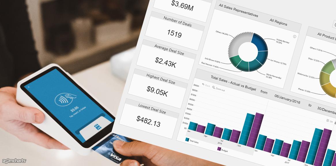
Get inspired! Take a look at this sample report and find new ideas for sprucing up your own sales reports in Power BI. Check out interactions, chart...
Get inspired! Take a look at this sample report and find new ideas for sprucing up your own sales reports in Power BI. Check out interactions, chart...
Get inspired! Take a look at this sample report and find new ideas for sprucing up your own sales reports in Power BI. Check out interactions, chart combinations and cross-chart filtering.

Try these interactions:
On the Sales Overview page
- Click on one of the two donut charts to filter the report by either seller or product line. Click on the center of the donut to go back.
- Click on the "Others" slice to see the rest of categories. Click "Previous" slice to go back.
- Click on one of the columns in "Total sales vs Budget" chart. It will filter report and drill down to a smaller time unit.
- Click and drag on the x-axis of "Total sales vs Budget" chart" to highlight a certain time period and filter report based on the selection.
On the Sales Team page
- Click on the image of one of the sales representatives.
- Click on one column in the column chart to filter results by product category.
- Clear filters.
- Right click on one of the columns in the " Sales by Product Line" chart. Slect Drill-through --> Deal overview to open detailed tabular view of the deals.
On the Product page
- Click on the columns in the column chart to drill into next level of data.
- Click on the area chart to drill down to a smaller time unit.
- Click "clear filters" afterwards
- Click and drag on the x-axis of the area chart to to highlight a certain period and filter the results based on the selection.
Noticed something you would like to include in your reports? See a room for improvements? Share it in the comment section!
Want to build such interactive reports yourself?
Sign up to our webinars, where our friendly product specialist Aivis Pavlovs will share the essentials, tips&tricks and best practices.


Want more info like this?
Subscribe to our newsletter and be the first to read our latest articles and expert data visualization tips!


