Dec 10, 2024
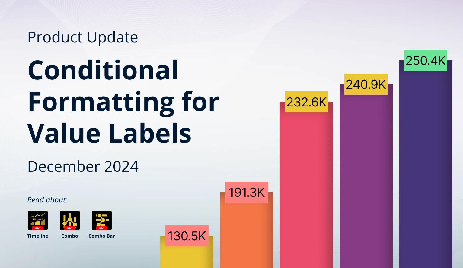
December 2024: New Conditional Formatting Settings & More
We have introduced conditional formatting for value labels to our Combo, Combo Bar and Timeline visuals, and X-Axis value alignment for Timeline & TimeSeries.
We have introduced conditional formatting for value labels to our Combo, Combo Bar and Timeline visuals, and X-Axis value alignment for Timeline & TimeSeries.
Your visuals should update automatically from AppSource. If your visuals have not received the updates automatically, read this documentation article that explains the manual update process.
Value Label Conditional Formatting
Conditional formatting is a widely used customization feature in our Combo, Combo Bar, and Timeline visuals. It allows report creators to apply specific series appearance rules based on data – for example, green color for values that exceed a KPI and red for those that fall short. An alternative use for these settings is to enable data-driven formatting via the Color field. With the v1.12.13.0 update for Combo/Combo Bar and v1.11.24.0 update for Timeline, we have added new ways to use conditional formatting.
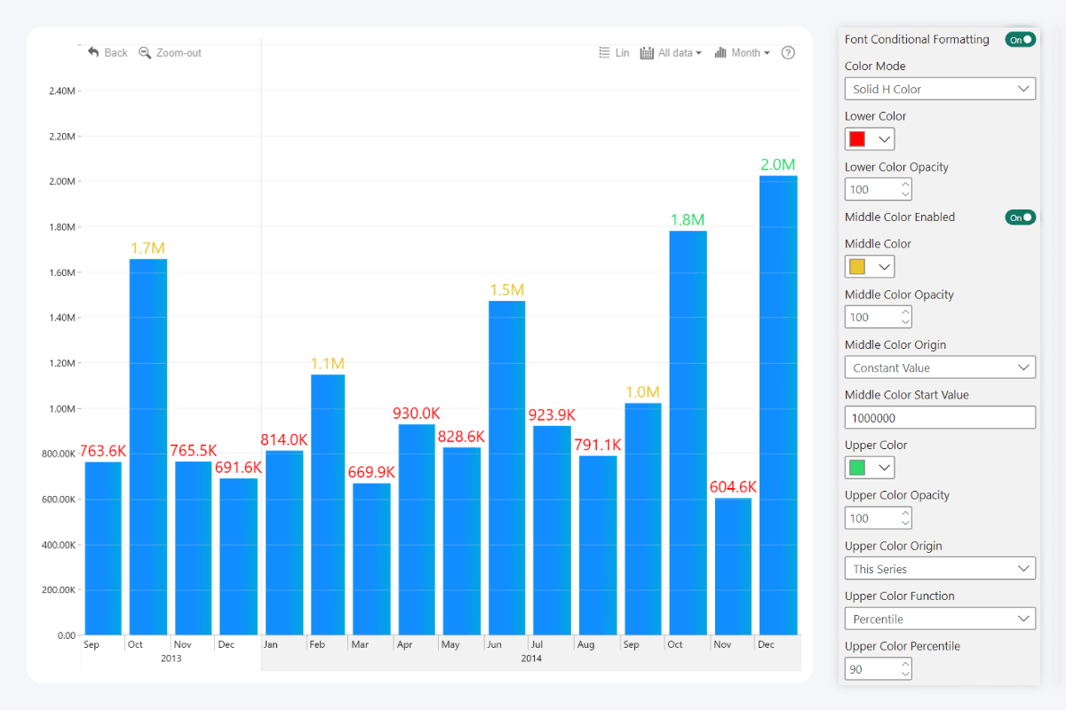
Before, conditional formatting could only be applied to the series (column, line, area) fill color and opacity. The new update introduces two additional settings for series value labels: Font Conditional Formatting and Background Conditional Formatting. Both settings can be enabled and customized separately from each other, and they will provide report creators with additional flexibility and more tools for data storytelling.
Font Conditional Formatting
This setting will enable conditional formatting for value label text color and opacity. You can define Lower, Middle (optional) and Upper colors and opacity values, and they will be automatically applied based on your defined conditions – you can enter a constant value or use dynamically calculated values like average, min, max, or percentile from the same series or any other series.
- Combo: Series X Value Labels -> Font Conditional Formatting
- Combo Bar: Series X Value Labels -> Font Conditional Formatting
- Timeline: Series X Value Labels -> Font Conditional Formatting
Note: Series X Value Labels sections will be available if the Customize Series Value Labels toggle is enabled in the Series X Configuration section of the series you want to configure.
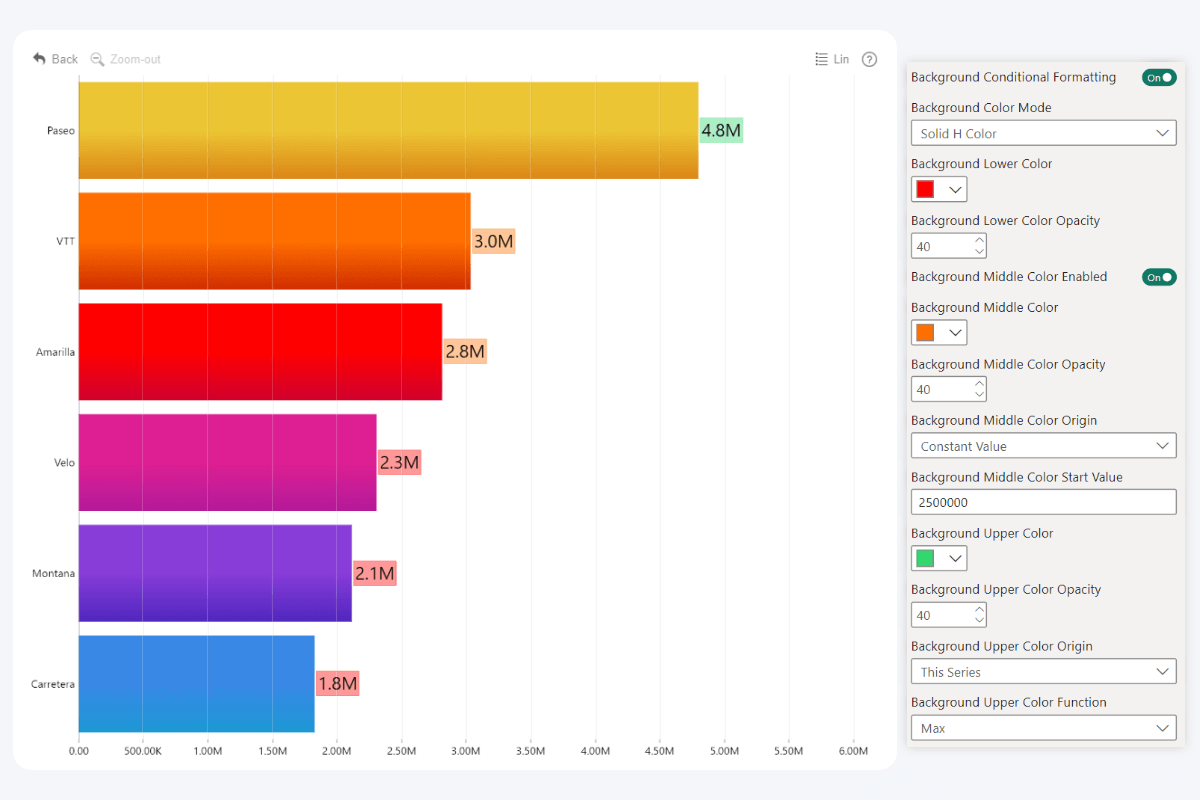
Background Conditional Formatting
Background Conditional Formatting, on the other hand, will be applied to the value label background. You can find this toggle right below Font Conditional Formatting, and it will reveal similar configuration options.
- Combo: Series X Value Labels -> Background Conditional Formatting
- Combo Bar: Series X Value Labels -> Background Conditional Formatting
- Timeline: Series X Value Labels -> Background Conditional Formatting
Note: Series X Value Labels sections will be available if the Customize Series Value Labels toggle is enabled in the Series X Configuration section of the series you want to configure.
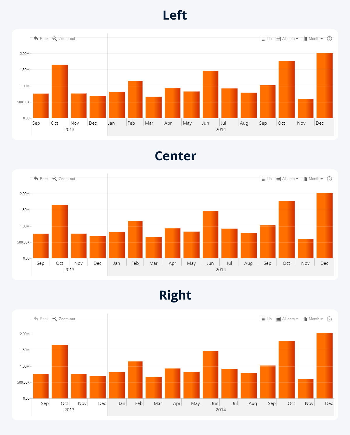
Minor Unit Alignment
The v1.11.21.0 update for Timeline and v1.12.10.0 for TimeSeries brings an additional configuration setting for the X-Axis. Previously, the labels for the X-Axis scale would be aligned to the left by default. The Minor Unit Alignment setting now allows you to choose the alignment for the minor units between left, center, and right, giving you more control over the appearance of your timeline chart.
- Timeline: X-Axis -> Minor Unit Alignment
- TimeSeries: X-Axis -> Minor Unit Alignment
Get Started with ZoomCharts
Be sure to download the latest version of ZoomCharts Visuals to enjoy these new additions, along with hundreds of other features! With a free trial available, you can see for yourself how these powerful visuals can take your Power BI reports to the next level.

Want more info like this?
Subscribe to our newsletter and be the first to read our latest articles and expert data visualization tips!


