Jan 30, 2023
The Secret to Financial Dashboards in Power BI
If you are part of running a business, a good understanding of financial reporting is absolutely crucial. In order to gauge out your company’s financial performance and potential opportunities for growth, an effective and smooth financial reporting process will be a key part of your decision-making process.
If you are part of running a business, a good understanding of financial reporting is absolutely crucial. In order to gauge out your company’s financial performance and potential opportunities for growth, an effective and smooth financial reporting process will be a key part of your decision-making process.
When it comes to growing a business, you must retain adaptivity and oversight. When overseeing your existing strategy’s effectiveness, be prepared to make adjustments where necessary in the face of any potential risks or opportunities. Fortunately, in the age of business intelligence and data visualization, technology is often combined with business operations. This simplifies many processes and uncovers potential areas of growth you might have otherwise missed.
Microsoft Power BI financial dashboards can be one of the most effective reporting tools that companies have at their disposal. Unlike static reports and long rows of tables, finance dashboards in Power BI can compact various key metrics and data points together from multiple data sources, showing vital information in an appealing visual format through the use of interactive charts.
Financial dashboards for Power BI come with a degree of interactivity, making them feel intuitive to users. They can also be customized to adhere to what your users want to see, whether that be trends in marketing, sales, or others. Upon implementation, insights from your finance data come more easily as daily management turns more effective.
What are the benefits of using Power BI to create my financial dashboards
An upside of using a Power BI financial dashboard to keep track of your financial data is the fact that you can compile multiple metrics into a compact report or dashboard, giving you a broader view of your company’s financial health. Power BI’s interactions and drill down capabilities let Power BI users pick and view the data that most interests them, so everyone can find the answers they need.
By switching to a financial dashboard in Power BI, you will see the following benefits unfold:
- Easier tracking of your expenses and income.
- Implementation of better management strategies.
- More appealing overviews of the daily cash flow in your business.
- Improved insights regarding your company’s financial status.
- Enhanced productivity and better overall financial planning.
A high-quality Power BI financial dashboard can also prove valuable when reporting back to external stakeholders and investors regarding how your company is progressing. Interactive Power BI reports enable proactive communication and encourage more effective arranging of your company’s financial plan of action.
However, Power BI report creators must remember that there is always a data story they must represent, which can fizzle out and lose focus if too many metrics and charts are incoherently added into a Power BI report.
How do I create a financial dashboard in Power BI
Financial Power BI dashboards and reports must be tailored to fit your intended user base. When going about building a financial dashboard with Power BI, consider the following questions:
Question 1. Who will be viewing the dashboard?
How familiar are they with complex numbers and how do they intend to use the Power BI finance dashboard? What kind of metrics and KPIs does their department look out for? Check in with your users thoroughly to see what their needs are and tailor the Power BI dashboard’s charts and interactions accordingly.
Question 2. What do they hope to achieve with the dashboard?
Once you’ve figured out what your Power BI user base for the finance dashboard is like, consider what their long-term goals are. What do they want to get out of this dashboard? Do they want to increase productivity or simply monitor their cashflow patterns? Maybe they just want a simple profit loss statement?
Think about how your Power BI financial dashboard will perform in the long-term. This is also a good way to ensure your hard work doesn’t get shelved.
Question 3. What metrics should the dashboard contain?
Sometimes you want to visualize a certain data story, and that story might involve more metrics than a static report or native Power BI dashboard can handle visually.
Fortunately, by using custom visuals for Power BI, you can compact multiple metrics in a neat way, staying true to the data story you want to reflect with your financial dashboard in Power BI.
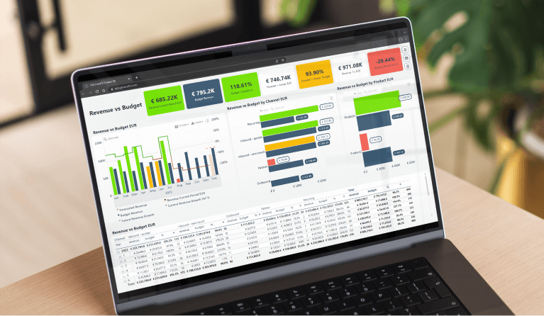
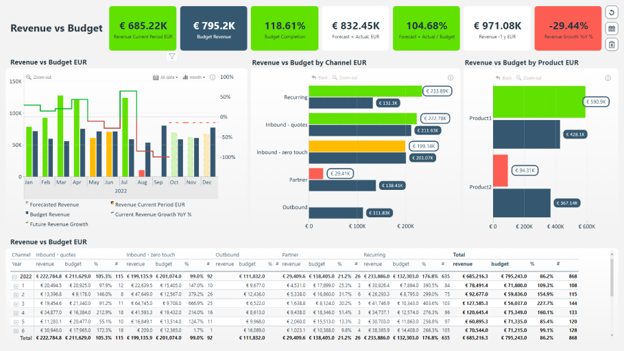
Use case: How a Power BI dashboard can be used to show Budget vs. Revenue
To serve as a case study, we’ve selected this Revenue vs. Budget sample Power BI financial dashboard from our Power BI Example Report Gallery, where you can download this and many other Power BI financial dashboard examples. This Revenue vs. Budget example dashboard is intended to be used by upper management to keep track of how the company is performing in relation to its financial goals. There are many interesting components in this Power BI finance dashboard. Let’s look at some of them.
Show forecasting data with Drill Down Timeline PRO
This Power BI finance report was built to let users examine two main things – how the company has progressed financially until now, and what is its forecasted growth. For a better Power BI financial dashboard reporting process, a key tool being used is Drill Down Timeline PRO, a custom visual for Power BI that focuses on visualizing timeline data using DAX calculated measures.
This visual lets you select a time period of your choice and drill down as far as the data will permit. Additionally, it comes with built-in cross-chart filtering capabilities. This means that upon selecting your timespan of choice on the chart, the rest of the report’s displayed metrics will adjust accordingly.
Drill Down Timeline PRO lets report creators easily combine multiple chart types. In this specific instance, we have combined columns together along with a line. The columns show budget revenue, current revenue growth, and the line represents year-over-year (YoY) revenue growth.
Now, all these metrics give a good overall picture of the company’s financial growth. But what if your users want to discuss something specific – maybe they don’t want to look at forecasted revenue, and simply want to discuss their current numbers. To suit instances like these, we’ve added visual switches below the visual. These can be used to hide or show certain data sets in the chart.
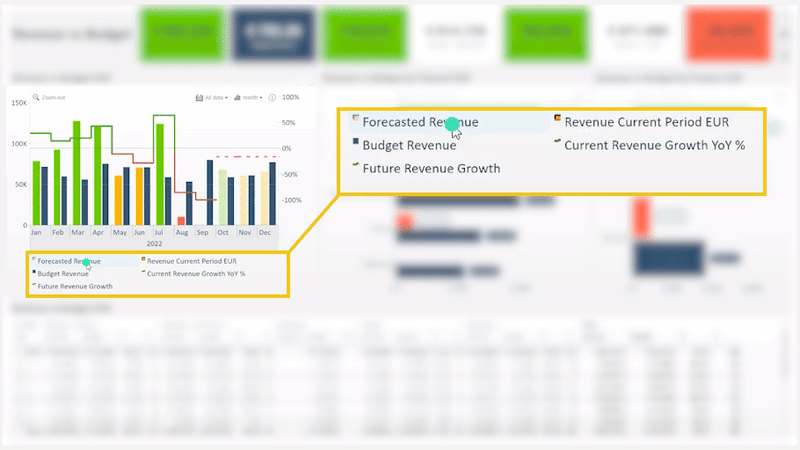
This is great way to give your financial dashboards in Power BI more functionality and staying-power when it comes to data-driven decision-making. Power BI users get the whole picture with multiple metrics provided by the report, but they are also free to pick and choose what’s visible according to what they’re most interested in.
Track numbers with dynamic KPI cards
At the top of this dashboard template, you’ll find various KPI cards that measure the progress of the company, and whether or not it is reaching its set goals. Now, as this is a Budget vs. Revenue report, the main KPIs to take note of as you explore the report are – Revenue (current period), Budget Completion, Revenue Growth YoY. The rest reflect forecasted numbers. All the KPI cards are dynamic, meaning that the number will adjust to reflect how you filter the report.

Dynamic KPI cards, or any title cards used in Power BI reports that change to reflect the user’s position in the report, are an incredible aid to a user’s data exploration journey. Users don’t need to click back and forth to remember their positions, as the numbers adjust with each interaction. This report also uses conditional formatting, which will color each KPI card red, yellow, and green depending on whether the number displayed is above or below the set threshold of the financial dashboard in Power BI.
Build flexible bar charts with Drill Down Combo Bar PRO
This report also uses another custom visual for Power BI to visualize two bar charts – Drill Down Combo Bar PRO. This particular visual is truly unique in its number of available customization options, and can be used to create multiple chart types from a single custom visual.
While this example dashboard uses this visual in a rather straightforward way, you can use Drill Down Combo Bar PRO to also create box and whisker plots, 100% stacked bar charts, line charts and more. If you'd like to learn more about this visual's possibilities, you can read our blog post. For now, let’s focus on the visual’s use in this Revenue vs. Budget report.
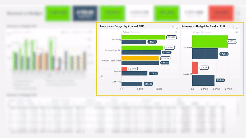
The two bar charts within this report compare revenue against budget respectively either by channel or by product. Due to the Power BI visual’s drill down capabilities, multiple data sets can be compacted together, letting users drill down and explore data as minutely as they wish. This particular report drill downs to show data for each employee and their respective channel.
Keep in mind that Drill Down Visuals let you add multiple levels if your data needs it. To mitigate the risk of getting lost, we like to implement Reset buttons into our reports. Power BI users don’t have to worry about getting lost, as they can easily undo any filters they’ve set by clicking the Back or Reset button for each individual chart, or simply reset the whole report.
How do you use this report?
This report makes data analysis feel easier than ever. All interactions take place on the charts themselves, including drill downs. In addition, this report combines on-chart interactions with cross-chart filtering, letting report users fully dive into the data analysis process head-on. To experience these interactions for yourself, feel free to head to our Power BI Example Report Gallery and download this Power BI financial dashboard template.
For example, you can select the channels that interest you, then select a specific time period. The KPI cards immediately adjust to reflect the numbers of your selection. This process enables ad hoc analysis, letting users ask and answer questions on the fly.
Additionally, these same interactions are entirely possible on touch-input devices, letting Power BI users open the report on a mobile device and perform data analysis anywhere.
Conclusion
Creating an interactive Power BI financial dashboard for reporting that suits every user isn’t easy. It takes careful consideration of your user’s goals and balancing those with the capabilities of the data visualization tools report creators work with. However, developing a trustworthy single interactive financial dashboard in Power BI that thoroughly reflects on the company’s status is worth it.
A finance report that users love to revisit leads to improved productivity and better planning. Using the vast customization options and immersive interactions of Drill Down Visuals, report creators can finally create the perfect Power BI dashboard that users will love.

Want more info like this?
Subscribe to our newsletter and be the first to read our latest articles and expert data visualization tips!


