Oct 06, 2025
Top 10 Power BI Reports
In this article, we review top reports that stand out with user-friendly features, such as: clear visual hierarchy, eye-catching design and interactive filtering.
In this article, we review top reports that stand out with user-friendly features, such as: clear visual hierarchy, eye-catching design and interactive filtering.
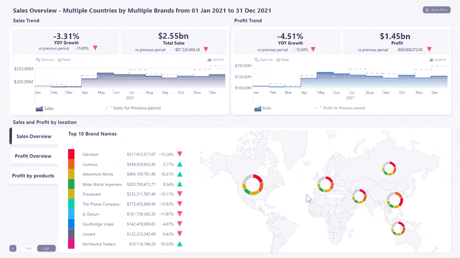
Power BI Report #1: Sales Overview Report
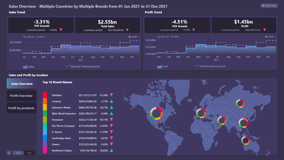
Visuals used: Drill Down Map PRO, Drill Down Timeline PRO
What’s it for: This report shows a comprehensive overview of your sales performance, including sales revenue, profit, yearly growth, and sales by region.
What makes it great: If you’re looking for the best Power BI sales report, here it is. The most important information—total sales revenue, profit, and YOY growth for each—is placed on the top of the report so you can get an insight into your sales performance at first glance. However, if you want to delve deeper into your data, there are two interactive timeline charts—one for sales revenue and the other for profits. In addition, you can see an overview of your sales performance per region on a map chart, and a list of your most successful brands or product categories.
The most impressive part of this report is the intuitive on-chart interactions that make finding the data you need a matter of just a few clicks. For example, if you filter a certain time period on the timeline, all other charts will automatically adjust to show relevant data for the selected interval. Similarly, pick a certain country or region on the map chart, and the rest of the report will dynamically show only data for the selected markets.
Furthermore, there’s a reset button on the top right corner that you can use to quickly return to the default view, and a dark/light theme switch. This is one of our best-looking Power BI reports, and it will make exploring sales data exciting for your users.
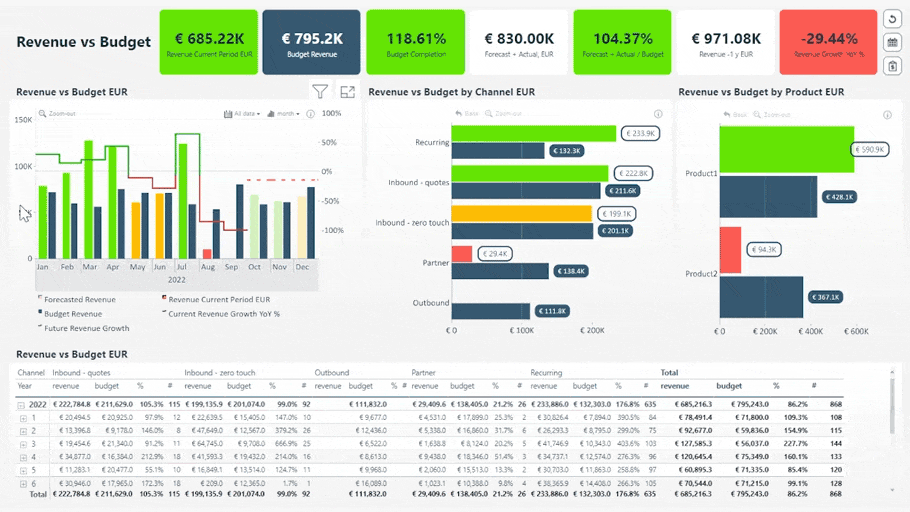
Power BI Report #2: Revenue vs Budget Report
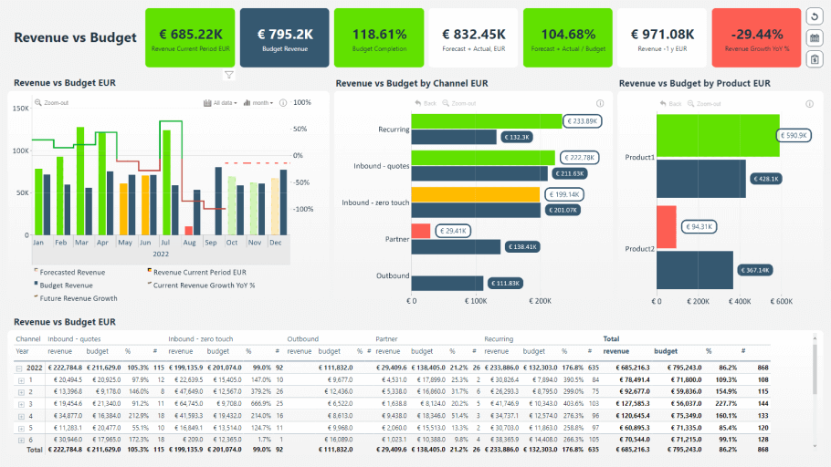
Visuals used: Drill Down Combo Bar PRO, Drill Down Timeline PRO
What’s it for: Get an overview of your business performance and see if you meet your targets with this finance report.
What makes it great: Just like you’d expect from a finance report, you can quickly get an insight into your main financial performance KPIs—current period revenue, budget revenue, budget completion, forecast, revenue growth, and more. With conditional formatting, these indicators will be color coded—if you see red, you’ll definitely know that some things need your attention.
Below you’ll find a timeline chart that shows per-month changes in the data. You can select a specific time period, and all other visuals will show data relevant only to that interval. There’s also one bar chart for a revenue vs. budget comparison per channel, and another one for products. Lastly, the table at the bottom will show you the raw numbers so you can cross-check them for accuracy.
Users will enjoy the clean and easy-to-understand design that combines quick scannability and great drill-down capabilities. Report creators, on the other hand, will have a wide range of customization options at their disposal. The visuals used in this report—Drill Down Timeline PRO and Combo Bar PRO—give them the option to display up to 25 series as a combination of bars/columns, lines, and areas.
Power BI Report #3: Sales Conversion Report
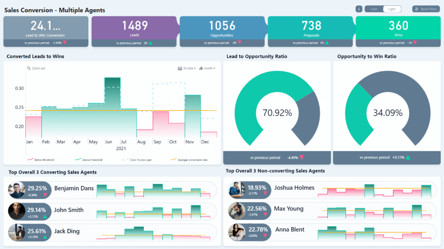
Visuals used: Drill Down Combo PRO, Drill Down Timeline PRO
What’s it for: Monitor your sales conversion rate, see the performance of your sales team, and identify the weak links in your sales process.
What makes it great: This report gives an overview of your entire sales process, with KPI cards showing total leads, opportunities, proposals, and wins in the selected period, in addition to comparisons with the previous period for each. This report will be a useful tool for sales managers.
On the upper left corner, you can see the lead-to-win conversion percentage, but the two gauges will show the lead-to-opportunity and opportunity-to-win ratio. There’s also a timeline chart that will show changes in leads-to-wins conversions. The average conversion rate will be displayed as a threshold, and with conditional formatting columns that fail to reach it will be marked in red. In addition, last year’s results will be displayed as a dashed outline.
What’s more, you can see a top 3 of sales agents with the most conversions, and the bottom 3 with the least conversions. It’s a great way to identify which agents use sales methods that work, and which team members need to change their approach.
We invite you to try this report for yourself because you will be astonished by how intuitive the interactions are. For example, if you select a certain time period on the timeline, the KPI cards and gauges will show the data from the selected interval, and the top and bottom 3 lists will adjust accordingly as well. In addition, your users can choose between dark and light theme.
Power BI Report #4: Inquiry Analysis
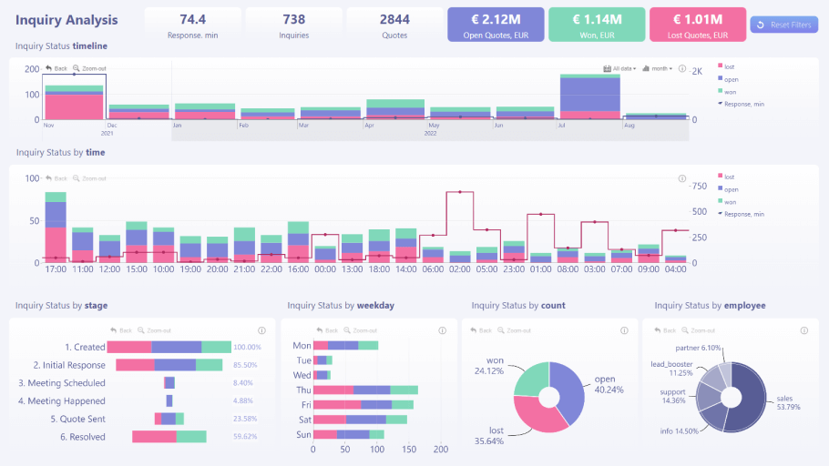
Visuals used: Drill Down Combo PRO, Drill Down Combo Bar PRO, Drill Down Timeline PRO, Drill Down Donut PRO
What’s it for? Monitor all your inquiries and see which of them are open, won and lost. The report will calculate the value of these inquiries, your average response rate and other info.
What makes it great: Performing an inquiry analysis and finding the reason for possible lost quotes is not easy, which is why this report features various visuals that will display your data from multiple perspectives.
For example, there are two different timeline charts, one of which displays a monthly view, and the other—an hourly view. The inquiries will be displayed as stacked columns, but the average response time will be shown as a line. In addition, you can use the bar, column, and donut charts to drill down further.
Just like the other reports mentioned in the article, the main benefit is the interactivity. With cross-chart filtering, you can see relevant info on all charts at the same time as you drill down. For example, if you select a specific employee on the donut chart, the report will be filtered to inquiries processed by them.
Power BI Report #5: Debtor Analysis
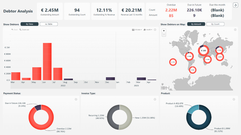
Visuals used: Drill Down Map PRO, Drill Down TimeSeries PRO, Drill Down Donut PRO
What’s it for: This report will display all your outstanding and overdue payments so you can quickly perform a thorough debtor analysis.
What makes it great: Keeping track of all your debtors can be tricky, but this report vastly simplifies this process by giving you an overview across multiple interactive charts. The KPI cards on the top of the report will show you the total outstanding amount, count and ratio to revenue, in addition to other crucial data.
Below you’ll find an interactive TimeSeries PRO chart that will give you a monthly view of all your debtors. Furthermore, there’s an interactive map that you can use to see where your debtors are located, in addition to three donut charts that will visualize the percentage of due and overdue payments, invoice types and products.
The report will dynamically filter the relevant data as you drill down on any of the visuals. For example, when you select a certain period on the timeline, the other charts will show data from that interval. You can also display the data as a table by pressing the As table button. If you want to return to the default view, simply press the Reset button on the top right corner.
Power BI Report #6: Banking Report
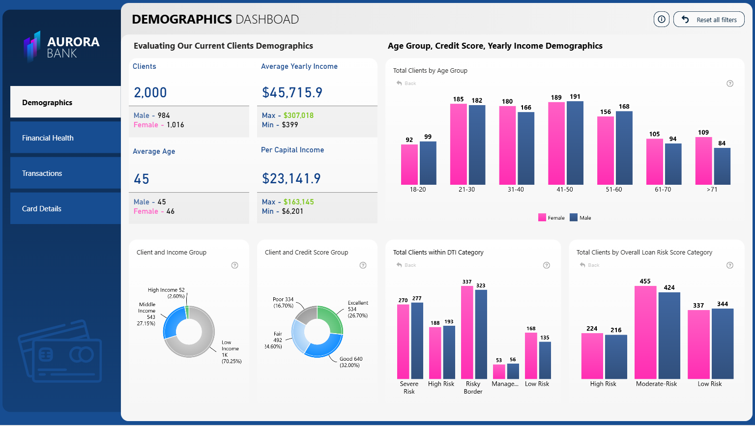
Visuals used: Drill Down Combo PRO, Drill Down Combo Bar PRO, Drill Down Donut PRO
What’s it for: This Power BI report enables financial institutions to analyze customers by demographics, income, financial health, and transactions.
What makes it great: This report is one of the best for banks and other financial institutions because it puts growth and risk in one clear view. You see deposits, loans, interest income, fees, and overdue or non-performing loans on a single page. Trends over time and breakdowns by product, branch, and customer segment show what drives the results.
This set of metrics helps you judge both business momentum and credit quality without switching pages.
It is fast to use. Filters change every visual at once, drill down takes you from totals to a specific slice in one click, and clear labels keep the story easy to follow. Because KPIs, trends, and breakdowns are clearly separated and labeled, report viewers make fewer mistakes when reading the numbers. The simple structure speeds monthly reviews and creates a clear trail from totals to underlying details, so you can be completely sure what you’re looking at and where the numbers are coming from.
Power BI Report #7: Finance Analysis Report
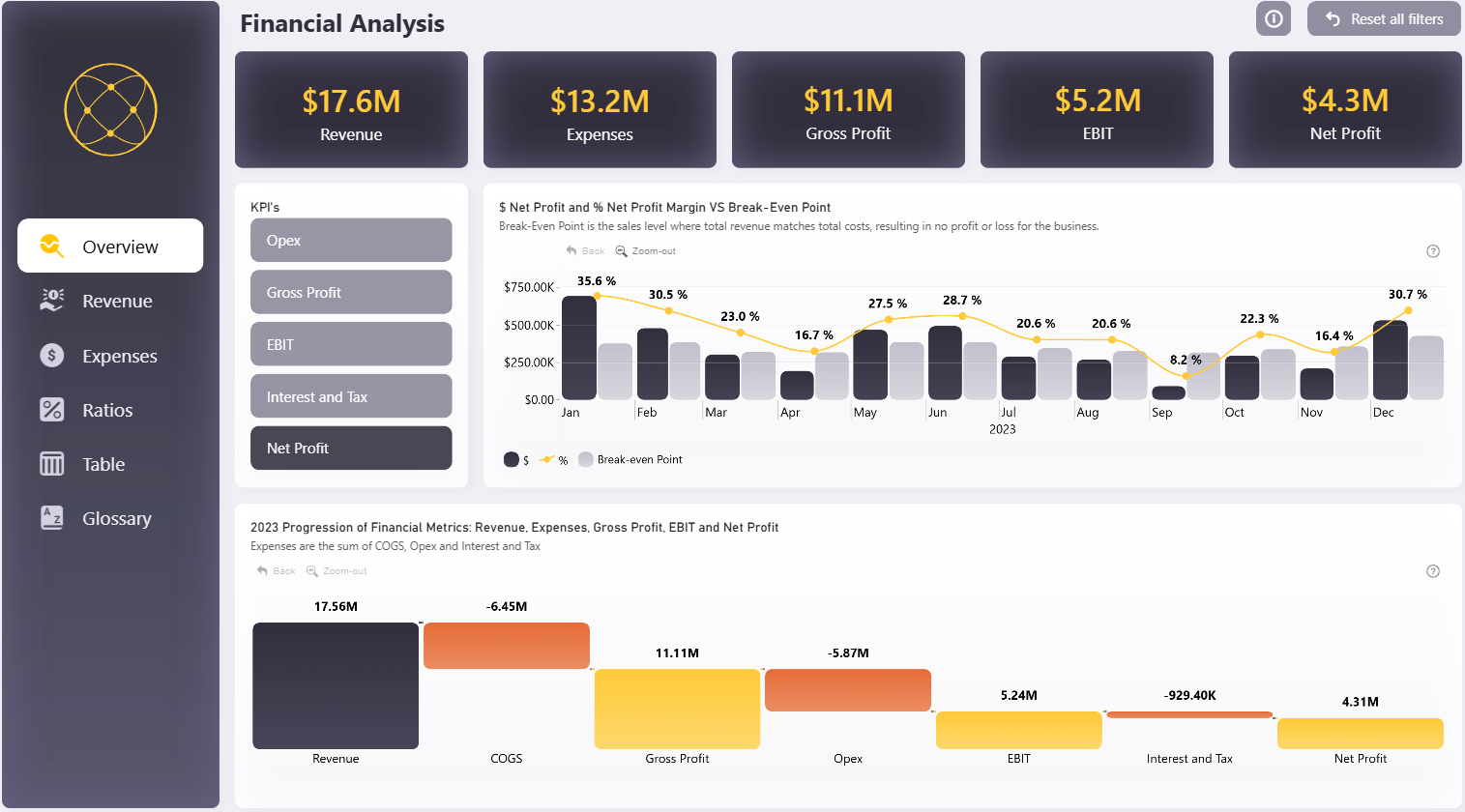
Visuals used: Drill Down Combo PRO, Drill Down Waterfall PRO, Drill Down Combo Bar PRO, Drill Down Timeline PRO, Drill Down Donut PRO
What’s it for: This financial report is for monitoring revenue, costs, profit and checking performance against target.
What makes it great: This report shows financial data in a clear, simple way. Key performance numbers like revenue, costs, profit, and margin are easy to see at the top. You can check variance and trends on the same page with cleverly set up field parameters, so there is no need to shuffle between different pages.
What’s more, you can filter the data by clicking directly on visuals, and every other visual will instantly cross-filter to provide contextual insights. The page layout is clean and easy to follow, with clear labels and simple drill downs. You can quickly confirm the numbers and move from a summary to detailed data in just one click. This helps you review performance faster.
Power BI Report #8: CRM Report
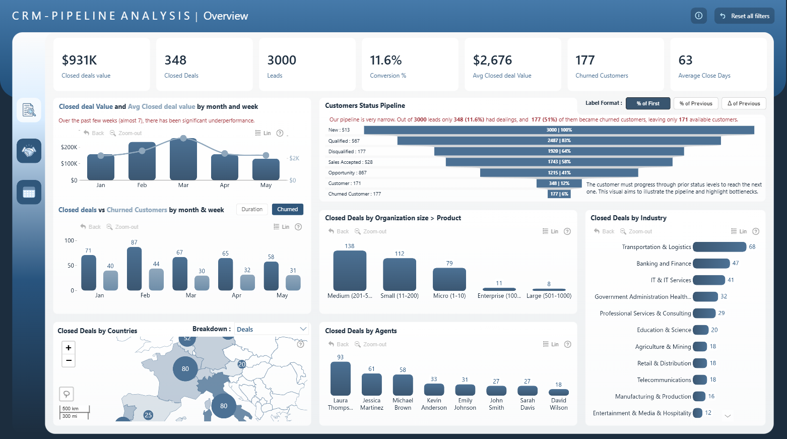
Visuals used: Drill Down Shape Map PRO, Drill Down Combo PRO, Drill Down Combo Bar PRO, Drill Down Donut PRO
What’s it for: This report is built for CRM pipeline tracking: monitor open/won/lost inquiries, pipeline values, response times, and conversion rates.
What makes it great: This report gives you a clear, end-to-end view of the CRM pipeline on a single page. Key metrics such as leads, closed deals, deal value, time to close, and conversion rate are easy to scan, so you can quickly judge pipeline health and identify any potential issues. Filters for date, industry, country, status, and agents update all visuals at once, which helps you answer everyday questions without jumping between pages. The visuals enable click-based drill down and cross-filtering.
The layout is clear and simple: KPI cards at the top, a wide trend chart in the middle, and focused panels on the side. A consistent color palette and easy-to-read text ensure readability, and compact slicers and helpful tooltips keep the page tidy and easy to use in meetings.
Power BI Report #9: Sales Customer Profile Report
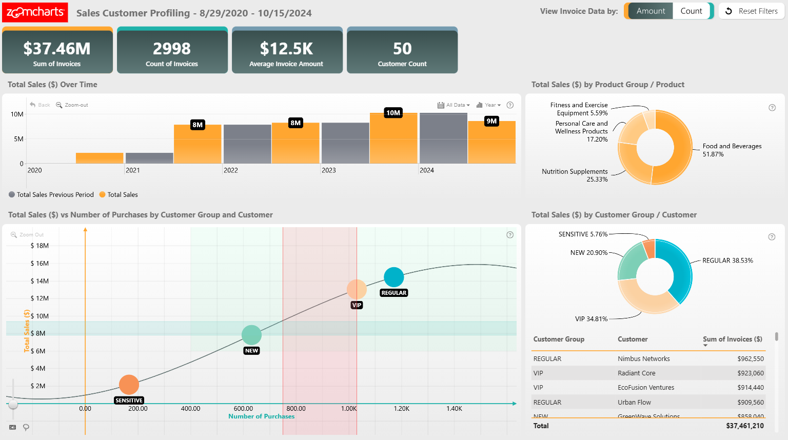
Visuals used: Drill Down Scatter PRO, Drill Down Timeline PRO, Drill Down Donut PRO
What’s it for: It’s for profiling customers and tracking sales to identify top segments and high-value accounts.
What makes it great: All metrics are interconnected. Any selection refines the rest of the report so you can examine the same results from several angles without changing context.
What makes this report great is that the layout provides fast answers to simple questions: who buys, what they buy, and when demand changes. This makes it easier to prioritize accounts and plan campaigns.
The visuals respond instantly to filters by date, product, customer group, region, or sales agent, which keeps analysis focused and practical. You can get on-demand insights with intuitive drill-down interactions, and the visuals will seamlessly cross-filter, so you can move from overview to detail with a click and explore trends without extra steps.
Power BI Report #10: Budget vs Actual Sales
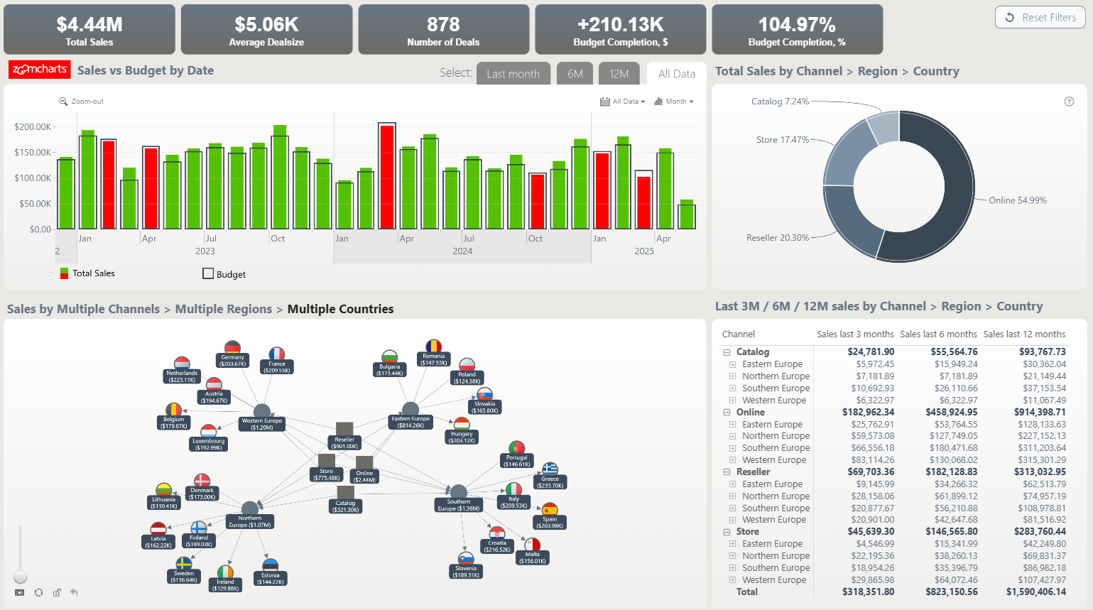
Visuals used: Drill Down Network PRO, Drill Down Timeline PRO, Drill Down Donut PRO
What’s it for: This report is for tracking sales vs. budget: compare actuals to targets by time, product, or region to spot variances and gaps.
What makes it great: This report helps you answer a simple question fast: are sales on track against the budget? Top KPIs show totals and variance at a glance. You can filter by time, product, or region and the page updates instantly, so you see trends, gaps, and risks without digging through many tabs. The timeline chart displays changes over time (with conditional formatting showing months that need attention), and the donut chart shows channel mix. The star of the show is the interactive network chart that shows channels, regions and countries and their relationships.
ZoomCharts visuals provide drill-down and natural cross-filtering with a click, so you stay in the flow. Everything sits on one clean page, saving time, reducing clicks, and making it easier to discuss actions in meetings.
What makes a great Power BI report?
Most importantly, it displays your data in a way that makes sense and gives a thorough insight. But, in addition to that, there are some less tangible yet equally important criteria that will vastly improve your users’ experience and speed up data navigation. Here are some of the signs that the Power BI report is great.
- It’s quick and easy to navigate. You can find the data you need with just a few clicks. With smart drill-down interactions and filtering capabilities, your users will save a lot of time, as shown in this video.
- It’s smooth and responsive to use. Your report should be easy and intuitive to use. Furthermore, there are no frustrating lags or hold-ups.
- It supports touch controls. Your report should provide top-tier user experience regardless of whether your users use it on their PCs, presentation screens, tablets or even smartphones.
- It’s interactive. Using Power BI to build plain old static reports is like buying a supercar just to do the groceries. A great report will push Power BI’s capabilities to the max to deliver the best in data storytelling.
- It’s exciting to use. A report that’s fun to explore will motivate the users to pay more attention to the data and use your reports to make data-driven decisions.
Benefits of having a well-designed report
On its own, data is just numbers—it’s up to the report creator to decide what to do with it. There are many decisions you must make when you’re creating your report, such as what visuals to include, what colors to use, and how to lay it all out in a single view. All these factors are important to ensure top-notch user experience.
Some creators make their reports from scratch, while others prefer downloading a professionally designed template such as Drill Down Reports and adjusting it to their needs. Both methods are equally valid, and it’s up to you and your preferences to decide which route you go.
Here are some of the main reasons why upgrading your data visualization workflow with premium visuals and reports is a sound investment.
Save time and money
While a couple of seconds might seem insignificant, they do add up in the long run. A report that offers valuable insight already from the first glance will save an incredible amount of time. Furthermore, if your report is intuitive and responsive, each interaction will take less than a second, and the user won’t have to waste time finding the data they need.
In a report with intuitive drill-down features and cross-chart filtering, each interaction can take up to 90% less time. Seconds add up to minutes, and if you multiply that by the total amount of users, you can see how a good report can save a lot of hours in the long run.
Just imagine how much shorter your meetings can be when your team is spending less time navigating the report and more time talking about the data!
Make more confident decisions
Many people believe that the purpose of a report is to simply visualize numbers. We, however, believe that the best reports in Power BI tell a narrative. Data storytelling is an important factor that you need to take into consideration when choosing the tools with which you visualize your data.
A great Power BI report that includes appropriate visuals will give the necessary context for your data, allowing you to make swift data-driven decisions. Intuitive drill-down features will allow you to choose between seeing the big picture or focusing on the minute details.
In a truly interactive report, the visuals will work together to bring you relevant data across all charts so you can view and analyze the data from multiple contexts at the same time. When your business intelligence is this thorough, your team will make decisions more confidently.
Motivate your team to embrace Power BI
We can’t deny that we have a soft spot for Microsoft Excel. Initially released in 1985, it started a revolution in spreadsheet software. Even today, it provides a lot of powerful features, which is why many companies still use Excel for their data analysis.
However, with more than four decades under its belt, Excel has started to show its age and is vastly outclassed by more recent software that are more suited for their jobs. For example, Power BI is an incredible tool for business intelligence and data visualization. Making the switch will vastly improve your data workflow.
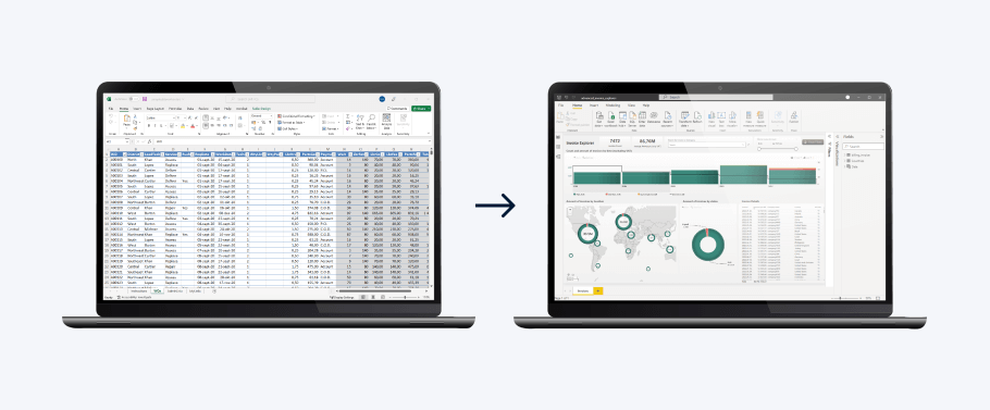
One well-made report might be just enough to impress your team and convince them to make the switch to Power BI. You can even import your Excel files into Power BI to use your already existing data.
Improve user experience
Some benefits can be measured with numbers, such as saved time or money. Others, however, are intangible, yet equally important. For example, if your reports are aesthetically pleasing and visually coherent, your users will find more joy in data exploration and be more enthusiastic about using them.
In addition, if your reports are used in meetings with partners or other stakeholders, they can leave a positive impression of your company. You can use the wide range of customization features to implement your organization’s brand guidelines, making the report unmistakably yours.
Conclusion
These are some of our best Power BI report templates that combine easy readability and quick insights with rich functionality and interactive drill-down capabilities. Check out our Use-case Gallery to see all our reports and try out the live demos to find the best reports Power BI can offer!
FAQ
How often should I update the design of my Power BI reports?
Review the design regularly (for example, every quarter or twice a year). Update sooner if user needs change or new design standards appear. Focus on clarity and function, and let user feedback guide improvements.
What common mistakes should I avoid when creating Power BI reports?
Skip messy fonts, clashing colors, weak contrast, too many visuals, and mismatched chart types. Keep a clear visual hierarchy, consistent styles, and simple, intuitive navigation.
How can I implement effective interactive filtering in my reports?
Use slicers, cross-filtering, and drill-through to let users explore data. Keep filters relevant, visible, and limited so they don’t overwhelm users.
Where can I learn more about creating Power BI reports?
Explore blogs, videos, and best-practice guides from Power BI and data visualization experts. If you’re new to Power BI, we recommend this guide: 27 Best Power BI Training Resources (2025).
How can I improve the visual hierarchy in my Power BI reports?
Arrange elements by importance, placing key metrics in prominent spots, for example, the top-left. Use size, color contrast and typography to guide the eye, and group related visuals logically.
Related content

Want more info like this?
Subscribe to our newsletter and be the first to read our latest articles and expert data visualization tips!


