97058
Power BI CRM Dashboard Example by Balu Chelluri
Power BI CRM Dashboard Example by Balu Chelluri
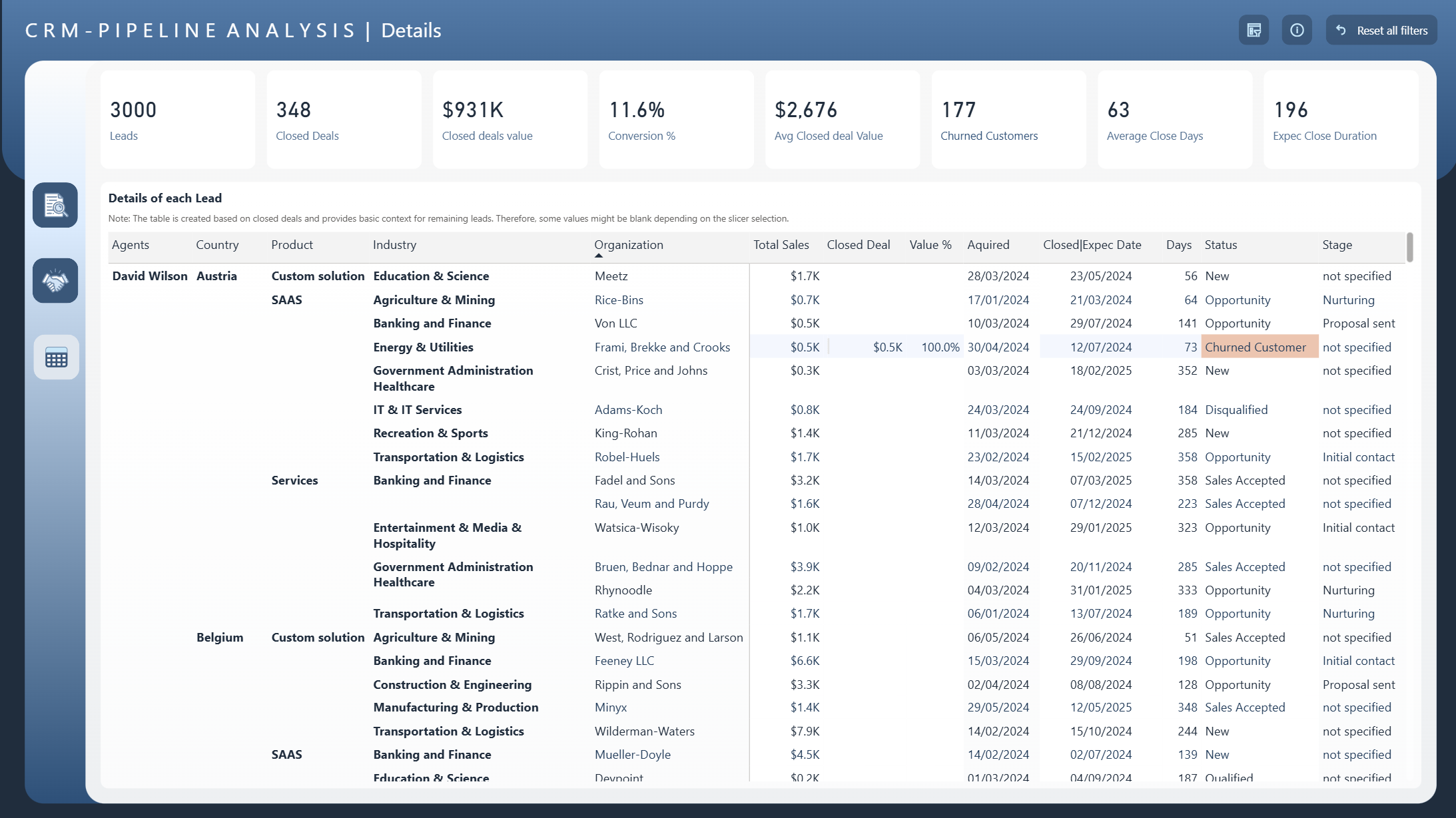
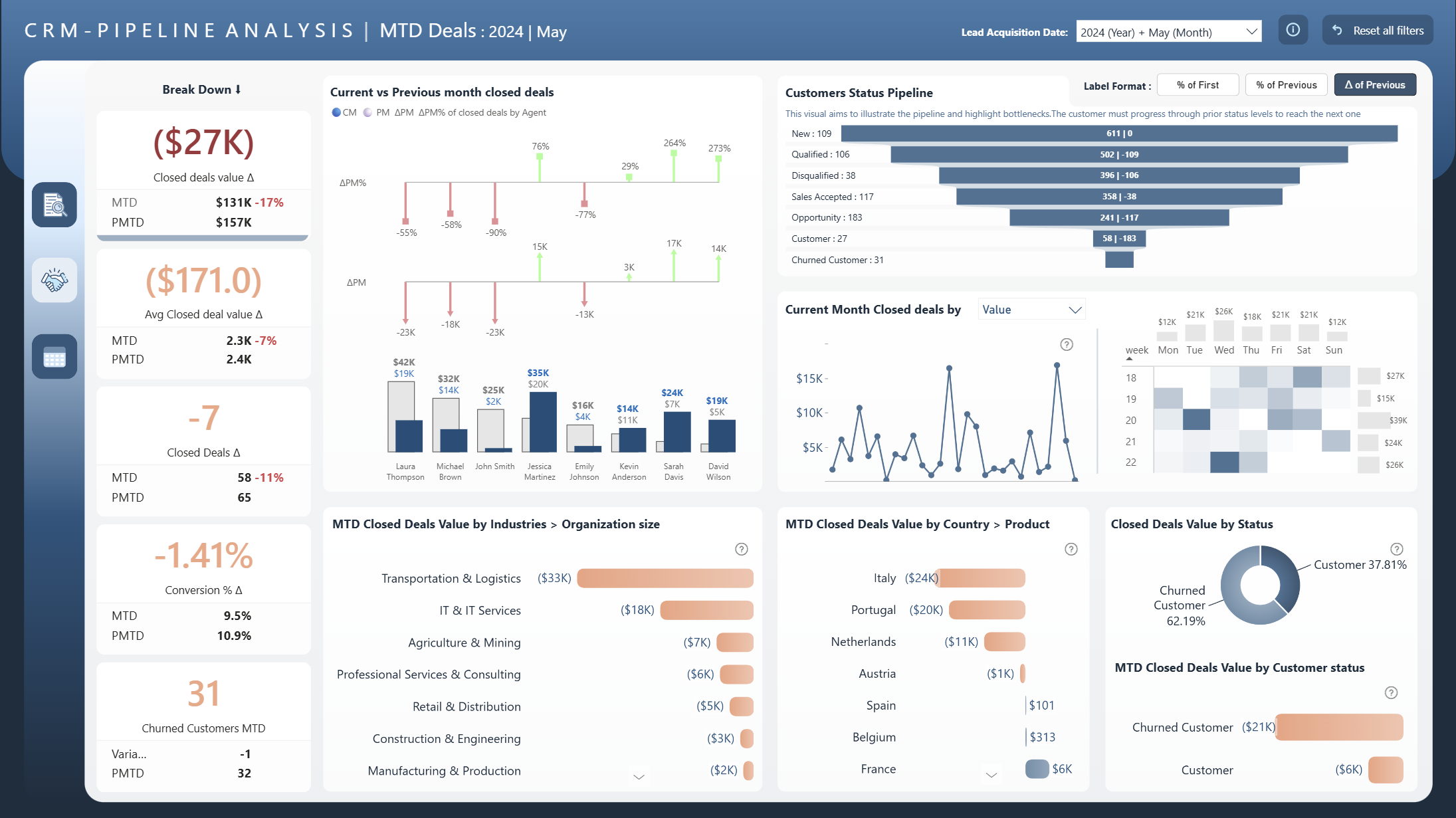
More Report pages
Overhauled by ZoomCharts
97058
Share template with others
Summary
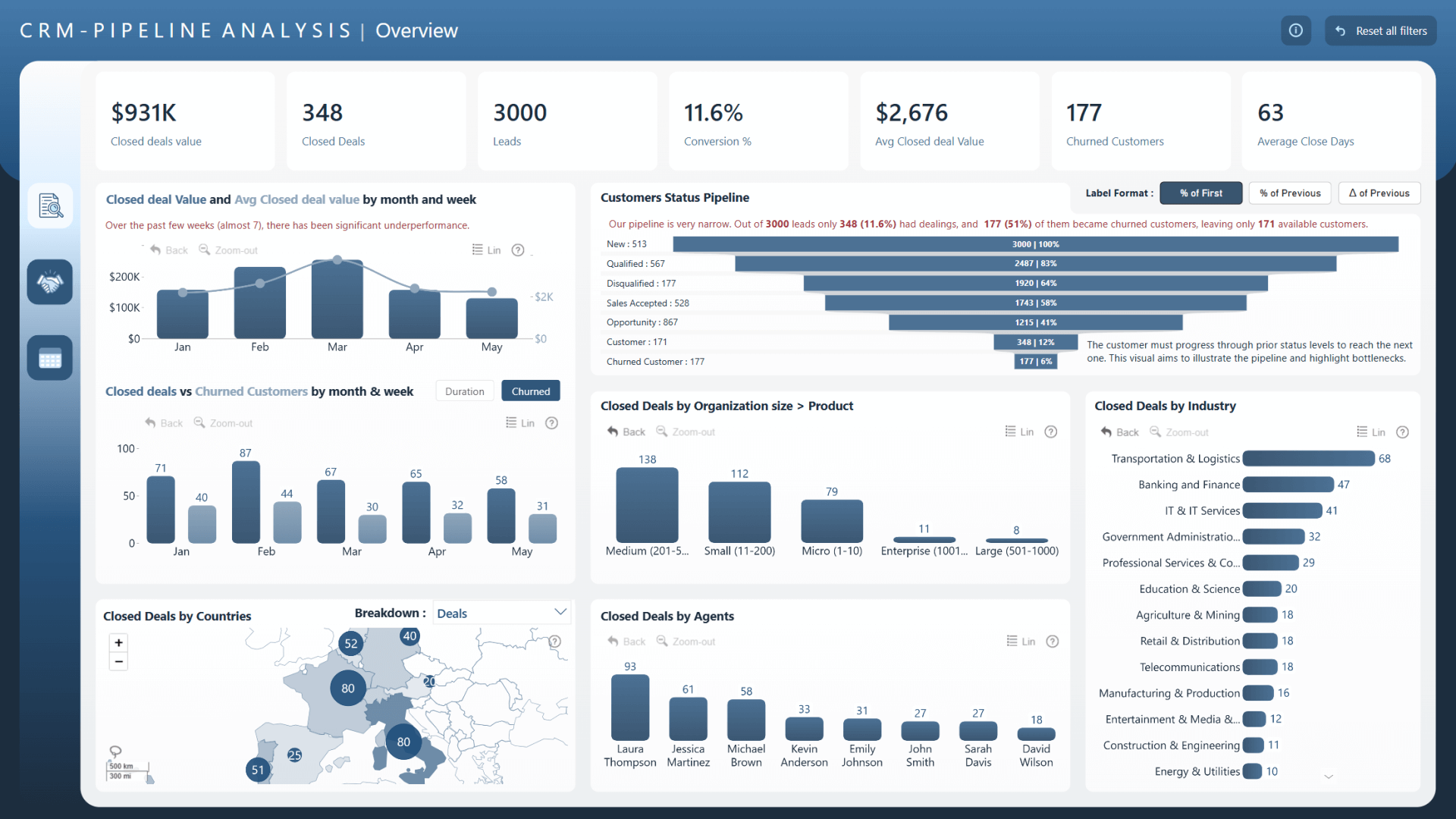
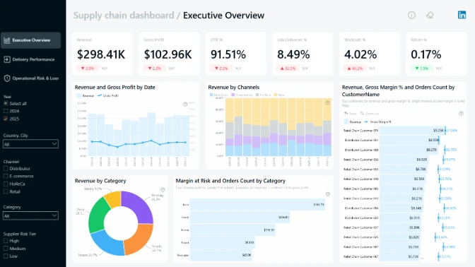
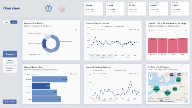
Analyze your sales pipeline with this Power BI CRM dashboard example! The report will instantly reveal the most important insights in an easy-to-read overview, while the interactive visuals will allow you to drill down and explore deeper insights with just a click.
This report is the winning entry for the FP20 Analytics July 2024 ZoomCharts Challenge, where the participants were tasked with visualizing a CRM dataset in Power BI.
Key Insights of this Report
This Power BI CRM dashboard example can be used to gain insights on various sales pipeline metrics, including:
- Number of leads
- Number of closed deals
- Average and total closed deal value
- Average days to close a deal
- Conversion %
Each of these metrics can be filtered by date, industry, customer status (new, existing, churned, etc.), country, sales agent, and other dimensions to quickly spot trends and find answers to questions regarding your sales performance, such as “Who are our top-performing agents?”, “Which industries or countries have the highest churn rate?”.
This Power BI CRM dashboard example is based on a challenge submission with minor design refinements by the ZoomCharts team. See the original submission here.
How To Use This Report Template
To interact with this Power BI CRM dashboard example, simply click any active element directly on the chart.
Download the report file to see all the settings, formulas, and calculations. Try it out with your own data by making a few adjustments.
ZoomCharts visuals used
4U Report Challenges
Participate in data challenges, build and submit reports to get free template downloads.
Join CommunityMobile view allows you to interact with the report. To Download the template please switch to desktop view.
Was this helpful? Thank you for your feedback!
Sorry about that.
How can we improve it?