Oct 30, 2025
Tooltips in ZoomCharts Power BI Visuals Explained
This guide focuses on tooltips in ZoomCharts visuals. Master all their features and learn how to use tooltips as a valuable data storytelling tool!
This guide focuses on tooltips in ZoomCharts visuals. Master all their features and learn how to use tooltips as a valuable data storytelling tool!
In a Power BI report, each element must contribute to data storytelling and deliver valuable insights to the user – from charts and tables to even the smallest details. Yes, that includes tooltips too – the tiny pop-ups that show info when you hover over data.
They serve an important role – while charts show data visually, tooltips are a way to reveal the exact values when you need them. This way, you can have best of both worlds – a clean and simple visualization, but with the option to see numbers on-demand.
Tooltips also have another purpose. Certain Power BI visuals (including ZoomCharts) have dedicated data fields just for tooltip content – their content will be displayed only in the tooltips. Useful if there are columns or measures that you want to provide to the user, but without dedicating report screenspace just for them; or if they are meant to be context or comparison against the values in the visual (like KPIs, last year’s performance, limits etc.)
In ZoomCharts visuals for Power BI, you can choose between the built-in Power BI tooltips, and our custom-developed tooltip style. In this guide, we will take a closer look at tooltips in our visuals, and show creative ways you can use them to enhance data storytelling in your reports.
ZoomCharts Tooltips vs. Power BI Tooltips
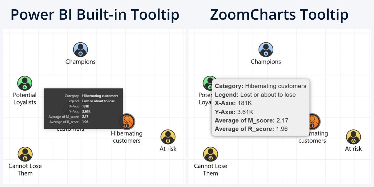
In ZoomCharts visuals, head to Tooltip Settings section of the Format Visual tab, where you can choose the Tooltip Type. By default, it will use Custom Tooltip – our tailor-made tooltip design; but you can set it to Power BI Tooltip if you wish to use the native style instead. They will look and feel just like they are in the built-in visuals.
In most cases, we will recommend using Custom Tooltip (totally unbiased opinion, we promise!), but the native tooltip option will find its use in certain scenarios:
- If your report has a lot of native visuals and you want to maintain UI consistency.
- You need to stick to the default behavior, or our custom features (like showing all series/legend segment values for category) do not fit your userflow.
- You wish to use report page tooltips.
The other available option is ZoomCharts custom tooltips. They were initially designed for our JavaScript Chart Library as a way to enhance data exploration, and naturally, they found their way to our Power BI custom visuals as well. In fact, what inspired this article was a chat with a long-time client of ours where they shared that in addition to things like interactivity, customization options, and powerful drill down capabilities, it’s these tooltips that make ZoomCharts visuals a must-have for their reports.
Whereas the built-in tooltips use the minimalist design language of Power BI – solid color background, rectangular shape and simple text – for our custom tooltips, we opted for a distinct appearance with readability and clarity as the main goal. Rounded corners, drop shadows, and visual distinction for when there are multiple values (i.e. colors, alternating rows, indentation).
And, while the overall tooltip design is consistent across all ZoomCharts visuals, we have made specific optimizations or included unique features to make them even more suited for the chart type and the data that you visualize in them. In the following sections, we will explore tooltips in each of our Drill Down Visuals; click on the links below if you want to jump to a specific section.
- Pie & Donut
- Combo, Combo Bar, Line, Timeline, TimeSeries
- Waterfall
- Map & Shape Map
- Network
- Graph
- Scatter & Bubble
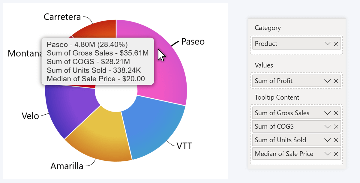
Tooltips in Pie and Donut
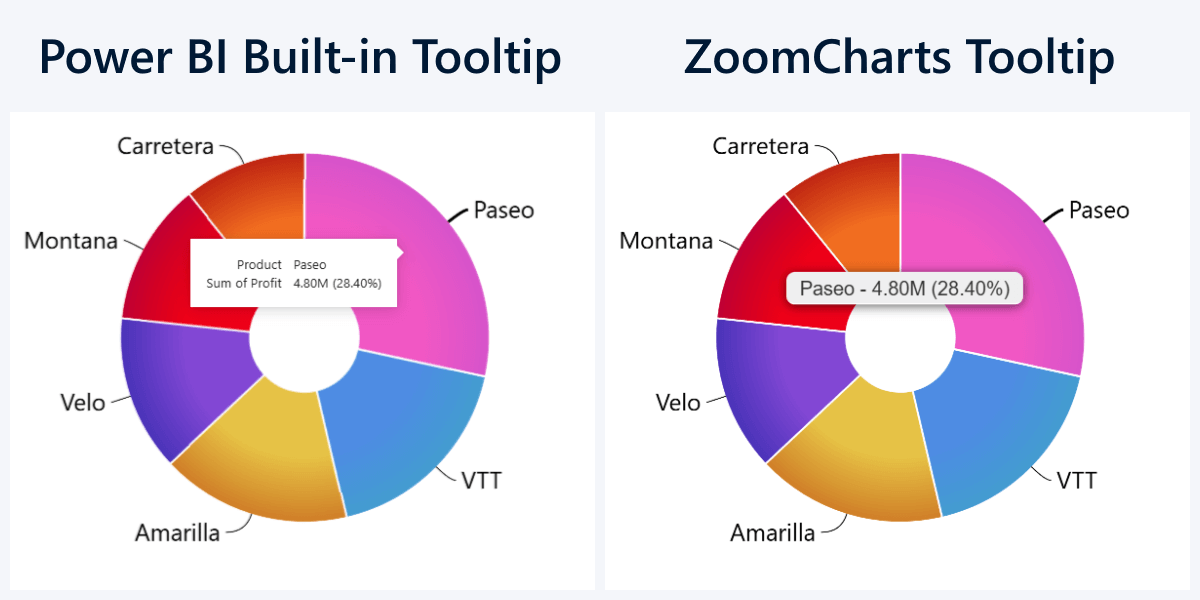
We’ll start with the simplest visualization type in Power BI, pie and donut charts. Their tooltip is equally simple – when you hover over a slice, you instantly see the category name, its value, and percentage against the total, just like in the built-in tooltip. It really comes down to the preference – whether you prefer the flat look of PBI tooltip, or the gradient in ours.
Tooltip Content Field
This will apply to both tooltip styles. If you want to deliver additional on-demand insights about a category – something you don’t want to visualize in the chart but could be useful to the user as additional context or comparison, you can add columns or measures to the Tooltip Content field. The tooltip will display category-adjacent values using your selected aggregation.
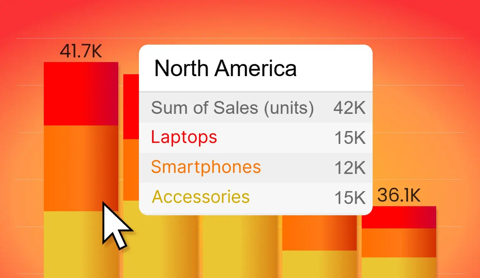
For pie/donut charts, some use cases could be: additional text for slices (for example, parent category such as type, segment, region), last year’s value for instant comparison, KPIs, additional metrics, or any other info that you want to display only when the user needs them. Like in this example: the slices show profit, but the tooltip will also reveal gross sales, COGS, sold units, and median sale price.
Tooltips in Combo, Combo Bar, Line, Timeline, TimeSeries
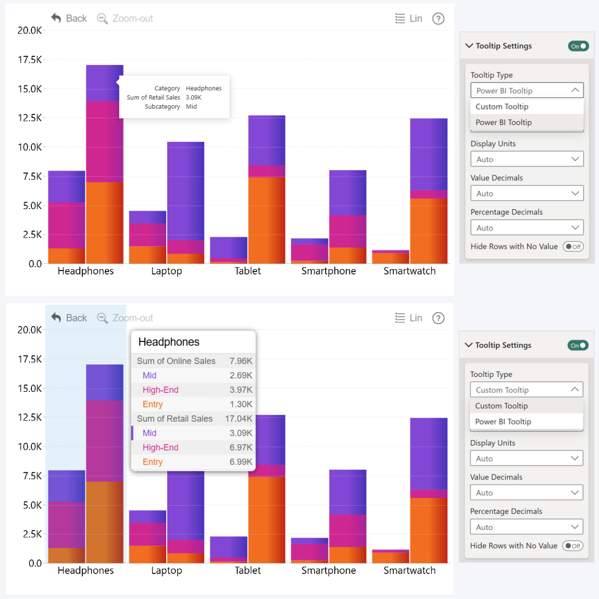
This section will cover five visuals because one of their standout features is the ability to display up to 25 series at once; so the tooltip had to be designed to accommodate that. Whether you’re making stacked column charts, clustered bars or area charts, you will encounter with a certain challenge – how to visualize values clearly and distinguish each series?
The default Power BI tooltip will display only the value for the specific data point you are hovering over. This is fine for a simple column, line, or area chart with one series, but when you have multiple series or legend segments, users may want to instantly compare values against each other. That’s why the custom ZoomCharts tooltip will show all series values for the category or time unit when you hover over it.
Users can instantly identify which value belongs to which series, because the label text uses the same color as it appears in the chart. There’s also a subtle marker next to the label that identifies the exact value that the user is currently hovering over. For added readability, we also used alternating row colors for the tooltip.
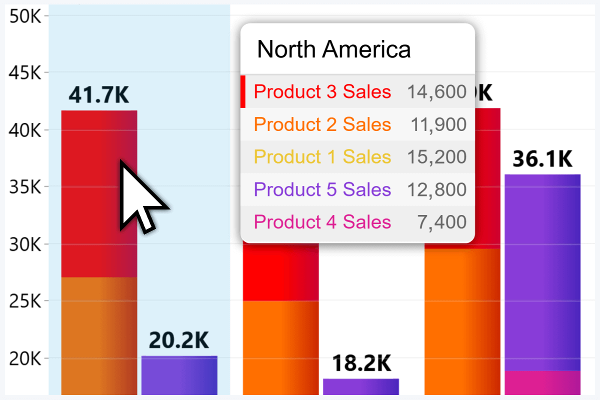
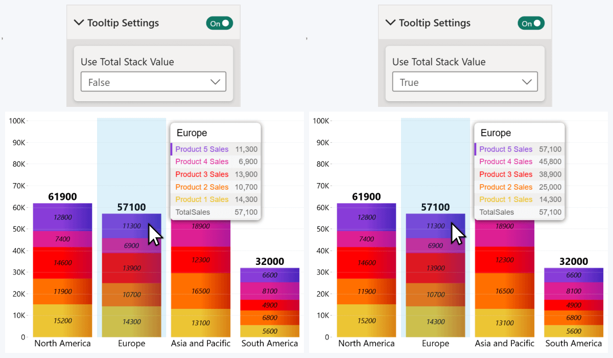
The above example used five series columns, so each series value is displayed separately. But if you use the Legend field to split series into stacked or clustered segments, the tooltip will display the total series value, and all the segment values under it.
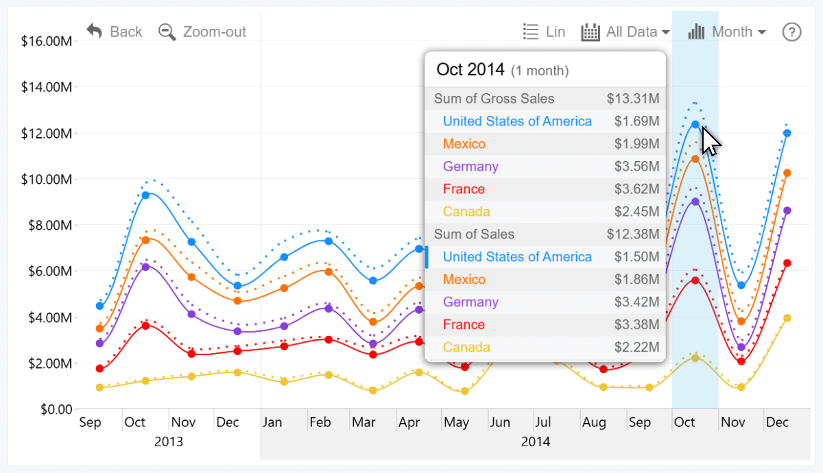
In this Timeline PRO example, we have two columns as Series fields: Gross Sales (dotted line) and Sales (solid line), and they are split into segments with the Country column. When you hover over a time unit, you can see the totals for each series, and country-specific values underneath.
Tooltip Content Field
As a way to show extra insights on-demand without overcrowding the chart, the Tooltip Content field is also available in these visuals as well. Here, you can add multiple columns or measures and the tooltip will show their adjacent values to the category or time unit that the user is hovering over.
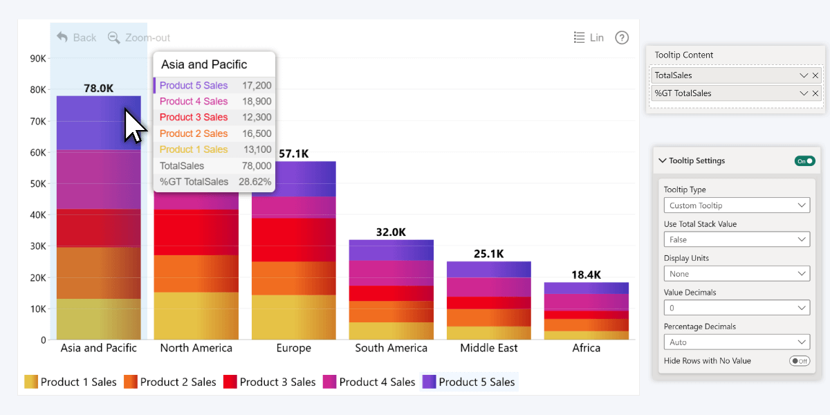
Some example use cases: the chart shows actual values, but the tooltip content field shows targets, last year’s value or other comparison metrics. Or, in a time series chart, you can show a measure with growth percentage against previous period. In the screenshot below, we populated the field with the total sales across all five series, and then added the same measure but showed it as grand total of all sales.
Tooltip Settings
Apart from the Tooltip Type dropdown for choosing between the built-in and custom tooltip, you will find other options. Use Total Stack Value will come in handy if you are creating stacked charts – if it is false, each series within a stack will show its independent value; but if it is true, the values will be cumulative and each series will show its value + all series below it (reflecting its position on the value axis).
In addition, there are three settings to adjust the format for numerical values in the tooltip (they are separate from on-chart value label settings). Display Units controls how the values are abbreviated (for example, 150 000 will be 150K with Thousands or 0.15M with Millions), whereas Value Decimals and Percentage Decimals control how many decimals to show after the comma. Lastly, with Hide Rows with No Value, you can choose if the tooltip shows No Data or omits the series completely if there is no value for that category or time unit.
Tooltips & Conditional Formatting
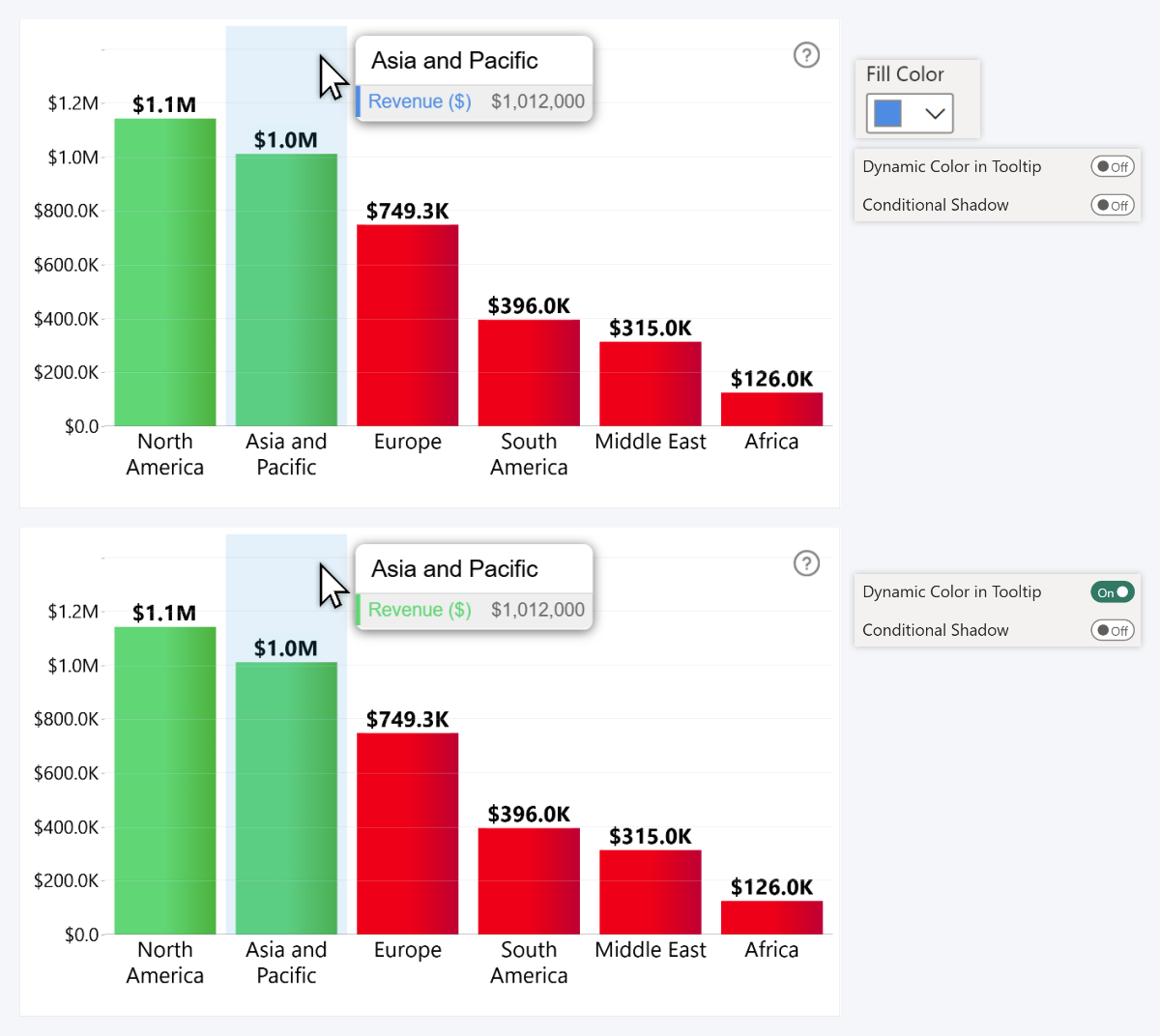
As we mentioned before, each series will be displayed in the tooltip using its fill color as it appears in the chart. That is fine when each series has a static color as defined in Category Colors or Series Configuration->Fill Color. But what happens if you apply conditional formatting? After all, it will change series color, so how do you color-code the values correctly in the tooltip?
When you enable conditional formatting, there will be a toggle in the Series Configuration section: Dynamic Color in Tooltip. If it is enabled, then instead of the selected series fill color, the tooltip will use the same color that is applied by the conditional formatting rules at the specific point.
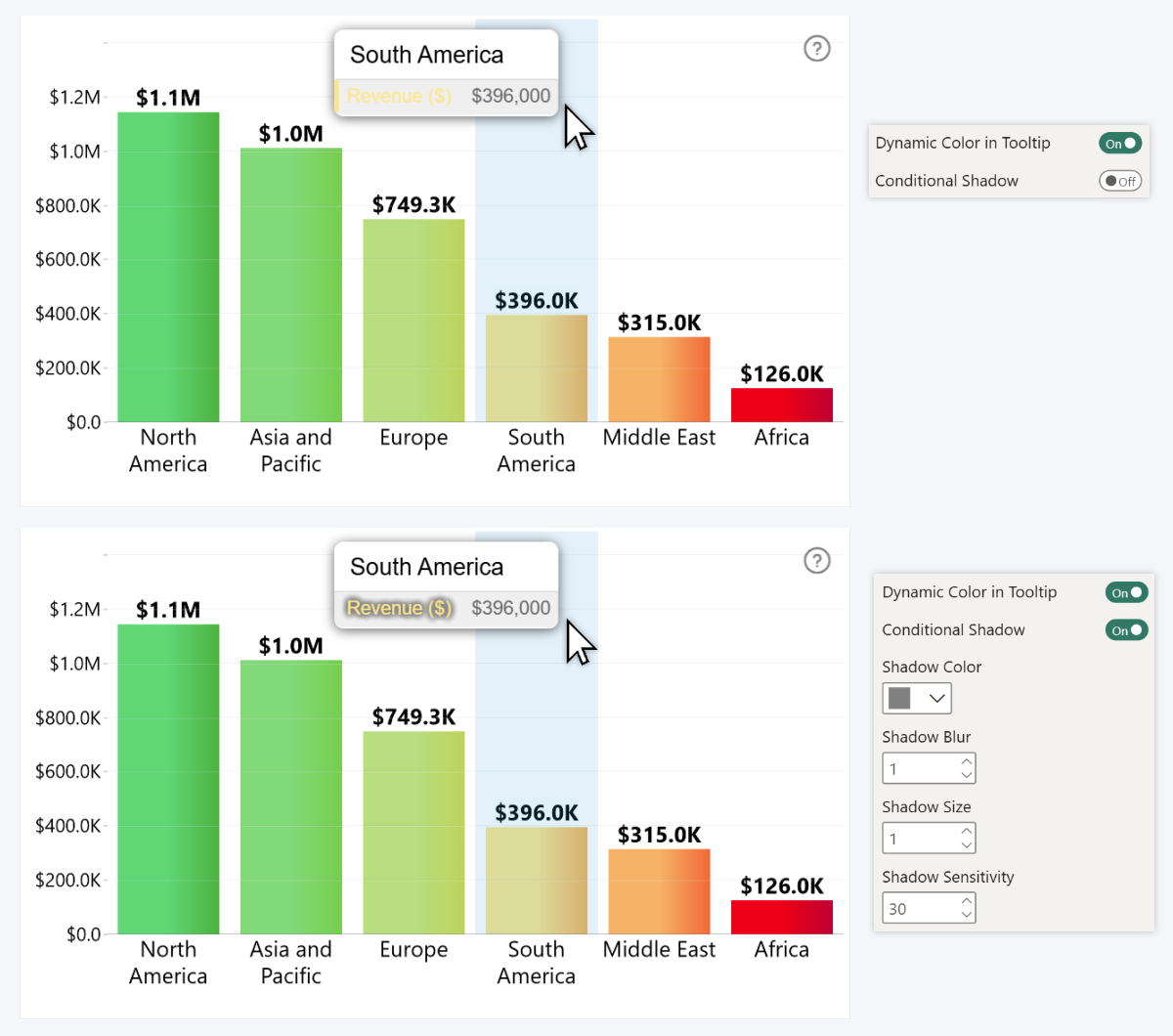
It will also reveal a setting called Conditional Shadow which will automatically apply a drop shadow effect to the label if the visual detects contrast issues (for example, yellow text on a light grey tooltip).
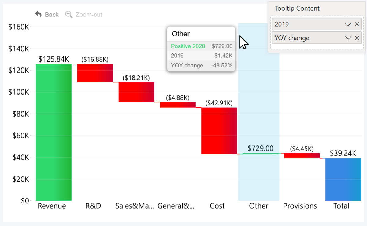
Tooltips in Waterfall
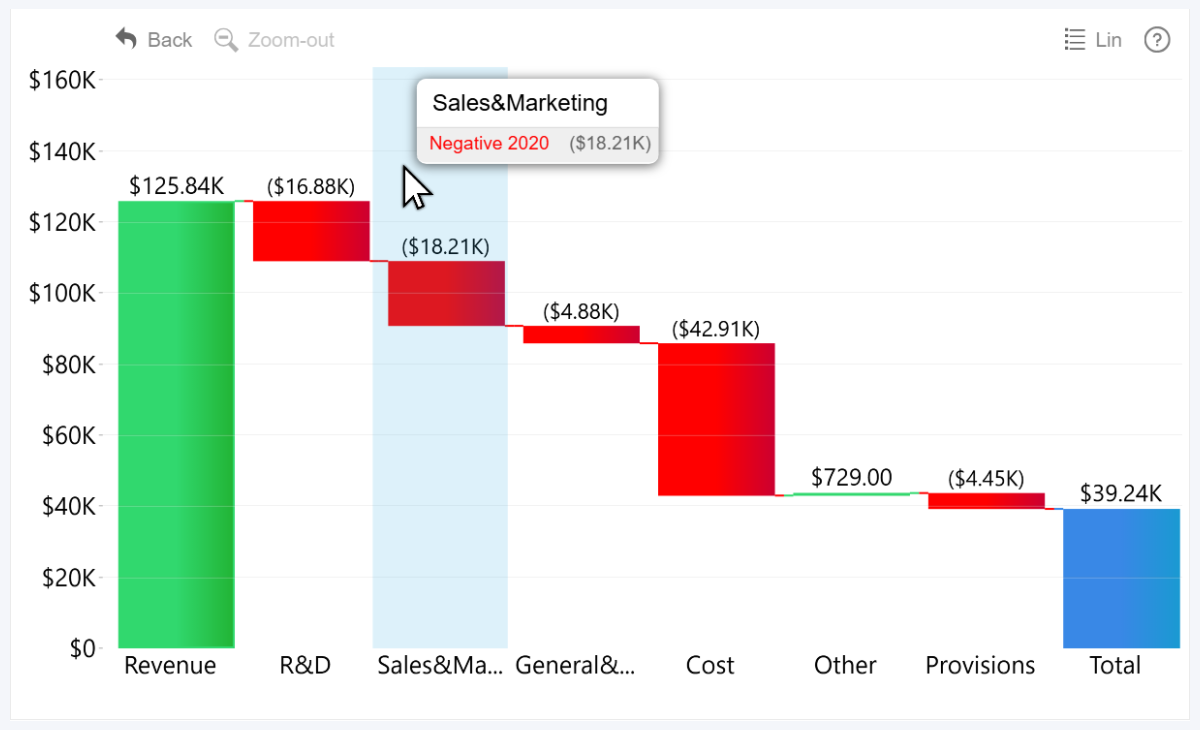
A lot of what we discussed in the previous section will also apply to Waterfall PRO, but with one crucial difference. Instead of up to 25 series like our other facet-like visuals, Waterfall operates based on values in the Change field, with separate configuration options for when the change is positive or negative (or it’s a total/subtotal).
So the tooltip will reflect that in the text color as well. The label will display the change direction (positive/negative) for the hovered segment, and the column’s name. In this example, it’s ‘2020’, but if the column was called ‘Cashflow’, ‘Financials’, etc., it would be displayed accordingly.
Tooltip Content
Just like in our other visuals, you can display on-demand insights in the tooltip using Tooltip Content field. In this example, we visualized 2020 values in the chart, but added 2019 values to the tooltip field for instant comparison. We also created a measure that shows YoY changes using DIVIDE (read more about DAX formulas in this article!).
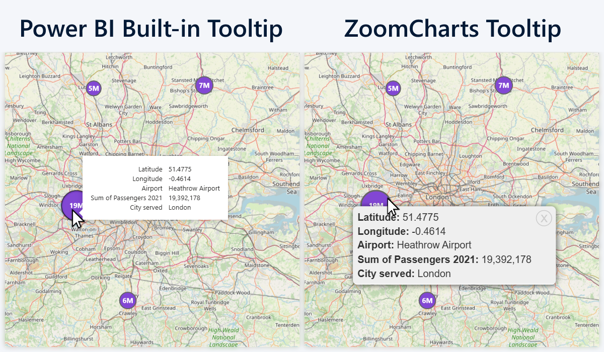
Tooltips in Map & Shape Map
Visualizing location-based data comes with its own unique challenges. How to deliver the necessary insights without making the visual too complicated? This is what we had in our mind when we developed our Map PRO and Shape Map PRO visuals, and all their core features – node clustering, base/shape layer customization and user interactions – serve that goal.
And that includes tooltips, which in Map & Shape Map have been optimized for location-based data. Like in all our other visuals, you can choose between built-in and custom tooltip styles, but the native tooltips will function exactly like they do in all other visuals, and only the custom tooltip style will benefit from all features exclusive in our map visuals.
Single Node Tooltips
When you right-click on a node, the tooltip will reveal information related to that data point. It will show latitude and longitude values (you can hide it if you want with Show Latitude and Longitude toggle in Tooltip Settings), node’s name from the Name field, and all that you have added to the Node Tooltip field. This will be true for both tooltip styles.
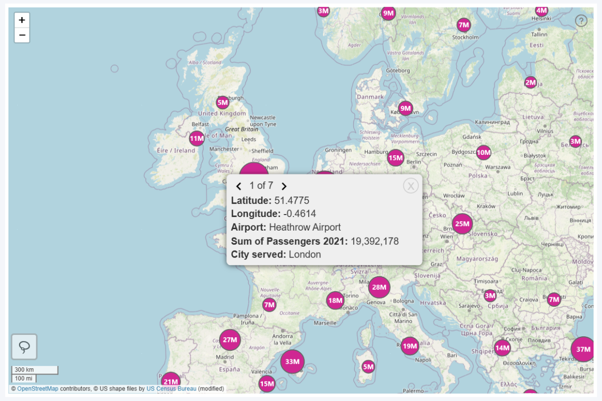
Cluster Node Tooltips
But what happens if you enable Cluster Nodes? This feature will combine multiple nearby nodes into a larger node – showing fewer nodes in the initial view and expanding as you zoom in. When clustered, a single marker on the map will have values from multiple datapoints, so how to visualize them in the tooltip?
If your selected Tooltip Type is Power BI Tooltip, cluster nodes will not show any tooltip at all. But if you use ZoomCharts Custom Tooltip, then right-clicking on a cluster node will show data for each node within the cluster in its own page. That’s also the reason why the interaction to reveal tooltip is right click (and not hover, like in our other visuals) because the tooltip is persistent, allowing you to click on the arrow buttons to flip between pages.
Node Pie Tooltips
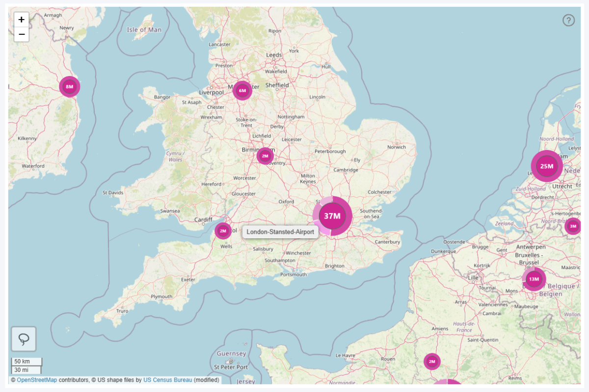
Here’s where it gets really exciting. One of the coolest features of the Map & Shape Map visuals is the ability to show cluster nodes as pie charts directly on your map chart. If you have added a Category field, these “mini pie charts” will show the category distribution of node values. This can be enabled with Pie Chart on Nodes setting in the Node Settings section.
Doing so will also reveal the Pie Tooltip toggle – if it is enabled, hovering over a slice will show its category name so the user can see which slice belongs to which category. It’s a separate tooltip type from the node tooltips – this one will be displayed on hover, whereas the node tooltip can be accessed with right click.
Node & Shape Tooltip Fields
Just like in all previously discussed visuals, you can display additional insights in the tooltip. However, in Map and Shape Map, you will see two separate fields for this purpose – Node Tooltips and Shape Tooltips. The reason for this is that you can show different insights in different contexts.
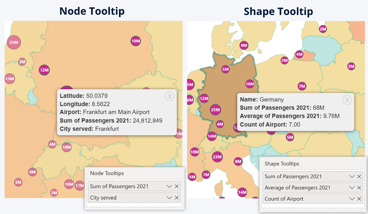
Node Tooltips field is for the columns or measures that you want to show in the tooltip for the nodes (in addition to the coordinates and name). Some use cases: traffic, revenue, and other metrics per each location, or text labels for additional context (for example, category, address, or other info). You can even have hyperlinks (i.e. website links, email addresses etc.), and they will be clickable – the Hyperlink Length setting will truncate them if they are longer than your defined limit.
Shape Tooltips field is for content that you want to display when the user right-clicks on a shape. In Map & Shape Map, you can enable one or multiple shape layers (i.e. countries, states, administrative divisions or even custom shapes), and if this field is populated, the tooltip will show aggregated values for all nodes within the shape. Some examples – total traffic or revenue for the area, average per each location, etc. If you want to learn more about shape layers (including tooltips), we recommend reading this article.
Tooltips in Network
While the Drill Down Visuals roster includes two seemingly similar of Power BI custom visuals for force-directed graphs – Network PRO and Graph PRO - there are crucial differences between the two, mainly because of the data structure used for each (read more in the article “Drill Down Network PRO vs. Graph PRO: A Detailed Comparison”).
And, whereas Graph PRO is intended for creators who want to have full control over the node relationships by using graph structure (source -> target nodes), Network PRO offers a simpler and more streamlined method to create Power BI network charts – it uses categorical data structure and will automatically identify relationships to visualize them in mere seconds.
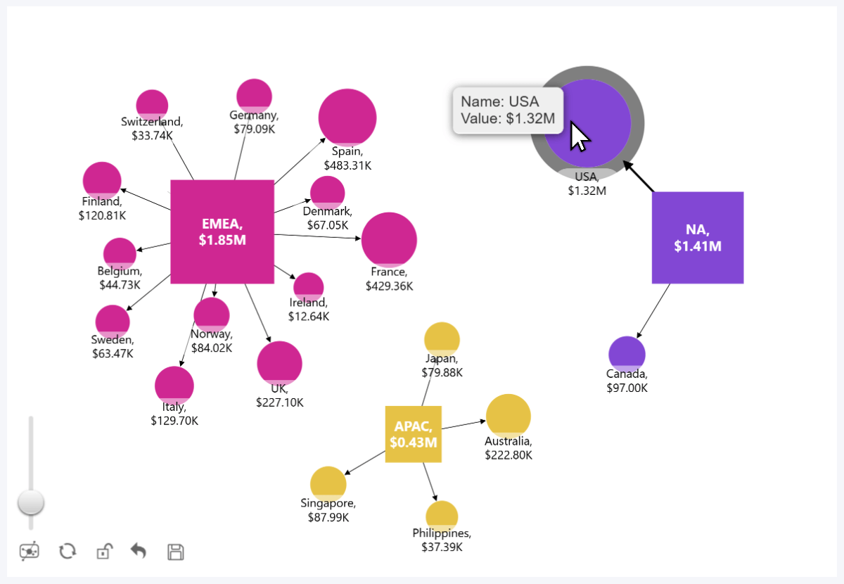
So the tooltips in Network PRO are equally straightforward. When you hover over a node, the tooltip will show its name (from the Nodes field) and its numerical value (from Measure field). You can choose between the native Power BI tooltip style or our custom tooltip. However, this visual does not have fields for additional tooltip content – for that, we recommend Graph instead.
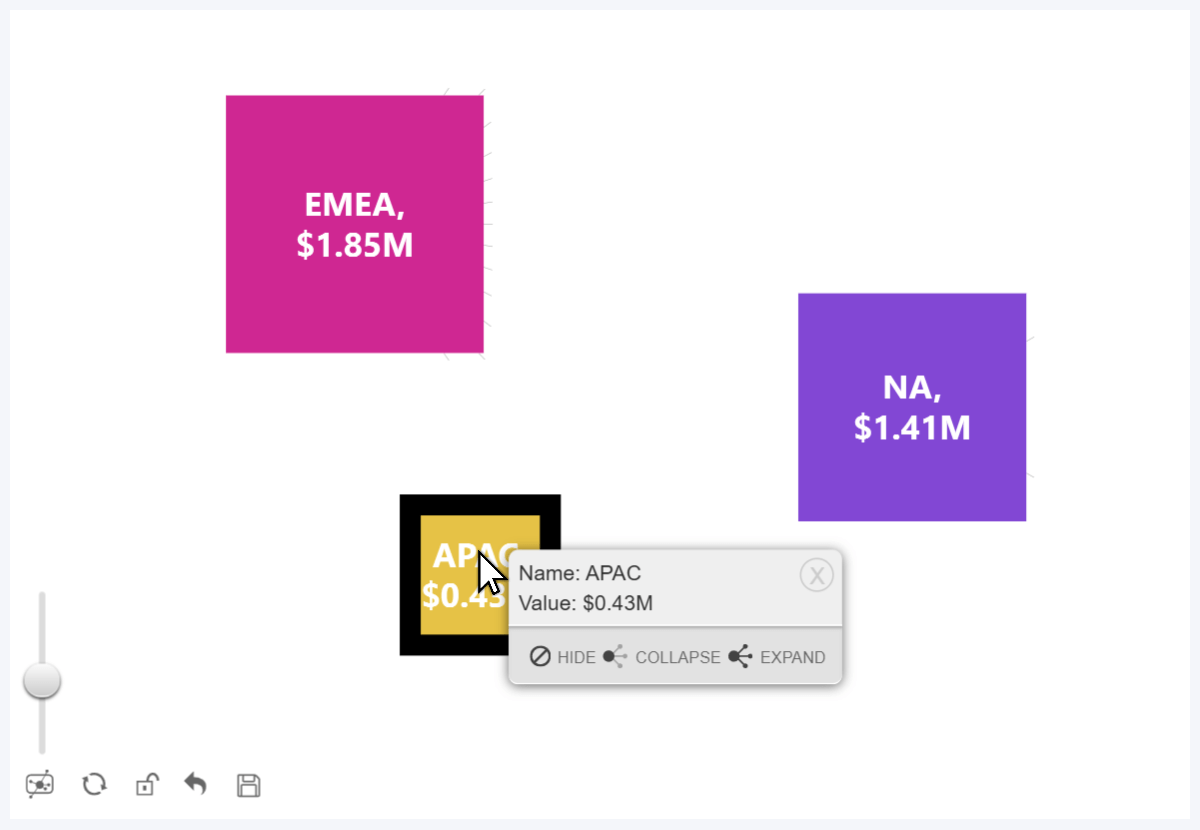
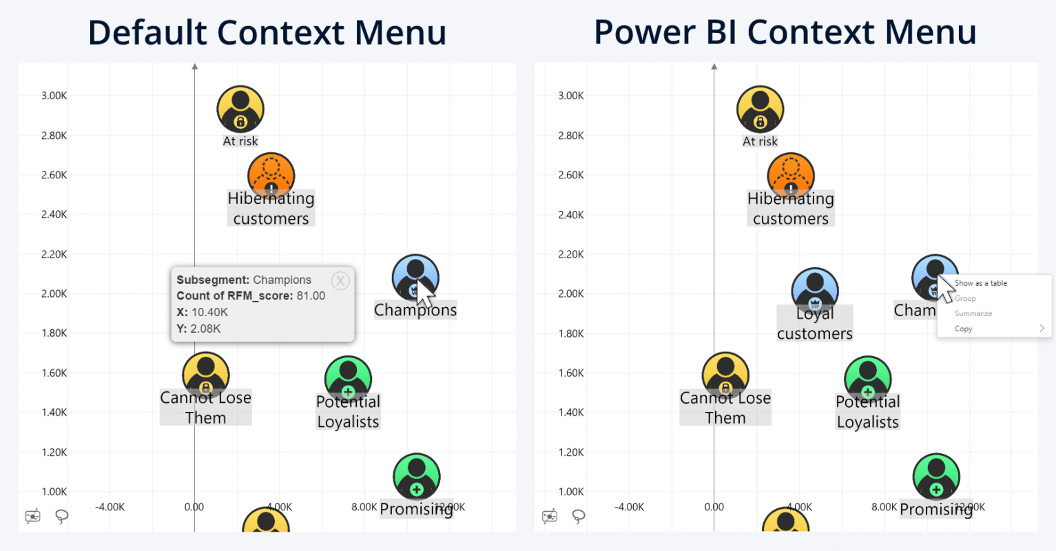
Network Context Menu
If you right-click on a node, you will see a context menu which will display the tooltip info (node name and value) and navigation buttons.
- Hide will simply hide that specific node from the chart (it will not affect other nodes). Tip: hidden nodes will be indicated with a short line stemming from the parent node.
- Collapse will hide not just that node, but also all child nodes that are linked to it.
- Expand: if you see this button, it means that this node is connected to a hidden or collapsed node in any direction – press it to unhide them.
This context menu will be available regardless of your selected Tooltip Type. Unlike tooltips, which will disappear once you move your cursor away from the node, the context menu is persistent and remain open until you close it with the X button. If you wish to use the Power BI native context menu instead, head to Navigation->Right Click.
Tooltips in Graph
If Network PRO is all about simplicity, then Graph PRO is for those who want options and full control over data visualization. This visual uses graph data structure, and it will identify relationships based on Source Nodes and Target Nodes fields. Similarly to Network, the visual will show a tooltip when you hover over a node or a link, and a context menu with navigation buttons when you right-click.
Keep in mind that tooltips are disabled by default. We recommend using only the right-click context menu, because it provides the same info as tooltips; and in a graph, it’s better UX to show tooltips only when the user intentionally requests them, instead of showing them any time the user accidentally hovers over something (especially when you have hundreds or thousands of nodes). However, the option to enable tooltips is there, which could be useful if you want to use the default Power BI context menu.
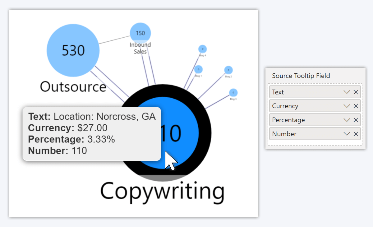
Node & Link Tooltip Fields
Graph has a lot of optional fields, and the reason for this is that each (e.g. Node Image, Color, Category, Aura, and, of course, Tooltip) has two variants – Source and Target. Both fields serve the same purpose, but they differ in the direction how the visual interprets these values.
- Source Tooltip Field: will be displayed for the source node of the row
- Target Tooltip Field: will be displayed for the target node of the row
These are for node tooltips. But did you know that you can also display custom tooltip content for links as well? That’s right – with the Link Tooltip Content field, you can show your selected column or measure values when the user hovers over a link between two nodes. For example, when visualizing a social network, the tooltip can provide a description of each relationship (e.g. “Partnership”, “Investor”, etc.). Another example: in a supply chain, show quick insights such as total expenses per supplier, average purchase size, etc.
Another thing we want to note is that like the previously discussed Map & Shape Map, this visual also supports hyperlinks in tooltips. If there’s an URL or a HTML hyperlink (<a href=Example Link”>Example Text</a>), it will be clickable. This could be useful in scenarios like org charts, where tooltips can give quick access to employee LinkedIn pages or email addresses.
Tooltips in Scatter & Bubble
In our two Cartesian plane visuals, Scatter and Bubble, tooltips serve an important role. The core insight of this chart type is the relationship between two values and the general trends in marker placement between X & Y axes, so the chart places less emphasis on the values of each individual data point.
But, if the user needs on-demand insights about specific data points, tooltips are the place where they can find them. When the user hovers over a marker, the visual will show a tooltip with the following info:
- X & Y coordinates
- Category (and/or Legend) name
- Label, Value Label (if these fields are populated)
- Tooltips field: useful for providing additional insights.
Like in our other visuals, you can choose between the built-in Power BI tooltip visuals or our custom tooltip style.
Scatter & Bubble Context Menu
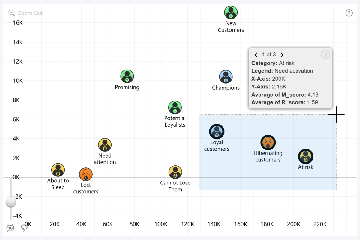
Similarly to Map, Graph, and Network, right-clicking on a data point here will show the same tooltip, but as a persistent context menu. If you want to use the default Power BI context menu instead, you can switch the right click interaction in the Navigation section.
However, the benefit of our context menu is that when you select multiple markers (i.e. with rectangular selection, lasso tool or Ctrl+click), the context menu will show data for each marker as a separate page. Also, if the Tooltips field has URLs, they will become clickable.
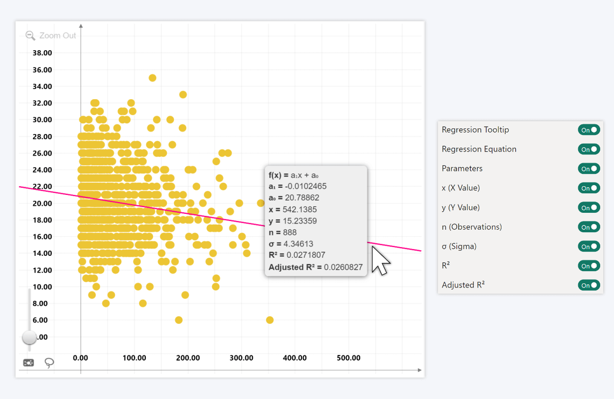
Regression Tooltip in Scatter & Bubble
One of the standout features of our Scatter & Bubble visuals is the dynamically calculated regression line up to the 10th degree. What’s more, you can enable a tooltip specifically for the regression line that will show various calculations for deeper analysis, such as regression equation, parameters, current coordinates, standard deviation and others. Mathematically minded users might enjoy such insights, so the option is there for you.
Final Thoughts
ZoomCharts visuals have many unique features that are designed to make your data user-friendly and more insightful, and we hope that after reading this article, you will discover creative and useful ways to incorporate tooltips in your data storytelling. This guide is a part of a series that explains various ZoomCharts features in detail, and we previously have covered:
- Stacked column charts in Combo, Combo Bar, TimeSeries, Timeline
- Reference lines and areas with Thresholds
- Shape layers in Map & Shape Map
- Conditional formatting in Combo, Combo Bar, TimeSeries, Timeline, Line
If you are new to ZoomCharts, the best way to get started is with the brand-new Developer License. It will grant you free access to all our visuals for an entire year, allowing you to explore all features and customization options in Power BI Desktop.

Want more info like this?
Subscribe to our newsletter and be the first to read our latest articles and expert data visualization tips!