Jan 20, 2026
January Update: Fewer Workarounds, More Control for Power BI Developers
If you build Power BI reports for others, analysts, managers, executives, you already know the real challenge is not creating visuals. The challenge is making reports that explain themselves, scale to dense data, survive handover to other developers, and work without hidden hacks.
If you build Power BI reports for others, analysts, managers, executives, you already know the real challenge is not creating visuals. The challenge is making reports that explain themselves, scale to dense data, survive handover to other developers, and work without hidden hacks.
Over the last release cycle, ZoomCharts focused on one clear goal: Turn common Power BI workarounds into first-class features.
Below is a quick overview of what’s new, followed by deeper context on why each update matters if you ship real reports, not just demos.
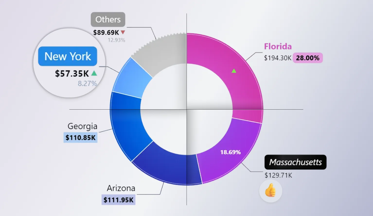
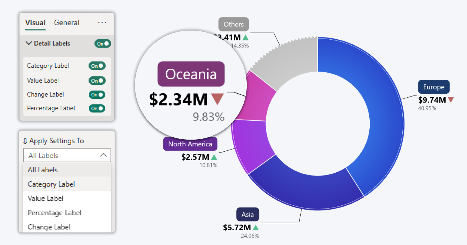
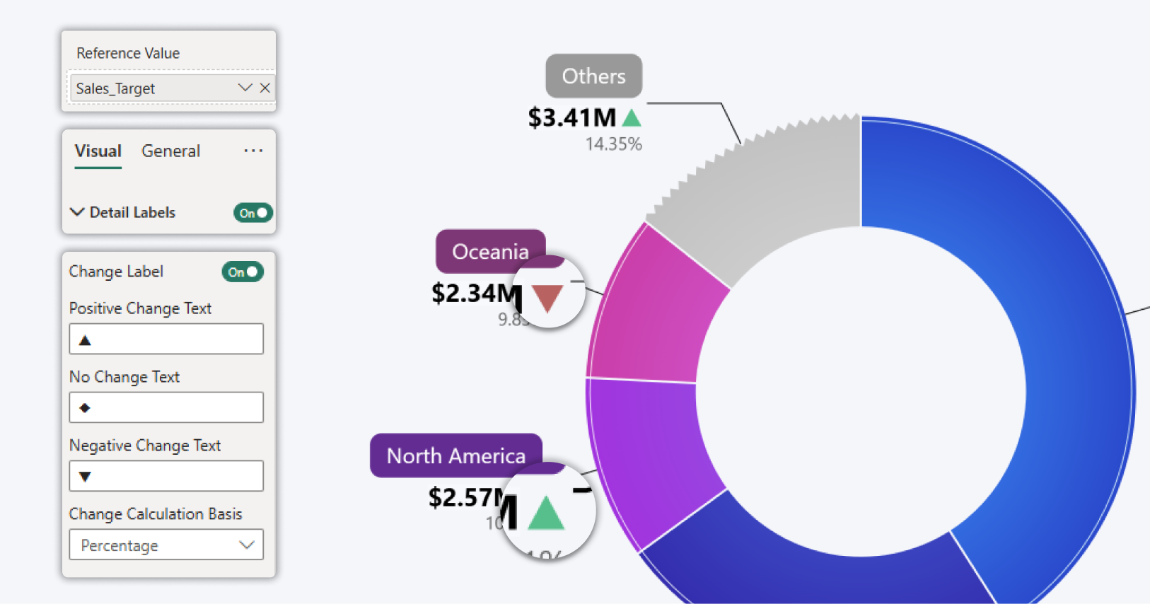
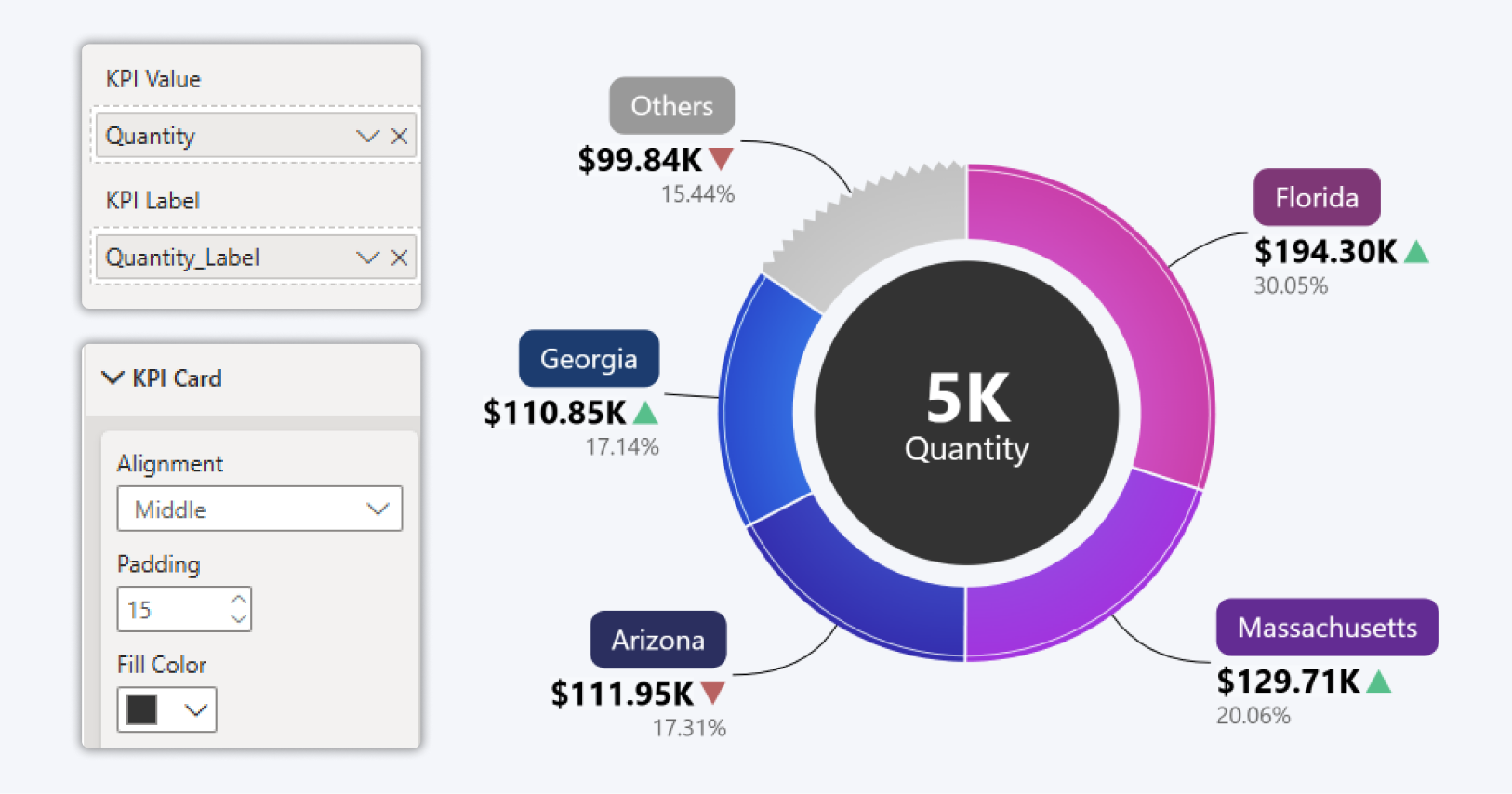
Donut and Pie Charts That Actually Communicate Performance
Donut and Pie charts are often dismissed. Not because they’re useless, but because they usually lack context. We fixed that.
Drill Down Donut PRO and Drill Down Pie PRO introduce advanced labelling and performance context to charts in Power BI, helping users quickly understand how categories perform against targets directly within the visual.
What’s new and why it matters:
-
Advanced label customization - control how category names, values, and percentages are displayed. Reorder label elements, place them on separate lines, apply custom fonts and backgrounds, or hide less important details to keep labels readable with dense data.
-
Category level reference markers -highlight positive or negative performance directly on the donut using visual indicators based on reference values, enabling faster interpretation without tooltips.
-
Built in KPI context (Only Donut) - display a KPI value in the center of the Drill Down Donut PRO visual that updates automatically with filters and drill down actions, keeping key metrics visible at all times.
-
Angled label connectors - use angled connectors that visually align with native Power BI visuals, improving readability and visual consistency across reports.
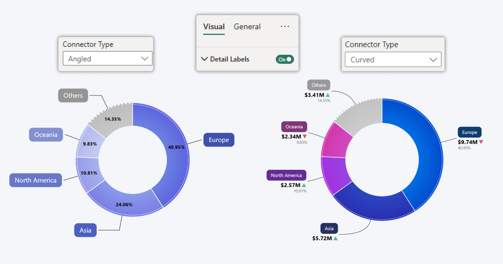
Why developers care:
- No overlay KPI cards
- No tooltip-only explanations
- No fake measures built just to simulate benchmarks
Key use cases
- Performance tracking against targets
- Progress monitoring across categories
- Executive and management reporting where clarity and context are critical
These enhancements make Drill Down Donut PRO and Drill Down Pie PRO powerful visuals for Power BI, combining drill-down interaction, KPI context, and flexible labelling in a single visual.
You can now build these visuals that explains performance at a glance, even in executive 4-IN reports. This is what turns a simple visual into a decision tool.
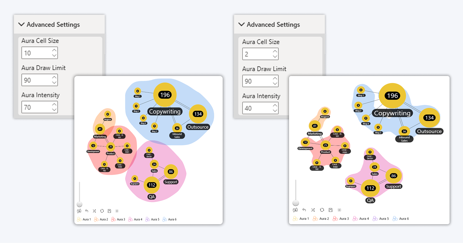
Graph Visual: Clear Risk Even When You Zoom Out
Dense datasets expose visual weaknesses fast, especially when users start from a high-level view.
New aura sensitization controls help manage how visual emphasis behaves at scale. In practice, this means zooming out no longer exaggerates or blends risk clusters:
- Adjust how far auras extend around data points
- Prevent blending when zoomed out
- Preserve correct risk perception at overview level
This came directly from real risk and dependency analysis use cases, where visual overstatement leads to wrong conclusions.
For developers, this means:
- More predictable behavior
- Fewer “this looked wrong” questions
- Safer default views for large datasets
How to enable in Power BI
-
Select a ZoomCharts Graph PRO visual
-
Open the Visualization pane
-
Go to Visual → Advanced Settings
-
Set Aura Cell Size, Aura Draw Limit and Aura Intensity
More Structure With Orthogonal Links
Straight or curved links don’t always reflect real systems.
Added:
- Orthogonal links for cleaner routing
- Better readability for process flows
- Clearer organizational structures
- Improved clarity in dense relationship graphs
When space is tight, structured routing matters more than decorative curves, especially in operational and architectural views.
How to enable in Power BI
-
Select a ZoomCharts Graph PRO visual
-
Open the Visualization pane
-
Go to Visual → Links
-
Set Orthogonal links to On
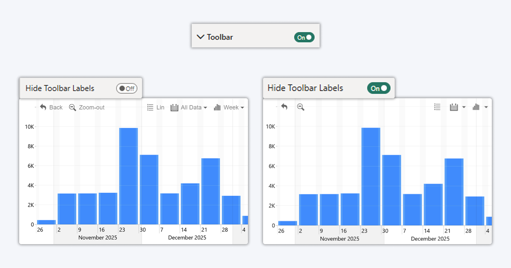
Toolbar Compacting: Hide Labels to Save Space
A new Toolbar Compacting option allows you to hide toolbar labels and display toolbar buttons as icons only. This helps reduce the space used by the toolbar while keeping all toolbar actions available.
Benefit
- Allows toolbar appearance customization
- Reduces the space used by the toolbar
Supported visuals
This option is available for ZoomCharts Drill Down PRO visuals:
Timeline, TimeSeries, Combo, Combo Bar, Donut, Pie, Scatter, Bubble, Line, and Waterfall.
How to enable in Power BI
-
Select a ZoomCharts visual
-
Open the Visualization pane
-
Go to Visual → Toolbar
-
Set Hide Toolbar Labels to On
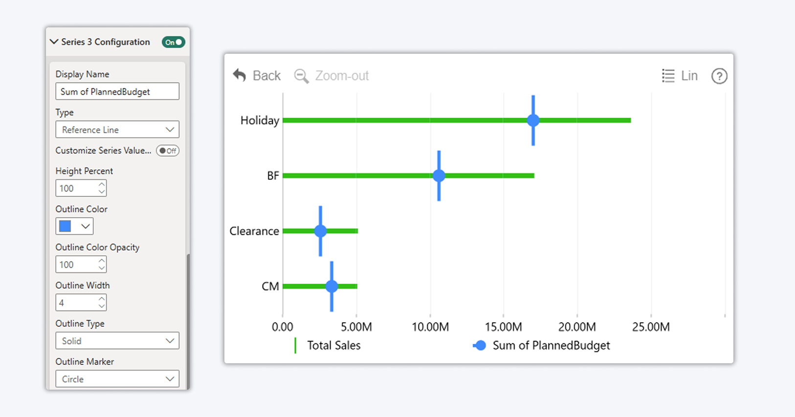
Combo Charts: Reference Lines Without Hacks
Previously, per-category targets required:
- Extra measures
- Hidden series logic
- Fragile formatting tricks
Now you can:
- Add reference values as a dedicated series
- Select series type "Reference Line"
- Fully customize width, style, and appearance
Result:
- Cleaner models
- Easier maintenance
- Faster onboarding for other developers
What used to be clever is now simply usable.
This option is available for ZoomCharts Drill Down PRO visuals: Combo and Combo Bar
Waterfall Charts: Multiple Change Thresholds (Coming next)
Real-world financial and performance analysis rarely fits a single start-to-end story.
What’s coming:
- Multiple change markers in one waterfall
- Year-over-year comparisons
- Sub-period analysis
- Custom range comparisons
Instead of rebuilding visuals for each scenario, you’ll be able to express multiple change narratives in a single chart without re-modeling.
Interaction Improvements That Reduce Support Overhead
These updates focus on removing “how did you do that?” questions from your reports.
- Legend items as filters instead of hide or show toggles
- Drill-down breadcrumbs for orientation
- Tooltip font and color control
- Freely placed chart annotations
Each improvement removes a workaround and replaces it with a discoverable interaction users understand naturally.
Built for Developers Who Ship, Not Just Prototype
Every update in this cycle was driven by real customer requests, not internal experiments.
The product philosophy is simple:
- If a feature requires 100 steps, people won’t use it
- If it removes a workaround, it’s worth shipping
That’s how ZoomCharts is evolving, from powerful visuals to developer-grade building blocks for decision-centric reports.
If you build Power BI reports professionally, these updates unlock immediate value:
- Start ZoomCharts and test the new features in your own reports
- Use the Developer License to build freely in Power BI Desktop
- Replace fragile hacks with our visuals so that your users can actually understand data
- Build 4-IN reports

Want more info like this?
Subscribe to our newsletter and be the first to read our latest articles and expert data visualization tips!


