162745
Power BI Financial Analysis Dashboard by Iris Mejuto Crego
Power BI Financial Analysis Dashboard by Iris Mejuto Crego
More Report pages
Overhauled by ZoomCharts
162745
Share template with others
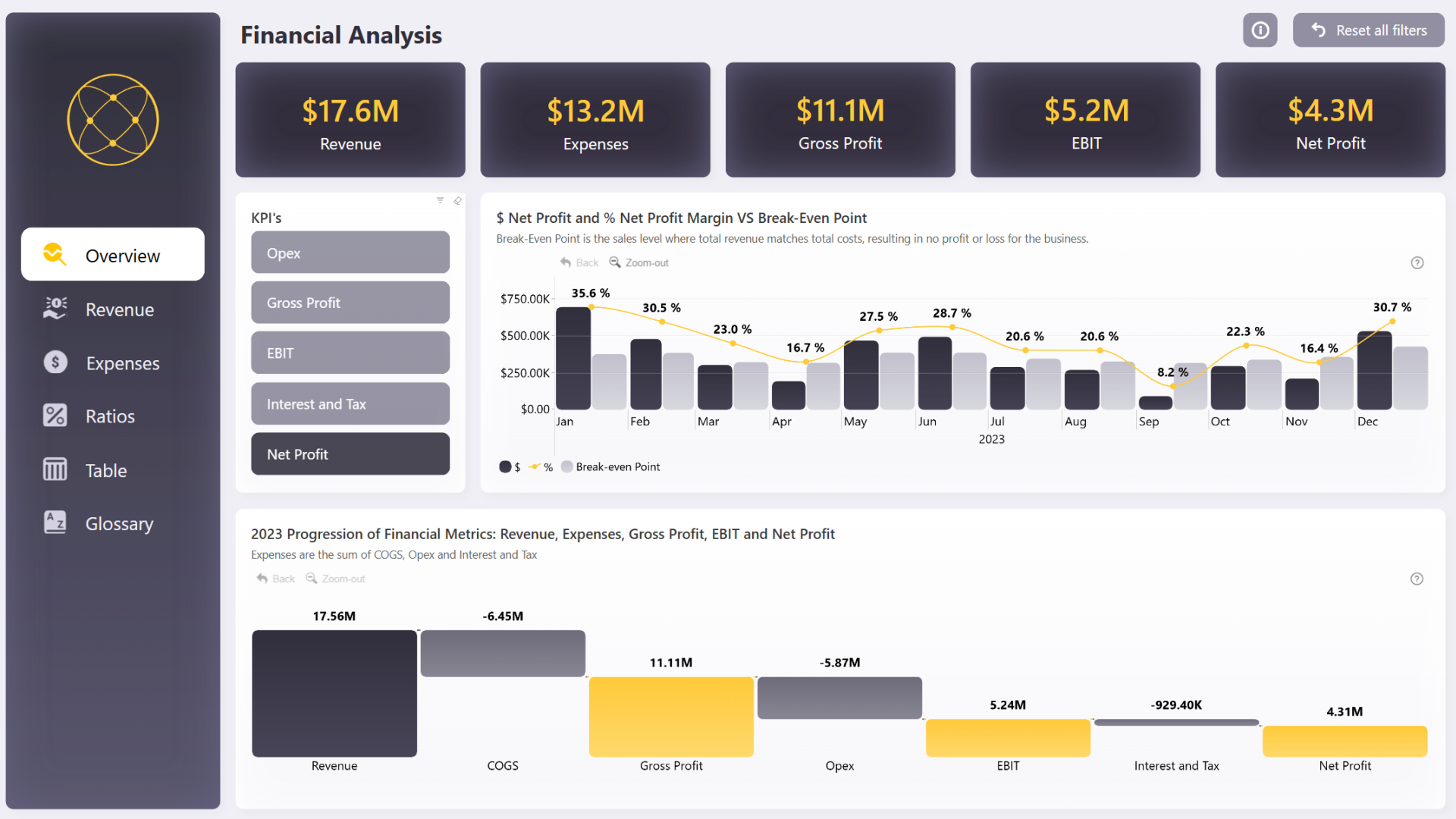
Summary
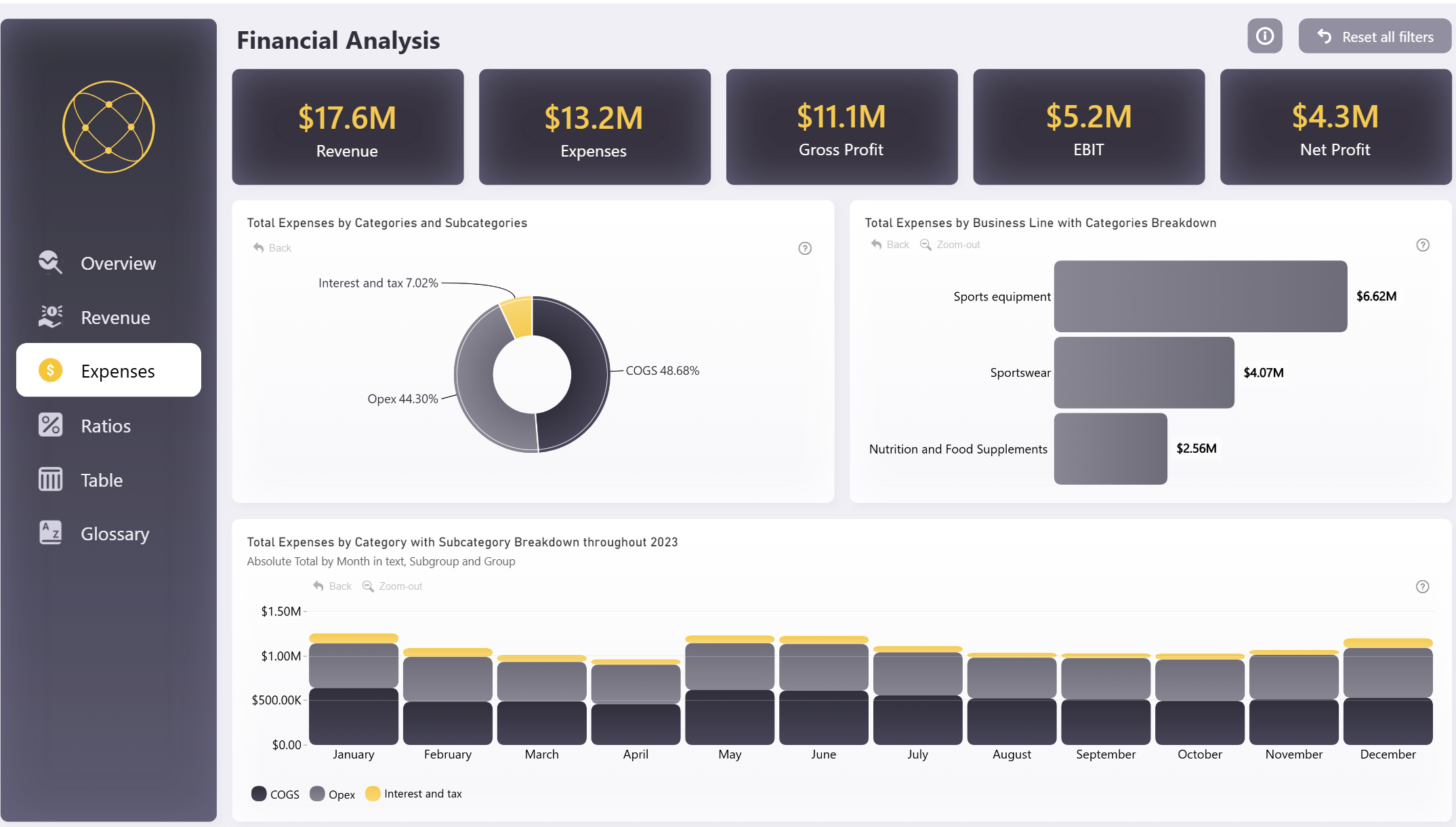
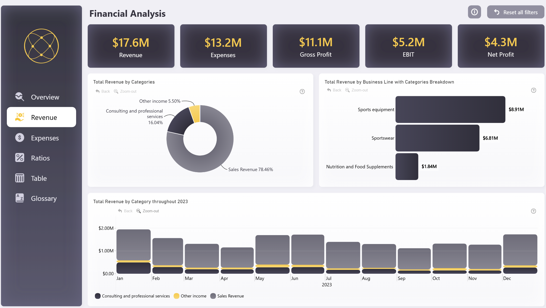
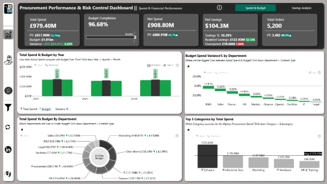
This financial analysis dashboard Power BI example is the winning entry for ZoomCharts Mini Challenge which was hosted as a part of the Onyx Data August 2024 Challenge.
It is a great example of using Power BI for financial reporting, and it instantly provides clear, easy-to-read insights on core financial metrics.
Key Insights of Power BI Financial Analysis Dashboard
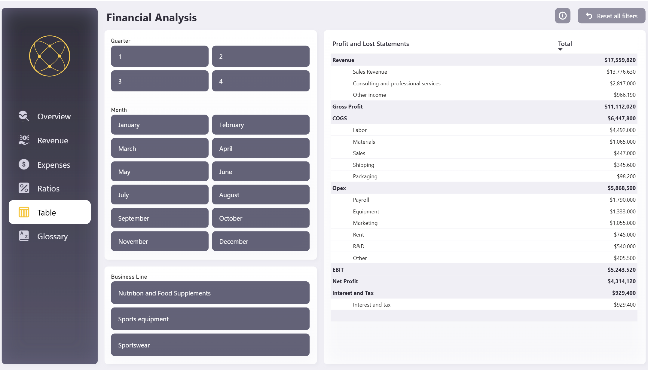
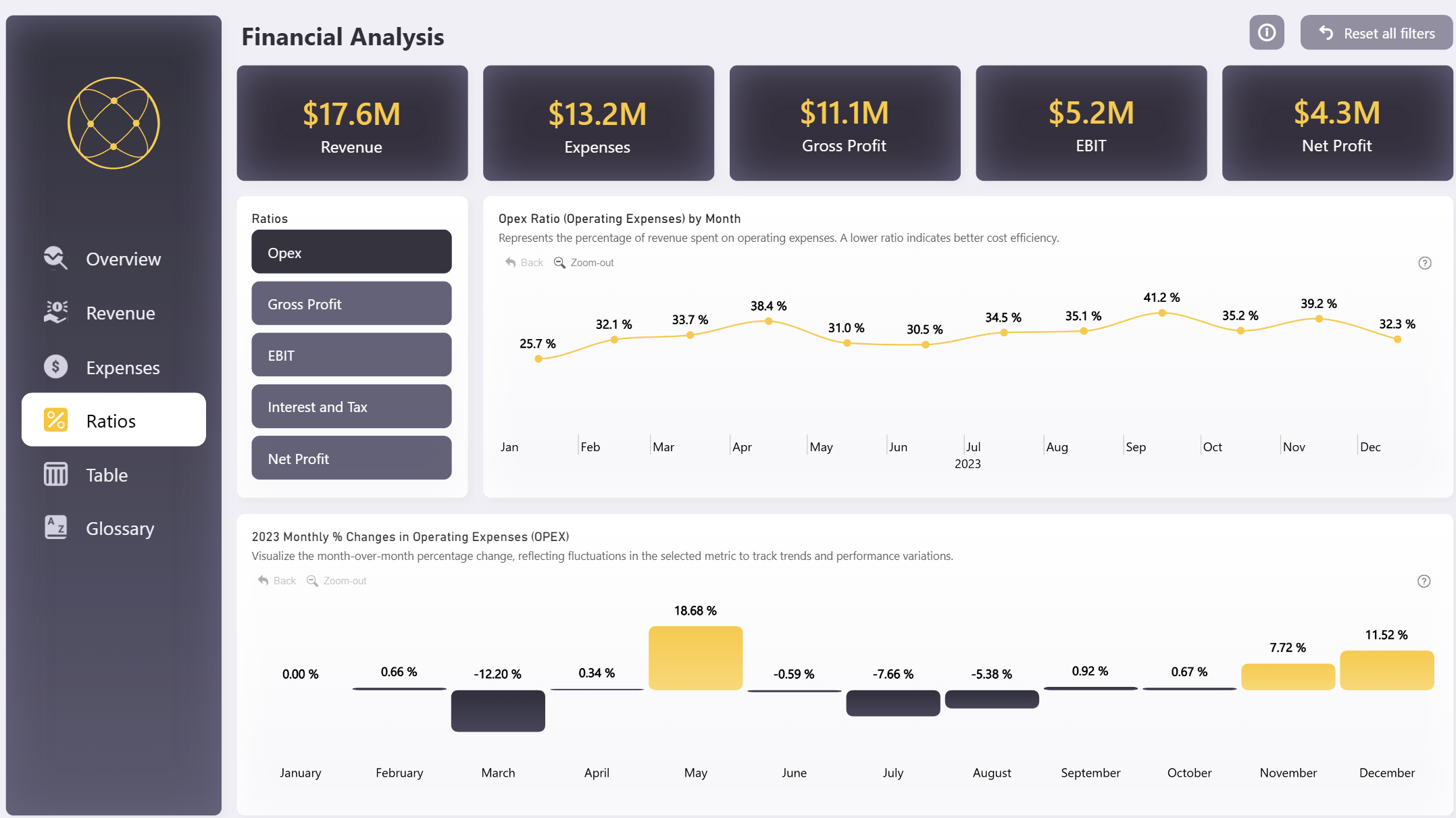
The report is structured in six pages. The initial view displays an overview, and each additional page allows user to delve deeper into more specific insights. Some of the main insights include:
- Step-by-step progression from revenue to net profit
- Revenue: total; by category, by channel; changes over time
- Expenses: by type, by business line; changes over time
- Profit: changes over time, comparison vs. KPis
With a thoughtful design and clever use of visuals, this Power BI financial analysis dashboard makes it quick easy to find valuable insights. The interactive visuals work together to filter relevant data, allowing users to instantly analyze it from multiple perspectives.
This report is based on the challenge submission with minor refinements by the ZoomCharts team. See the original submission here.
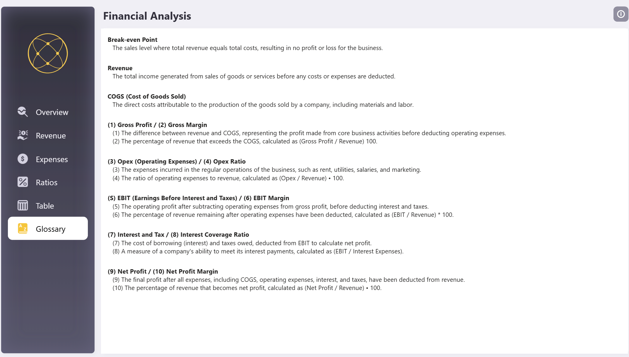
How to Use This Power BI Financial Analysis Dashboard
To interact with this Power BI financial KPI dashboard, simply click on any active element directly on the charts.
Download the .pbix file to see all the settings, formulas, and calculations. Try it out with your own data by making a few adjustments.
ZoomCharts visuals used
4U Report Challenges
Participate in data challenges, build and submit reports to get free template downloads.
Join CommunityMobile view allows you to interact with the report. To Download the template please switch to desktop view.
Was this helpful? Thank you for your feedback!
Sorry about that.
How can we improve it?