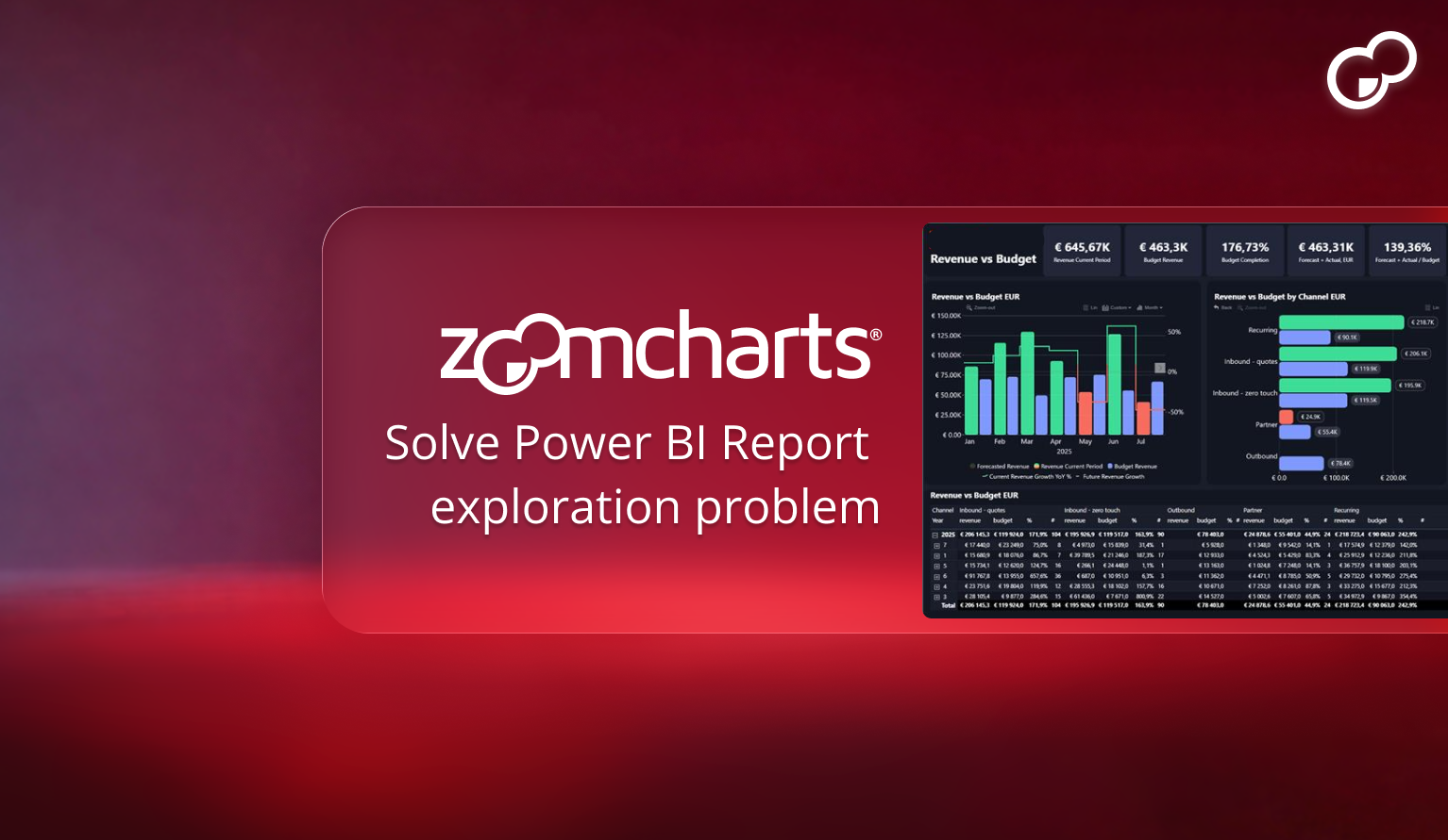
You have probably experienced this before.
A stakeholder opens your Power BI report. They click through a few slicers. They switch pages. Then they say: "Can we export this to Excel?"
Or: "Can we get another page that breaks this down by region?"
Then another request comes in. And another. Soon your report grows from five pages to fifteen. Drill-through pages multiply. Slicers stack up. Bookmarks start controlling hidden states. And despite all that effort, users still struggle to detect correlations or identify outliers quickly.
This is not a data modeling problem. It is not a DAX issue.
It is an exploration design problem.
This is the core challenge that the 4U Reports framework was designed to solve. Reports that earn adoption are built around four user-centered stages: Unique, User-friendly, Uncovering, and Understandable. Exploration design is what separates them from reports that simply display data.
What Report Users Actually Need
Users want to follow questions as they emerge, compare segments quickly, and validate hypotheses without losing context. Exploration should feel fluid, not procedural.
They want confidence and control. They want to discover insights themselves instead of requesting new pages every time they hit a limitation.
The current frustrations
Too many filters make the report feel complicated. Too many pages make navigation confusing. Correlations are hard to spot with static visuals. Outliers get buried in aggregates. Excel exports become the default workaround for exploration that the report should have handled itself.
Why regular Power BI visuals often fail for deep exploration
Regular visuals are excellent for structured reporting. But when you need true exploration, the pattern becomes more drill-through pages, more duplicated visuals, more slicers, more bookmarks. That creates page fragmentation. Instead of one interactive decision environment, you end up with a collection of static snapshots.
Step 1: Identify Why Exploration Fails
Drill-down inside the visual, not across pages
Replace navigation with exploration
The problem: Users cannot naturally move from overview to detail without leaving the visual or the page. Most developers solve this by creating drill-through pages, duplicating visuals at different hierarchy levels, or simulating exploration with bookmarks. The result is friction. Users lose orientation. Filter states feel inconsistent. Maintenance scales with every new variation.
The better approach: Allow drill-down directly inside the visual. ZoomCharts Drill Down visuals are built around a simple interaction model: click to explore. Context stays intact. Users explore within the same canvas.
In a procurement report, a user clicking the IT Software bar in a spend chart should immediately see sub-categories and suppliers without leaving the page. This is how the 4U Procurement Report eliminates drill-through pages entirely. When users can drill down inside the visual, your report becomes smaller, clearer, and easier to maintain. Exploration replaces navigation.
Why Drill-Through Pages Create More Problems Than They Solve
Drill-through pages feel like the right solution the first time you build one. A user clicks a product name, lands on a detail page filtered to that product, and the experience feels polished. But the cost compounds quickly.
Every new dimension your users want to explore requires a new drill-through page. Every layout change needs to be replicated across all of them. Every filter state needs individual testing. And users who land on a drill-through page often cannot find their way back to the context they came from.
- Each dimension needs a new page
- Layout changes multiply across pages
- Filter states need individual testing
- Users lose context when navigating back
- Maintenance grows with every request
- All hierarchy levels in one visual
- One layout to maintain
- Context stays intact on every click
- Back button returns to previous level
- Cross-filters the whole page instantly
If you are building a drill-through page, ask whether a drill-down visual would answer the same question without the navigation cost. In most cases it will. The Intuitive principle in 4U Reports is built on exactly this idea: users should never need a separate page to get more context.
Step 2: Reduce Report Fragmentation
Consolidate views into richer interactive visuals
More insight density, fewer pages
The problem: Developers separate overview, breakdown, and comparison into different pages because a single page cannot support all exploration paths. Over time, the report becomes an ecosystem of partial answers. Each page adds formatting effort, testing, documentation, and long-term maintenance risk.
The solution: Consolidate views into richer interactive visuals. Drill Down Combo PRO allows comparison and hierarchy in one place. Instead of multiplying pages, you increase insight density inside the same one.
A single Drill Down Combo PRO chart binding Category → Sub-Category → Department replaces three separate pages. Users click to go deeper and click the back button to return. No bookmarks, no hidden page states, no duplicate formatting to maintain. This is navigation users never have to think about — the Intuitive stage of the 4U Reports framework.
Step 3: Enable Correlation Analysis
Use visuals designed for correlation detection
Spot patterns users would miss in side-by-side charts
The problem: Correlations are rarely obvious in bar charts or matrices. Users must mentally connect patterns across visuals. Developers typically place two charts side by side and hope users interpret the relationship correctly.
The solution: Use visuals designed for correlation detection. Drill Down Scatter PRO turns correlation analysis into interaction. Users zoom into clusters, isolate segments, and immediately see where behavior differs.
In an executive KPI report, placing Revenue variance on the x-axis and Customer adds on the y-axis with bubble size as Headcount surfaces three dimensions of performance in one visual. Clicking any bubble cross-filters the entire report. See how this is applied in the 4U Executive KPI Report guide.
Step 4: Surface Outliers Without Extra Pages
Make anomaly detection interactive
Zoom into what changed, when it changed, and why
The problem: Outliers hide inside aggregates. Users need to explore what changed and when it changed without navigating away from their current context.
The solution: Drill Down Timeline PRO enables zoom-based anomaly discovery. Drill Down Network PRO reveals structural anomalies in relational data.
In a procurement report, a spike in overdue invoices during a specific quarter is invisible in a monthly aggregate bar chart. Drill Down Timeline PRO lets users zoom into that quarter, see the daily pattern, and cross-filter the supplier table — all without leaving the page. This is the Uncovering stage of the 4U Procurement Report: users discover what the numbers are actually telling them.
Step 5: Turn Static Reports into Decision Environments
Answer the question the user did not know they would ask
From static dashboard to interactive decision tool
Many reports behave like slide decks. They answer predefined questions but do not support follow-up thinking. When users can drill, zoom, isolate, and compare instantly, reports become decision environments rather than static dashboards.
This is the goal of the Understandable stage in 4U Reports: users walk away knowing not just what happened, but why. The difference between a report that gets used and one that gets ignored is almost never the data. It is whether the design gives users the confidence to explore on their own.
A decision environment answers the question the user did not know they were going to ask. That is the definition of a 4U Report.
How to Implement This in Your Next Report
Choose one exploration-heavy page. Replace duplicated visuals with drill-down visuals from ZoomCharts. Add correlation analysis. Introduce zoom-based anomaly discovery. Reduce slicer dependency. Test with real stakeholders and observe where friction disappears.
-
Step 1Replace drill-through pages with Drill Down Combo PRO with hierarchy levels bound to your data dimensions.
-
Step 2Add a Drill Down Scatter PRO chart for any analysis where two measures are compared across segments.
-
Step 3Replace static bar charts on time data with Drill Down Timeline PRO for zoom-based outlier discovery.
-
Step 4Enable cross-chart filtering on all ZoomCharts visuals so every click refocuses the entire page without a single slicer.
-
Step 5Test with a real stakeholder. Count how many times they say "can we add another page?" Zero is the goal.
Frequently asked questions
How do I improve Power BI visuals without adding more report pages?
Replace static charts with drill-down visuals that contain hierarchy internally. When users can click to move from overview to detail inside the same visual, the need for additional pages disappears. ZoomCharts Drill Down visuals are built specifically for this interaction pattern and participate in Power BI's cross-filtering model natively.
What is the difference between drill-down and drill-through in Power BI?
Drill-through navigates the user to a separate report page filtered to their selection. Drill-down expands the hierarchy inside the same visual without any page navigation. Drill-down keeps context intact, reduces report complexity, and eliminates the maintenance burden of managing multiple pages with synchronized filter states.
How do I detect correlations in Power BI without side-by-side charts?
Use a scatter or bubble chart that maps two or three measures simultaneously with cross-filtering enabled. Clicking any data point refocuses the rest of the report. Drill Down Scatter PRO is designed for this interaction — users zoom into clusters and isolate segments without any additional configuration or extra pages.
How do I find outliers in Power BI without creating extra report pages?
Use a timeline visual with zoom capability so users can move from annual to daily granularity within the same chart. Drill Down Timeline PRO allows users to zoom into anomalies and cross-filter the rest of the report from that zoomed view, surfacing outliers without requiring separate pages or additional slicers.
What are 4U Reports and how do they reduce report complexity?
4U Reports are Power BI reports designed around four user-centered stages: Unique, User-friendly, Uncovering, and Understandable. The framework prioritizes interactive exploration over page navigation, which directly reduces report complexity. Instead of more pages answering more predefined questions, a 4U Report gives users the tools to answer their own questions within a compact, well-designed canvas. Read the full introduction here.
Ready to build reports people actually use?
The 4U Reports framework gives developers a clear path from visual design to user adoption. See the full framework, worked examples for executive KPI and procurement data, and the ZoomCharts visuals that make it possible.
Read the 4U Reports introduction Explore Report Design Services