Oct 23, 2025
October 2025 Update: Donut KPI Card & Color Field
Here’s what’s new in ZoomCharts visuals for Power BI: KPI Card in the middle of the donut chart, Color Field and a new user interaction for Donut & Pie, display period settings for Timeline, and more.
Here’s what’s new in ZoomCharts visuals for Power BI: KPI Card in the middle of the donut chart, Color Field and a new user interaction for Donut & Pie, display period settings for Timeline, and more.
What an exciting time to be a ZoomCharts fan! Since our last Product Update, we launched Developer License, which grants you free 1-year access to all our visuals; and we also released our latest Power BI custom visual – Bubble PRO.
While these two were the main headlines, we also were working on our existing visuals, continuously improving them with updates and new features. Here’s what’s new in Drill Down Visuals!
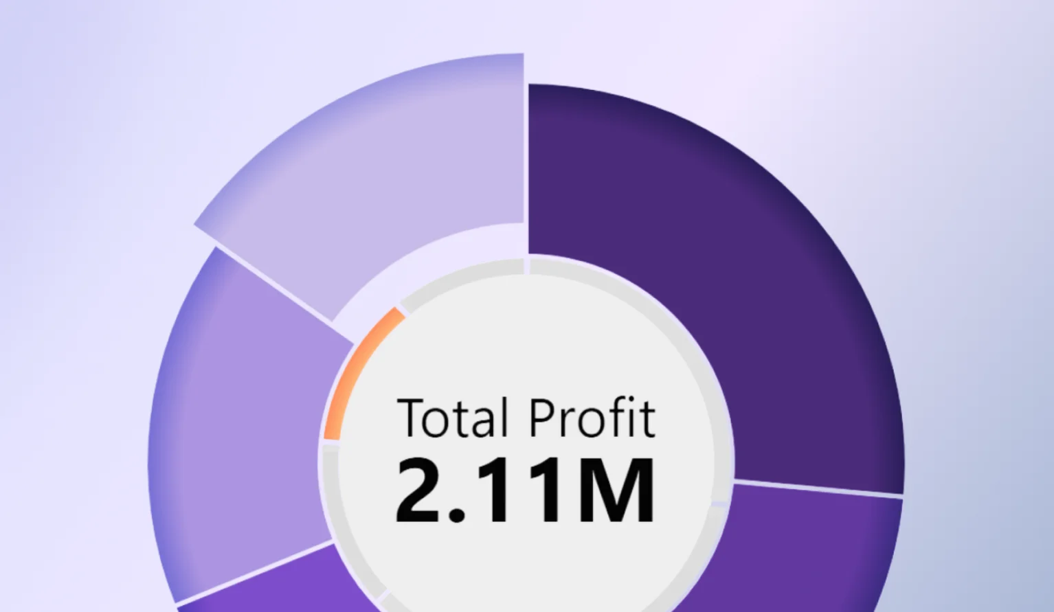
Donut: Show a KPI Card in the Middle
Just like their namesake, donut charts have a “hole” in their middle. In the latest update for Donut PRO, we’ve added a way to use that empty space to show valuable insights – KPI Value and KPI Label. With these two fields, you can display a numeric value and a label.
The KPI Value field is for a numeric column or measure, whereas KPI Label field will take text from a column and display it next to the value. The value will be affected by filters and drill downs, showing relevant value as the user drills down and explores the report. In the KPI Card section of the visual’s settings, you can configure its appearance, including alignment, size, background color, font, text color, and value format.
One way to use the KPI card is to display the donut chart’s total – simply populate the KPI Value field with the same column as the Value field. Or apply an aggregation like Average to that field to show additional insights about the values.
Alternatively, you can use a different column to display KPIs, targets or other values (however, be careful to not confuse the user and clearly label what that number represents). There’s a lot you can do with this – one creative idea we saw from report creators during testing was using the Category column with Count aggregation to show the total number of slices in the chart – useful if you are grouping smaller slices into Others.
- Documentation: KPI Card

 Drill Down Donut PRO
Donut, Pie: Color Field
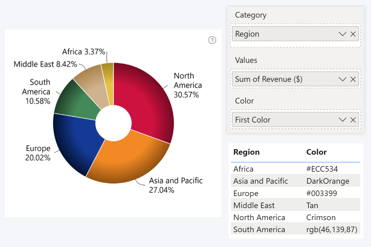
Last year, we introduced the Color field to our Combo and Combo Bar visuals, and now it has been added to Donut and Pie as well. This way, you can automate formatting by deriving slice colors from data, instead of manually picking them in Category Colors settings.
You can populate the field with a column or measure that contains HTML color names (e.g. red, blue, green), hex codes (e.g. #ff0000), or RGB color codes (e.g. ‘rgb(255,0,0)’), and they will be applied as slice colors. This image showcases a column with all color notation types that you can use.
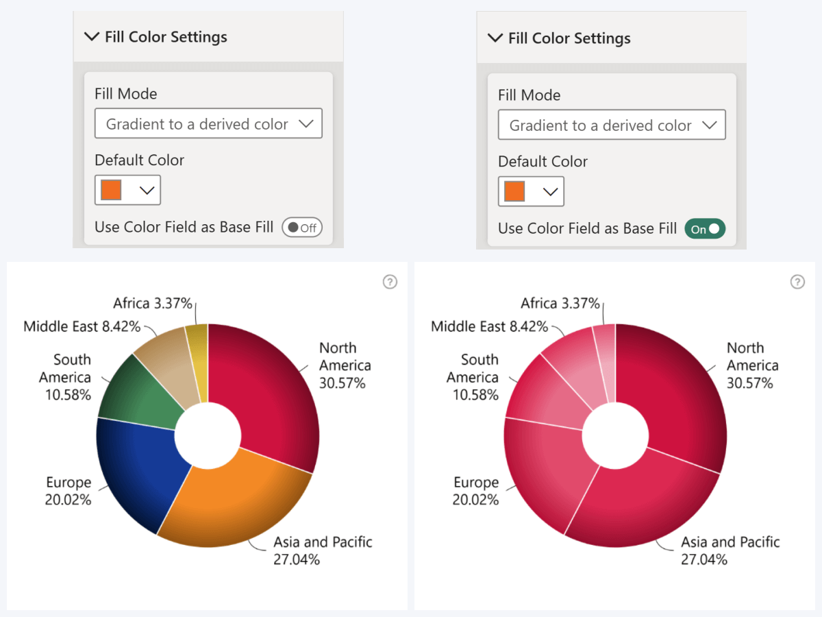
Once you successfully populate Color field with valid values, the colors will be applied to slices. It will override the Category Colors settings, which will become unavailable. In Fill Color Settings, you can also enable Use Color Field as Base Fill, which will take the first slice’s fill color and create a scale of derived shades for all other slices.
One way to use Color Field is by simply providing color values to categories in a related table (i.e. brand colors, country flag colors, etc.). You can also use DAX measures to create a custom conditional formatting logic (for example, IF or SWITCH, where each outcome has its own color).
- Documentation: Color Field
- Drill Down Donut PRO

 Drill Down Pie PRO
Donut, Pie: “All Except” Selection
We have added a new user interaction to Donut and Pie. Now, with Ctrl+Shift+Click, you can instantly select all visible slices except the one you are clicking on. This will come in handy if you want to apply a filter that excludes a specific category (for example, “show data for all countries except USA”).
Previously, you could do that by selecting one slice, and then inverting the selection with triple click; but the new “All Except” selection consolidates that into one interaction.
Timeline: New Display Period Settings
Since its first release, Timeline PRO has allowed users to quickly switch the visible timespan with a toolbar dropdown, but this update gives you even more control. You can find the new settings in the Display Periods section of the Format Visual tab.
With the Initial Display Period setting, you can choose the visible timespan that the user can see in the initial view. It provides a wide range of options, including the current or previous periods (year, month, week, etc.), or All Data to show everything from the first to last available timestamp in your data.
Below, you can also choose which Display Period options are available to the user in the toolbar dropdown. Enable toggles for all options you want to provide to the user. We also included “Enable All” and “Disable All” toggles for convenience.
- Documentation: Display Periods

 Drill Down Timeline PRO
Timeline, TimeSeries: X-Axis Quarter Display Format
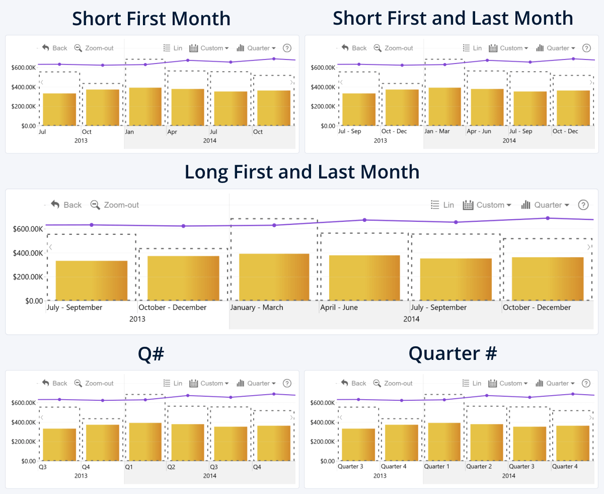
In Timeline and TimeSeries, you can choose between a wide range of display units, and one of them is quarters. However, even though the year was split into four quarters, the X-Axis did not label them as such, instead displaying the first month of each quarter.
That’s why we included a new setting – Quarter Display Format. Now, you can choose how the X-Axis labels quarters when using this display unit:
- Short First Month (“Jan”)
- Short First and Last Month (“Jan – Mar”)
- Long First and Last Month (“January – March”)
- Q# (“Q1”)
- Quarter # (“Quarter 1”)
- Documentation: Quarter Display Format
- Drill Down Timeline PRO

 Drill Down TimeSeries PRO
Combo, Combo Bar: Drillthrough From Subseries
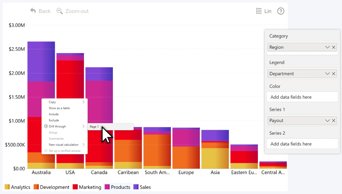
ZoomCharts visuals have always been tightly integrated with the native Power BI functionality and navigation interactions, and drillthrough is no exception. In Combo and Combo Bar, if you drill through from a series (for example, within a stacked column), you could navigate to another page for detailed insights.
Last year we implemented a new method to create stacked or clustered charts – the Legend field, which allows you to split a series into subseries. The new update for Combo and Combo Bar adds drillthrough support for Legend field subseries.
Get Started with ZoomCharts
Be sure to download the latest version of ZoomCharts Visuals to enjoy these new additions, along with hundreds of other features! With a free trial available, you can see for yourself how these powerful visuals can take your Power BI reports to the next level.

Want more info like this?
Subscribe to our newsletter and be the first to read our latest articles and expert data visualization tips!


