Aug 28, 2025
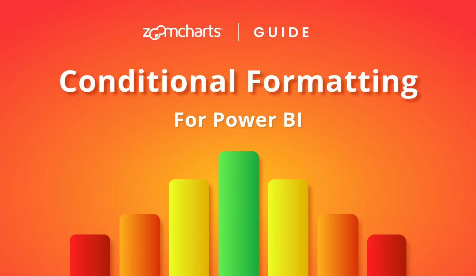
Power BI Conditional Formatting: Tutorial for ZoomCharts Visuals
How to set up conditional formatting for columns, lines, areas (fill and outline), value label font and background, with examples, steps and explanations for each setting.
How to set up conditional formatting for columns, lines, areas (fill and outline), value label font and background, with examples, steps and explanations for each setting.
Power BI conditional formatting is an incredible tool for visual storytelling – it can change color, opacity and other settings based on data. This way, you can instantly provide insights to the user at the very first glance and guide their attention to data points that need immediate attention. Here are some examples:
- KPIs and targets: visualize financial performance, target completion and other binary comparisons between value and condition; for example, apply ‘green’ for values above target, and ‘red’ below.
- Scales: For use cases like thermal efficiency, power consumption, etc., you can set multiple gradient stops, and paint each data point based on their proximity to each (e.g. ‘blue’ for cold, ‘yellow’ for warm, ‘red’ for hot)
- Custom conditions: You can use an IF or SWITCH measure or calculated column to apply a custom color code to each row based on your condition. For example, apply #003399 (EU flag color) to all data points with Region = “EU”.
In Power BI and its built-in visuals, you can use conditional formatting for various settings – table cells and text, data colors (i.e. bar and column fill) and others. In most cases, if you see the fx button near a setting, it means that you can use it to configure conditional formatting for that setting.
However, this guide will focus on conditional formatting in ZoomCharts Drill Down Visuals. Here, the set-up process is different from the default Power BI experience, which is why this article will explain various features and settings available in our visuals, demonstrate how to use them with practical examples and explain how to achieve your desired visuals.
How To Use Conditional Formatting in ZoomCharts Visuals
This guide will focus on our Combo, Combo Bar, Timeline, and Line visuals. All of our examples will use Combo, but the instructions here are applicable to the other visuals as well. In these visuals, you can use conditional formatting to affect:
- Column, line, area fill color and opacity
- Column and area outline color and opacity
- Value label text color and opacity
- Value label background color and opacity
You can enable and configure each separately, allowing you to mix and match different settings to achieve your desired result. What’s more, you can set up conditional formatting for each of the series independently.
Step 1: Enabling Conditional Formatting
In the Format Visual tab, head to the Series Configuration section of the series you want to customize. For example, if you added your desired column to the Series 1 field (out of 25), then its settings will be located in Series 1 Configuration.
If you have enabled the toggle for the Series Defaults section, then, by default, all series will use the default settings as configured there. In that case, you will have to enable Customize This Series to reveal all available settings for that series, which will override the series defaults.
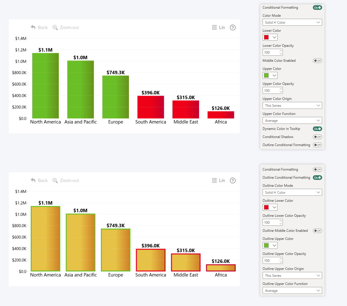
At the bottom of the Series Configuration section, you will find two toggles: Conditional Formatting, and Outline Conditional Formatting (if the series type is Columns or Area). Set each toggle to On to enable conditional formatting – doing so will reveal new settings for each.
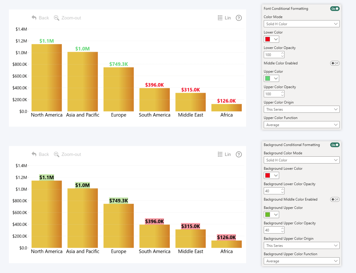
As for value label font and background conditional formatting, these settings can be found in the Series Value Labels section of the series you want to customize. To access it, you must first enable the Customize Series Value Labels (or Total Value Labels) toggle in Series Configuration, which will reveal the new section where you can apply series-specific settings to its labels; including conditional formatting. Once again, toggle to enable and reveal more settings for each.
Step 2: Configuration
You will now see a wide variety of configuration options for your enabled conditional formatting setting, and in this section, we will explain the most important things you need to know to use them effectively.
For clarity, we will showcase these settings by using fill color conditional formatting for columns, but these settings will operate in the same way for outlines, label text and backgrounds as well so you can follow the same instructions for all.
Also, when talking about color origin values, we will add manually created reference lines in the screenshots to better illustrate the effect of each setting – read more about Thresholds in this article!
Lower, Middle, Upper Color
In ZoomCharts visuals, you can set two or three colors that will be applied at your selected values. How they are applied will depend on your selected Color Mode (explained in the next section), and the values are determined by their Color Origin settings (for example, Upper Color Origin will determine the position of the Upper Color).
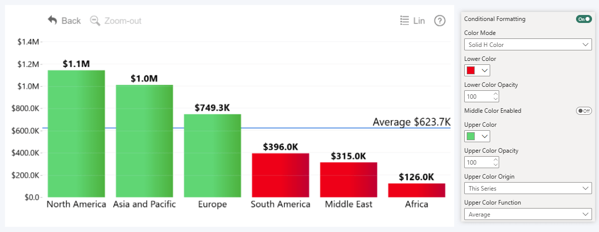
By default, two colors will be enabled – Lower Color, which will be applied to all values below the Upper Color value; and Upper Color, which will be applied to values above your selected value. Here, any column that is above the average (our selected Upper Color Origin) is painted green, not red.
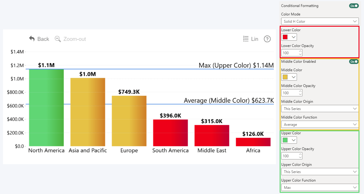
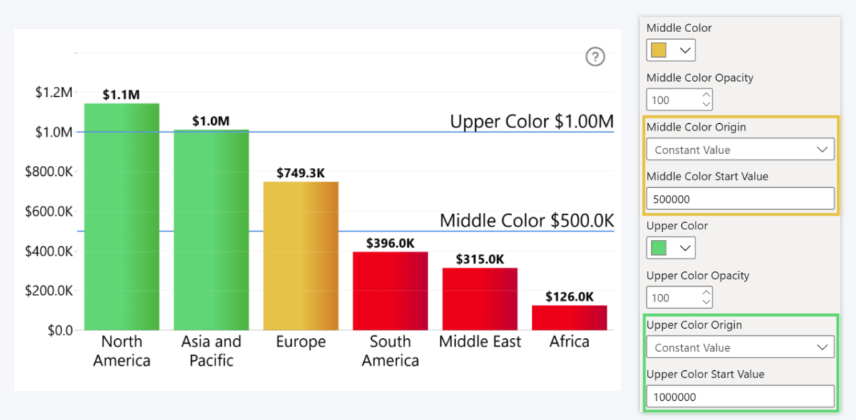
If you want to add a third color to your conditional formatting setup, set the Middle Color Enabled toggle to On. This will allow you define an additional color condition between the two values – useful if you want to visualize target completion (lower color for underperforming, middle color for acceptable, and upper color for overachieving), or if you want to create a gradient with three color stops (e.g. thermal charts). Enabling it will reveal options for the middle color.
Now we have three sets of options – for lower, for middle, and for upper colors. For each, you can choose a color from the Power BI color menu, set opacity for that element, and configure the value origin for that color point. In simple terms, when using Solid H Color:
- Lower Color will affect all values between 0 and the next color point.
- Middle Color will affect values above the Middle Color point and below Upper Color
- Upper Color will affect all values above the Upper Color
In this example, the middle color is set at average, and upper color is at the max value of the series, which means that all columns below average are red, and everything above average but below the max value is yellow. Only the max value is painted green. We will explain setting up color origin values in a later section.
Color Mode
Now that we have selected the colors and opacity values for each condition, it’s time to configure the way it will be applied to your chart. In the examples, we will use the same Lower Color (red), Middle Color (value 500,000; color yellow) and Upper Color (value 1,000,000; color green) to show how each mode works with different elements.
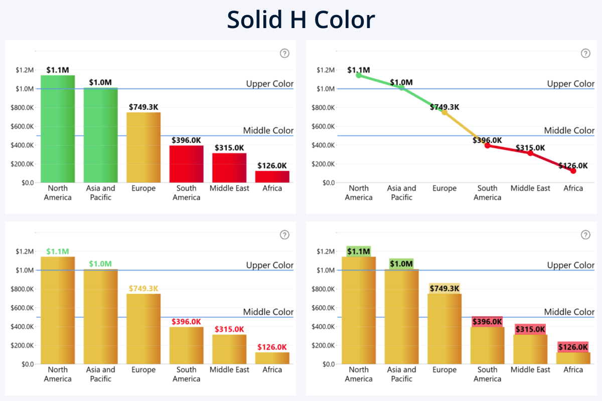
Solid H Color: the entire element will use a solid color: if the condition is met, apply Middle or Upper Color as-is, else use Lower Color.
Available for: Series, series outline, value label font, value label background. Note: In Combo Bar, the Solid H and V Color modes work in the opposite way due to the visual’s value and category axes swapping places.
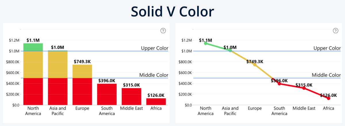
Solid V Color: Whereas Solid H Color applies the color to the entire column, line, or area, Solid V Color will apply color only to the segment that exceeds the color origin point’s value.
Available for: Series, series outline. Note: In Combo Bar, the Solid H and V Color modes work in the opposite way due to the visual’s value and category axes swapping places.
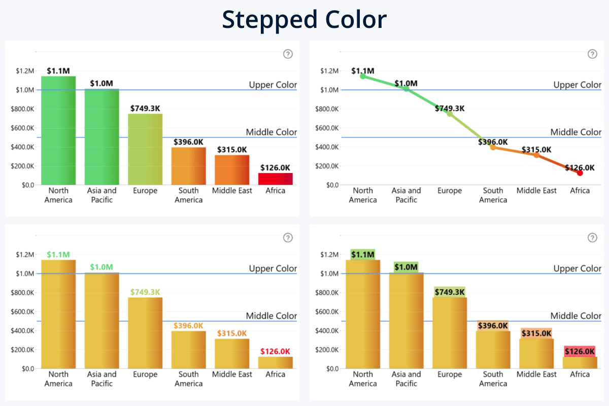
Stepped Color: The visual will create a stepped color scale and apply fill color to each element based on the data point’s proximity to the nearest color point. For example, if Lower Color is ‘red’ and Middle Color is ‘yellow’, then a value right between them will be ‘orange’.
Available for: Series, series outline, value label font, value label background.
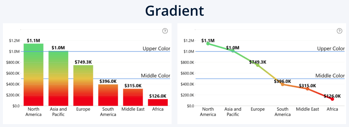
Gradient: The color origin points will be used as color stops for a linear gradient that spans the entire series.
Available for: Series, series outline.
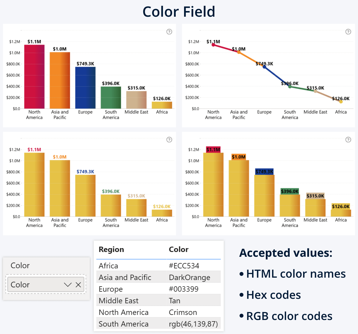
Color Field: Instead of the built-in conditional formatting rules, the visual will apply fill colors to each element based on your provided color values in the Color Field. This field may contain a column or measure with HTML color names e.g. “red”, hex codes e.g. “#ff0000”, or RGB/RGBA color codes e.g. “rgb(255,0,0,1)”.
This could be useful if you want to simply color-code your data (for example, use brand or country flag colors; can be done easily in a related table), or create a custom logic for conditional formatting with a DAX measure like SWITCH (read more about DAX measures in this article). The above example demonstrates all three color notation types in the same table.
Available for: Series, series outline, value label font, value label background. Note: ‘Color’ field is available in Combo, Combo Bar, and Line visuals.
Color Origin
So far, we have set the colors for the two or three color origin points, and selected the method in which they are applied to the series or value labels. Now, it’s time to define the values at which these origin points are placed. These are the values that will be compared against each data point’s numerical value to determine its color or opacity.
- Lower Color Origin: Will determine the placement of lower color point. Note: available only for ‘Gradient’ and ‘Stepped Color’ modes; ‘Solid H/V Color’ will always use 0.
- Middle Color Origin: Will determine the placement of middle color point – if Middle Color toggle has been enabled.
- Upper Color Origin: Will determine the placement of the upper color point.
Each setting will have three options - Constant Value, This Series, and Another Series.
Constant Value
The first option, Constant Value, is simple – you just enter a numeric value, and the visual will place the color origin point at that value on the Y axis (or X in Combo Bar). For example, if you have a static KPI that you want to compare against all data points in the series, simply enter it as a constant value.
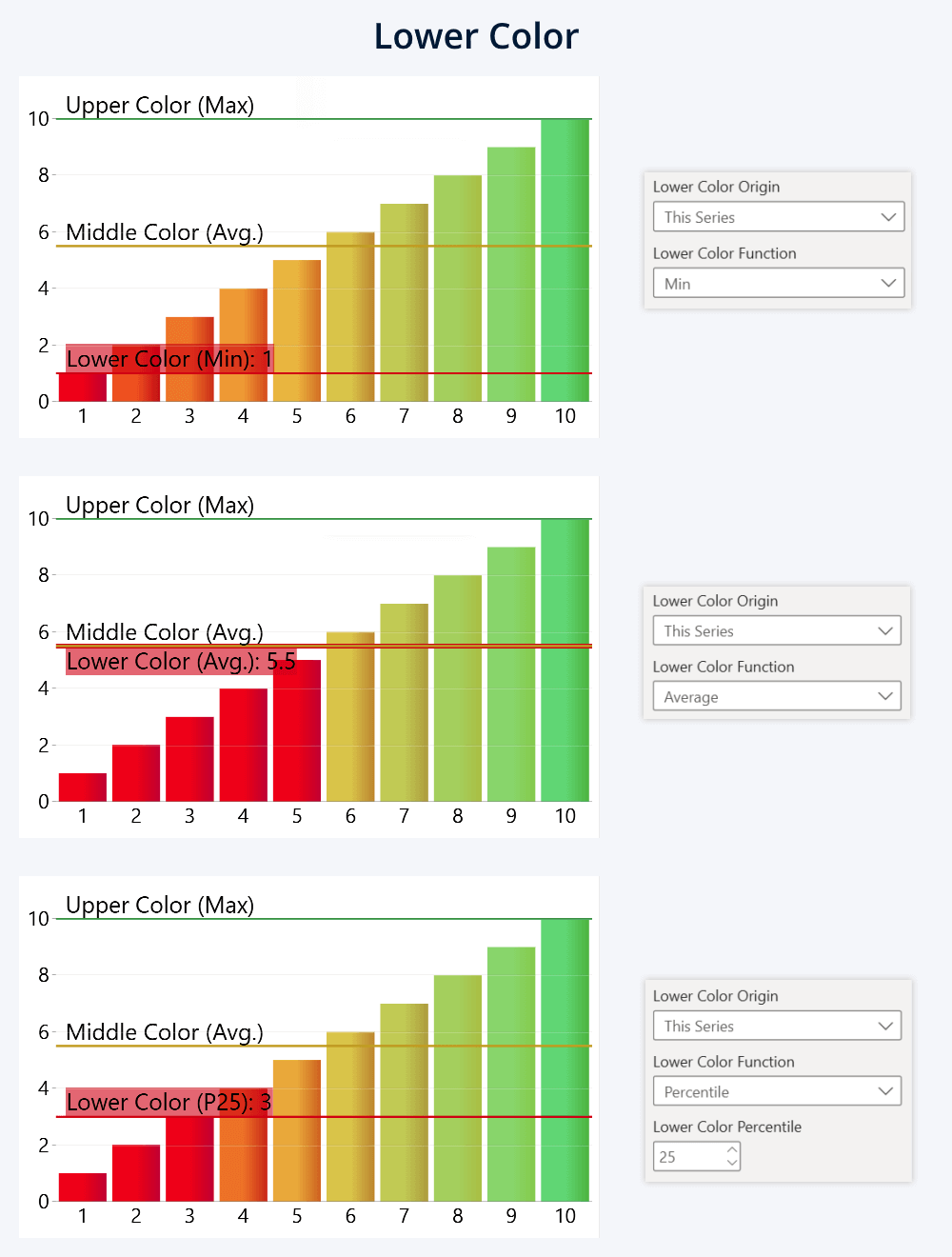
This Series
Select this option if instead of a constant value, you want to use a calculated value as the color origin instead. Picking this option will reveal a new setting: Lower/Middle/Upper Color Function, and the visual will apply your selected function to the series to determine the placement of the color origin point.
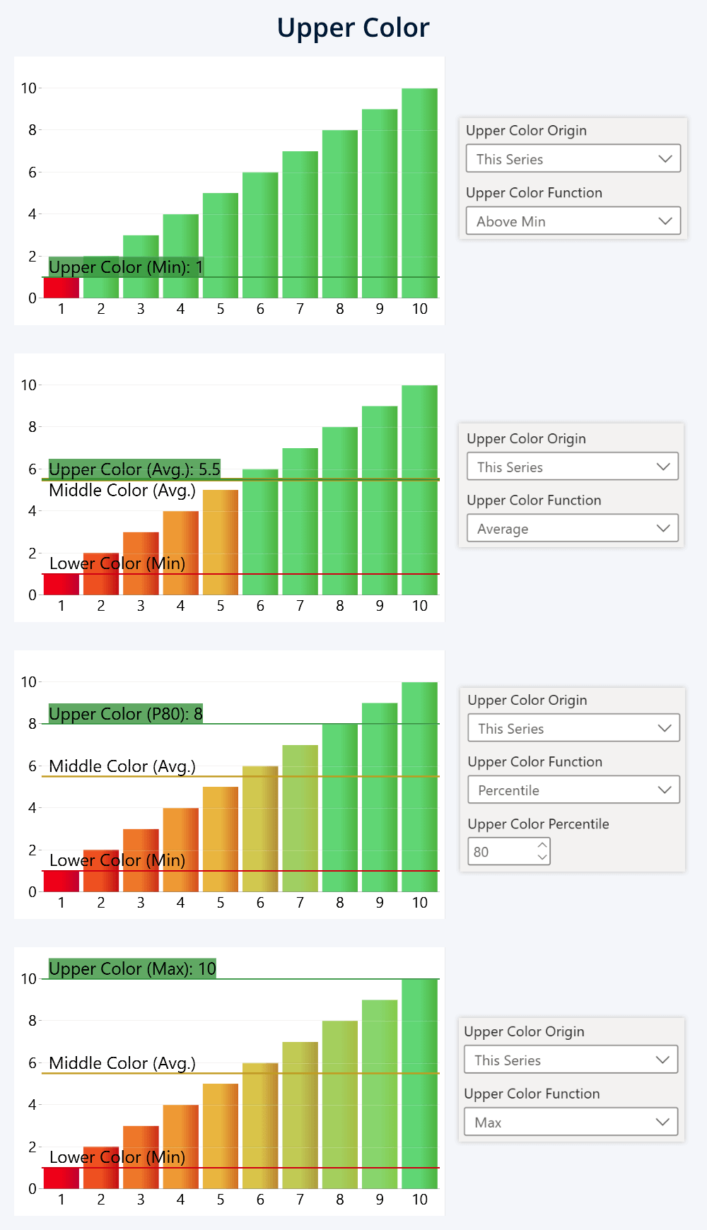
In the examples below, we created a simple series of values from 1 to 10 to better illustrate the effect with the Stepped Color mode. Some of these examples also showcase what happens when two color origins use the same value.
For Lower Color (available only with Gradient or Stepped Color):
- Min: The color origin point will be placed at the smallest value in the series.
- Average: The color origin point will be at the mean value (average) of the series.
- Percentile: The color origin point will be at a value that is above xx% of all data points in the series. For example, if you enter 25th percentile, then 25% of series values will be below and 75% will be above.
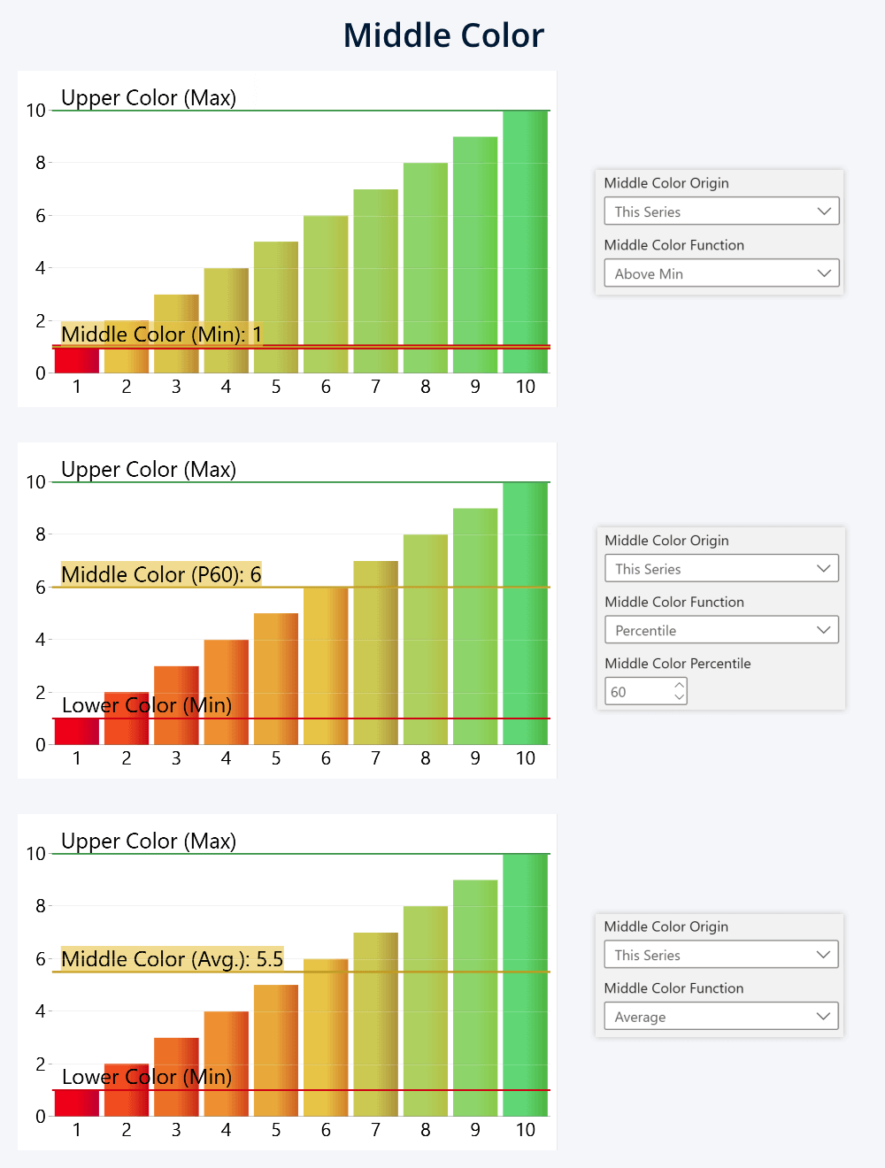
For Middle Color:
- Above Min: The color origin point will be placed directly at the lowest value of the series, which means that Lower Color will be applied only to the lowest value, and all others will use Middle or Upper Color.
- Average: The origin point will be placed at the mean (average) value of the series.
- Percentile: The origin point will be placed at a value that includes xx% of the series data points. For example, if you enter 60th percentile, 60% of data points will be below, and 40% above it.
For Upper Color:
- Above Min: The upper color origin point will be placed directly at the lowest value in the series. Keep in mind that if you use it for the upper color, the middle point will be effectively redundant, since the upper color will be applied to all but one value.
- Average: The upper color will be placed at the mean (average) value of the series.
- Percentile: The origin point will be placed at a value that includes xx% of the series data points. For example, if you enter 80th percentile, 80% of data points will be below, and 20% above it.
- Max: The upper color origin point will be placed at the max value of the series. With Solid H or V modes, it will effectively apply upper color to just one value, so it’s best used with Gradient or Stepped Color for creating a gradient scale that spans the entire series range.
Another Series
With this color origin setting, you can compare this series against another series values. Choose which series you want to reference (out of any of the twenty-five Series fields in Combo, Combo Bar, Line, and Timeline), and the origin point for each data point will be placed at the adjacent value in your selected Another Series.
Unlike other two settings, which will use the same origin point across the entire chart, this mode differs by allowing each data point to have an individual origin point. This way, you can visualize unique KPIs for different categories (for example, apply ‘red’ or ‘green’ depending on its completion). Or use a measure as a series to create your own conditions using DAX.
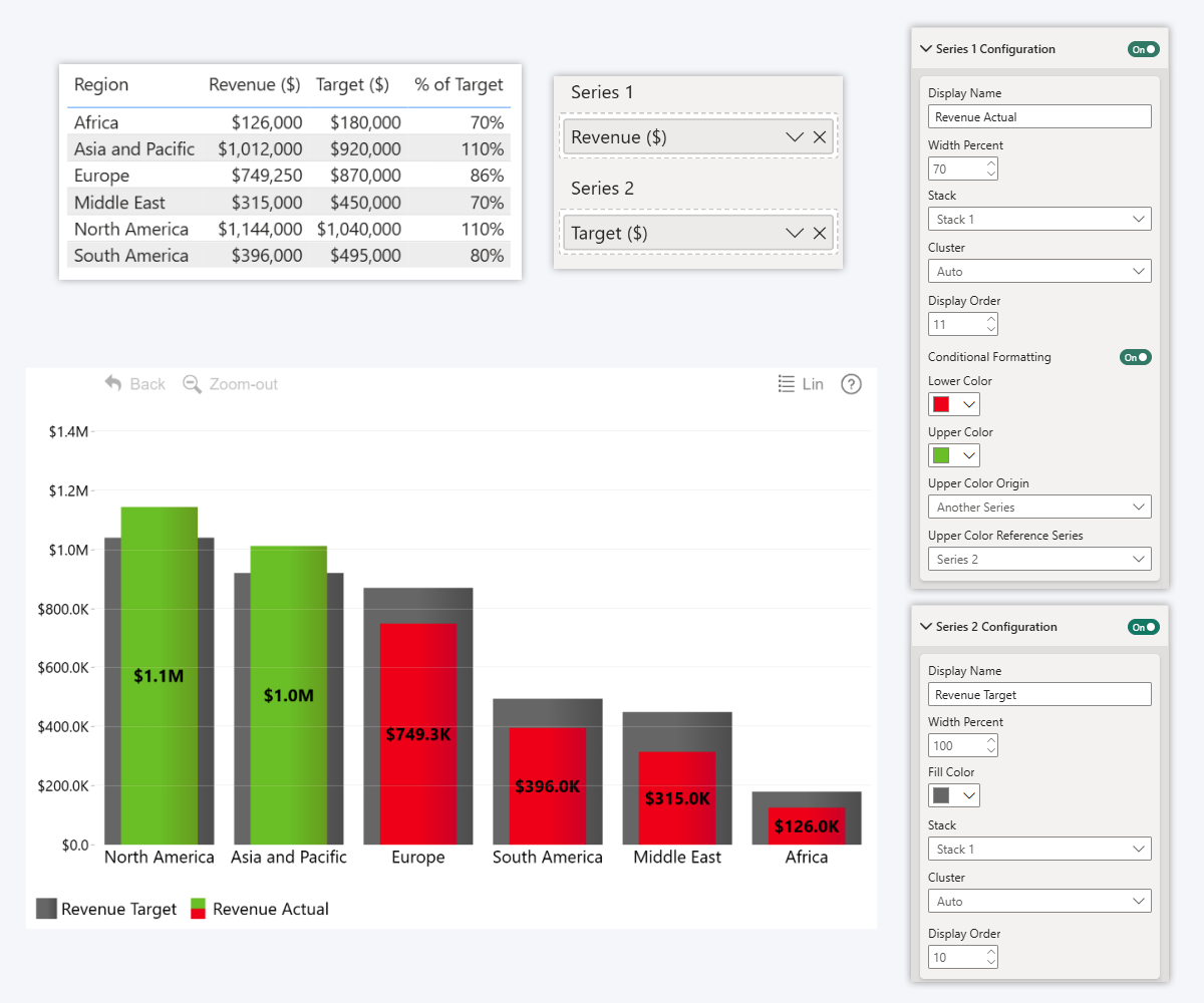
This image is from our article about stacked column charts in Power BI, and it showcases using Another Series to apply a binary condition to the actual revenue values (color mode: Solid H Color). It uses Series 2 (here visualized as grey columns in the background) which has target revenue values – if the actual is below the target, apply red, but if it exceeds the target, use green.
In our visuals, you can toggle series visibility. If you want to use a dedicated column or measure just for your formatting condition, you can simply add it to an empty Series field and then disable its Series Configuration section toggle – the visual will be able to reference series values, but it will not be displayed to the user on the chart itself.
Additional Settings
We’ve covered all you need to successfully apply conditional formatting in our Power BI visuals, but there are a few additional settings that you can use to finetune your reports even further.
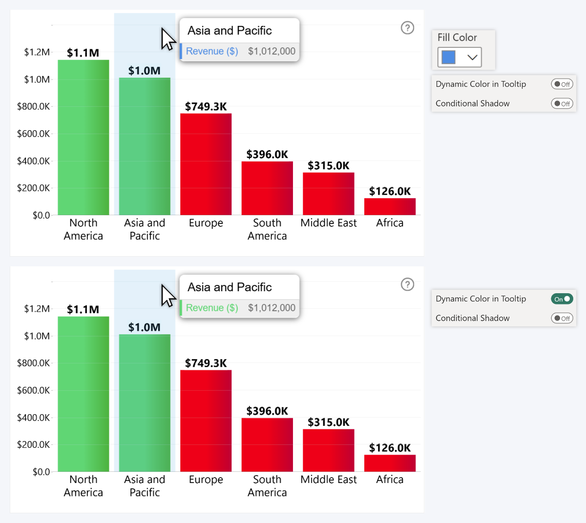
Dynamic Color in Tooltip
This will be available only for the regular Conditional Formatting (for column, line, or area fill color). The default behavior for our visuals is to represent each series in the tooltip using its fill color, so the user instantly knows which value refers to which element. If this toggle is disabled, the series values in tooltips will keep on using the default fill color setting, unaffected by conditional formatting. If it is enabled, the tooltip text will use the same color that is applied to the data point.
This may be useful if you want to avoid confusing the user. For example, if you leave the default fill color as ‘blue’, but the conditional formatting paints the series from ‘red’ to ‘green’, the user will be wondering: “Where is that blue series? I can’t find it!”.
Keep in mind that Fill Color setting will be hidden once you enable Conditional Formatting, so if you want to leave Dynamic Color in Tooltip off and use a custom color for the series, make sure you set it up beforehand.
Conditional Shadow
Once you enable Dynamic Color in Tooltip, you will see another new setting: Conditional Shadow. We included this as an optional readability aid: since the tooltips are light gray (or dark gray with Dark Mode enabled), you might run in scenarios where conditional formatting applies a color that has poor contrast or other readability issues – for example, yellow in light mode or purple in dark mode.
Enabling Conditional Shadow will apply a drop shadow effect to the tooltip labels for that series, which will ensure that the text has enough contrast against the tooltip background, regardless of its color.
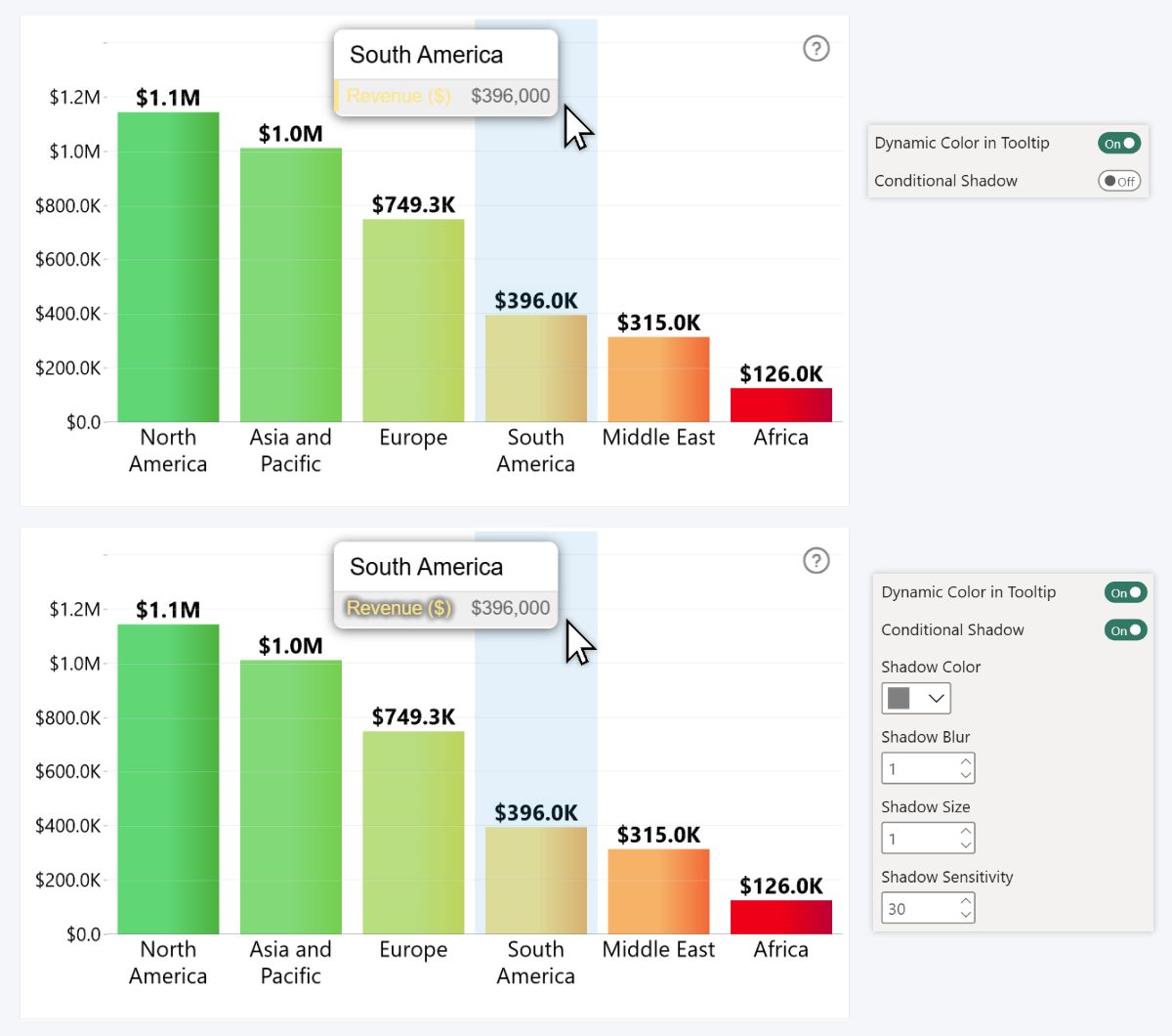
You can finetune the shadow appearance with Shadow Color, Blur, and Size settings, whereas Shadow Sensitivity (0-100) will adjust its behavior – lower values will display the shadow only when the visual detects poor contrast, but higher values will show the shadow at all times.
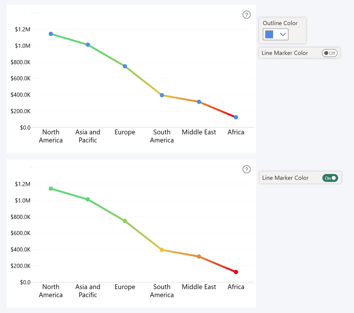
Line Marker Color
This setting will be available if your series has Line or Area type, and will take effect if you have enabled Outline Marker (by choosing anything other than None). With Line Marker Color toggle off, conditional formatting will be applied to the line or area itself, but the line markers will still use your selected Outline Color. Enable it if you want your conditional formatting to also affect the markers.
Real-life Examples of ZoomCharts Conditional Formatting
Now that we have explained all you need to know about using conditional formatting in ZoomCharts Drill Down Visuals, let’s showcase some actual examples how you can use it to enhance your data storytelling so you can get inspiration for your next report.
MRR Growth – green for positive, red for negative
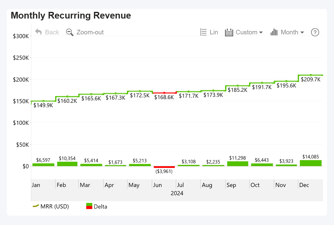
This Timeline PRO example is from our article “Top 12 Key SaaS Business Metrics”, and it visualizes MRR growth. Since a healthy SaaS business should always keep on growing, it is important to identify periods where the growth was negative – so we marked months with reduction in MRR red.
| Color Mode | Solid H Color |
| Lower Color | Red |
| Upper Color | Green |
| Upper Color Origin | Another Series (previous month's MRR value) |
To achieve this, we created a new column which has the previous month’s values adjacent to the current values, added it to a Series field, hid it from the chart, and used it as the upper color origin. If the actual value is larger than that, the month will be green (Upper Color), but if it is lower, the month will be red (Lower Color).
Orange outline if CAC Payback Period exceeds ACL
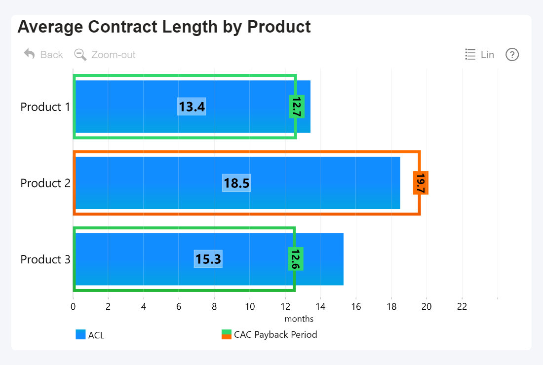
Another example from our SaaS Metrics article – this Combo Bar chart shows the Average Contract Length for three products. We need to compare it against the CAC Payback Period – the minimum time period that a user needs to be a paying client to generate revenue larger than the marketing costs of attracting said client.
To do that, the CAC Payback Period is shown as a thin outline (bar fill color opacity = 0), and it uses Outline Conditional Formatting to apply a green or orange color based on a binary condition. Is the average contract length longer than the CAC Payback Period? Green. Is it shorter? Orange – which means that Product 2 is losing money and you are spending too much in marketing or not retaining users long enough.
| Color Mode | Solid V Color |
| Lower Color | Green |
| Upper Color | Orange |
| Upper Color Origin | Another Series (Average Contract Length) |
Creating such a comparison is easy – with ACL being Series 1 and CAC Payback Period being Series 2, all we had to do is set the series with ACL values as the upper color origin. The visual will simply compare both values, and paint the outline orange if Series 2 has a larger value than Series 1. We also applied the same rules to Value Label Background Conditional Formatting, so the label looks like it’s a part of the outline.
Net Revenue Retention – mark the line red if it dips below 100%
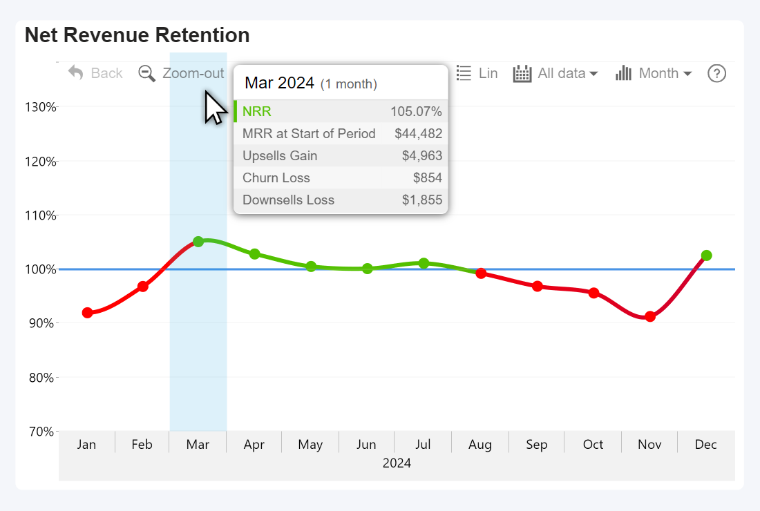
As it turns out, conditional formatting is very handy in finance reporting, especially for SaaS, and this is yet another example from the very same SaaS Metrics article. This Timeline PRO chart showcases NRR – a metric that has a 100% baseline, so anything below that mark should be red to immediately raise an alarm about potential churn issues.
Even though this is a simple example, there are still some choices that can be left to the report creator’s taste. We used Solid H Color, so the entire line segment between two data points has the same color; for example, in Feb 2024, you can see that the line is still red even after crossing the 100% threshold – we did it so that the user isn’t misled into thinking that the NRR went positive in the middle of the month. If you want a consistent color application for cleaner appearance, you can use Solid V Color or Gradient Color Modes instead.
| Color Mode | Solid H Color |
| Lower Color | Red |
| Upper Color | Green |
| Upper Color Origin | Constant Value |
| Upper Color Value | 100 |
Thermal chart – gradient based on temperature
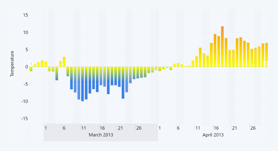
Here’s an example of Timeline PRO thermal chart that shows the daily temperature changes over time. With conditional formatting, you can color-code temperature values using widely known color associations (blue for cold, red or orange for hot).
| Color Mode | Gradient |
| Lower Color | Blue |
| Lower Color Value | -15 |
| Middle Color | Yellow |
| Middle Color Origin | Constant Value |
| Middle Color Value | 0 |
| Upper Color | Orange |
| Upper Color Origin | Constant Value |
| Upper Color Value | 15 |
For this example, the Gradient color mode was the most suitable choice, since it provided a visual representation of the temperature intensity: the lower the temperature, the bluer the color becomes. But you can also experiment with other color modes as well – Stepped Color would apply the same color to the entire column, but determine it based it on how cold or hot the temperature is.
Final Thoughts
Customization is one of the core pillars that make ZoomCharts visuals so special (the other two being intuitive user interactions for data exploration, and seamless integration with other visuals for incredible Power BI reports). In the previous articles, we explored:
- Stacking options for different types of column charts
- Thresholds feature for reference lines, areas or change indicators
- Shape Layer customization in Map & Shape Map visuals (read about map chart conditional formatting there!)
All these features, put together, make ZoomCharts visuals an incredibly versatile tool for data visualization in Power BI. We are planning to explore other of our standout features in future articles, so sign up to our newsletter to be the first to read them!
FAQ
Are there limitations when using conditional formatting with DirectQuery mode?
Yes, with DirectQuery, conditional formatting may lag or refresh slowly when data changes or filters are applied, because the coloring depends on runtime queries.
Why is the “Custom” option for gradient formatting sometimes disabled on cards?
Some users report that in certain versions the gradient “Custom” option is grayed out for card visuals, forcing users to enter fixed min/max values instead.
Can conditional formatting respond to text values or non-numeric fields directly?
Not directly. You must convert or map text values to numeric or color/hex values (often via DAX) and base your formatting on that derived field.
Related content

Want more info like this?
Subscribe to our newsletter and be the first to read our latest articles and expert data visualization tips!