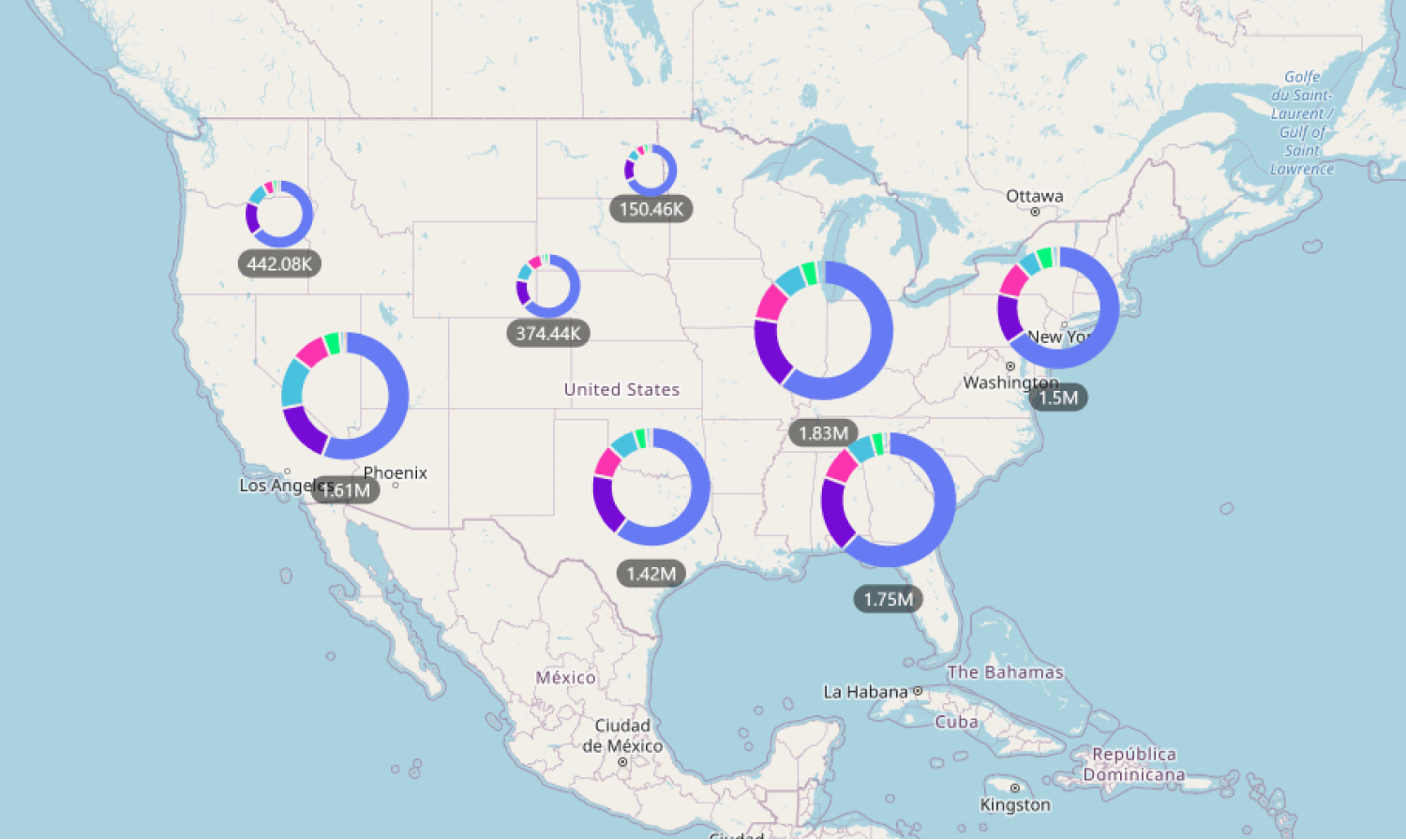
If this toggle is enabled, all cluster nodes will display a donut chart that visualizes the values of all clustered data points. The donut chart slices will be created based on the Category field, and the slice sizes will be determined by aggregating the values from the Value field.
This setting is available if the Cluster Nodes toggle is enabled, and data has been added to the Categoryfield. Once enabled, you can customize the donut chart appearance and behavior further with the following settings:
- Enable ‘Others’
- Number Of Slices
- Data Sorting
- Data Sorting By
- Pie Tooltip
- Pie Tooltip Type
- Fill Mode
- Base Fill Color

Was this helpful? Thank you for your feedback!
Sorry about that.
How can we improve it?