Use these Power BI examples to find dashboard design ideas, compare industry-specific KPIs, and see how drill-down charts help turn an overview into practical analysis.
1. Healthcare Power BI Dashboard Example: Patient Flow and Hospital KPIs
Best for: Hospital management, patient flow, staffing, quality of care, and financial performance
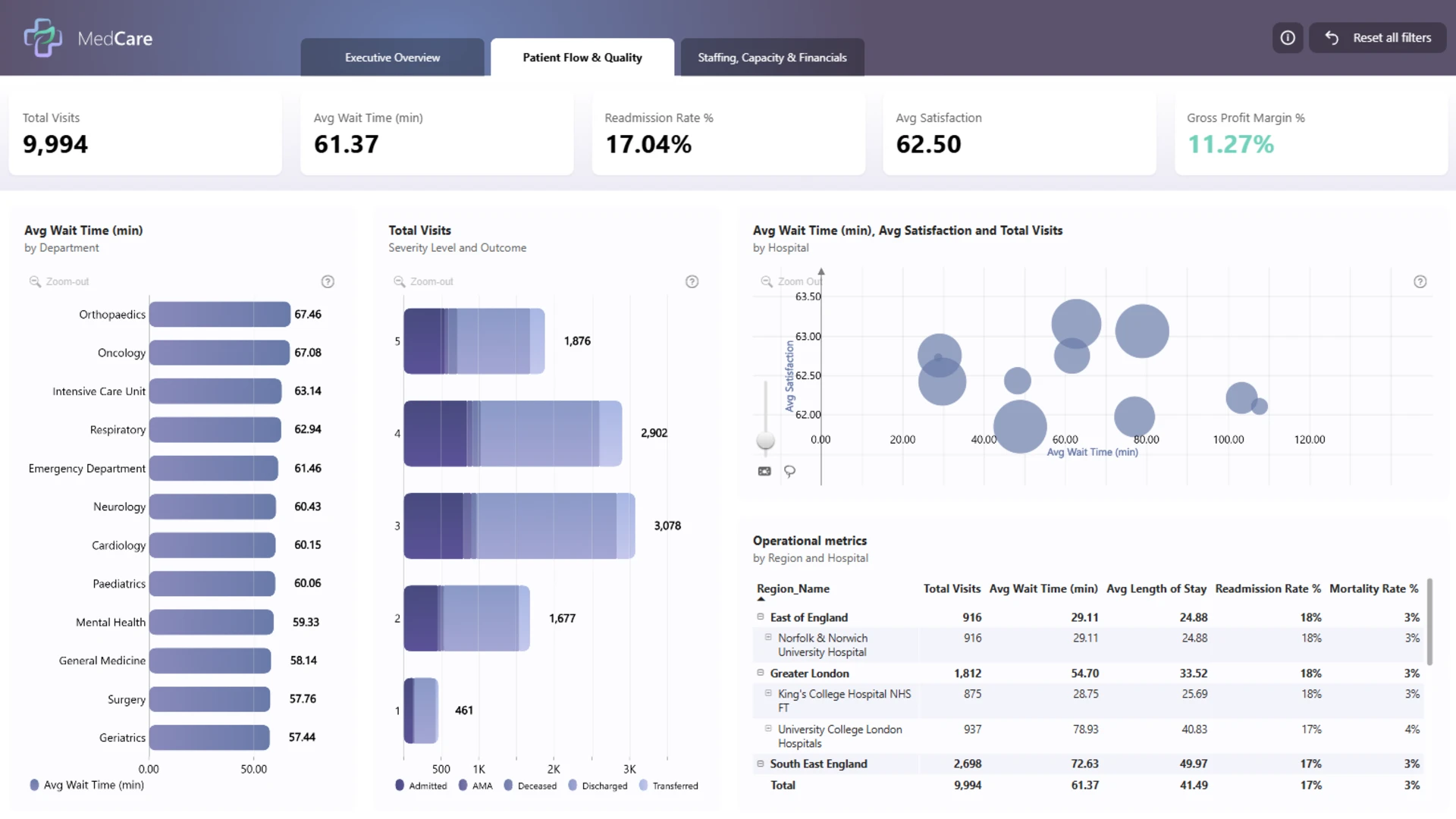
A healthcare dashboard needs to connect clinical activity with the resources that support it. This three-page example brings hospital visits, average wait time, readmission rate, patient satisfaction, staffing, capacity, and financial indicators into a single Power BI reporting experience.
The Patient Flow & Quality page lets users compare waiting times by department and explore visit outcomes by severity. Separate views for the executive overview and staffing, capacity, and financials help managers investigate whether operational pressure is associated with changes in care quality or hospital performance.
Explore this healthcare dashboard template
ZoomCharts visuals used:
Drill Down Bubble PRO, Drill Down Combo PRO, Drill Down Combo Bar PRO, Drill Down Timeline PRO.
2. Supply Chain Power BI Dashboard Example: Inventory, Suppliers and OTIF
Best for: Supply chain managers tracking inventory, suppliers, stockouts, waste, and deliveries
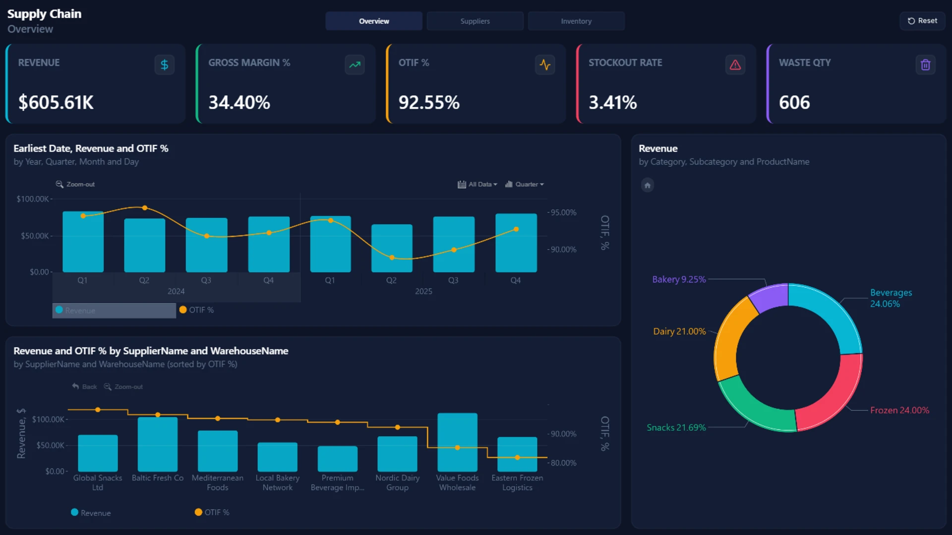
This supply chain Power BI dashboard places commercial and operational results together. Its overview tracks revenue, gross margin, on-time-in-full delivery (OTIF), stockout rate, and waste quantity, while additional pages examine suppliers, inventory, warehouse performance, and expired products.
The layout makes it easier to follow a practical question: when delivery reliability changes, which suppliers, categories, or locations deserve attention? Interactive time and category breakdowns help users move from a headline KPI into the operational details behind it.
Explore this supply chain dashboard template
ZoomCharts visuals used:
Drill Down Bubble PRO, Drill Down Combo PRO, Drill Down Combo Bar PRO, Drill Down Timeline PRO, Drill Down Donut PRO.
3. Retail Power BI Dashboard Example: Sales and Supply Chain Analysis
Best for: Retail teams comparing sales, product performance, fulfillment, and regional operations
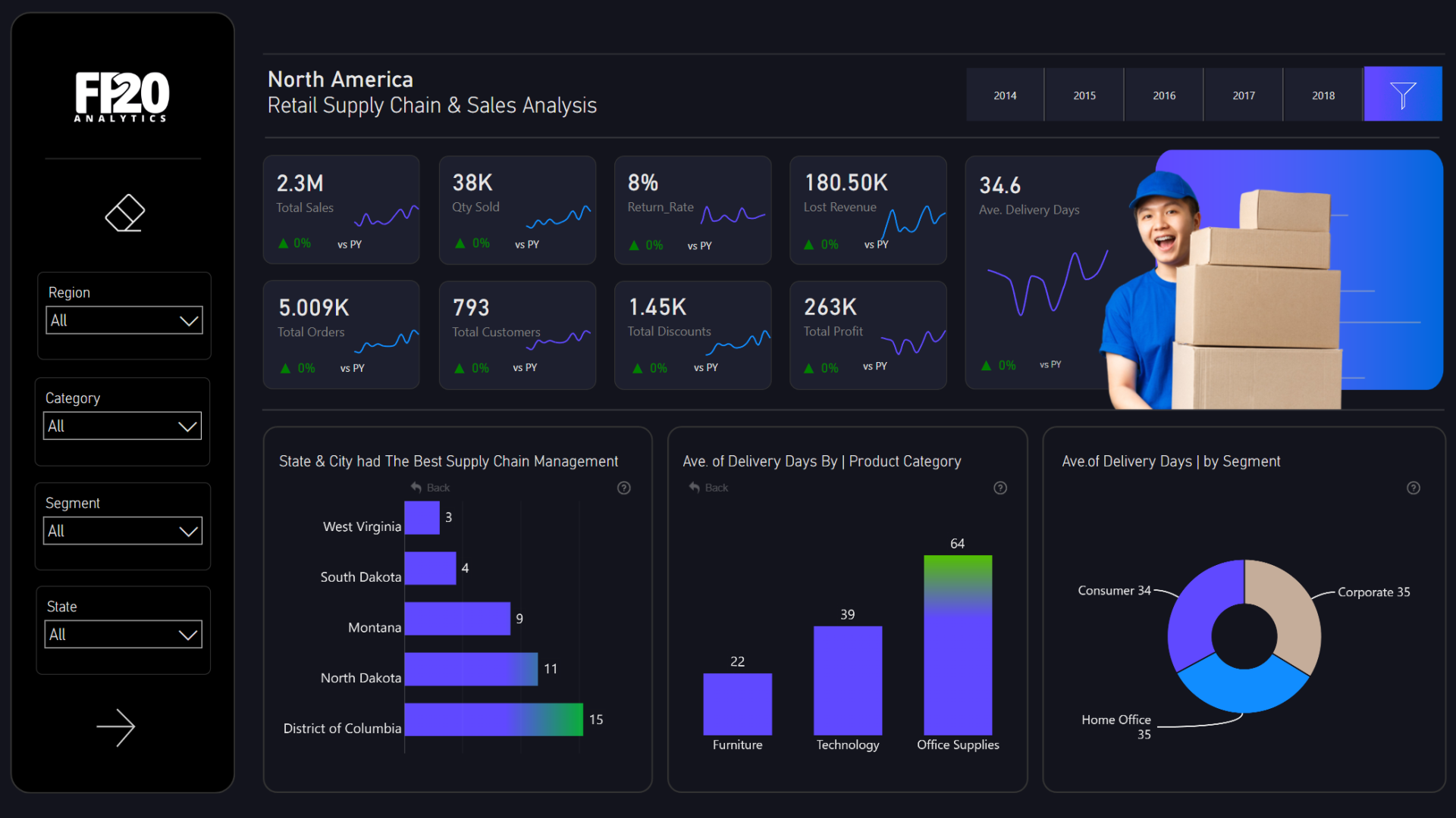
Built around a North American retail network, this example combines total sales, orders, customers, discounts, returns, profit, and delivery measures. KPI cards and time comparisons establish the business picture before users investigate categories, customer segments, and regional results.
Unlike a sales-only report, the dashboard connects demand with fulfillment. The interactive charts show how sales performance relates to product categories and delivery outcomes, making it a helpful reference for retailers that want a more complete view of their operations.
Explore this retail dashboard template
ZoomCharts visuals used:
Drill Down Combo PRO, Drill Down Combo Bar PRO, Drill Down Donut PRO.
4. Power BI E-Commerce Profitability Dashboard Example
Best for: Online retailers tracking contribution margin, returns, fulfillment costs, and profitable growth
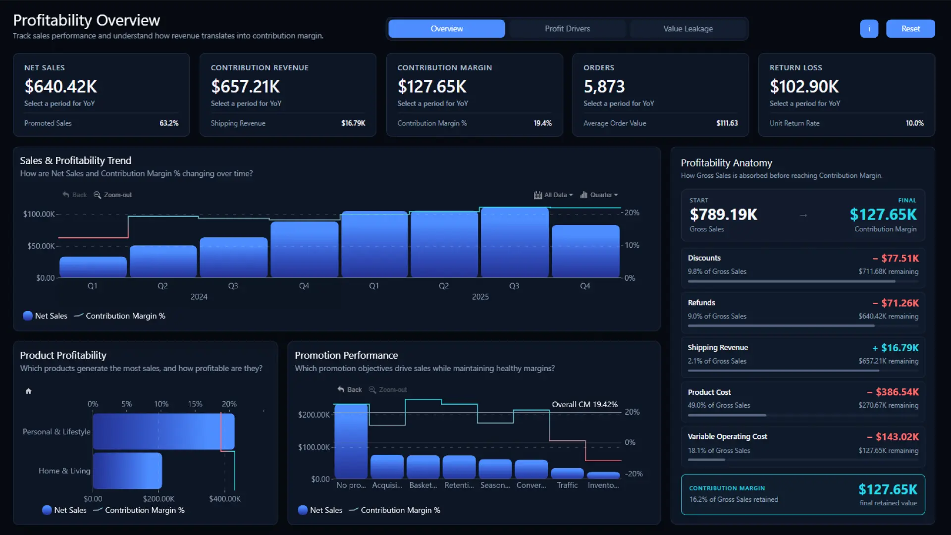
This three-page e-commerce dashboard shows what remains from gross sales after discounts, refunds, shipping revenue, product costs, and variable operating costs. The Overview brings net sales, contribution margin, orders, average order value, and return loss together in one place.
The Profit Drivers and Value Leakage pages help users compare brands, customers, acquisition channels, and European markets while investigating return reasons, delivery performance, and fulfillment costs. It is a useful Power BI dashboard example for teams that need to improve profit, not just increase sales.
Explore this e-commerce profitability dashboard
ZoomCharts visuals used:
Drill Down Bubble PRO, Drill Down Combo PRO, Drill Down Combo Bar PRO, Drill Down Timeline PRO.
5. Banking Power BI Dashboard Example: Customers, Risk and Transactions
Best for: Banking teams analyzing customer segments, financial health, risk profiles, and spending behavior
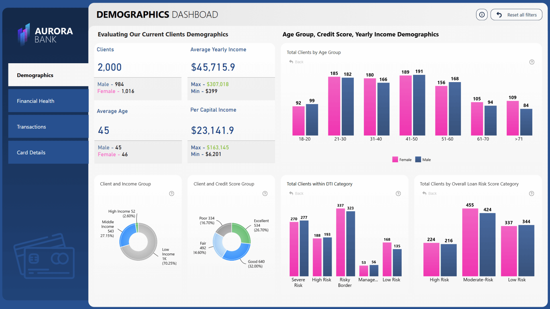
This banking template organizes complex customer data into separate views for demographics, financial health, transactions, and card details. Users can review age and income groups, credit scores, loan-risk categories, spending, payment methods, and transaction patterns without crowding all measures onto one page.
The dashboard shows why industry context matters. Customer counts alone rarely answer a banking question; pairing them with credit risk, debt-to-income information, and transaction behavior gives analysts a clearer route from customer segment to financial exposure.
Explore this banking dashboard template
ZoomCharts visuals used:
Drill Down Combo PRO, Drill Down Combo Bar PRO, Drill Down Donut PRO.
6. Financial Services Power BI Dashboard Example: Customer Complaints
Best for: Banks and financial service providers monitoring complaint volume, resolution and customer issues
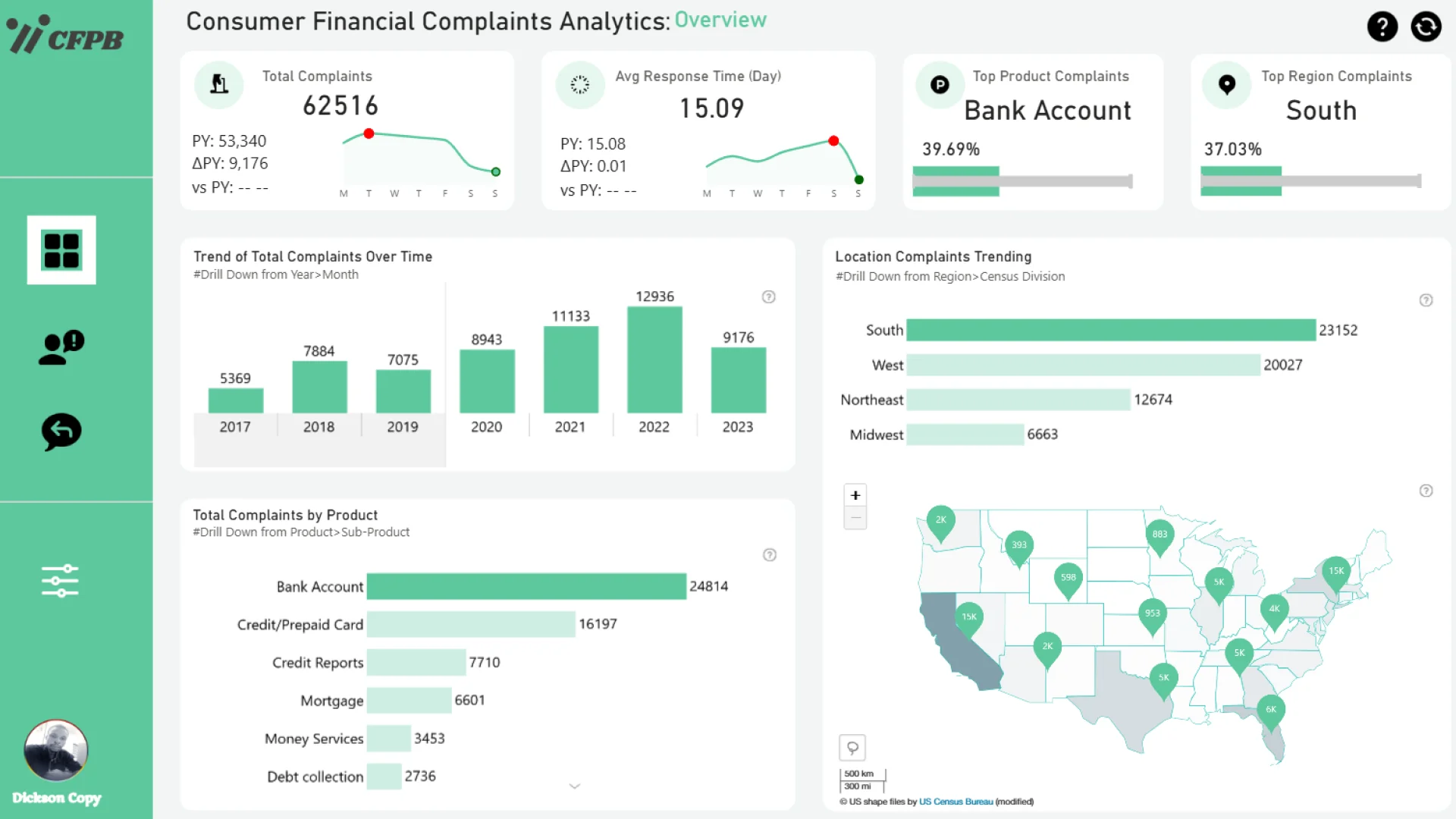
Agbata Dickson Ukolojo's consumer financial complaints dashboard connects complaint counts and response times with products, regions, and changes over time. Interactive maps and category comparisons help analysts identify where complaints are concentrated and which issues recur.
Complaint reporting is more useful when it goes beyond counting cases. This design supports comparisons of company response patterns and customer concerns, giving compliance and customer experience teams a way to prioritize further investigation into services or geographic areas.
Explore this financial services dashboard template
ZoomCharts visuals used:
Drill Down Scatter PRO, Drill Down Combo PRO, Drill Down Combo Bar PRO, Drill Down Map PRO, Drill Down Timeline PRO, Drill Down Donut PRO.
7. Power BI Project Management Portfolio Dashboard Example
Best for: PMOs and project managers tracking portfolio health, budgets, benefits, delivery progress, and risks
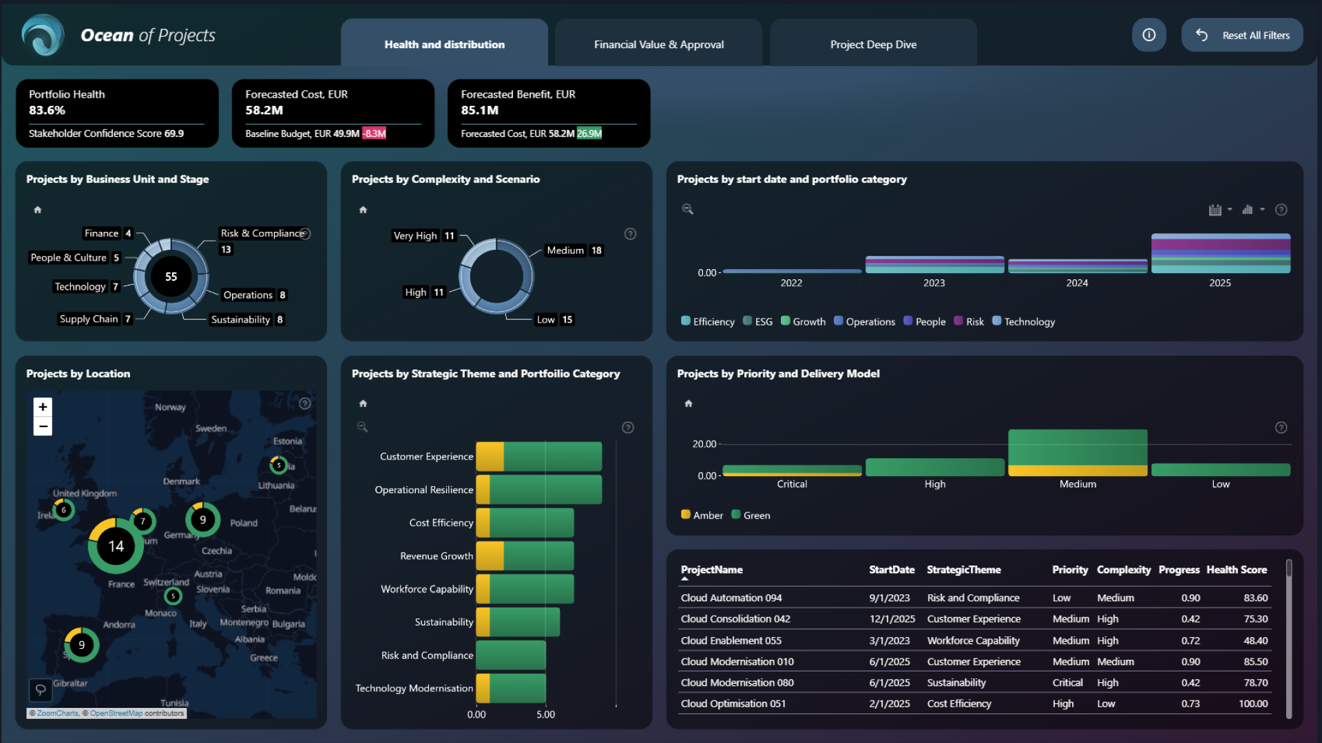
This project portfolio dashboard combines a Health and Distribution overview with Financial Value & Approval and Project Deep Dive views. PMO teams can monitor portfolio health, stakeholder confidence, forecast costs, expected benefits, project priorities, and lifecycle stages.
The financial view compares planned and actual costs alongside expected and realized benefits. In the project-level view, managers can examine milestones, schedule progress, cost variance, critical risks, and resource information. Interactive charts make it easier to identify which projects need attention instead of treating the entire portfolio as one result.
Explore this project management portfolio dashboard
ZoomCharts visuals used:
Drill Down Bubble PRO, Drill Down Scatter PRO, Drill Down Combo PRO, Drill Down Combo Bar PRO, Drill Down Map PRO, Drill Down Timeline PRO, Drill Down Donut PRO.
8. B2B Sales Performance Power BI Dashboard Example
Best for: Sales leaders evaluating revenue, gross profit, targets, returns, and performance by market and product
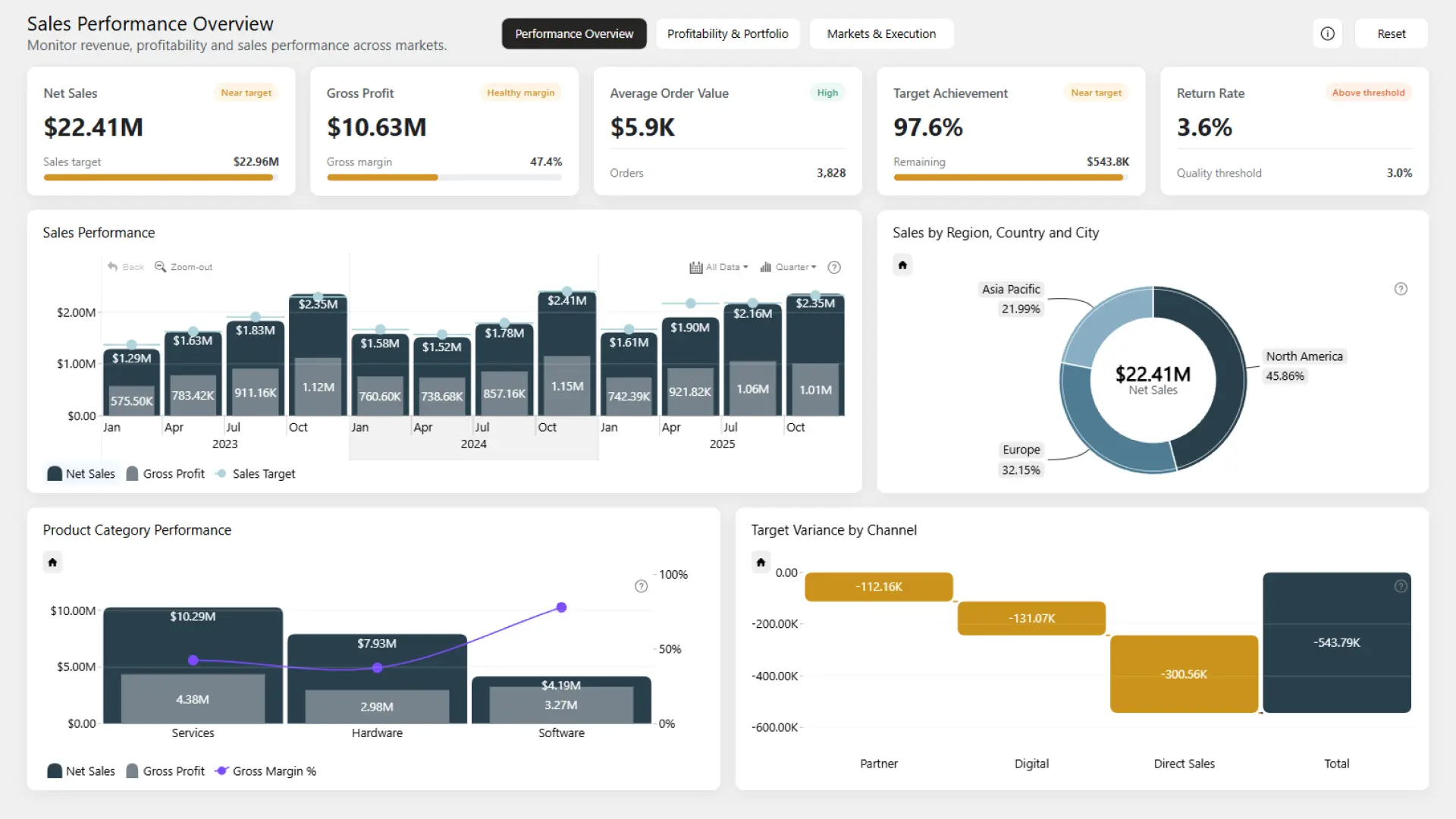
This B2B sales performance dashboard brings net sales, gross profit, target achievement, average order value, and return rate into a connected three-page report. The Performance Overview compares actual results with sales targets and shows where performance differs across regions, product categories, and channels.
Profitability & Portfolio and Markets & Execution pages provide deeper analysis by product, customer segment, industry, sales team, and market. Use it to evaluate both sales growth and the profitability behind it, with interactive visuals that filter the related charts when users investigate a result.
Explore this B2B sales performance dashboard
ZoomCharts visuals used:
Drill Down Timeline PRO, Drill Down Donut PRO.
9. Sales Conversion Power BI Dashboard Example: Funnel Performance
Best for: Sales teams analyzing leads, opportunities, proposals, wins, and conversion efficiency
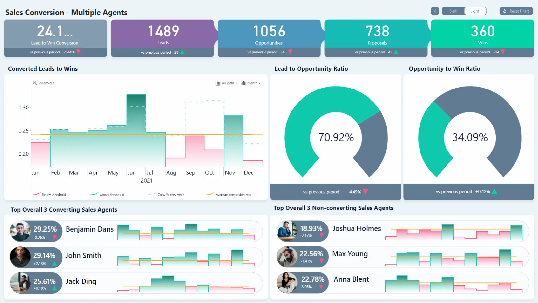
This sales conversion report follows the movement from leads to opportunities, proposals, and wins. It pairs funnel-level conversion indicators with a time-based chart and performance comparisons for individual sales agents.
The most useful question here is not simply how many leads arrive. Teams also need to see which stages lose the most opportunities and whether conversion results improve over time. The dashboard provides a visual structure for reviewing those changes and identifying coaching or process opportunities.
Explore this sales dashboard template
ZoomCharts visuals used:
Drill Down Combo PRO, Drill Down Timeline PRO.
10. Finance Power BI Dashboard Example: Revenue vs. Budget
Best for: Finance teams comparing actual revenue, budget targets, forecasts, and variances
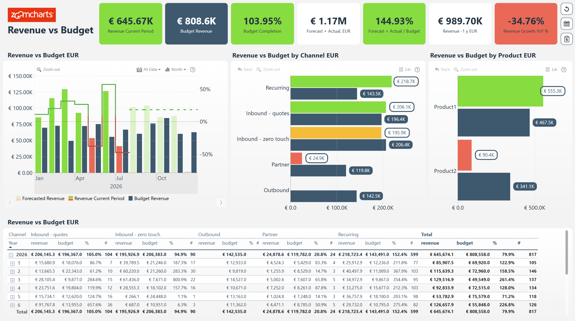
A good Power BI finance dashboard makes the comparison visible. This revenue-versus-budget example presents actual revenue, budgeted revenue, completion rate, forecast values, and a monthly variance chart, with separate comparisons by channel and product.
The headline metrics make it easy to spot a gap, while the interactive breakdowns help explain it. Users can inspect which channels or products are ahead or behind plan, then check the underlying figures in the detailed table.
Explore this finance dashboard template
ZoomCharts visuals used:
Drill Down Combo Bar PRO, Drill Down Timeline PRO.
11. Operations Power BI Dashboard Example: Performance and Risk KPIs
Best for: Operations and executive teams comparing targets, service metrics, budgets, and business unit performance
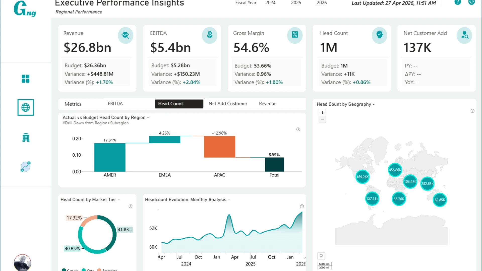
This executive operations dashboard by Agbata Dickson Ukolojo connects financial and operational performance. It includes revenue, EBITDA, gross margin, headcount, customer growth, uptime, delivery performance, support activity, and comparisons against budget or forecast.
Rather than showing isolated KPI cards, the report supports investigation across geographic and business-unit dimensions. That makes it a useful example for leadership teams that need to understand both what changed and which departments or regions contributed to the result.
Explore this operations dashboard template
ZoomCharts visuals used:
Drill Down Scatter PRO, Drill Down Combo PRO, Drill Down Waterfall PRO, Drill Down Combo Bar PRO, Drill Down Map PRO, Drill Down Timeline PRO, Drill Down Donut PRO.
12. Energy Power BI Dashboard Example: Production and Site Performance
Best for: Energy analysts exploring operational trends, production targets, site locations, and regional comparisons
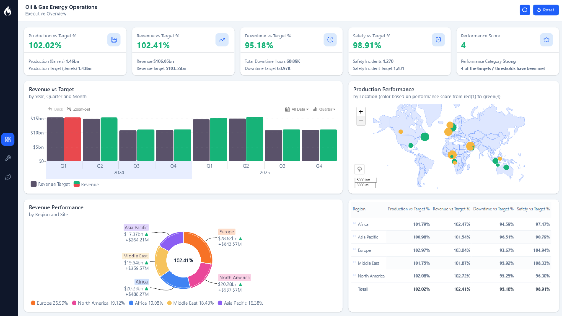
This energy analytics template uses a combination of time trends, a map, categorical comparisons, and performance indicators to explore oil and energy operations. The executive view highlights production, revenue, downtime, safety, and performance relative to targets.
For teams with sites across multiple regions, geography and time are essential analysis paths. Interactive charts help users compare regions and locations, follow the development of operational measures, and narrow broad performance questions to specific sites.
Explore this energy dashboard template
ZoomCharts visuals used:
Drill Down Bubble PRO, Drill Down Combo Bar PRO, Drill Down Map PRO, Drill Down Timeline PRO, Drill Down Donut PRO.
13. Software Delivery & Quality Power BI Dashboard Example
Best for: Software engineering and product teams monitoring releases, defects, testing, and delivery quality
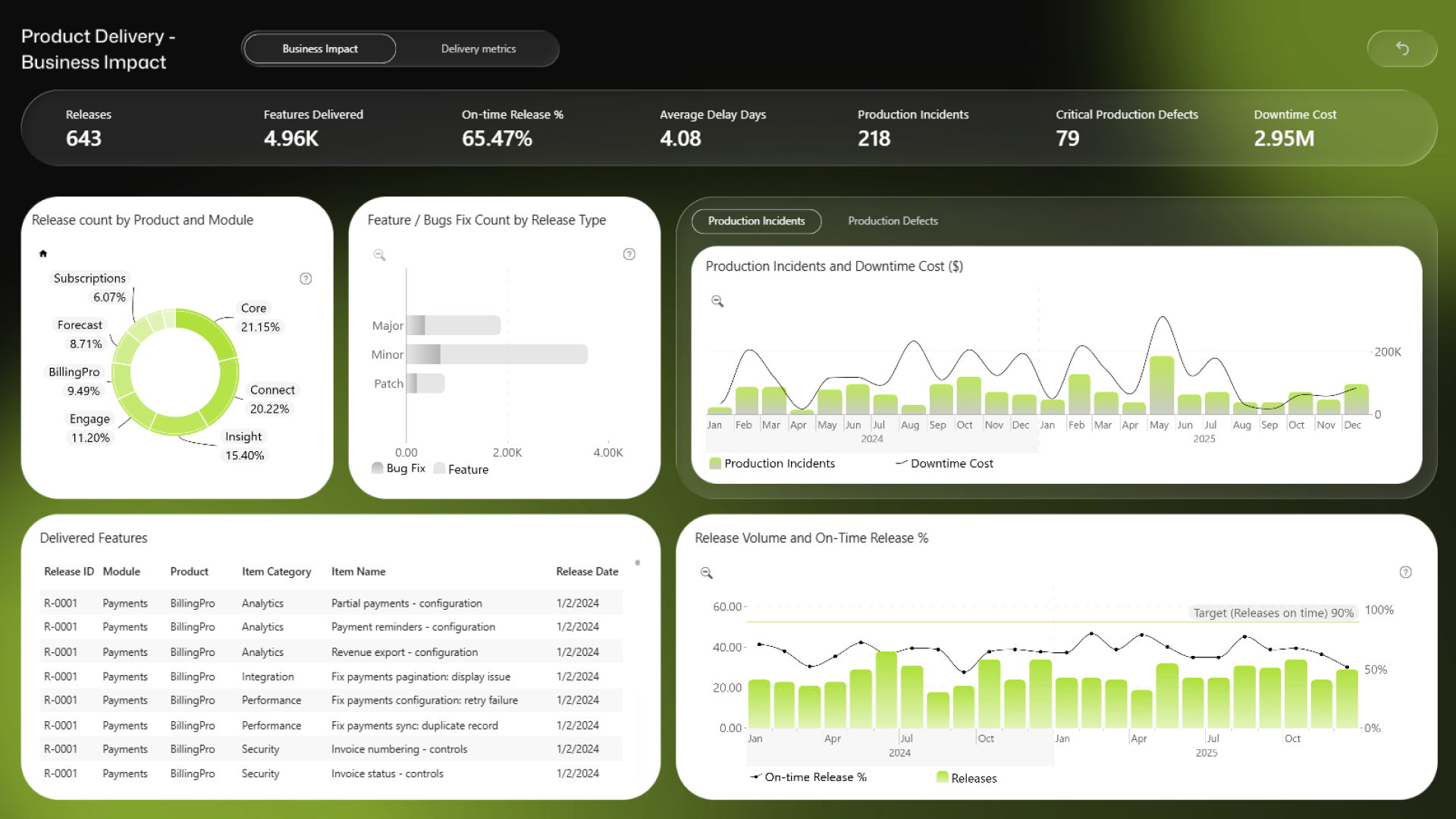
This two-page software delivery dashboard connects release performance with product quality and business impact. The Business Impact page summarizes releases, delivered features, on-time release rate, average development time, production incidents, critical defects, and downtime cost.
The Delivery Metrics page adds views of testing effectiveness, automated test coverage, test failures, release patterns, and the relationship between development time and testing effort. Engineering leaders can filter by product, module, team, release type, or reporting period to understand whether faster delivery is improving or weakening software quality.
Explore this software delivery and quality dashboard
ZoomCharts visuals used:
Drill Down Bubble PRO, Drill Down Combo Bar PRO, Drill Down Timeline PRO, Drill Down Donut PRO.
14. Transportation and Logistics Power BI Dashboard Example
Best for: Logistics teams reviewing bookings, delivery delays, supplier concentration, and vehicle use
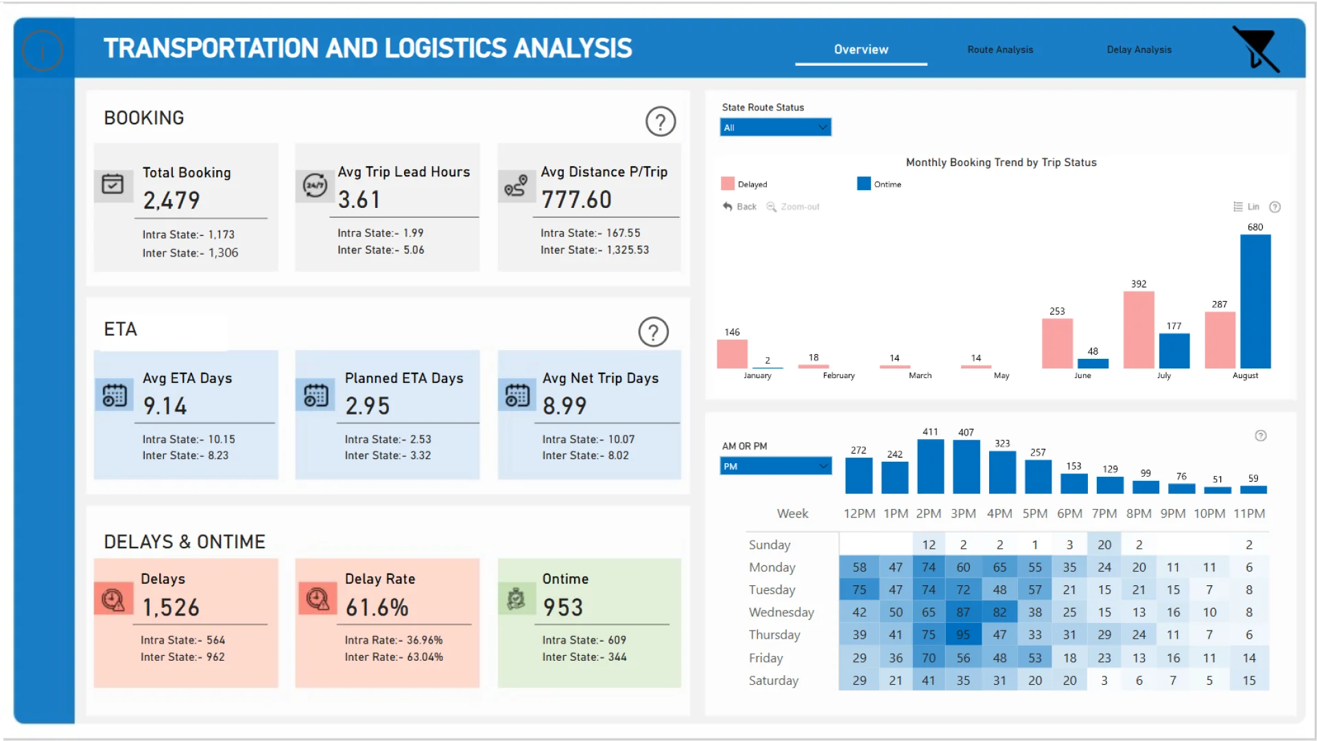
Okeh Dono Efasa's logistics report analyzes bookings, delivery delays, suppliers, routes, and vehicle utilization. It combines summary indicators such as total bookings, estimated arrival time, delay rate, and on-time deliveries with demand patterns by month, week, and time of day.
The design connects service reliability to operational activity. Instead of relying on a single on-time KPI, users can compare routes and supplier behavior, explore periods with higher delay volumes, and examine whether vehicles are used efficiently.
Explore this transportation dashboard template
ZoomCharts visuals used:
Drill Down Combo PRO, Drill Down Combo Bar PRO, Drill Down Donut PRO.
15. HR Analytics Power BI Dashboard Example: Workforce and Retention
Best for: HR teams tracking headcount, turnover, retention, hiring, separations, and compensation
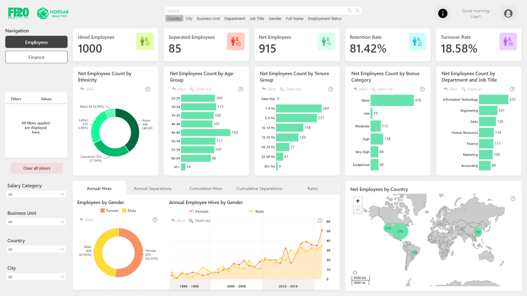
This HR analytics dashboard helps human resources teams study workforce composition and movement over time. It brings together employee counts, retention, turnover, compensation, age, tenure, departments, and hiring and separation trends.
The layout makes it possible to move from an overall workforce metric into the organizational context behind it. HR managers can compare departments and locations, study hiring and separation trends, and examine potential retention questions before adjusting workforce plans.
Explore this human resources dashboard template
ZoomCharts visuals used:
Drill Down Donut PRO, Drill Down Combo PRO, Drill Down Combo Bar PRO, Drill Down Map PRO, Drill Down Timeline PRO.
How to Choose the Right Power BI Dashboard for Your Industry
The best Power BI dashboard is not necessarily the one with the most charts. Start by identifying the decision your audience needs to make, then select the KPIs and breakdowns that help users reach it. A finance manager may need budget variance by product; an operations leader may need on-time delivery by supplier; an HR manager may need turnover by department.
- Identify the decision: Decide whether the report should monitor performance, reveal risks, diagnose problems, or support planning.
- Choose meaningful industry KPIs: Keep targets, comparisons, and the metric definitions close to the headline figure.
- Design an overview with a clear drill path: Let users move from a summary into time periods, business units, locations, products, or people without losing their place.
- Connect related business functions: Where useful, place outcomes alongside drivers, such as profit and fulfillment costs or staff turnover and hiring.
- Validate the data model: Review relationships, measures, permissions, refresh schedules, and performance before using a downloaded report with business data.
Well-designed interactive dashboards also make it clear which filters are active and how to reset the view. For more ideas, explore the ZoomCharts category pages for project management, sales, finance, HR, banking, KPI reporting, and logistics.
Project Management dashboard examples | Sales dashboard examples | Finance dashboard examples | HR dashboard examples | KPI dashboard examples | Banking dashboard examples | Logistics dashboard examples
Power BI Dashboard Examples: Frequently Asked Questions
What are good Power BI dashboard examples for beginners?
Begin with a report that focuses on one familiar business process, such as sales performance or revenue versus budget. Look for a clear KPI row, a time trend, a category breakdown, and a detail view. Then build more complex industry analysis when the metrics and data model are understood.
Can I download these Power BI dashboard templates?
The ZoomCharts Template Gallery lets you preview and interact with reports online. PBIX downloads are available through the gallery according to the applicable account and download plan. Open a downloaded PBIX file in Power BI Desktop to review the layout, measures, pages, and interactions.
Can I use my own data in a Power BI dashboard template?
Yes. A PBIX report can be edited in Power BI Desktop. Replace the sample data connection, map your fields to the existing model, update measures, and test the visual interactions. Check ZoomCharts licensing requirements before publishing or sharing a report that uses its custom visuals.
What makes a Power BI dashboard useful for a specific industry?
A useful industry dashboard reflects how that sector works. It combines the right operational or financial KPIs with relevant comparisons and a clear way to drill into time periods, locations, customer groups, teams, or products.
Explore Power BI Dashboard Templates in the ZoomCharts Gallery
These 15 examples show how the same Power BI platform can support very different business decisions. The right starting point is a report that closely matches your industry, KPI definitions, audience, and data structure.
Browse more than 2,700 Power BI dashboard and report examples in the ZoomCharts Template Gallery. Preview reports, explore their interactive charts, and choose a PBIX template to adapt to your own use case.
Explore Power BI dashboard examples
Try ZoomCharts Drill Down Visuals Free for 30 Days
Want to build your own interactive report? ZoomCharts Drill Down visuals help Power BI users explore data directly on charts. You can try their paid features with a 30-day trial license and see how they work with your data.
You can also explore more Power BI report templates before deciding what to build next.