3164
Healthcare Power BI Dashboard Example
Healthcare Power BI Dashboard Example
More Report pages
Report Author: ZoomCharts
3164
Share template with others
Healthcare Operations & Financial Performance Power BI Dashboard Example
This healthcare Power BI dashboard example helps hospital and care operations teams monitor patient flow, quality, staffing, capacity, and financial performance in one interactive report.
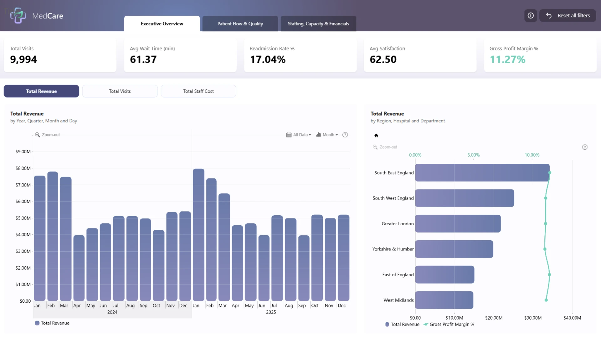
The report brings together key healthcare performance indicators across executive, operational, and financial views. Users can analyze total visits, average wait time, readmission rate, patient satisfaction, gross profit margin, overtime hours, staff absences, bed occupancy, revenue, costs, and profit by hospital, department, region, and time period.
Designed as a healthcare dashboard example for Power BI, the report supports a practical view of hospital performance. It helps leaders compare demand, service quality, workforce pressure, and financial results so they can identify areas that may need closer review, operational adjustment, or deeper analysis.
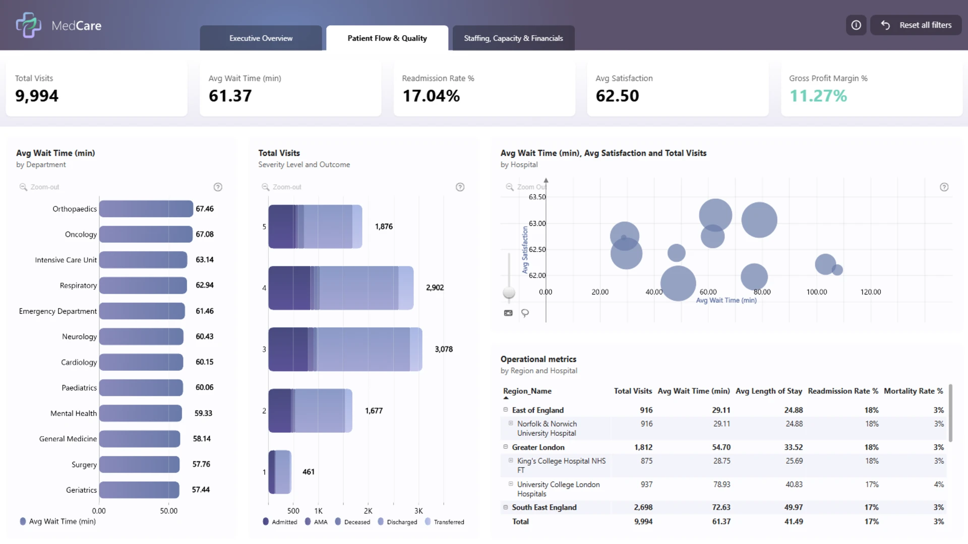
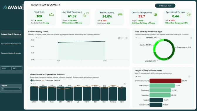
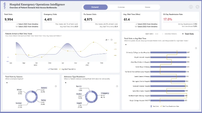
Patient Flow & Quality
Track patient visits, wait times, severity levels, outcomes, satisfaction, readmission rates, length of stay, and mortality metrics across departments and hospitals.
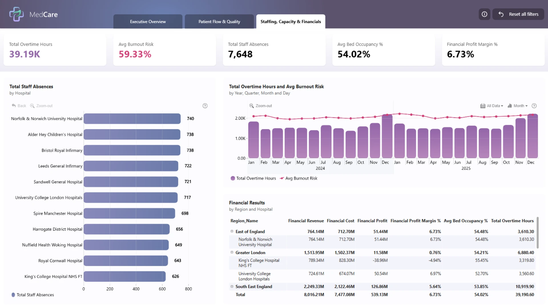
Staffing & Capacity
Review overtime hours, burnout risk, staff absences, and bed occupancy to understand where workforce demand and hospital capacity may be under pressure.
Financial Performance
Compare revenue, costs, profit, and profit margin by region and hospital to connect operational performance with financial outcomes.
Standout Report Feature
A key strength of this healthcare Power BI dashboard example is the way it connects clinical operations, staffing capacity, and financial performance in a single reporting experience. The executive overview provides high-level KPI cards for quick monitoring, while detailed pages allow users to investigate patient flow, hospital-level quality metrics, workforce trends, and financial results.
Visuals such as bar charts, timeline charts, bubble charts, and matrix tables make it easier to compare departments, hospitals, regions, and time periods without separating operational and financial analysis into disconnected reports.
How to use this Healthcare Dashboard Example
Use the executive overview to monitor overall healthcare performance, including total visits, average wait time, readmission rate, satisfaction, and gross profit margin. From there, explore the patient flow and quality page to compare departments and hospitals by wait time, visit volume, patient outcomes, and operational metrics.
The staffing, capacity, and financials page can be used to review staff absences, overtime, burnout risk, bed occupancy, revenue, costs, and profit margin. Together, these views make the report useful as a Power BI healthcare dashboard template or reference example for hospital operations, healthcare analytics, and performance reporting.
Download and Customize this Template
This healthcare operations dashboard example can be adapted for hospital performance reporting, patient flow analysis, healthcare KPI monitoring, financial performance reviews, and executive reporting. Customize the model with your own departments, hospitals, regional structure, patient metrics, staffing data, and financial measures to create a report that reflects your organization’s priorities.
ZoomCharts visuals used
4U Report Challenges
Participate in data challenges, build and submit reports to get free template downloads.
Join CommunityMobile view allows you to interact with the report. To Download the template please switch to desktop view.
Was this helpful? Thank you for your feedback!
Sorry about that.
How can we improve it?