Nov 01, 2024
New Visual Release: Drill Down Scatter PRO by ZoomCharts
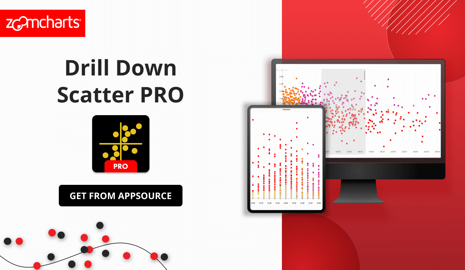
We are excited to release Drill Down Scatter PRO, which is the latest addition to ZoomCharts family of custom Power BI visuals. It is designed to deliver 360° insights and empower decision-centric data exploration for business users.
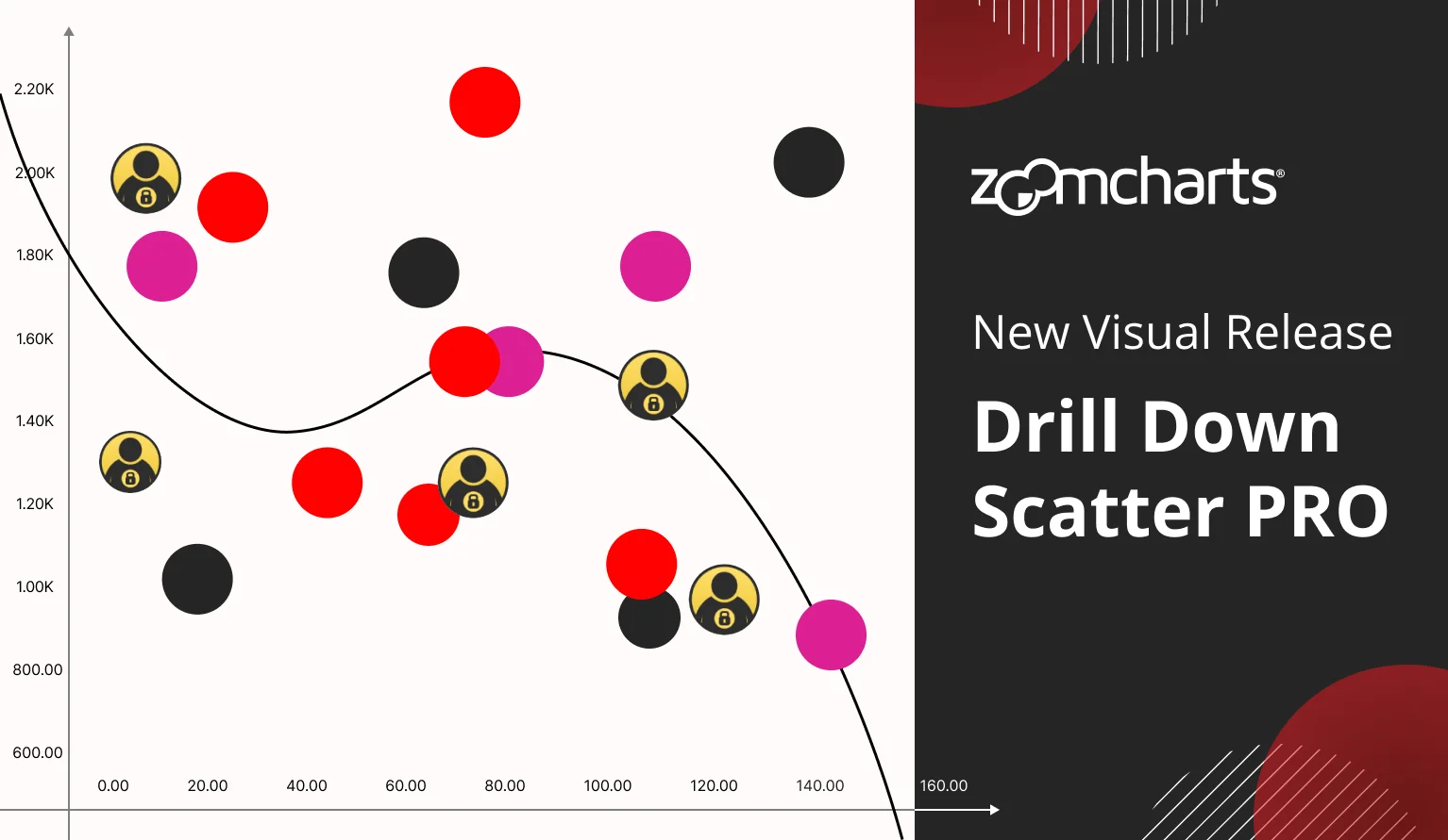

We are excited to release Drill Down Scatter PRO, which is the latest addition to ZoomCharts family of custom Power BI visuals. It is designed to deliver 360° insights and empower decision-centric data exploration for business users.
Watch the Scatter PRO Demo Webinar
Want to see a deep dive into the visual and learn how to create insightful and powerful reports with Scatter PRO? In our latest webinar, our Power BI experts Una, Aivis, and Lee demonstrated its capabilities and showed practical examples on how to seamlessly integrate it within Power BI reports. Watch the recording here!
The All-in-One Power BI Scatter Chart
Whenever we develop a new visual, we ask ourselves: how can we expand the capabilities of what’s already out there? Our aim was to provide the most complete feature set among all Power BI scatter visuals and deliver the ZoomCharts signature user experience that makes our visuals the best choice for data exploration.
By combining powerful big data analytics capabilities with class-leading user experience, Scatter PRO empowers executives and decision-makers with clear, accurate insights and a 360° overview of the full business story.
Learn more about Scatter PRO
User Experience That Drives Engagement
Big data should not be a hassle to explore. Scatter PRO has simple and intuitive user interactions that make it easy for business users to analyze data and find insights – and not just for keyboard and mouse, but also touch input.
- Move the chart around freely with click/tap + drag.
- Zoom in/out with scroll wheel, pinch gesture, or zoom slider.
- Drill down by clicking a data point.
- Select a data point with a long press.
- Select multiple data points with Ctrl+click, rectangular selection or Lasso tool.
We spent a lot of time researching how users interact with software tools to develop an intuitive user experience for Scatter PRO. For example, everyone is used to panning and zooming things like images, maps and websites, so why not do it in a Power BI scatter chart? Simply drag the chart in any direction and quickly zoom in or out. Selecting data is also incredibly intuitive, with four ways to select exactly what you need and apply a filter to the rest of the report.

Each interaction is carefully designed to make it readily apparent and easy to access, instead of hiding them in context menus or other places. They are also accompanied by smooth animations that show exactly what the user did and what changed in the chart. We can confidently say that Scatter PRO is the most user-friendly scatter chart visual for Power BI, and it will empower anyone, from data analysts to decision-makers, to fully engage with data exploration.

Ready for Big Data and Big Decisions
Scatter PRO is designed to handle even the largest datasets and visualize tens of thousands of data points with ease. However, the real challenge is providing valuable insights from that data and giving users the necessary tools to analyze trends and outliers, and that is where Scatter PRO truly shines.
Multi-Level Drill Down
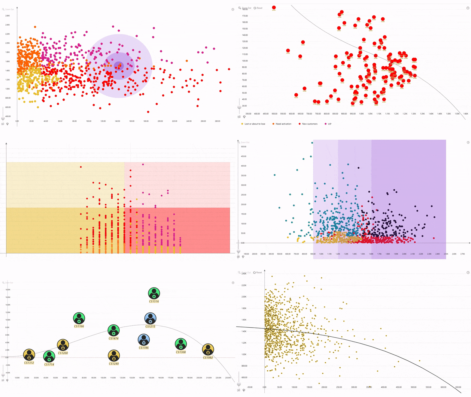
One of the biggest challenges with scatter charts is overplotting, which can make data overwhelming and difficult to analyze. That’s why Scatter PRO supports drill down with up to nine levels of hierarchy. The visual can aggregate all data points within the same category and display them as a single marker. Simply click on a marker to drill down and instantly reveal focused insights!

Dynamic Regression Line
Looking to present predictive insights that executives demand when making critical business decisions? With the dynamic regression line feature, you can display a linear trendline or polynomial regression up to the 10th degree. Whenever the user drills down or filters data, the regression line will be dynamically recalculated to instantly accommodate changes in the chart. This is a game-changer for various use cases – for example, when analyzing different forecast routes.

Area Shading
Call attention to what’s important and provide additional visual clarity! In Scatter PRO, you can create up to eight background shapes at custom coordinates to emphasize specific data clusters, highlight outliers, or mark risk areas.

Thresholds
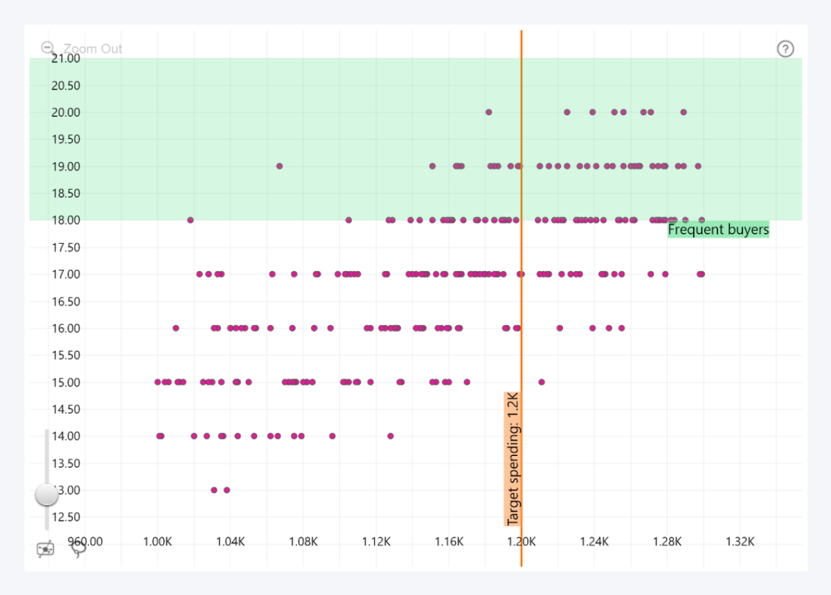
Enable up to eight threshold lines or areas (four per each axis). For example, if you wish to compare your data against KPIs or benchmarks, you can add a line at a constant or dynamically calculated position, or you can mark a specific value range with an area threshold.
Cross-Chart Filtering
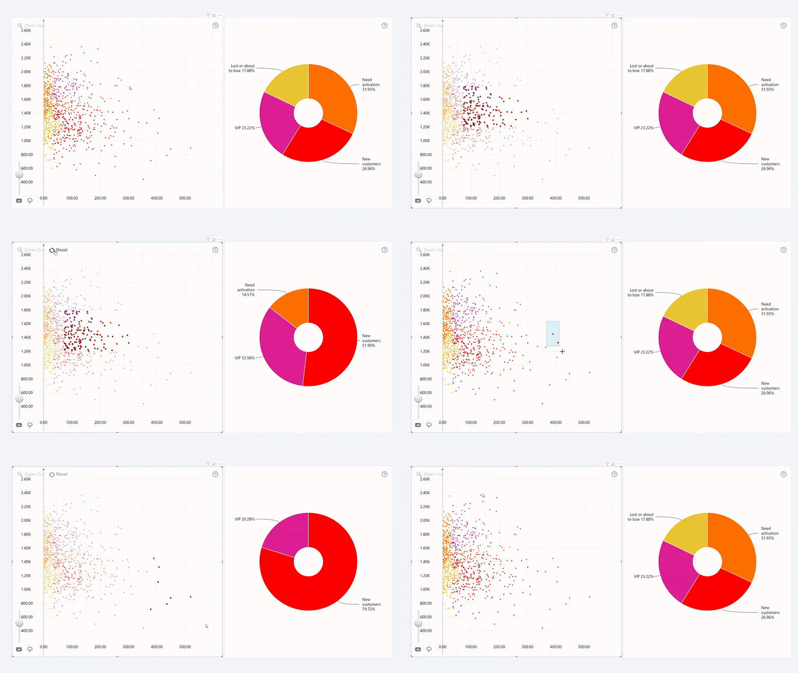
Just like all our Drill Down Visuals, Scatter PRO will dynamically interact with other visuals on your report and cross-filter each other to provide the most relevant insights to the user whenever they need them. Scatter PRO isn’t just a Power BI scatter visualization – it’s an interactive data exploration tool for confident and informed business decisions.
Peerless Customization
Customize your Power BI scatter chart to meet the exact requirements of your users and adhere to your branding guidelines. In Scatter PRO, almost any aspect is fully customizable with over 240 configuration settings to control the look and feel of your scatter chart, including:
- Axis customization: Customize axis location, color, opacity, value range, value font and affixes, titles and gridlines, invert axis, enable crosshairs, and more.
- Data points: Customize marker shape, fill color and opacity, outlines, size, and control label behavior when multiple data points overlap.
- Data point labels: Display category names or show numeric and/or text values from the Label and Value Label fields. Choose position (inside or outside), customize font, size, background and border.
- Legends: Create data segments with the Legend field and display them in the legend as clickable items. Customize position, alignment, size and font of the legend items.
- Tooltips: Choose between Power BI native tooltip or ZoomCharts custom tooltip. Display additional insights in the tooltip by adding columns or measures to the Tooltips field.
It's not just about having a long list of toggles. We have implemented multiple ways to customize data point markers in Scatter PRO, allowing each report creator to find a method that best suits their needs. You can apply custom colors to each category or legend segment, set default settings for all data points, and create up to nine data point groups with the Data Point Group field to set separate customization rules for each group.
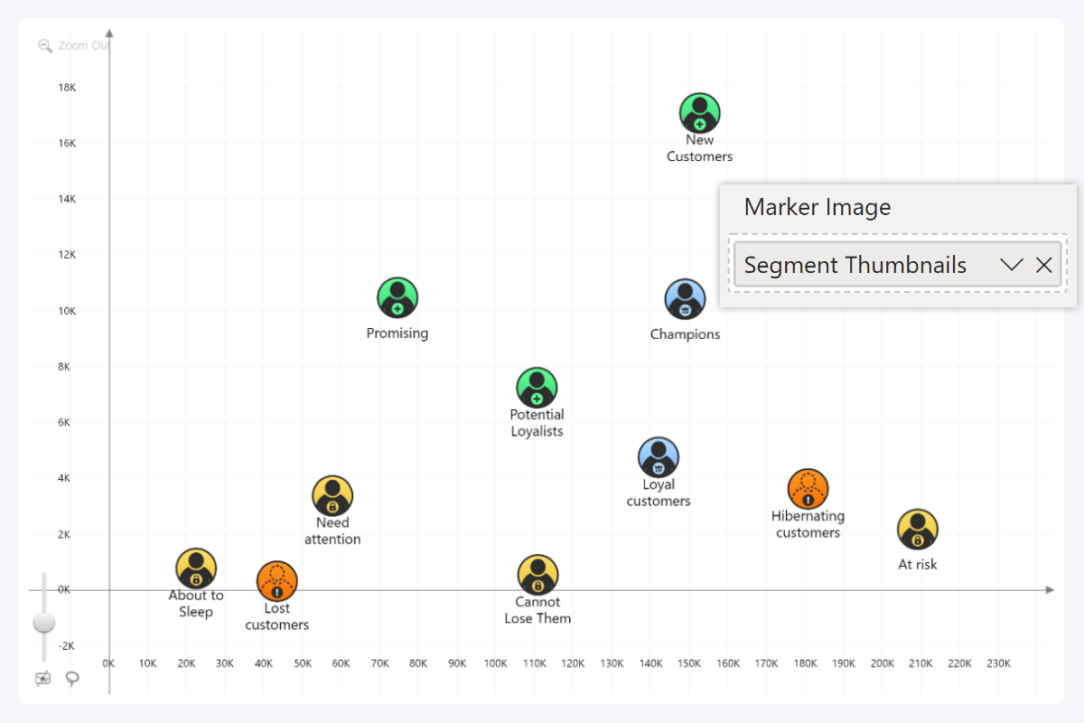
In addition, Scatter PRO supports data-driven formatting, allowing you to apply specific formatting rules for each data point with the Marker Color, Marker Shape, and Marker Image fields. The latter can be used to display your own images in the data point markers, which will provide additional flexibility and flair to your Power BI scatter chart.
Get Started with Drill Down Scatter PRO
Drill Down Scatter PRO is available now! You can purchase it from AppSource as a single visual or get it as part of the Drill Down Visuals bundle which also includes all our Power BI custom visuals (Pie, Donut, Combo, Combo Bar, Timeline, Map, Graph, and more).
Want to try Scatter PRO for yourself? Download the free demo from AppSource and explore all its features for 30 days!
Looking for Additional Resources?
- Scatter PRO documentation: Read in-depth explanations of each feature and technical descriptions for data fields and configuration settings.
- How-To Guide: Learn the essentials of Scatter PRO in this step-by-step tutorial blog article.
- Sample .pbix file: See the visual in action and explore the customization options of Scatter PRO.
- YouTube tutorial series: Get up to speed with the visual and learn about data setup, axis settings, regression line, area shading, data point customization, and more.
- Scatter PRO product page: Learn about the key features of Scatter PRO.

Want more info like this?
Subscribe to our newsletter and be the first to read our latest articles and expert data visualization tips!
