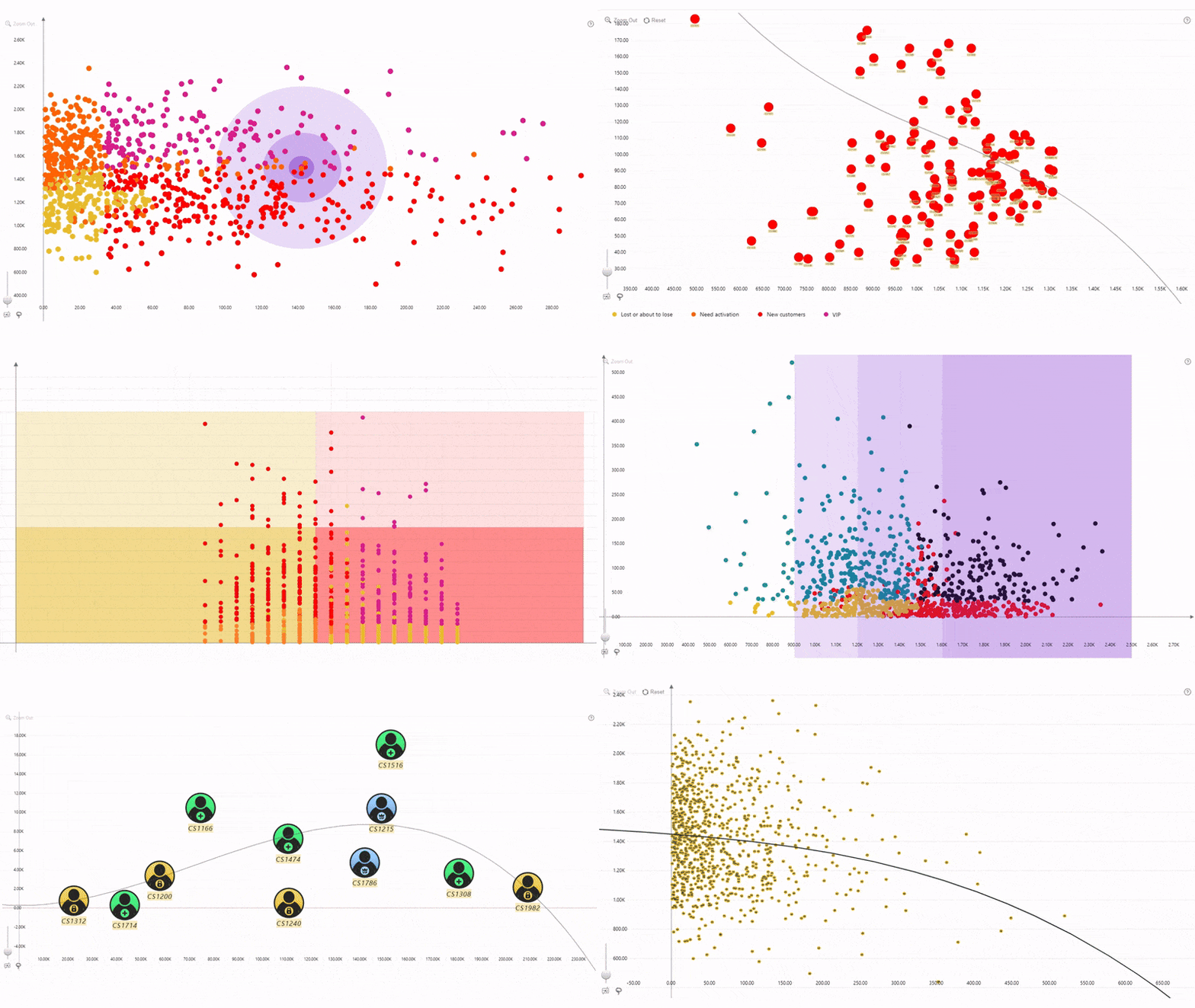
Data Point Customization gives you full control over how scatter data points are displayed in the chart, helping you create visuals that are both informative and visually engaging. Configure the default appearance for all data points, create custom groups with their own styling, apply consistent colors and shapes based on categories or legend values, or use data-driven formatting to style individual markers directly from your data.
By default, settings in the Data Point section apply to all data points in the visual. To customize subsets of data points, add a field to Data Point Group and enable the desired groups in Customize Groups. Settings configured for an enabled group override the default settings, allowing you to highlight or distinguish specific data points while maintaining a consistent overall design.
Group-specific customization is available for the following settings: Marker Style, Marker Outline and Labels. To apply custom settings, select the desired group from the Apply Setting To option within the relevant section.
For additional customization options, you can also:
- Use Category Colors to assign colors to data points based on their category.
- Use Legend Colors and Legend Shapes to apply consistent colors and marker shapes to data points that belong to the same legend group.
This approach keeps default formatting simple while giving you the flexibility to emphasize important data points, create meaningful visual distinctions, and build charts that are easier to interpret.
Was this helpful? Thank you for your feedback!
Sorry about that.
How can we improve it?