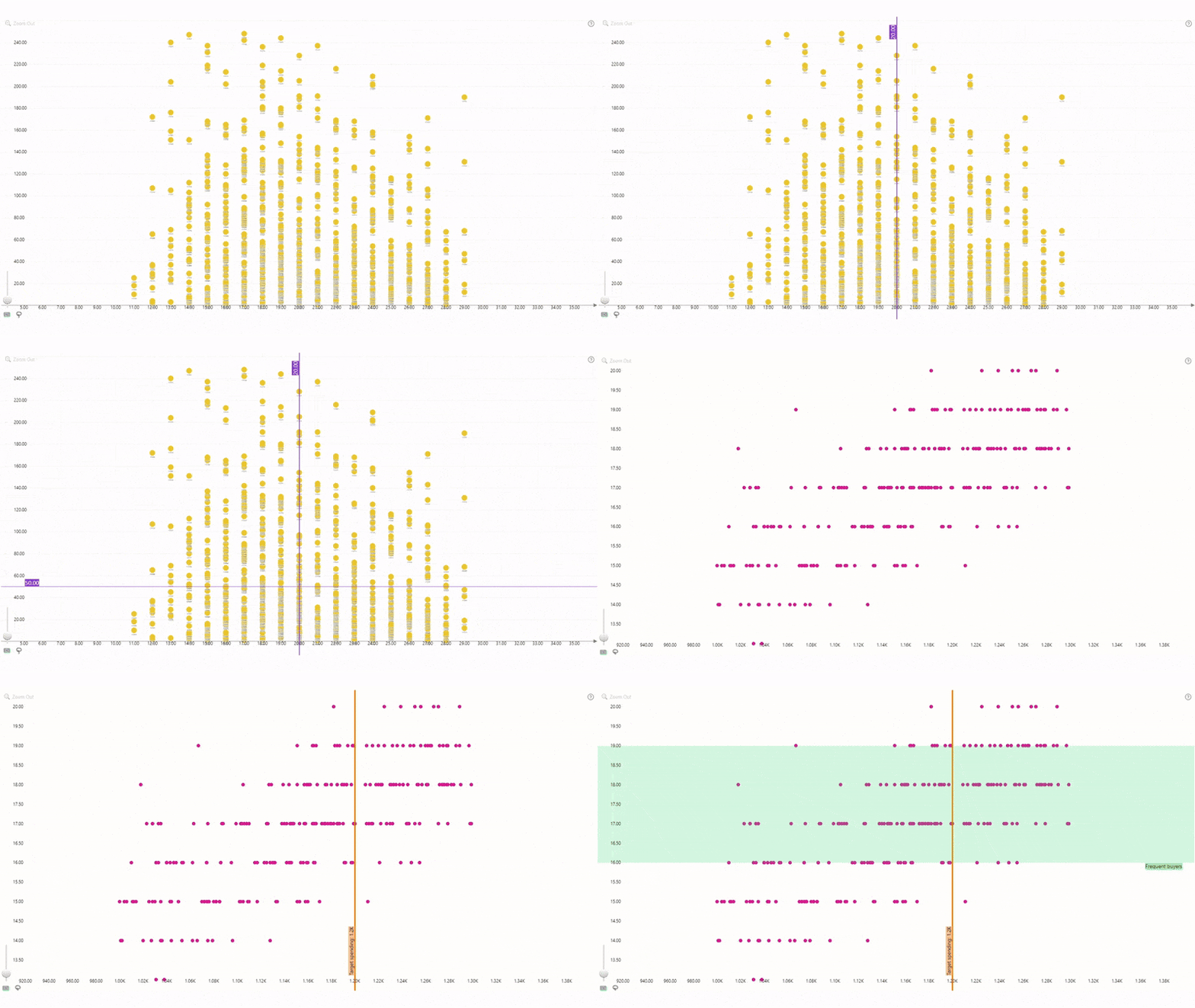
Compare your data against KPIs and benchmarks, or mark
specific value ranges with the Thresholds feature. You can enable up to eight
thresholds at the same time (four on the X-Axis and four on the Y-Axis) and
customize each threshold independently, including:
- Threshold type: choose between a line that’s displayed on a single value, or an area with color fill between two values.
- Value type: Enter a constant value manually or choose a dynamically calculated value derived from your data (First, Last, Minimum, Maximum, Average, Median, Percentile).
- Line or area appearance: Customize the line or area fill color and transparency, line thickness, and layering order.
- Label: enable or disable threshold label and customize its content (custom text, value, or both), font and appearance.
You can enable and customize each threshold in the Thresholds sections of the Format Visual tab (separate for Y and X axis).

Was this helpful? Thank you for your feedback!
Sorry about that.
How can we improve it?