
Written by the ZoomCharts team. ZoomCharts Drill Down Visuals are used in Power BI reports across more than 25,000 organizations worldwide. Originally published: October 2025. Updated: May 2026.
Jonathan is a Chief Data Officer at a large global enterprise. A year ago, he led the project to transition their entire data infrastructure to Power BI. He championed the investment to the board with a clear promise: centralized data, better governance, self-service analytics, and more employees making data-driven decisions.
A year later, the finance department still runs their books in Excel. Marketing manually compiles campaign stats from separate platforms. Sales operates on instinct. And the board has not touched a single report, preferring two-sentence email summaries instead.
If you recognize Jonathan, this article is for you. Poor Power BI adoption is the most common reason BI investments fail to return their value. We will cover the three specific causes, with the research that explains why each one matters and the specific fixes that actually work.
of employees actively use BI and analytics tools on a regular basis. Active usage remains concentrated among analysts and power users.
BARC, 2022, confirmed by Gartner, Microsoft and Salesforce 2023 to 2025
of employees avoid or minimize use of a tool after a single negative first experience. 41% increase usage after a positive one.
of employees feel overwhelmed or unhappy when working with data. Many respond by avoiding it entirely or finding manual workarounds.
Accenture and Qlik, 2020, supported by DataCamp 2023 to 2024
of executives say culture and people, not technology, are the main barrier to becoming data-driven. This figure has grown more relevant since 2024.
Wavestone, 2024, aligned with Gartner 2023 to 2025
three-year ROI from Power BI when it is actually adopted, across a Forrester study of 63 companies. Payback period under six months, with ROI increasing each year. Organizations that do not solve adoption never reach this number.
Forrester: The Total Economic Impact of Microsoft Power BIPower BI adoption is the rate at which employees across an organization actively use Power BI reports and dashboards as part of their regular decision-making workflow. High adoption means users open reports independently, explore data without assistance, and act on the insights they find. Low adoption means the investment in data infrastructure, licensing, and report development produces no measurable business outcome because the reports are not being used.
Power BI adoption fails for three reasons: the data foundation is unreliable and users cannot trust what they see; there is no cultural leadership visibly driving data use; and the reports themselves are too difficult to navigate without instruction. Of the three, poor report UX is the most immediately fixable through better report design. The other two require systemic change but the third can be addressed in the next report you publish.
Why Power BI Adoption Is Your Most Important ROI Metric
Business intelligence is expensive. Round up the initial investment in data infrastructure, transition costs, and onboarding, then add recurring licensing and cloud capacity costs, and the number is significant even before any analysis is run. Power BI is considerably more cost-effective than its main competitors, but it is still a meaningful investment that requires justification.
The Forrester study above found 366% Power BI ROI over three years across 63 companies. That ROI came from reduced costs, better productivity, time savings, and a direct increase in revenue. The payback period was under six months and the return grew each year. But there is a critical condition buried in the headline number: it requires actual adoption. Organizations in the study that drove high user engagement realized the full return. Those that did not never reached it.
Think of it as a conference room that was fully renovated at significant cost: new furniture, AV equipment, video conferencing, but that no one books for meetings. The investment is made. The value lies dormant. The same dynamic plays out in every organization where Power BI is deployed but not used: the data infrastructure runs, the licenses are paid, and the reports exist. But the decisions are still made from Excel exports and gut instinct.
If your Power BI user adoption rate is below 70% of target users, the three reasons below explain why. Each has a specific fix. Each has a specific fix.
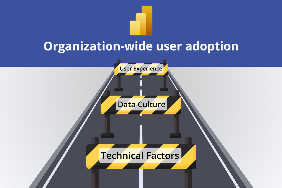
Reason 1: Poor Data Foundation Destroys Adoption Before It Starts

Every organization with high Power BI adoption rates has one thing in common: the back-end works. The data is clean, accurate, and up to date. There are no performance errors, no confusing access denials, and no calculations that return different results depending on who runs the query.
This matters because the end user interacts only with the front-end, the reports and dashboards, but has no visibility into or control over the back-end. When something goes wrong, they have two options: submit a support ticket and wait, or quietly stop using the tool. The second option is far more common than most organizations realize.
Slow queries cause user frustration and wasted time. If clicking a filter triggers a 10-second wait, users learn to avoid clicking. The report gets checked less often, then not at all.
Improperly configured permissions produce "No access" errors and force users through access request workflows. Each friction point erodes the habit before it forms.
If a report returns numbers that do not match what the user expects, they will not trust it, and they will stop using it. Inconsistent KPI definitions, missing data, and calculation errors are adoption killers that no UX improvement can overcome.
Technical problems have technical solutions, and fixing them produces immediate adoption gains. For performance, identify slow queries and summarize data at the appropriate grain before it reaches the report layer. For access, use Microsoft Entra ID to configure row-level security and communicate clearly to users what they are permitted to see. For data quality, implement robust ETL processes, enforce consistent KPI definitions across datasets, and validate model calculations and relationships before publishing any report. A solid data foundation does not guarantee adoption, but a weak one makes adoption impossible.
What this looks like when it is right: a report that loads in under two seconds, returns consistent numbers regardless of who is running it, and never shows an access error to a user who should have permission. Users form trust on the first open. That trust is the foundation every subsequent adoption effort depends on.
Reason 2: No Data Culture Means No One Leads by Example

Behind every successful Power BI rollout is a deliberate effort to create a data culture: an environment where the first instinct when a business question arises is to look at the data. This culture does not emerge automatically when a new tool is deployed. It has to be built, and it has to start from the top.
Power BI adoption behaves like an avalanche: as more people start using data for their daily decisions, more will follow. They see colleagues benefiting from it. They notice that managers reference data in meetings. They feel the social pressure of being the only person still working from a spreadsheet. The reverse is equally true. An employee who receives a vague "we encourage you to use the new tool" email, sees no one around them using it, and receives no guidance will default to what they know.
The phrase "if you build it, they will come" has never been true for enterprise software. Deploying Power BI and waiting for organic adoption is not a strategy. It is a gap.
A Power BI adoption strategy requires three components working together. Data literacy: employees need enough knowledge about data to correctly interpret what they see. This requires a structured program, not just shared links to documentation. Data culture: change must come top-down. When the board, department heads, and managers visibly use data in their decisions and reference Power BI reports in meetings, their teams follow. Onboarding: provide focused, role-specific training rather than generic feature walkthroughs. A sales manager and a finance analyst need different entry points into the same platform. Microsoft's Fabric Adoption Roadmap is the most comprehensive publicly available resource for building a structured adoption program.
What this looks like when it is right: the weekly leadership meeting opens with a Power BI dashboard on screen. The department head references a specific chart when making a budget call. A manager sends a report link instead of a summary email. These visible acts of data-driven leadership do more for Power BI adoption than any training programme.
Reason 3: Poor Report UX Is the Most Fixable Adoption Problem

Even when the data is clean and the culture is supportive, adoption still fails if the reports are poorly designed. Users interact with Power BI through its front-end: the reports and dashboards they open on screen. If that experience is confusing, slow to navigate, or requires training before anything useful is visible, Gartner's 40% figure above explains what happens next: they avoid the tool and find manual workarounds.
Report design is not a luxury or a "nice-to-have." It is the primary mechanism through which most users form their opinion of Power BI. A user who opens a report and immediately finds the answer they needed will open it again tomorrow. A user who spends five minutes configuring filters before seeing anything useful will not. The entire adoption outcome hinges on that first experience.
The specific UX failures that cause report abandonment are consistent across organizations and roles. They are not random. And because they follow a pattern, they have a structured solution.
The 4U Reports Framework: A Design System for Adoption
The 4U Reports framework is a Power BI report design methodology built around four user-centered stages that address the specific UX failures which cause abandonment. Each stage targets one failure mode. Together they create a chain from attention to decision.
How ZoomCharts Implements the Uncovering Stage
The third stage, Uncovering, is where most report builders struggle. Cross-chart filtering in standard Power BI visuals has limitations, and building true drill-down hierarchy across multiple connected dimensions requires significant development effort. ZoomCharts Drill Down Visuals implement this pattern as a ready-made component set: every click simultaneously applies a page-wide cross-filter and drills one level deeper in the hierarchy, with up to nine drill levels per visual.
Click to open the live demo. Every selection instantly updates all other visuals on the page.
The practical effect on adoption is direct. A sales manager who clicks a territory bar and sees the rep leaderboard, deal timeline, and product breakdown all update simultaneously does not need to be told to use the report. The report just showed them something useful. That is the mechanism behind the Gartner 41% figure: a positive first experience creates a usage habit. A well-designed 4U Report is engineered to produce that positive experience for every user, every time.
Browse live 4U Report examples and download ready-to-use templates in the ZoomCharts Report Gallery.
Apply the 4U framework to every report before it is published. The test for each stage is simple and takes under five minutes: can a user find the primary answer in three seconds without clicking? Can a new user navigate without guidance? Does every click reveal something useful without requiring filter setup? Can the user state the insight in one sentence within ten seconds of reaching it? A report that passes all four tests will be opened again. That is what adoption looks like at the design level.
If you recognize Jonathan, we can help.
If all three problems in this article apply to your organization, and you would rather solve them with expert help than start from scratch alone, ZoomCharts Power BI Services works with enterprise teams to close the gap between investment and outcome. From semantic model design and data infrastructure to 4U Report development and adoption strategy.
Talk to us about your Power BI adoptionKey Takeaways
- Adoption is the primary ROI metric for Power BI. The Forrester 366% ROI figure assumes active use. Organizations that do not drive adoption never realize it. If fewer than 70% of target users open reports regularly, the investment is not paying off.
- A poor data foundation makes adoption impossible. Clean data, reliable performance, and correctly configured access controls are the prerequisite. Technical problems have technical solutions. Fix them before addressing anything else.
- Adoption is cultural before it is technical. It must be led from the top. When board members and department heads visibly use data in decisions, teams follow. A deployment without a data culture strategy will not reach its potential regardless of how good the reports are.
- Report UX is the most fixable adoption problem. Gartner's research confirms: 40% of employees avoid a tool after one negative first experience, and 41% increase usage after a positive one. The 4U Reports framework (Unique, User-friendly, Uncovering, Understandable) gives report builders a structured methodology for producing the positive experience consistently.
- ZoomCharts Drill Down Visuals implement the Uncovering stage. Cross-chart filtering and drill-down in a single click, with up to nine drill levels. The report experience that earns a daily open habit.
Frequently Asked Questions
How do I get my team to use Power BI?
Address all three layers at once: ensure data reliability, build visible top-down leadership, and design reports that deliver a useful answer in the first 30 seconds without training. Of the three, report design is the most immediately actionable. A report that earns a positive first experience does not need an adoption campaign. The habit forms naturally. The 4U Reports framework gives report builders a structured design system for producing that experience consistently across every report they publish.
What is a good Power BI adoption rate?
A healthy Power BI adoption rate is 70% or higher among designated users. Below 50%, most of the investment in infrastructure, licensing, and development is producing no measurable outcome. For context, BARC research shows the industry baseline is only 25 to 30% of employees actively using BI tools, meaning most organizations are well below the benchmark before any deliberate adoption work begins.
Why do Power BI reports fail to get adopted after deployment?
Three reasons account for most post-deployment failures. Unreliable data: slow queries, access errors, or inconsistent numbers that users cannot trust. No cultural momentum: no visible leadership using data, no peer adoption, no structured onboarding. Poor report UX: users cannot find what they need without instruction, clicking reveals nothing, and insights are not clearly formatted. The UX problem is the most immediately fixable. It does not require systemic change, only better report design before the next publish.
Does Power BI report design really affect adoption?
Yes. Gartner found 40% of employees minimize use of a tool after a single negative first experience, and 41% increase usage after a positive one. The report is that first experience for most Power BI users. A report that is visually clear, navigable without instruction, and rewards exploration with insight earns the positive outcome. One that requires training earns the negative one. The difference is not marginal. It is the difference between a daily usage habit and a report permanently ignored after two opens.
How do I measure Power BI adoption?
Track monthly active users per report relative to the target user population for that report. A report opened by fewer than 50% of its intended users is not adopted. Power BI usage metrics are available in the Admin Portal under Usage Metrics Reports, and workspace-level usage data is accessible to workspace admins. Track three numbers: unique users per month, opens per user per month, and the percentage of target users who have opened the report at least once in the past 30 days.
What is a Power BI adoption strategy?
A Power BI adoption strategy addresses three layers simultaneously: a reliable data foundation so users trust what they see, a data culture led visibly from the top so employees follow their managers' example, and report UX designed so users can find answers without training. Microsoft's Fabric Adoption Roadmap provides a comprehensive step-by-step framework covering both technical and cultural dimensions.
What is the ROI of Power BI?
366% over three years, with a payback period under six months. That is the finding from a Forrester study commissioned by Microsoft across 63 companies. The return came from reduced costs, improved productivity, time savings, and a direct increase in revenue. The critical condition: it requires actual adoption. Organizations that drove high active use realized the full return. The ROI from a Power BI investment that is not being used is effectively zero.
Build Power BI reports that earn consistent use
ZoomCharts Power BI custom visuals are certified by Microsoft and available on AppSource. Install the free developer license and test the 4U framework on your next report. Or if you want expert help across all three adoption layers, our Power BI services team works with enterprise organizations directly.
Get the free developer license Talk to the services team See live 4U Report examples


