Feb 09, 2024
Power BI for Supply Chain and Retail Analysis: Full Guide [+ report templates]
Visualizing both supply chain and retail data within the same Power BI report sounds hard, but with planning, knowledge, and the right tools, it can be done. Learn all you need to know to create a stunning report in this article!

Visualizing both supply chain and retail data within the same Power BI report sounds hard, but with planning, knowledge, and the right tools, it can be done. Learn all you need to know to create a stunning report in this article!
We’ll delve deep into the entire process of creating a supply chain and retail analysis report in Power BI, from gathering your data sources and creating a data model, to finding the right insights and choosing the right visuals. What’s more, we will also showcase three awesome report examples with live demo and free download links! Let’s get started.
Top 3 Best Power BI Retail and Supply Chain Dashboard Examples
The best way to get inspiration is by exploring similar reports from other creators. Our website has a dedicated Report Gallery section where you can try live demos and download a wide variety of Power BI reports, created with ZoomCharts Drill Down Visuals.
We regularly get involved with the Power BI community by co-hosting report challenges where creators compete for the grand prize by finding the best ways to visualize the same dataset. The FP20 Analytics Challenge had more than 50 report creators who worked with a supply chain and retail sales dataset. We’ll highlight the Top 3 reports from this challenge and explore what made them great and what clever ideas you can borrow from them.
Report #1: North America Retail Supply Chain and Sales Analysis by Sushree Jena
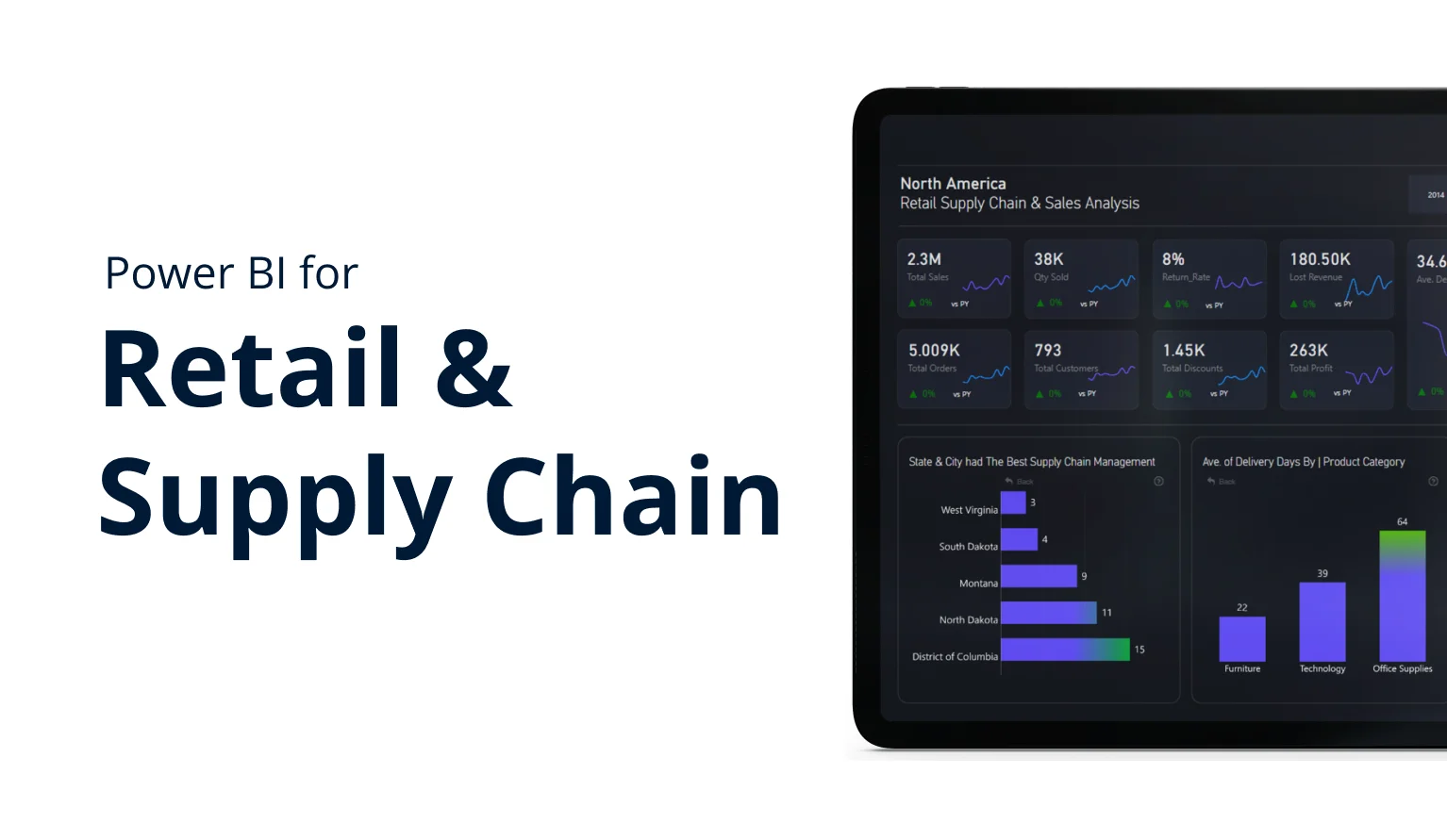
Among all Power BI supply chain dashboard examples in this competition, ZoomCharts and FP20 Analytics teams selected this one as the winner. With a consistent and visually appealing color scheme, carefully selected and placed visuals, and smart design and UI choices, this report serves as a great example of using Power BI for retail.
The first page shows an overview of the most important metrics, allowing the user to immediately get valuable insights at the first glance. Regional data and the full table of orders are neatly placed in separate tabs for quick access when needed.
Data can be filtered by interacting with the visuals or using the buttons on the left side of the report, which makes data exploration simple intuitive. We would also like to highlight the clever use of the Info button on the bottom left corner. Pressing it shows a helpful tutorial overlay that explains how to use the report and how to read the data.
If the user needs to perform a more thorough analysis, the second page has a large scatter plot and three line charts that compare two metrics each. By clicking the selectors on the sidebar, you can choose which values are displayed on the scatter plot, and what dimensions are used as the X and Y axes.
Report #2: Retail Supply Chain & Sales Analysis by Toni Hewlett
This retail supply chain Power BI dashboard is designed with simplicity and ease-of-use as the main focus. With a compact ribbon of KPI cards and just four visuals on the first page, it shows the most important insights without overwhelming the user. You can filter data across the entire page by interacting with the Drill Down Visuals, or by using slicers that are neatly hidden in a hamburger menu on the top right corner.
If you need to delve deeper, the second page has more visuals – a map chart that shows the most successful sales locations and the most popular shipping modes per each area, two column charts of the Top 5 most and least profitable customers, and a bar chart that juxtaposes the total sales of each salesperson with their return rate.
Note how the bar chart on the first page displays sales and profits on top of each other, allowing you to directly compare these two values and quickly see which product categories have the largest profit margins. This effect can be achieved using the Zero-Based Stacking mode of the Drill Down Combo PRO, Combo Bar PRO, TimeSeries PRO, and Timeline PRO visuals.
Report #3: Retail Supply Chain & Sales Analysis by Wejdan Alalawi
A study by Google found that it takes less than 50 milliseconds for users to shape a first impression. That’s enough time to fall in love with the sleek and eye-catching visual design of this report. It looks simply gorgeous!
Thankfully, it’s not just eye-candy: the initial view provides quick insights into key metrics and trends by using neatly structured KPI cards and sparklines. The three visuals (Combo PRO, Combo Bar PRO, and Donut PRO) provide a deeper look into delivery times per location, product category and market segment. You can filter data with the visuals, the slicers on the left side, and by selecting a specific year with the buttons at the top.
If you want to explore even more data, the second page of this report has tables containing the Top 5 fastest and slowest products by average delivery speed, a donut chart with return rate per each shipping method, a bar chart that shows which salespeople have the highest return rate, another bar chart of most profitable customers, and a scatter plot.
Even though this report is mostly focused on the delivery side of the supply chain, there are a lot of nifty design ideas you can borrow for your next report. We especially loved the way that conditional formatting was used to put a subtle color highlight on the columns or bars with the highest value.
About this Retail Supply Chain Dataset
The sample dataset for this competition featured sales data for a North American retail network. Each order (identified by a unique ID) had data in adjacent columns for order and ship dates, shipping mode, location data (with country/region/state/city/postal code columns), and the name of the salesperson.
Customers were identified by name and their unique ID, and they were categorized into segments (consumer/corporate/home office). Each order also had columns for the product name and SKU, ordered quantity, product category (furniture, office supplies, etc.), and subcategory (chairs, tables, etc.); in addition to the total price, applied discount, and profit, and a yes/no column for the return status.
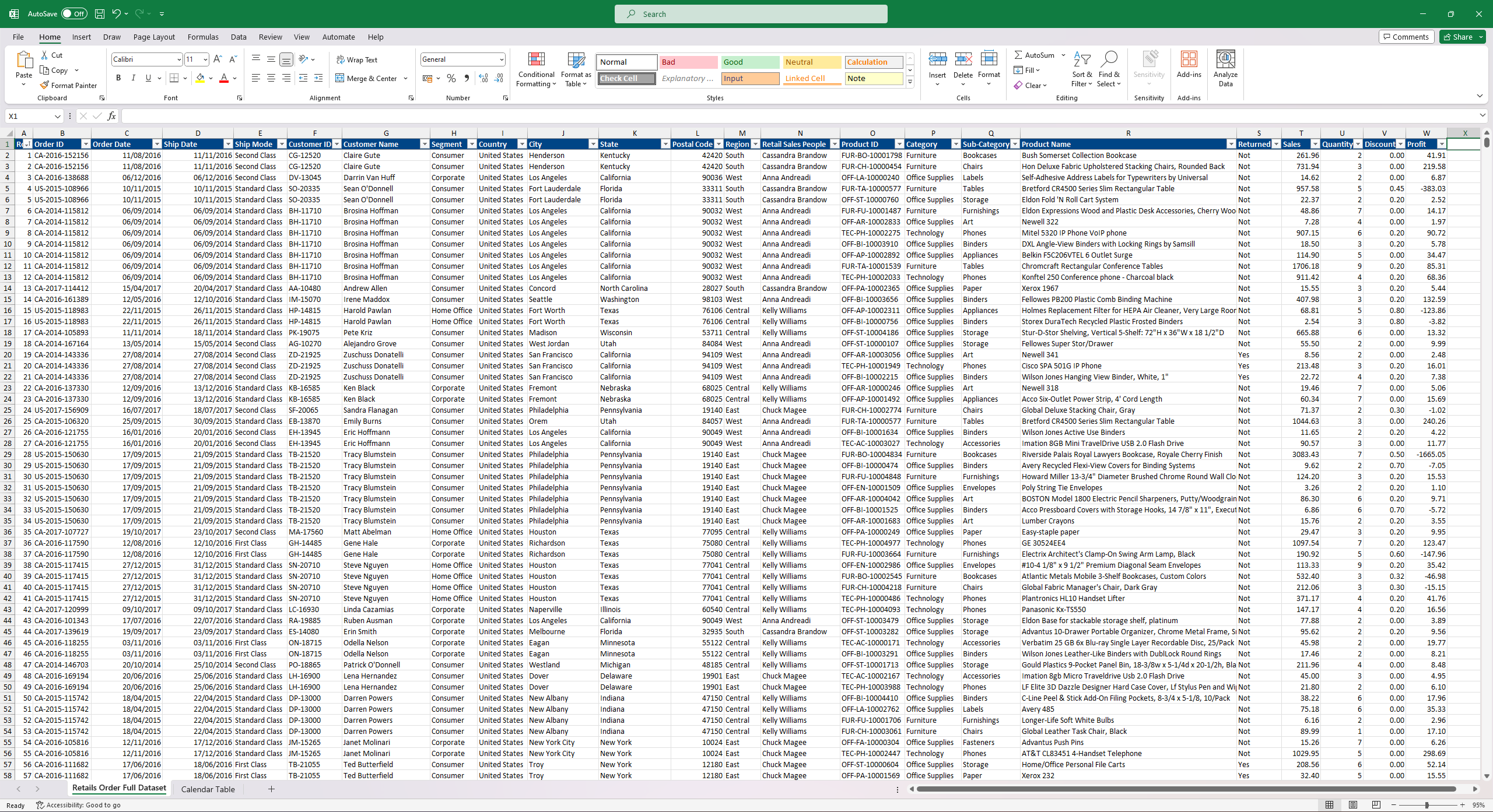
You probably started thinking about what you would do with this data and imagined the links between different columns to visualize insights. For example, using the Return and Product ID columns to find out which products have the highest return rates; or maybe finding the highest-performing salespeople per each month (using Retail Sales People and Profit columns and filtering by Order Date) to see who’s got a bonus waiting for them.
Each report creator will have their own approach, which is why report creation challenges are so exciting – you get to see so many unique methods and fresh ideas, and no two submissions are the same. Browse all 52 submitted reports on the contest page!
What is Retail & Supply Management Report in Power BI
You can use Power BI for supply chain data, and you can use Power BI for retail analytics. So, why on Earth would anyone want to combine both in the same report? It’s going to be slow to open and explore, and each report page is going to be crowded with visuals and confusing to read, right?
Maybe in the past, but not anymore. Power BI is an incredibly efficient and powerful platform, and processing even the most complex data models with it is a breeze. Add cutting-edge data visualizations to the mix, and you’re looking at reports that can be dense with insights without any compromises on the user-friendliness and readability. The best Power BI reports can be as easy to use as a regular smartphone app, making them accessible to any user regardless of their prior experience with business intelligence tools.
Knowing this, many businesses are starting to create all-in-one reports that visualize the entire supply chain and retail infrastructure. For companies that utilize modern management processes such as JIT (Just-in-Time) or other tightly integrated methods, it’s handy to have a bird’s eye view of the entire chain and see how each step directly affects others. For example, by identifying manufacturing delays, retail managers can anticipate shortages and distribute stocks to retail locations appropriately.
Retail and supply management reports basically consist of two widely used Power BI report types that are combined into one for easy access and deeper insights:
- Power BI Supply Chain Dashboard: shows data about suppliers, manufacturing facilities, logistics and storage.
- Power BI Retail Dashboard: shows data about sales and inventory in retail locations or other commerce channels.
Of course, creating such a complex report requires a lot of thought and careful consideration on the report creator’s part, and we’ll go through each step and share valuable tips to help you build effective and actionable supply chain and retail analytics reports in Power BI.
Data Sources for Power BI Retail & Supply Management Analysis
The Power BI report that you are creating will visualize the entire journey of your product or service, from the factory line all the way to the customer’s shopping bag. Thankfully, each step along the way leaves a trail of data, which you can use to build a comprehensive data model that will serve as a solid foundation for the report.
Start by taking out a notepad and a pencil and sketching out each step. Where is your product manufactured? How is it transported from the factory to the warehouse? How is it delivered from the warehouse to the retail location? Do you deliver directly to the customer (and how)?
Creating a map of this process is an important starting point to identify possible sources for your data model. Afterwards, you can start thinking about what kind of data is produced at each step and how you can integrate it in your data model. Here are some possible examples.
Of course, each business is different, and the data that’s available to you will differ depending on the data policy within your company, its business model, industry, and the nature of your supply chain and retail infrastructure. That’s why it’s a great idea to have a friendly chat with key people at each step, such as supply chain or retail managers, to gain more insight into the process.
Once you have understood the kind of data you can work with, it’s time to add all these data sources to Power BI and create a data model. Having them all in one place will allow you to build a retail and supply chain report that allows the user to explore the entire situation, not just one limited portion of it.
In any case, that’s a lot of data, and not all of it will be relevant to the user, so you will have to decide what to put in your report and what to leave behind.
Conversely, there may be some insights that are not readily available in your data set, and you may need to do some creative thinking to fill the gaps with some clever DAX tricks or calculated columns. After all, there are two types of people – those who can extrapolate from incomplete data, and…
In these cases, simply look at the data you already have, and think how you can use it to get the answer you need. For example, with the DATEDIFF function you can determine how many days it takes from one timestamp to the other (such as time between date of manufacture and successful sale); which you can then use to calculate the average time for each product and find outliers. It’s just one example that shows that you can find answers even when the data is not as perfect as you wish.
If you want to learn more about working with supply chain and retail data, you should watch this webinar recording where Aivis from ZoomCharts and Federico from FP20 Analytics share their most useful tricks when working with this kind of data. Check it out below, and don’t forget to subscribe to our newsletter (using the form right below this article) to not miss any future articles, webinars, and report competitions!
Who Uses Power BI for Supply Chain and Retail Analytics, and How?
It’s always worth reminding that reports must be designed for the user. You, the report creator, know the data inside out – after all, you built the data model and made the report! You understand how each value is related to others, what do the numbers mean and how to find what you’re looking for.
However, for the user, this report is the medium between themselves and your data; it’s a tool that they use to find answers to their questions. Ideally, they want to take away meaningful insights already at the first glance and have an easy and intuitive way to explore specific data in closer detail. They don’t want to spend time sifting through heaps of data just to find something that’s relevant to them or learn a UI that’s completely alien to them.
That’s why it’s important to design your Power BI supply chain and report dashboard or report with the user as the main focus. Firstly, the user experience must be seamless and user-friendly to eliminate any potential frustrations – because if the user becomes frustrated, they will be less likely to even engage with your report. Conversely, a visually pleasing report with smooth and intuitive user interactions will practically invite the user to explore data in detail.
Read more about report design in this article: “Top 5 Power BI Report Design Mistakes You Should Avoid”
Secondly, remember that any visual, slicer or table that doesn’t provide relevant answers or enhance others with additional context is something that takes away the user’s attention or may even confuse them. So, before you start building your retail and supply chain analysis report in Power BI, ask yourself the following two questions:
- Who will use my report?
- What problems are they looking to solve with my report?
Comedian Ricky Gervais once said: “If you try to please everyone, you’ll please no one”, and this adage is especially true in data visualization. Different users will focus on different data in your report, so you can cater to their needs specifically by removing irrelevant data and highlighting the most important visuals with size, color, or placement.
For example, when browsing your supply chain and retail sales dashboard in Power BI, the C-suite will usually look at the total costs and profits to get a general feel of the entire situation, while supply chain or retail managers will be more interested in minute details of each step in the process to see if it’s running smoothly and if anything needs attention.
So, find out who will use your report the most, and have a chat with them about what data is the most important to them, what answers they are looking for and what are their design and UI preferences (such as touch input, specific visuals, etc.). Once you’ve done that, you can start designing your report and look for the best ways to provide answers they’re looking for.
Here’s an example - feel free to replace our sample questions with your own. Once you know the questions, you can then start finding ways to answer them by visualizing relevant data.
Doing this beforehand will help you save your own time, and save your users’ time as well by creating a report that is intuitive and easily readable without any fluff or frustrations. As you design your Power BI supply chain and retail analytics report, feel free to ask the involved parties for feedback and make adjustments as you go!
Top 3 Tips for Creating a Retail & Supply Chain Report
The following design principles will apply to almost any Power BI report, but they are especially important when creating a complex and all-encompassing report for supply chain and retail analytics. Follow these three recommendations, and your users will appreciate the ease-of-use and efficiency of your report and they’ll enjoy using it every day.
Tip #1: Choose Your Data Carefully
As we discovered earlier, the entire supply chain and retail network produces a lot of data from a variety of sources. It is tempting to display as much data as you can in your report, we know. But just like a movie director must leave some scenes on the cutting room floor to fit the runtime, you’ll also have to make tough calls on what to show and what to leave behind when creating a report in Power BI for supply chain and retail analysis.
Your screen space is limited, which means that every pixel on a report page must count. Each visual or other report must serve the same goal – building a cohesive data narrative and providing value to the user.
Does this visual answer the user’s questions or add context to other visuals? If you said no, then it must go.
We already discussed involving your users and their requirements in the design process, but we’d like to add that the data that you need to visualize in your reports will also be affected by the nature of your business, supply chain design, and your sales strategy. Some industry-standard metrics may not be relevant to your business at all, or, conversely, you may need to focus on things that are unique to you.
Here’s an example – when using Power BI for retail, many report creators often include a bar or column chart that shows Highest Income per Client. This may be relevant if you have a lot of returning customers that make large purchases (especially in B2B); and this data can be used to pinpoint focus on maintaining relationships or adjust buyers’ personas.
However, if your revenue is created by a large volume of small purchases, data about individual clients will not be that relevant and you may want to focus on other, more general metrics instead. By thinking similarly about every data column and how it relates to your operations, you can create more focused reports that will make it easy for users to efficiently analyze the supply chain and retail data.
Tip #2: Use the Correct Visuals for Your Data
You’ve got the data – now it’s time to decide how to visualize it. There are so many different visuals, each with their strengths and weaknesses, so you’ll have to pick visuals that are best suited for your purpose. This is important because the right visuals will make data easy to read and simple to understand, but poorly chosen visuals will make your report confusing and may even lead to misleading conclusions.
We’ve previously explored the most popular chart types and discussed their pros, cons and use-cases in our article: “Power BI Chart Types: Choosing the Right Visuals for Your Data”, so check it out if you want to learn more! We’ll now briefly go through some chart types that are the most likely to find their place in a retail and supply chain Power BI dashboard or report.
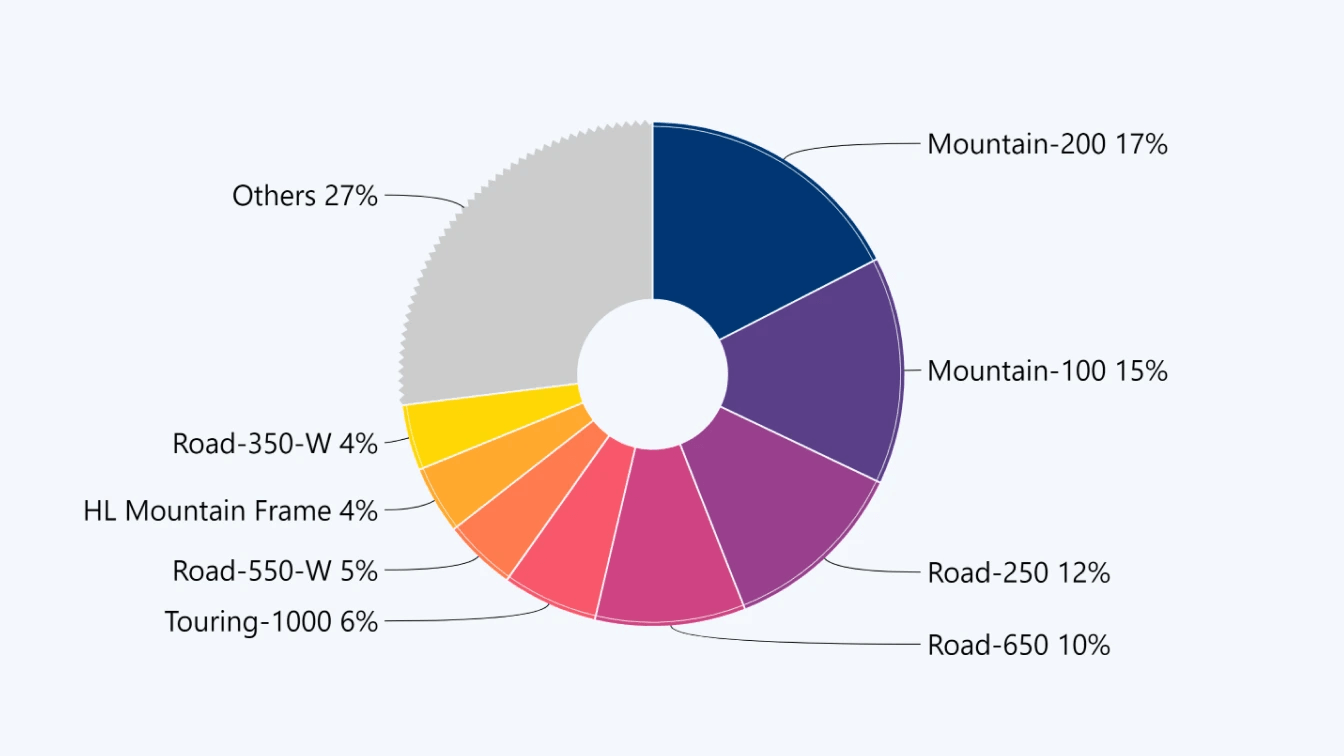
Pie & Donut Chart
Familiar to almost any user and provides quick insights at a glance. Best used to visualize percentages or proportions. Interactive pie/donut charts can also work as a filtering or navigation tool for other visuals. Drill Down Pie PRO and Donut PRO can also feature up to 9 levels of drill down.
Example data: Sales percentage per region, product category, etc.Total inventory distribution per each warehouse.
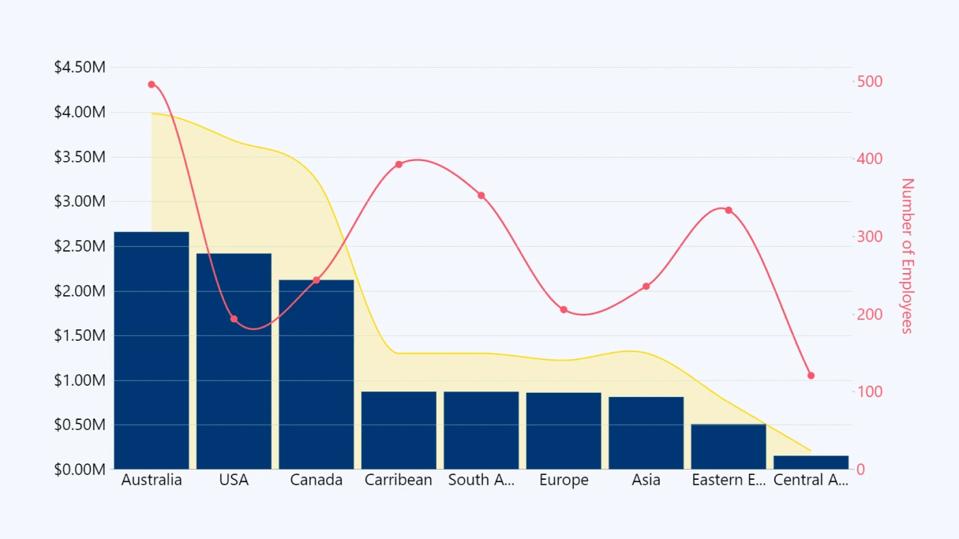
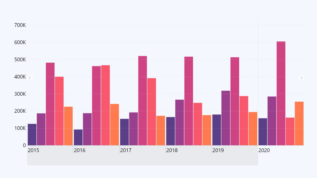
Combo Chart
Displays numerical values as columns, lines, or areas. Most visuals provide just one of these chart types, but Drill Down Combo PRO can mix and match all three. Can be used to accurately compare numerical amounts between multiple categories. You can also stack multiple values on top of each other to see combined values or use different stacking modes for unique use-cases (such as overlaying two columns to visualize target vs. actual).
Example data: Units per product type (at any stage, e.g. manufactured, inventory, sold, etc.), revenue per product type, etc.
Time Series Chart
Similar to combo chart (with column, line, and area charts), but the X-axis has a time scale instead of categories. Best used when comparing changes in numerical values over time. Drill Down TimeSeries PRO (or Timeline PRO if you need a custom time unit hierarchy and DAX measures) will also automatically aggregate data and allow users to quickly drill down.
Example data: Yearly/monthly/daily manufacturing output, shipments, sold units. Changes in demand; peak days or hours.
Waterfall Chart
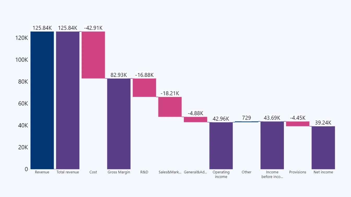
This chart type differs from combo charts by visualizing data as a sequence. Waterfall charts have a very specific niche, and in Power BI supply chain and retail analytics reports they will most likely be used to add up the costs at each step (manufacturing, logistics, storage, retail) and arrive at the COGS and/or the final retail price. With Drill Down Waterfall PRO, users can easily drill down with just a click.
Example data: COGS (cost of goods sold).
Map Chart
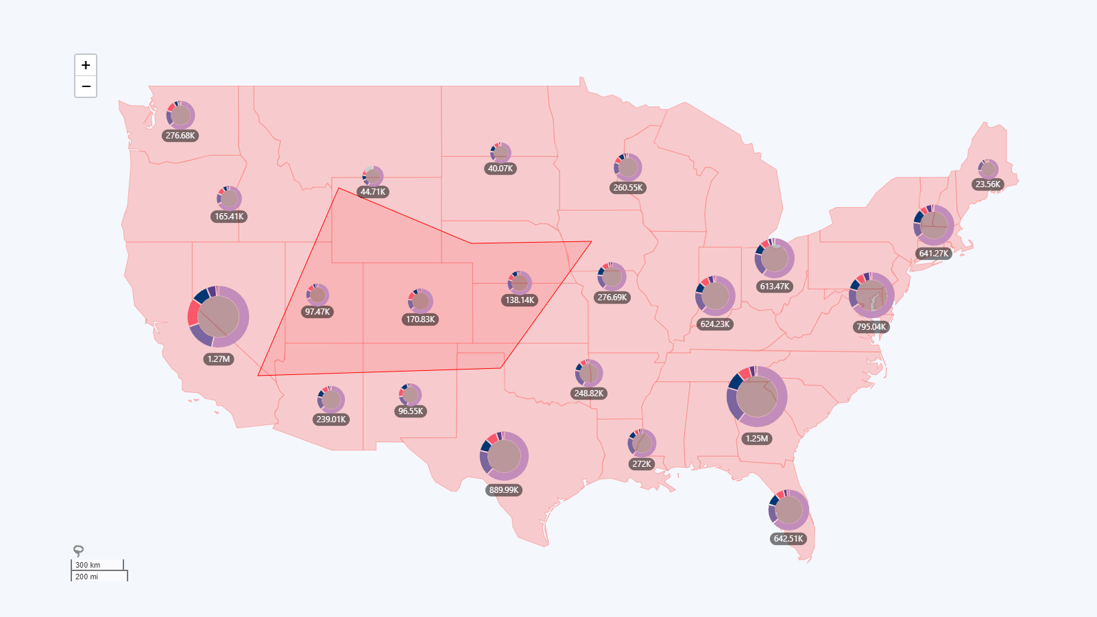
With an interactive map chart, you can give a geographic context to your data and make it easy to browse and filter data across different manufacturing facilities, warehouses, or retail locations on a global, regional or city level. Drill Down Map PRO can also cluster multiple values in a region and display them as a donut chart directly on the map.
Example data: Product output per facility, inventory per warehouse, sales per retail location, online orders per region.
These are just some of the most popular visuals in Power BI for retail and supply chain analytics, and we invite you to think carefully about the larger data narrative and thoughtfully choose the best visuals for the job.
Don’t forget that with cross-chart filtering, multiple visuals can work together and extract even more value! For example, an interactive map chart can also act as a geographic filter, and when the user clicks on a specific location, other charts can apply the same filter to show data that’s relevant to that area. Similarly, by selecting a specific range on the time series chart, the entire report can drill down to data within that time period.
All ZoomCharts Drill Down Visuals support cross-chart filtering, allowing you to find creative new ways to weave engaging data storytelling narratives.
Learn more about thoughtfully implementing drill down in Power BI reports by reading our article: “Power BI Drill Down: The Ultimate Guide”
Tip #3: Focus on Usability
This is what determines if your report will be something that the user reluctantly browses for a bit and then puts away, or actively explores before making each decision. You, obviously, want the latter, which is why your reports must make a good first impression and provide a consistently great user experience that doesn’t distract the user with any frustrations or annoyances.
Your choice of visuals is step one in creating a great user experience, and our Drill Down Visuals are designed to provide intuitive and user-friendly interactions for exploring data. Users can drill down to access more insights by simply clicking or tapping directly on the chart, which will allow users of any experience level to quickly find answers they’re looking for.
Furthermore, you can create a consistent appearance across the entire report, and thoughtfully incorporate colors and shapes in your data storytelling, by exploring the wide range of customization features built within each of our Drill Down Visuals.

Another important factor you should consider when making your retail and supply chain Power BI dashboard or report is the way your users will access them. While the C-suite usually works from their office computers, retail managers may often be on the move to physically visit each location.
This means that they are likely to use a tablet PC to access data, and you will need to ensure a great user experience for touchscreens as well. Drill Down Visuals are designed for mouse + keyboard and touch input alike, providing full feature parity for both input methods.
Key Takeaways
We explored three great Power BI reports for retail supply chain analysis, and each showed how different creators can have a completely unique approach to visualizing the same data. We also shared insights about the entire process of building this kind of report, which can be summarized by three important points:
- Carefully plan and research before designing the data model and creating the report itself.
- Talk to your main report users to gain insights on what answers are important to them.
- Create reports that provide great user experience and caters to the users’ needs.

Want more info like this?
Subscribe to our newsletter and be the first to read our latest articles and expert data visualization tips!
