Sep 24, 2025
Excel vs. Power BI for Finance Reporting
Which is better for finance analysis in 2025 - Power BI or Excel? What are the most important things you need to know if you make the switch ? This article explores the pros, cons, and important tips for Power BI in finance.
Which is better for finance analysis in 2025 - Power BI or Excel? What are the most important things you need to know if you make the switch ? This article explores the pros, cons, and important tips for Power BI in finance.
If we were to rank which facet of a business has benefitted the most from technology, finance departments would be at the top. Just take a look at this old-school advertisement for Microsoft Excel from 1990 – things that we now take for granted, like autofill and formatting, are presented as total game-changers (because back then, they were).
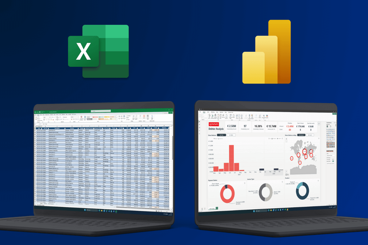
But it has been more than three decades since then. While many small and medium sized businesses still base their entire operations on Excel spreadsheets, we now have various advanced business intelligence tools, with Microsoft’s Power BI at the forefront.
However, while adopting Power BI has been a no-brainer for various parts of the business, like sales, marketing, or supply chain management, finance analysts are a bit more reluctant to change their workflow and often stick to the tried-and-tested Excel, sometimes with a bit of help from Power Query.
Is Power BI good for finance analysis? What are its pros and cons; should you take the leap? What are the things to keep in mind when using Power BI for finance? Let’s find out!
Reasons to use Power BI for Finance Reporting
Any change in your existing workflow is daunting. Not just the buy-in, but also learning the new tools, moving your finance workflow to the new platform, and getting used to the change. So it better be worth it. Here are the main benefits of using Power BI for finance.
Better Integration of Data Sources
As we mentioned before, Excel already supports Power Query for integrating multiple data sources and automating data transformation. With that, Power Pivot, and a bit of knowledge, you can create surprisingly robust analytics workflows – all within Excel, the deceptively simple spreadsheet app that can be found in more than 750 million office PCs worldwide.
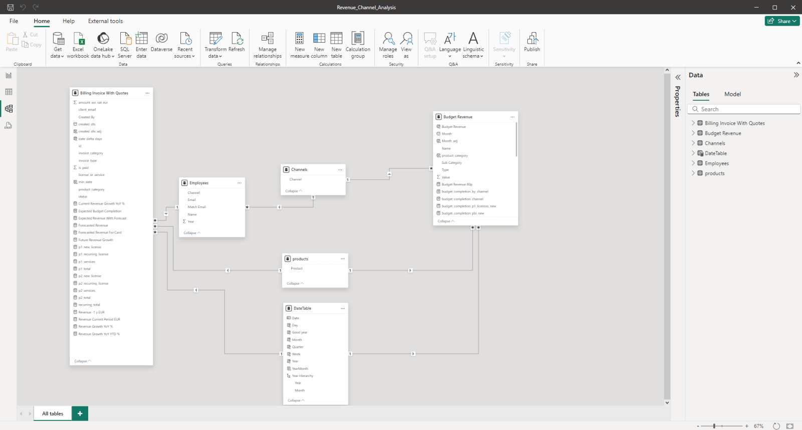
But Power BI takes it to the next level. It is built ground-up to integrate a wide variety of data sources, from Excel sheets and SQL databases to large data warehouses and lakes, and even third-party services with the use of connectors.
Power Query handles ETL here as well, but it is tightly integrated within Power BI and provides more capabilities: larger datasets, more complex schemas, more powerful calculations, and even real-time updates if need be. It is also much faster when handling large datasets.
Data Visualization & Exploration
The main benefit of Power BI for financial analysis is that it’s an all-in-one solution. It’s not just the place where you crunch the numbers – it can also visualize them, all within the same platform. And not just as static tables or charts, but as interactive reports that stakeholders can easily and intuitively explore.
This allows you to not just show the financial statement as plain numbers but also explore it deeper to find underlying reasons or spot trends and correlations. Yes, we had a surplus in Q2 and that’s a good thing, but… why?
Power BI reports allow the user to find on-demand insights by drilling down, filtering and slicing to find pinpoint insights. Whereas the old-school way is producing a financial statement and sending it as PDF, with Power BI, you can present data in a way that allows CFOs, CEOs, and other stakeholders to find insights they need on their own.
At this point, we must mention our Drill Down Visuals, which take this concept even further – they are designed to make data exploration as intuitive as possible, and to drill down, user can simply click directly on the chart itself. As you interact with data, other visuals will instantly cross-filter to show relevant insights.
Ease of Adoption
Of course, one of the biggest challenges of adopting a new platform is buy-in. Even if you have found an incredible tool that will make your work more efficient, how do you convince your company to invest in it? Power BI tackled this in a very clever way, which is one of the main reasons for its market dominance in the business intelligence industry.
Power BI is included in the E5 tier of Microsoft 365. So, if your business already uses Teams, Office, Azure and other Microsoft services, then adopting Power BI is not just cost-effective, but also smooth thanks to its seamless integration with Azure, SharePoint, Active Directory and other Microsoft cloud services. Furthermore, Power BI’s data analysis and visualization capabilities are useful not just for finance departments, but also other parts of the organization.
Basically, if your organization has access to Power BI and is already using it elsewhere, then it makes sense to try it out for finance analysis purposes as well to gain its benefits. While it has a bit of a learning curve, many of your Excel skills, including Power Query and DAX, will be transferable to Power BI and it will be more familiar than it may seem at first glance.
Power BI Desktop is free (and so is the Developer License for ZoomCharts visuals!), so you can simply install it and try it out on your own machine – and upgrade to a higher tier if you want to publish your reports to the team or access them from web.
Power BI Drawbacks for Finance Reporting
Of course, there are certain reasons why many finance analysts still swear by Excel, instead of switching to a modern BI platform like Power BI.
Learning Curve

When you have spent years, even decades using the same tool every day, you learn it inside out and know where everything is and how to make it do what you want it to do. And suddenly switching to a new platform is a daunting task – the benefits must be worth the time and resources spent in learning it.
Every BI platform will have a learning curve, and you will have to spend some time to get back up to speed and do everything you used to do with Excel and more. That being said, what speaks in Power BI’s favor, especially compared to other BI platforms, is that you won’t have to start from scratch. PowerQuery (and maybe even DAX) will be already familiar to many finance analysts, and you can use your Excel knowledge as a great starting point to learn more about Power BI.
Power BI’s popularity also means that there’s no shortage of great learning resources, courses and certificates. We have compiled them in our article “27 Best Power BI Training Resources”, but if you want to learn more about DAX specifically, check out our article “12 Essential Power BI DAX Formulas Every Report Creator Should Master” as well!
Data Entry Complexity
One of the biggest differences that you will notice after switching from Excel to Power BI is when adding new data or making edits to an existing table. This stems from the fact that while Excel is a spreadsheet tool that has gradually expanded with more capabilities, Power BI already started out as an ETL back-end with a visualization front-end.
While Power BI, without any doubt, is more capable, it’s also not as simple as Excel: you can’t simply open the table and add a new row or simply write over an existing cell. Any permanent changes will have to happen in the data source itself. On the flipside, it also means that data is consistent, centralized, up-to-date, and tamper resistant.
Company-Wide Buy-In

Previously, we discussed the ease of adoption if your organization already is immersed within Microsoft’s ecosystem, and maybe even already uses Power BI – in those cases, moving your finance workflow to PBI is an easy decision. But if that’s not the case, it will be a different story.
Even though Power BI is more cost-effective than other business intelligence platforms, it will still require a lot of work to fully set up the back end (dataflows, modelling, governance etc.). It will not make much sense to use it just for finances – the organization will get most value from PBI if it is used for other purposes as well.
While we firmly believe that Power BI is an incredible platform and one that can benefit almost any business (after all, we develop custom visuals for it), the hesitation is completely understandable. Sure, more powerful data processing capabilities and nicer, more interactive reporting are good to have, but convincing other departments and the C-suite to switch to an entirely new platform? That’s way more challenging than creating a finance statement in Excel.
Tips for Better Power BI Finance Reports
As we found out earlier, there are many reasons to use Power BI for finance, and one of the biggest benefits is the ability to present the findings to stakeholders as interactive, easy-to-explore reports. However, this also means that to get the most value from Power BI, you must be proficient not just in data modelling and analysis, but also report design and user experience.
If you are looking for pointers on how to design better Power BI finance reports, we highly recommend watching the webinar for Onyx Data & ZoomCharts Financial Analysis Report Challenge, where community members were tasked with designing the best Power BI reports for a financial data set.
In the webinar, ZoomCharts Senior Product Expert Aivis Pavlovs and ZoomCharts CEO Jānis Volbergs showcased the Top 5 best financial reports, highlighted what makes them great and gave them constructive feedback for improvement, while sharing useful tips from their experience.
Being not just a seasoned data-viz veteran, but also the CEO of a company, Jānis’ insight on how he uses data every day and what is important to him when looking at financial reports is especially useful if you’re seeking ideas for presenting data to stakeholders. Here are some of key takeaways.
Tip 1: Establish a Visual Hierarchy
The interactivity of Power BI reports is a double-edged sword. On the one hand, you can present more insights than in a static finance statement – it can be enriched with contextual insights, and the users can see not just the numbers, but also explore the reasons behind them. However, with that also comes the risk of overloading the report with too much information.
That’s why, when designing a report, the most important insights (in finance, it will usually be net profit, revenue vs. target, or other core metrics) should be the first thing the user sees. You can then enhance it with context-appropriate visuals that provide relevant info, like breakdown per product category or region, comparison against last year’s performance, and others.
One of the terms often used in data visualization is “data storytelling”, and when building a report, you should approach the layout design process like you’re telling a story. You’d start with a question “What happened?”, then explain “why it happened” and “where” – similarly, when visualizing your financial situation, answer the most important question – are our finances healthy? - and then gradually expand with details.
Less is more, and the best reports keep it to three or four major visuals per page.
Tip 2: Tables Aren’t Optional

Of course, when we say “less is more”, it doesn’t mean that you should omit crucial elements while chasing simplicity. One of these things that users will always expect in a finance statement, be it an Excel printout or a Power BI report, is a table that shows the pure numbers. While visualizations are excellent for overall insights and data exploration, tables provide detailed information.
That being said, even tables are incredibly capable in Power BI. With cross-filtering enabled, they will filter data as the user explores other visuals (and vice versa), plus you can use formatting options to make them more engaging and readable – one such example is conditional formatting (e.g. highlight cells red with negative numbers). When choosing what fields to display as table columns, ask yourself “What do my users want to see?”, and show only data that matters.
Tip 3: Choose Visuals That Make Sense for Finance

We’ve covered the most popular Power BI chart types and their use cases in a different article, but when it comes to finance analysis, the main visualizations you’ll use will be time series charts (to show changes over time, e.g. target vs. actual completion), combo charts (to visualize values per category as columns, lines, areas), and, crucially, waterfall charts.
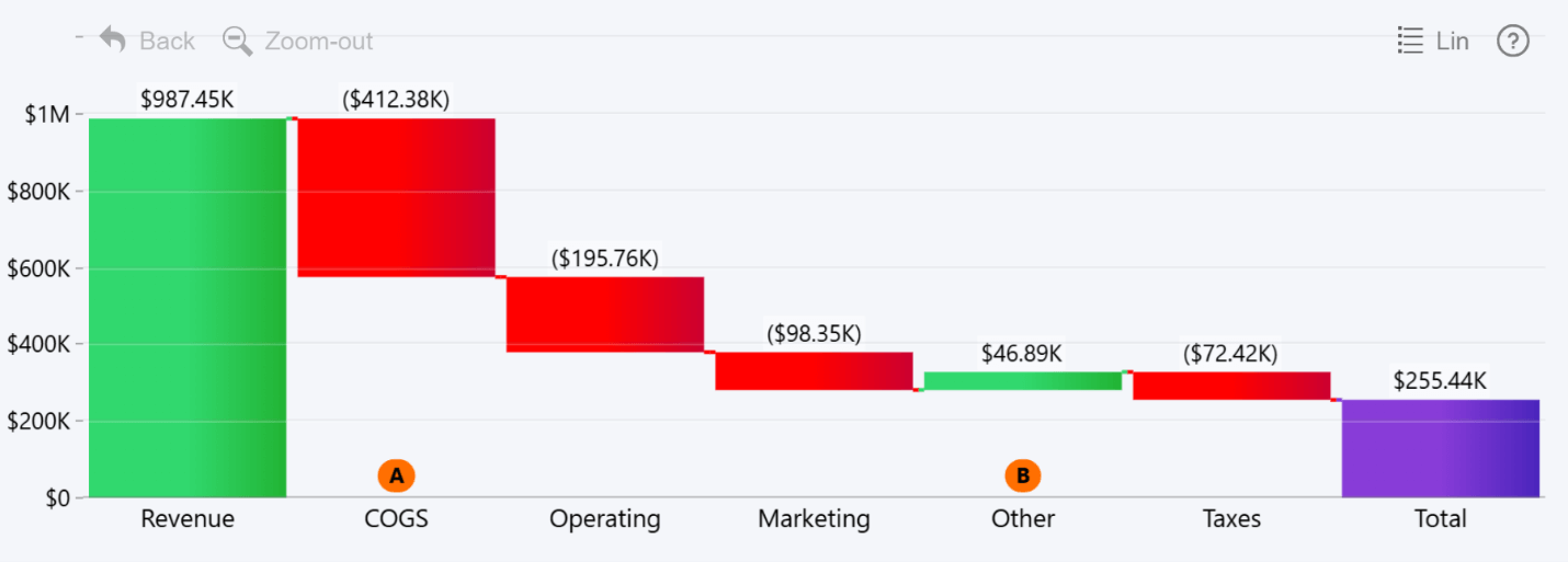
Waterfall charts are uniquely suited for finance reporting because they show a breakdown from start to finish of how a value was achieved; for example, gross revenue to net profit with each expense along the way. For waterfall charts, the order in which the data is displayed matters, which is why we included a Sequence field in our Waterfall PRO visual.
Tip 4: Report UX: Design for Users, Not Analysts

If your report isn’t intuitive and easy to use for stakeholders, then it’s no better than a static printout from Excel. The main benefit of Power BI for finance is the ability to share interactive reports to users directly so they can click around, explore data and find insights that matter to them in seconds. To that end, your Power BI financial reports must have a thoughtfully designed layout and consistent, seamless user interactions that always do what the user expects from it. Here are some tips for better user experience:
- Show context: Numbers on their own are just that – numbers. Give them a meaning by comparing them against something – KPI, target, MoM/YoY deltas, last year’s value, etc. Some ways to include them: as side-by-side columns or overlays, reference lines, as a conditional formatting rule, or by adding that value as a tooltip field so the user can see it on mouseover.
- Field Parameters: If you need to show different metrics or contexts, let users switch them on-the-fly with field parameters instead of duplicating similar visuals on a different page. This will clean up the report and also improve performance.
- Visuals can also be slicers: Slicers are a regular sight in Power BI reports, allowing users to quickly apply filters to data and see focused insights. But a clever and efficient UX approach is to use visuals themselves as slicers – for example, highlighting a timespan on a time series chart to filter data to just that period, or selecting categories on a pie or combo chart.
- Drill Down: In Power BI, users can drill down to instantly see deeper insights, and in ZoomCharts visuals, drill down is the main user interaction – simply click on data to instantly drill down deeper. However, when designing a drill down hierarchy, do it in a way that provides the exact insights an user would be looking for when investigating finances – for example, Business Line -> Product/Category -> Account.
- Color & Data: Even though in many cases, the color scheme may be dictated by branding guidelines or personal preferences, be mindful of the meaning of color and how it changes how data is perceived. Classic example – green for positive, red for negative values. Apply color consistently, and implement it in your data storytelling with conditional formatting. Also, establish similar consistency with other formatting details – like solid lines for actuals, and dotted/dashed lines for projections.
- Device Support: Think about how stakeholders will interact with your report. For example, investors and the C-suite are often on the move, so for them, mobile devices like tablets are the main way they’ll interact with your report. Ensure that the report is legible on smaller screens, not just desktop monitors, and that the navigation is fully usable with touch input (it’s one of the things that ZoomCharts visuals excel at).
Power BI Finance Report Examples
If you have decided to implement Power BI in your finance workflow, the next step is to look for design inspiration for reports. Here are two awesome Power BI finance report examples from our Report Gallery that beautifully visualize finance data and fully leverage PBI’s capabilities to make data exploration engaging and intuitive.
You can explore live demo for each example and even download the .pbix template so you can open them in Power BI, experiment with different settings and try them out with your own data! Both are created using ZoomCharts Power BI visuals – with the free Developer License, you can use all 20+ of them for development purposes for an entire year.
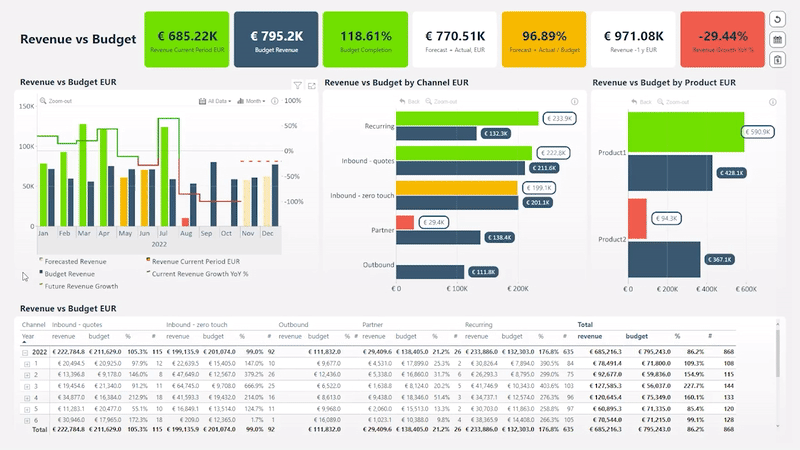
Revenue vs. Budget Power BI Report by ZoomCharts Team

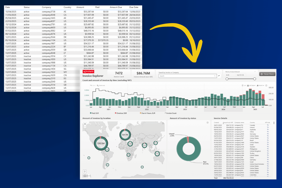
What’s the most important question to ask when assessing the financial health of any organization? Indeed – “does our revenue meet our budget”. This Power BI budget vs. revenue report puts it front and center, with three simple and easy-to-read charts analyzing these metrics over time, across channel, and per product. The visuals talk to each other, instantly cross-filtering data to your selected context (i.e. timespan or channel).
The KPI cards on the top show key metrics – totals initially, or filtered values as you interact with the report – and with conditional formatting, they provide visual cues at the first glance using color (green = all is ok, yellow = needs attention, red = urgent action needed). For pure numbers, there is also a table at the bottom of the report.
Try Live Demo & Download Free .pbix Template
Power BI Financial Analysis Report by Iris Mejuto Crego
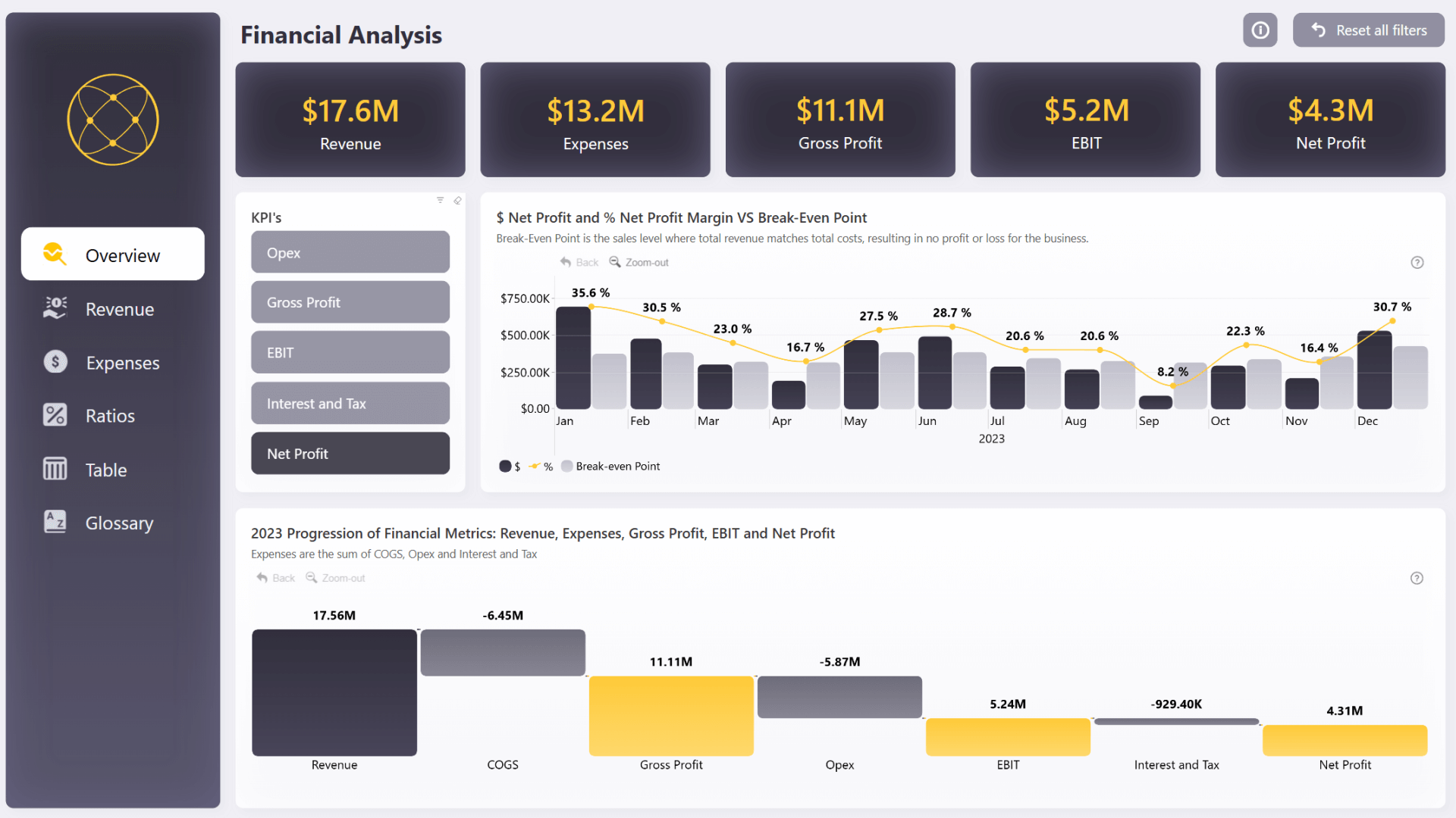
This Power BI finance report is the winner of a Power BI report design challenge, and the reason why the judges liked this report was the thoughtful way it provides lot of finance insights while keeping the design clean and simple.
It perfectly showcases our point about using field parameters – the big and beautiful buttons allow the user to quickly change metrics on-the-fly, and switch between net profit, gross profit, opex, EBIT and others instantly.
Each topic is neatly separated into pages that allows thorough analysis, such as overview, revenue, expenses and ratios, plus a dedicated page for the table with useful slicer buttons. Overall, this report is informative, pleasant to use and nice to look at as well.
Try Live Demo & Download Free .pbix Template
Key Takeaways
Excel just celebrated its 40th birthday, and it’s still the bread and butter for many finance analysts across the world. It still packs enough horsepower for most finance-related tasks, especially in small or medium-sized businesses.
However, more and more businesses are switching their entire data infrastructure to business intelligence platforms like Power BI, and here is what you will gain from it:
- Support for larger, more complex models that integrate multiple data sources
- Interactive reports that offer self-service analysis for stakeholders
- Centralized data solution not just for finance, but other departments
If your organization is looking to implement Power BI in finance and other facets of business, our Report Development service is for you! Our team of report design professionals will design tailor-made report based on your requirements, and provide training for your team. In addition, this service includes licenses to all our visuals. Get started with more intuitive, interactive and insightful reports and get more value from your business data!

Want more info like this?
Subscribe to our newsletter and be the first to read our latest articles and expert data visualization tips!


